Journey Into Mordor With CSS
Today’s project is silly and fun, but it does have a real point and educational purpose. In a recent article, I explored five ways to use multiple CSS background images to create cool hover effects. I had one idea in that article that I didn’t get to simply because its complexity merited a standalone explanation.
This article then is an extension of that previous discussion. We’ll be using multiple backgrounds to create a cool cinematic effect where someone traverses a map while the vantage point zooms out. The best and most nerd-tastic way to show this off is of course to use the familiar tale of Frodo crossing Middle Earth to arrive at Mount Doom in Mordor. Let’s get started.
The Concept
The basic idea for this hover effect is simple. There’s a container with two different backgrounds. The one on the bottom of the stack fills the entire container, the one on the top of the stack is much smaller. On hover, the full bleed image (which actually extends well beyond the container) moves left while the small image moves right. This is a super fundamental animation technique that makes it look like the subject is moving through the scene.
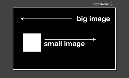
To make things even more interesting, I want the scene to start on a zoomed in view of the subject and then pan out to view the landscape as a whole.
Why Middle Earth?
The most practical use that I could think of for this idea was to show someone moving across a map. This is a pretty typical use case. Whether your company just changed locations or your family just went on vacation, you’ll find it pretty easy to come up with a decent excuse to implement a fun map animation.
Now, given that I’m a huge nerd who is completely excited about the upcoming film, “The Hobbit,” my mind immediately jumped to a scene from Middle Earth. Consequently, today’s project evolved into a hat tip to the last cinematic hobbit journey. Feel free to make fun of me in the comments, after seeing the demo, my wife ensures me that I deserve it.
Why Multiple Background Images?
Could we do this same thing with images dropped into our HTML? Yep. Would it give us even more freedom to manipulate the images? You bet.
Then why don’t we use HTML? Because the entire point of the exercise is to learn how to wield multiple background images in CSS, that’s why! One day you’ll be forced to code something with multiple background images and you’ll fortunately know all about them.
See It In Action
Before we start building, let’s get a look at what we’re trying to create. Click below to check out the finished product.
Demo: Click here to launch the live version.

Getting Started: The HTML
This experiment uses all CSS with minimal markup. All you really need for the entire project is a single empty div. That’s it!
<div id="middleEarth"></div>
Obviously, you can add text and other objects to make the item more complex but for today’s purposes, this is all the HTML we need.
Size Up the Div
Before proceeding with anything else, we need to decide on a size for our div. This will influence all the rest of our decisions. I chose a good sized rectangle: 500px wide by 375px tall. I then centered it on the page and dropped it down from the top of the page by 20px.
#middleEarth {
  width: 500px; height: 375px;
  margin: 20px auto;
  border: 3px solid white;
}
Prepare your Images
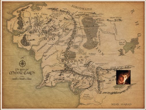
To follow along, you’ll need two images: a map and a subject. You can use anything you like but I chose the two images below for reasons already explained:
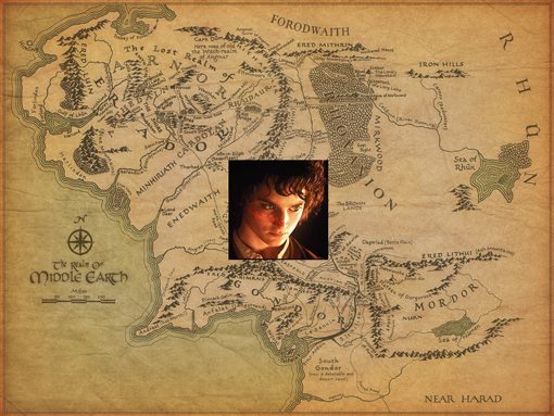
My Middle Earth map is fairly large: 1000px by 750px and my Frodo image is fairly small: 100px by 100px.
Plan the Animation
Now that we have our images, we need to think carefully about what it is that we’re trying to do. Obviously, Frodo starts his journey in The Shire, so we’ll need to zoom in on the Northwest quadrant of the map and position the small image somewhere in that area.
He then makes a journey to Mordor, which is in the Southeast quadrant, so we want Frodo to move down and to the right in a diagonal line. At the beginning of the animation, we want to be zoomed in on The Shire but at the end of the animation we want to see the whole of Middle Earth. Here are the two states for our map size:
- Beginning Map Size: 1,000 by 750 pixels (full size)
- End Map Size: 500 by 375 pixels (the div size)
Frodo will also need to change size since we are zooming out. Since the numbers above worked out to perfectly cutting the image size in half, we’ll follow suit here:
- Beginning Frodo Size: 100 by 100 pixels (full size)
- End Frodo Size: 50 by 50 pixels (half size)
We’ll also need to position the images, but that’s easier to do on the fly as we insert them so let’s proceed to that step.
Insert the Images
Now it’s time to toss the images into our div. The great thing about using multiple backgrounds is that you don’t need any crazy vendor prefixes, you don’t even really need to learn new syntax, just drop one image in like always, insert a comma, then toss in another image.
Here I’ve thrown in some line returns for clarity. They add in extra space, but help keep the code readable. Keep in mind that the stacking order in the code will represent the stacking order in the live version. Here the map is on the bottom and the subject is on top, which is exactly what we need (this is all in the #middleEarth selector).
background:
	url('frodo.jpg') no-repeat,
	url('middleearth.jpg') no-repeat;
Here’s what this gives us:
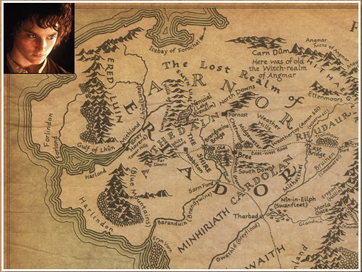
The good news is that the map is, by default, positioned with the top left as its origin, which is exactly what we want. The bad news is that Frodo is positioned the same way so we’ll need to move him over to The Shire to start.
To position the Frodo image, simply add in a horizontal and vertical position after the “no-repeat” bit. The best way to do this is just to experiment and see what works. I came up with 150px 150px, which puts him right next to the label for The Shire.
background:
	url('frodo.jpg') no-repeat 150px 150px,
	url('middleearth.jpg') no-repeat;
Our initial setup is now right where we want it to be.
Applying Separate Image Sizes
To make sure the animation works poperly, we need to make sure we get a few key things right. One important step is to declare our background image sizes.
These aren’t necessary at first as we’re simply using the default size, but we can’t animate the change without explicitly stating the starting and stopping parameters. We simply use the background-size property with and throw in a comma to separate the values. Just as with inserting the images, we can uniquely manipulate the corresponding properties of each image using a comma.
background:
	url('frodo.jpg') no-repeat 150px 150px,
	url('middleearth.jpg') no-repeat;
background-size: 100px 100px, 1000px 750px;
Hover Styles
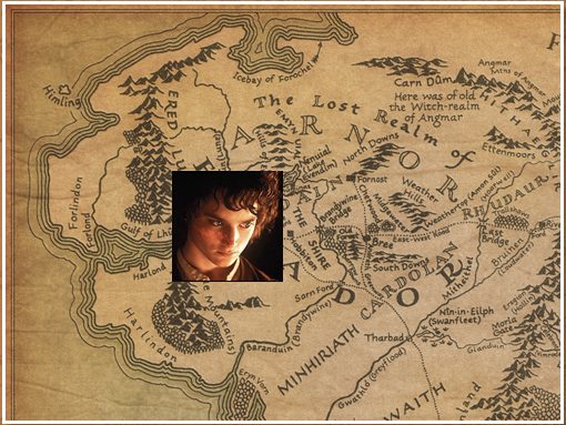
On hover, Frodo needs to set off to Mordor as the map begins to zoom out. We’ve already figured out most of what we need to do this. This time our background sizes need to be 50px by 50px and 500px by 375px (shrinks Frodo, zooms out to show full map). Also, we need to move Frodo way down to Middle Earth so we crank up the horizontal and vertical shift to 400px and and 240px respectively.
#middleEarth:hover {
  background:
    url('frodo.jpg') no-repeat 400px 240px,
    url('middleearth.jpg') no-repeat;
  background-size: 50px 50px, 500px 375px;
}
This puts good old Frodo right in the heart of Mordor.
Final Step: The Animation
Now we have our starting point and our stopping point all set up, all that’s left is the animation. Of course, we’ll use CSS transitions for this. CSS keyframe animations would be much more fun and would allow us to do lots more (like make appropriate stops along the way), but they’re not as widely supported so we’ll have to stick to transitions.
On hover, I want the journey to be nice and long, about five seconds. When you stop hovering, the animation should reverse back to where it started. However, I want it to be much quicker here, about one second.
To accomplish this, we need to set up two separate transitions. The first one goes in the #middleEarth selector and is set to one second. Oddly enough, this will control the mouse-out animation. The second transition goes inside the #middleEarth:hover selector, this controls the mouse-in animation.
Here’s our completed CSS, which shows everything you need to make it all work:
#middleEarth {
	width: 500px;
	height: 375px;
	margin: 20px auto;
	border: 3px solid white;

	/*Background*/
	background: url('frodo.jpg') no-repeat 150px 150px, url('middleearth.jpg') no-repeat;
	background-size: 100px 100px, 1000px 750px;

	/*Mouse Out Animation*/
	-webkit-transition: all 1s ease;
	-moz-transition: all 1s ease;
	-o-transition: all 1s ease;
	-ms-transition: all 1s ease;
	transition: all 1s ease;
}

#middleEarth:hover {
	background: url('frodo.jpg') no-repeat 400px 240px, url('middleearth.jpg') no-repeat;
	background-size: 50px 50px, 500px 375px;

	/*Mouse In Animation*/
	-webkit-transition: all 5s ease;
	-moz-transition: all 5s ease;
	-o-transition: all 5s ease;
	-ms-transition: all 5s ease;
	transition: all 5s ease;
}
Conclusion
With that, we’re all finished! You should now know a ton of great stuff about using multiple backgrounds: how to apply them in the proper staking order, position them independently and animate each image’s size and position.
Be sure to take another look at the demo to see the project in action and let us know what you think in the comment section below.