Toggle a Page’s Color and Content With Pure CSS
Today’s project is going to be a fun one. We’re going to build a basic HTML/CSS demo page, then add in a button that allows the user to toggle the page’s color scheme between to states: day and night. As the colors switch, so will various other elements on the page.
The really awesome part is that we can pull all of this off using only CSS. Along the way we’ll learn how to create a CSS-powered click event as well as how to wield pseudo elements to manipulate page content.
What We’re Building
Basically, we’re going to have a very simple stage that can be toggled between two states. The default state with be a “day” theme, which uses a light background and dark text. The second state with be a “night” theme with a dark background and light text. With the click of a button, you’ll be able to switch between the two.
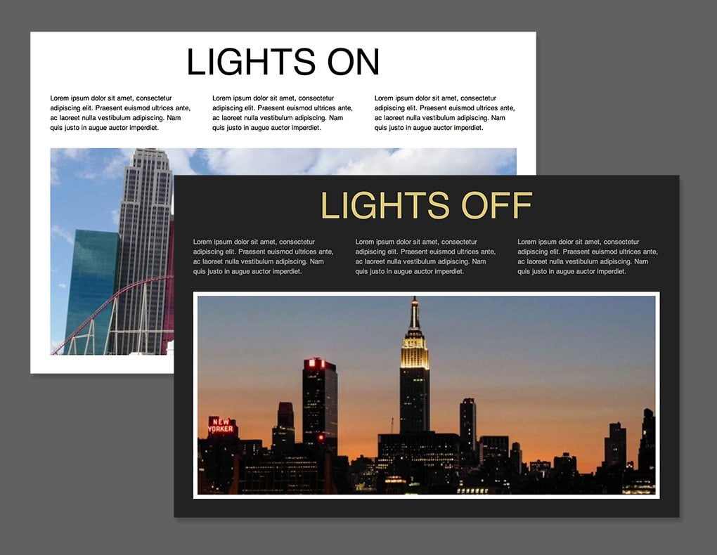
Not content with simple color changes, I wanted to take this idea even further, so we’ll change a few other things around as well. The dark and the light theme will also showcase different headlines and background images.
Once again, just to show off, we’re going to perform this all of this magic without a single drop of JavaScript. Let’s get started.
Step 1. Page HTML
The first thing we’re going to do is build our test page. There doesn’t need to be much here, just a few basic elements that we can play around with in our CSS. As you can see, I used a headline, three paragraphs and an image.
<div class="main">
    <h2>Lights</h2>
    <div class="features">
      <p>Lorem ipsum dolor sit...</p>
      <p>Lorem ipsum dolor sit...</p>
      <p>Lorem ipsum dolor sit...</p>
    </div>
    <div class="headerimage"></div>
</div>
The really weird thing here is the empty “headerimage” div. Normally, I’d just toss in an image here, but if we want to be able to swap this pic out in our CSS, we’ll have to insert the photo as a background image.
Step 2. Starter CSS
Before we dig in and start styling specific pieces of our markup, we’ve got a lot of setup to do. First, we’re going to use border-box sizing to make our size relationships a little easier to manage. This manipulates the CSS box model so that the specific width of an object actually includes padding and borders.
Next, I added a transition to everything on the page. This is certainly not recommended for serious web pages, but for our fun little demo, it’s the perfect way to make sure the lights on/off transition is animated.
To finish off, I simply defined the sizes and padding for the page containers. Note that if we want to use height: 100% on the main class, then we have to make sure both the body and HTML are also set to occupy the full height of the page.
/*Sizing & Transition*/
*, *:after, *:before {
  -webkit-box-sizing: border-box;
  -moz-box-sizing: border-box;
  box-sizing: border-box;
}

* {
  margin: 0;
  padding: 0;
  -webkit-transition: all 1s ease;
  -moz-transition: all 1s ease;
  -o-transition: all 1s ease;
  -ms-transition: all 1s ease;
  transition: all 1s ease;
}

html, body {
  height: 100%;
}

/*Wrapper*/
.main {
  padding: 20px;
  width: 100%;
  height: 100%;
}
Step 3. Headline CSS
Now it’s time to begin styling the specific elements on the page. We’ll start with our headline. Center it, give it a font family, and transform it to uppercase. Next, here’s where things get interesting, use a pseudo element to add in the word “On” after the text we inserted into our HTML.
/*Headline*/
h2 {
  text-align: center;
  text-transform: uppercase;
  font: 70px Helvetica, Arial, sans-serif;
  margin-bottom: 20px;
}

h2:after {
  content: " On"
}
Pseudo elements seem a little complicated when you’re first starting out, but it’s important to understand exactly what’s happening here. Essentially, our HTML sets up a headline with the word “Lights” and our CSS then jumps in and adds on the word “On.”
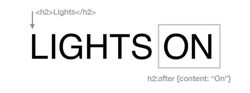
For a complete explanation of pseudo elements, check out “The Lowdown on :Before and :After in CSS.”
Step 4. Paragraph CSS
Next up are the three paragraphs under the headline. These should be floated left, set to a third of the parent’s width, and then cleared. There are also a few visual tweaks here, but everything is pretty straightforward.
/*Feature Paragraphs*/
.features {
  width: 940px;
  margin: 0 auto 30px auto;
}

.features p {
  width: 33.33%;
  float: left;
  padding: 0 20px;
  font: 13px/1.5 Helvetica, Arial, sans-serif;
}

.last {
  padding-right: 0;
}

.features:after {
  content: "";
  display: table;
  clear: both;
}
Step 5. Big Photo CSS
To finish off the demo page, assign a background image to the headerimage class and define the dimensions. As usual, I’m grabbing an image from LoremPixel.
/*Big Photo*/
.headerimage {
  height: 400px;
  width: 900px;
  margin: 0 auto;
  background: url(http://lorempixum.com/900/400/city/3);
}
Progress Check
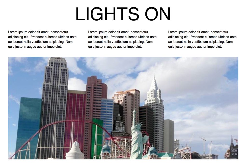
At this point, your page should look like the image below. Overall, it’s not very impressive… yet!
Step 6. Light Switch HTML
Now that we have a demo to work with, it’s time to install a “light switch,” which is a fancy way to say we’re going to toss in a button that changes up some styles on the page. The trick to doing this with pure CSS is largely outlined in a previous post, “Using Checkboxes to Toggle CSS and Create Click Events.”
In that post, we learned how to hijack a checkbox and bend it to our will. It’s not the most semantic of techniques, but it’s definitely a blast to toy around with. To get this party started, add in a label and checkbox input at the top of the body in your HTML.
<body>
  <label for="lightswitch">Light Switch</label>
  <input type="checkbox" id="lightswitch" />

  <div class="main">
    <h2>Lights</h2>
    <div class="features">
      <p>Lorem ipsum dolor sit...</p>
      <p>Lorem ipsum dolor sit...</p>
      <p>Lorem ipsum dolor sit...</p>
    </div>
    <!-- end .features -->

    <div class="headerimage"></div>
  </div>
  <!-- end .main -->
</body>
Step 7. Light Switch CSS
Essentially, what we’re going to do here is hide the checkbox itself and style the label to look like a button. The reason that this works is that, in HTML, the label for a given checkbox can be clicked just like the box itself to toggle the off/on state.
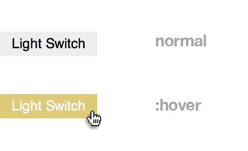
To pull this off, set the label display to “block”, then set a height, width, background color, text-align, font and margin like below. Also notice that I set the position to “fixed,” which allows the light switch to stay visible as you scroll down the page. On hover, we simply change the colors around.
To finish off, we use absolute positioning on the checkbox itself and push it out to no man’s land, effectively hiding it from the page.
/*Light Switch*/
label {
  display: block;
  height: 25px;
  width: 100px;
  background: #eee;
  text-align: center;
  font: 14px/25px Helvetica, Arial, sans-serif;
  margin: 20px 0;
  position: fixed;
}

label:hover {
  background: #ddca7e;
  color: #fff;
  cursor: pointer;
}

input#lightswitch {
   position: absolute;
   top: -9999px;
   left: -9999px;
}
Progress Check
This gives us a little button that bleeds off the left side of the page. Here’s a shot of the two states that we’ve set up:
Step 8. Change the Background Color
Now that we have our light switch set up, it’s time to target it in our CSS and define the “:checked” state. The real voodoo here is that we can tack on other selectors and actually change just about anything on our demo page when the button is clicked. Let’s start by changing the page’s background color:
input#lightswitch:checked + .main {
  background: #222;
}
Here we used the adjacent sibling combinator, which is set to grab any “main” class that is immediately follows our checked light switch. This will effectively make the background color dark when the switch is off.
The Trick
The quirky part here is that you have to tie the second selector to the checkbox somehow because it really all makes up one complicated (and likely pretty inefficient) selector. For instance, we couldn’t merely grab the body, instead we had to use a sibling selector that defined the relationship between the checkbox and another element. You can also pull this off with the child combinator, which we’ll see in the next step.
Step 9. Change Lots of Stuff!
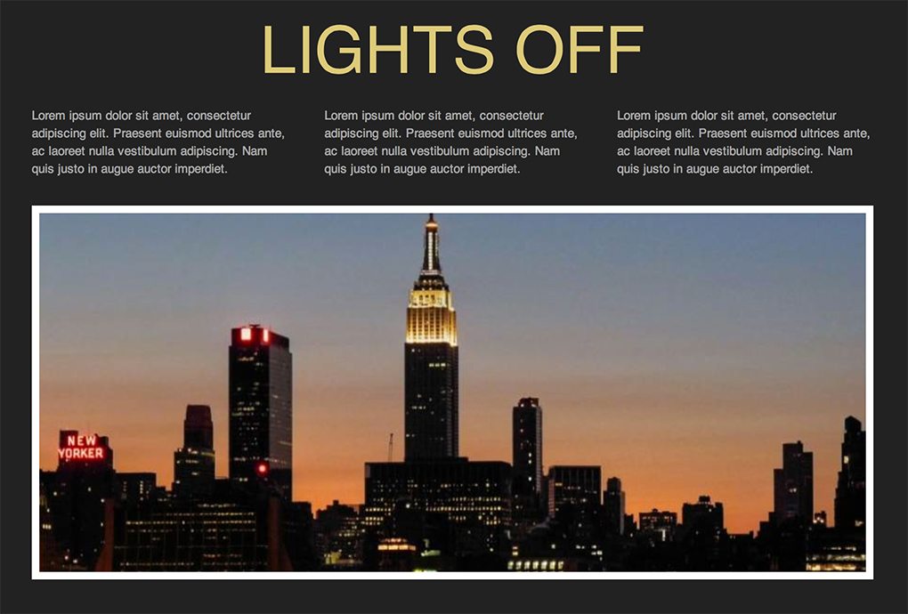
Now that we know how to use the light switch to change items on the page, we can go nuts. Here I change the text color, background color and even the background image to a night time photo! I also changed the h2:after text to read “Off” so that the headline will alternate between “Lights On” and “Lights Off” as you play with the toggle. Pretty cool!
/*Switched Off*/
input#lightswitch:checked + .main {
  background: #222;
}

input#lightswitch:checked + .main h2 {
  color: #ddca7e;
}

input#lightswitch:checked + .main h2:after {
  content: " Off"
}

input#lightswitch:checked + .main p {
  color: #aaa;
}

input#lightswitch:checked + .main > .headerimage {
  background: url(http://lorempixum.com/900/400/city/4);
  border: 8px solid #fff;
}
This gives us a nice dark theme that the user can choose to activate.
See it Live
All of our hard work has paid off, not it’s time to view the fruits of our labor. Be sure to click the light switch on the left to see the effect. Also, fork the demo on CodePen and show us how you would make it even better!
Demo: Click here to launch.
Conclusion
We pulled off a lot of fancy CSS tricks today with very little effort. We created a click event by hijacking a checkbox, utilized changing pseudo elements and toggled the overall look of a page.
As always, thanks for reading. I hope you learned a few things along the way, I always do!