Make It Snow on Your Website With CSS Keyframe Animations
The holiday season is at its peak and for some lucky people in weather appropriate climates, winter is in full swing. I live in Phoenix so real winter, and consequently snow, is really just a distant dream. Thus I am forced to turn to nerdery to get my fix!
Today we’re going to go over a super simple CSS technique that you can use to make it snow on your website. It’ll only take you a few minutes at the most and it serves as a great introduction to using multiple background images and keyframe animations in CSS.
Webkit FTW

To keep things simple, I’ll start off all of this code using the -webkit vendor prefix. This will keep our code cleaner and easier to read as we learn. The reason I chose Webkit is simple: the CSS keyframe animation support rocks. Even Firefox, which recently added keyframe support, really won’t cut it nearly as well as Safari.
Afterwards, we’ll discuss how to toss in the other vendor prefixes and what type of experience you can expect on each browser. Ultimately, if you’re really looking for a solidly supported effect that works on as many browsers as possible, I recommend seeking out a jQuery snow plugin. However, if you’re up for a fun CSS learning experience, keep reading!
Getting Started: We Three PNGs
The setup for this project is three snowy background images. You can definitely add more if you like, but we’ll use three here to keep things nice and simple. Basically, all you need is three transparent background PNG files of varying size with random little white dots on them.

Here’s my process for setting these up. First, I created a 500px square image and used a tiny brush at full hardness. You can set up a scatter brush if you want but I like the control of manually placing the dots around the canvas. Then, to make sure it tiled nicely, I went to Filter>Other>Offset.
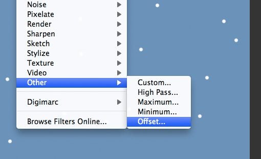
Since I started with a 500px square image, I’m going to cut that in half and offset by 250px both horizontally and vertically.
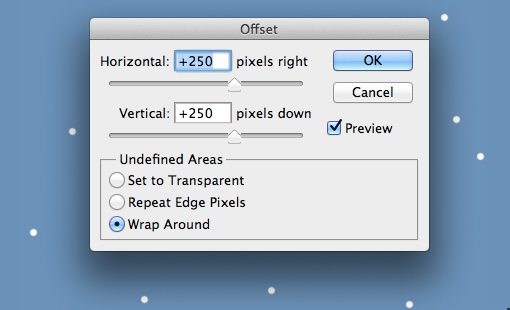
After you’ve run this command, you might have some messy spots near the center, these should be easy to clean up with a little erasing. The important part is that the edges wrap nicely so the middle of the image can be changed however you want.
Now save your PNG out and repeat this entire process for a 400px square image and a 300px square image. For these last two, I made the snowflakes a little blurrier and reduced the opacity a little.
Applying the Backgrounds
Now we’re going to apply these images to our background in CSS. I’m throwing them on using the body selector but feel free to apply them to something more specific.
Implementing multiple backgrounds is exactly like applying only one background, the only difference is that you throw in a comma after the first image URL and add in another. Here’s what our code will look like, note that the background images will all repeat by default.
body {
	background-color: #6b92b9;
	background-image: url('snow1.png'), url('snow2.png'), url('snow3.png');
}
Multiple backgrounds have great support across the board, the only real thing you have to worry about is, you guessed it, older versions of IE. As with just about everything else in advanced CSS, multiple backgrounds are supported in IE9, but nothing older than that. Hopefully the new IE auto update program will put an end to these types of woes!
Setting Up the Keyframes
In the past, we’ve done some decently complex keyframe animations on Design Shack, but this time we can keep in really simple.
@-webkit-keyframes snow {
 0% {background-position: 0px 0px;}
 100% {background-position: 500px 1000px, 400px 400px, 300px 300px;}
}
Despite the fact that I’m referring to this as “simple” there’s admittedly a lot going on in this syntax so let’s break it down piece by piece. What this is doing is setting up an animation that we can then call into action elsewhere in our CSS. The base syntax is “@keyframes” but here we’re implementing the Webkit version so we used “@-webkit-keyframes”. The “snow” part is the name that I chose for the animation. You have some freedom here but try to choose something descriptive and helpful.
Next we initiate two frames. The first is what our page will look like at the beginning of our animation, the second is what it will look like at the end. At the beginning, I’ve placed all of our background images at the top left of the page using “0px 0px.” Then at the end, I’ve moved each image to a new location. Just like when we place each image, we’ll separate each set of position values with a comma.
The Position Logic
The position of each image at the end of the animation may seem arbitrary, but in reality this is very intentional. In order to make the animation work right, you have to understand a few things.
The reason we’re using keyframe animations instead of the simpler and much better supported transition property is because we can loop a keyframe animation endlessly so it will continue to snow indefinitely. With this in mind, you have to remember that once a single instance of an animation has run its course, it’s going to start over. If you don’t position your images properly, you’ll see a blip at this point.
The trick is to utilize the size of your images to make sure the end frame matches the beginning frame, thus creating a seamless transition. For instance, my second background image was 400px by 400px, so I moved the background 400px down during the course of the animation, the same for my third image at 300px. For my first image I did something a little different. I wanted it to move faster so I doubled the height and moved it 1,000 pixels. Since this is a multiple of the height, the last frame will still match the first.
Also notice that I moved the horizontal position of the images as well. This adds a bit of wind into the equation so the snow isn’t falling perfectly vertically. If you want the snow to sway back and forth as it falls, simply add in a few more frames.
Implementing the Animation
Our final step is to return to the body selector and throw in “-webkit-animation” to create an instance of the animation. First we state the name of the animation that we want to use, in this case “snow,” then we state the duration of the animation (20 seconds), next we choose a timing function (linear) and finally we loop the animation infinitely.
body {
	background-color: #6b92b9;
	background-image: url('snow.png'), url('snow3.png'), url('snow2.png');
	-webkit-animation: snow 20s linear infinite;
}
With that, your website should be snowing like crazy in Safari! Let’s take a look at expanding this a little.
Other Browser Prefixes
Now to add more browser support. Our keyframe setup section should be expanded to the following. I’ve started with the base syntax without a browser prefix, then used the prefixes for Mozilla, Webkit and Microsoft.
/*Keyframes*/
@keyframes snow {
 0% {background-position: 0px 0px;}
 100% {background-position: 500px 1000px, 400px 400px, 300px 300px;}
}

@-moz-keyframes snow {
 0% {background-position: 0px 0px;}
 100% {background-position: 500px 1000px, 400px 400px, 300px 300px;}
}

@-webkit-keyframes snow {
0% {background-position: 0px 0px;}
 100% {background-position: 500px 1000px, 400px 400px, 300px 300px;}
}

@-ms-keyframes snow {
 0% {background-position: 0px 0px;}
 100% {background-position: 500px 1000px, 400px 400px, 300px 300px;}
}
Then we do the same for the styles in the body. All of the various browsers use the same syntax, only the prefix changes.
body {
	background-color: #6b92b9;
	background-image: url('snow.png'), url('snow2.png'), url('snow3.png');

	-webkit-animation: snow 20s linear infinite;
	-moz-animation: snow 20s linear infinite;
	-ms-animation: snow 20s linear infinite;
	animation: snow 20s linear infinite;
}
Note that the IE support here is purely for the future. Only IE 10 has support for keyframe animations and its still under development.
“Not So Fast” says Firefox
At this point I wanted to be all done with the tutorial, but alas, I opened up Firefox and found a problem: no animation! After some digging it turned out that the problem is in the multiple background implementation.
The issue is a strange one. Firefox supports multiple background images and it supports keyframe animations. It even supports animations that use multiple background images! However, for some reason it doesn’t seem to support moving each background image’s position independently during a keyframe animation.
Update
Great news, commenter Patric solved our little Firefox problem! It turns out my love for shorthand got me into trouble here. Firefox works perfectly if you list out all of the values in the initial line. Here’s the updated keyframe code:
/*Keyframes*/
@keyframes snow {
0% {background-position: 0px 0px, 0px 0px, 0px 0px;}
 100% {background-position: 500px 1000px, 400px 400px, 300px 300px;}
}

@-moz-keyframes snow {
0% {background-position: 0px 0px, 0px 0px, 0px 0px;}
100% {background-position: 500px 1000px, 400px 400px, 300px 300px;}
}

@-webkit-keyframes snow {
0% {background-position: 0px 0px, 0px 0px, 0px 0px;}
 50% {background-color:#b4cfe0;}
 100% {background-position: 500px 1000px, 400px 400px, 300px 300px; background-color:#6b92b9;}
}

@-ms-keyframes snow {
0% {background-position: 0px 0px, 0px 0px, 0px 0px;}
 100% {background-position: 500px 1000px, 400px 400px, 300px 300px;}
}
See It in Action
Demo: Click here to launch

Conclusion
To sum up, making a pure CSS looped snow animation that works in modern browsers is a snap. A few minutes of Photoshop and a couple of simple lines of code and you’ve got the North Pole. IE won’t support keyframe animations until version 10, Opera currently has zero support and Firefox has support, but it’s not as extensive as what you’ll find in Webkit.
This project perfectly illustrates why it’s important to play around with this stuff before it’s ready to be implemented in the real world. I had no idea that Firefox would throw a wrench into my little animation until I actually got my hands dirty with an experiment. Now I find myself much more educated on the necessary syntax for CSS animations on a browser to browser basis.