3 New Logo Trends to Try for Your Brand
We all know the story. You spend a lot of time perfecting the perfectly trendy design element… and then, just like that, the trend is over. And your cool design goes with it. But it doesn’t have to be that way.
The trick to designing around trends is speed. To make the most of an emerging trend, you need to get from concept to deployment quickly. The second trend trick is to use trends that aren’t “too trendy,” meaning they pull from classical design elements.
Today, we’re going to look at three logo trends that you can start using right away. Done well, they should also have a lot of staying power because they use some more timeless concepts from design theory.
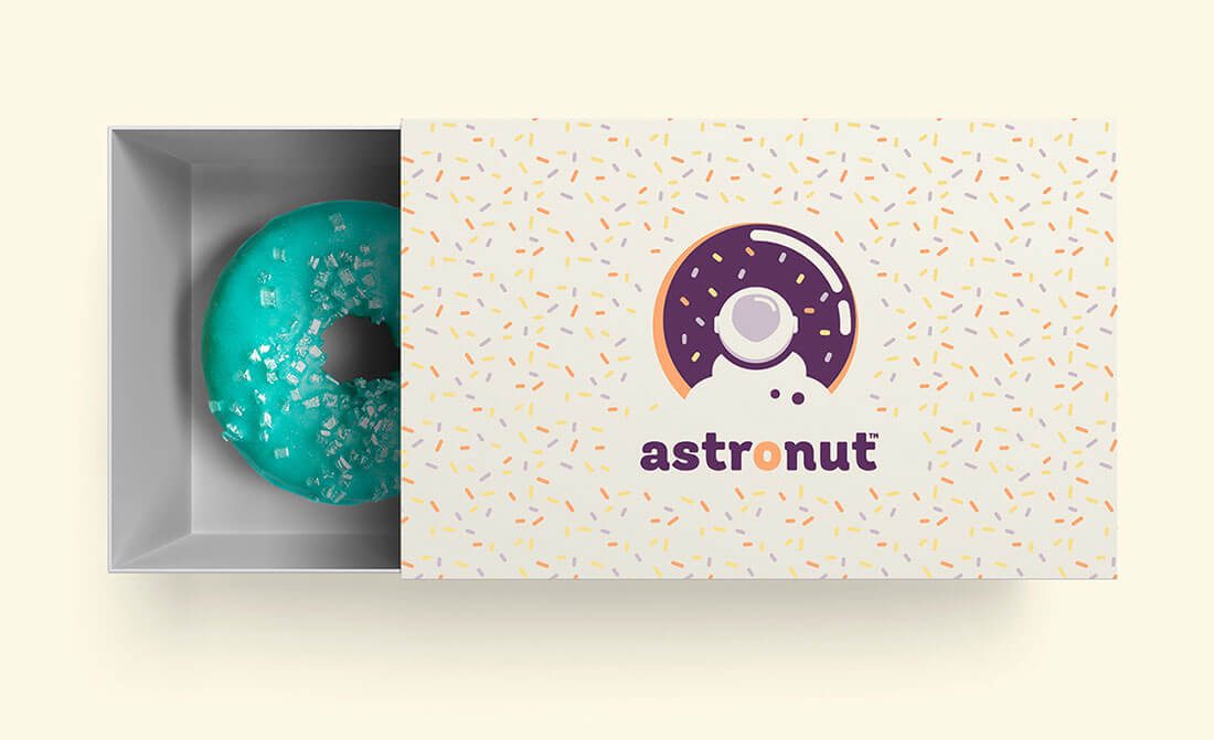
1. Novelty Lettering
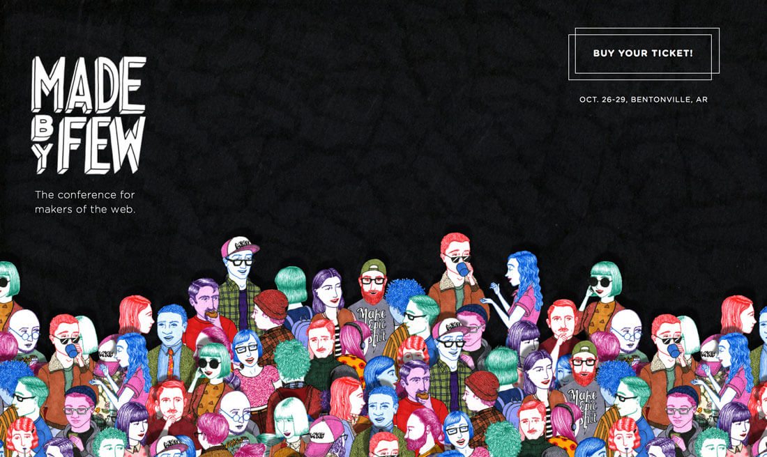
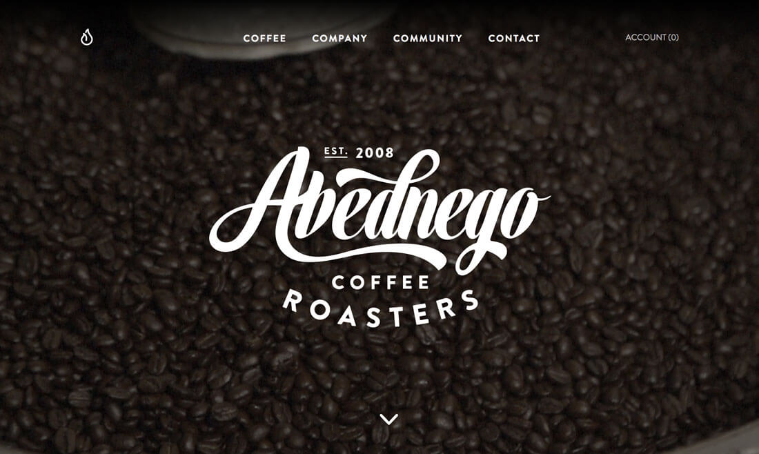
Novelty lettering is just cool. While this might sound like one of the easiest ways to create a logo – “let’s just slap a neat font on it” – it’s actually one of the more difficult techniques.
Here’s the process:
- Pick a typeface. (Remember that you’ll be using it for a while.)
- Realize that typeface does not look good with your words. (This happens all the time.)
- Select a new typeface.
- Stack, shift, tilt and play with different combinations of the words.
- Incorporate special characters, such as swashes or glyphs for extra interest.
- Adjust kerning. Adjust line spacing. Adjust kerning again.
- Make it color. (And black … and repeat.)
- Pair it with an image.
- Sigh and start over. (At least a few times.)
The nice thing about a great logotype – a logo using words – is that once finished, they often work for long periods of time. Look at the Coca-Cola logo, for example. That type style isn’t really fashionable right now, but the logo holds up. The company uses in with today’s trends to make the iconic logo stand out and feel fresh.
That’s a sure sign of a great novelty typeface.
2. Smart Negative Space
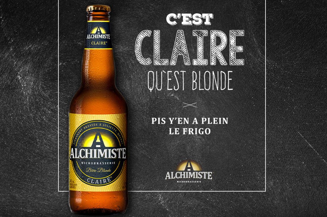
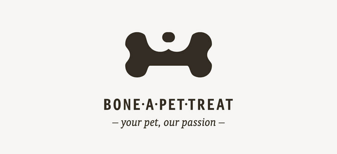
Great use of negative space will leave you saying “That was clever.” Sometimes the uses are obvious – we all know about the arrow in the FedEx logo, but others are a little harder to find.
There’s a fine line between being clever and pushing a design too far. It takes a lot of tinkering, creativity and collaboration to get it right.
Here are 10 tips to help you get it right:
- Make the most of contrast. Black and white logos are OK.
- Be literal. Show what the words say (or your product).
- Incorporate a photo with letterforms. (This one can be tough, but it’s possible.)
- Use plenty of space. Not just the negative space, but white space around the design as well.
- Flip the design. Does it work both ways?
- Create flow so users can see the “hidden element.”
- Use a neat cut out.
- Don’t go overboard. Subtlety can be divine.
- Do something abstract. (Represent the literal figuratively.)
- Keep it minimal.
3. Geometric Shapes
Cool geometry can bring so much meaning to a project. The sharpness of lines and weight of strokes can convey a lot of meaning to users before they even really touch your project.
What a shape says about your brand is important and can help you choose where to start with a logo-based project. Here’s a primer on shape associations (and you can learn more in a previous Design Shack article.) https://designshack.net/articles/layouts/the-sometimes-hidden-meaning-of-shapes/
- Squares and rectangles: Common shapes create a sense of equality and conformity. They are stable and trusted. These shapes, when used with hard edges, take on a more masculine feel.
- Circles: Circles are most frequently used to represent completeness. Because a circle does not have a distinct beginning or end, they imply movement (such as a wheel). The shape is thought to have a feminine association and is connected to love, energy and power.
- Triangles: The shape can imply stability, power and energy when it rests on a solid base. But it results in feelings of conflict, tension and nervousness when the base is upside down or appears unstable. It implies motion and is related to masculine ideas because of social and cultural norms related to strength and stability.
In addition to the actual shape, it is important to consider the edges of shapes and how the lines connecting them are drawn. The truest geometric forms are most connected to the ideas above. But it the lines are softer with more curves or less hard-edge and more squiggles, the associations also become lighter and less rigid.
Then there’s the abstract nature of shapes. They lack true definition. The most common form of an abstract shape is an icon using an outline element. The shapes and ideas are easy to see, but lack formality or some of the polish you might expect in other uses.
Conclusion
Now that you’ve seen some fresh logo ideas and have an idea of where to start with some more trendy elements, are you ready to revamp your logo? When working with trendy elements, it’s important to think about how long you will associate the design with your brand. (Logos tend to stick around for much longer periods than other design tactics.)
While you need to work with a certain degree to speed to make the most of a trend while it is popular, you still should research, plan and design your logo in such a way that it will last and work for your brand. Trends are fun, but a logo can last a long time; you need it to be a full and accurate representation of who you want to be. Have fun and good luck!