5 Cool & Quick Photoshop Shadow Tricks
Photoshop layer styles can be used for good or evil. In the hands of a beginner, they can lead to cliché results that are so overused that they’re downright cringeworthy. However, in the hands of an experienced Photoshopper, they can be the building blocks for complex and impressive effects.
Today we’re going to pay tribute to the shadow layer effects that come built into Photoshop. We’ll go over five super quick and easy tricks that you can pull off using simple shadow techniques.
The Ultimate Designer Toolkit: 2 Million+ Assets
Envato Elements gives you unlimited access to 2 million+ pro design resources, themes, templates, photos, graphics and more. Everything you'll ever need in your design resource toolkit.
Stack ‘Em
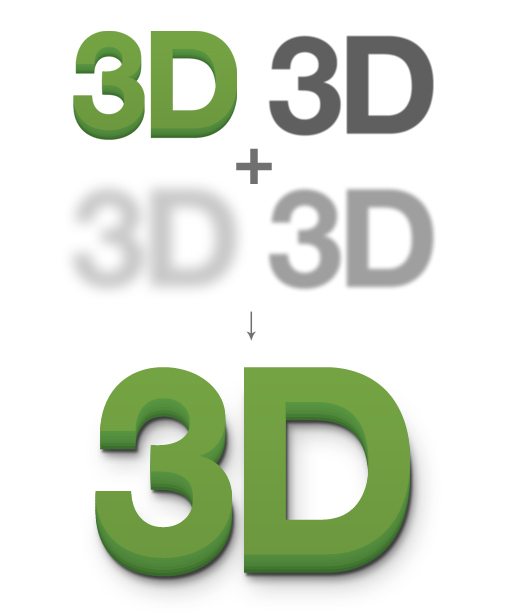
One of the big downsides of using Photoshop layer effects is that you can only have a single instance of each effect. For instance, if you add one drop shadow to a piece of text, that’s all you get, you can’t then go back and add more.
Fortunately, there are a few workarounds that you can use to pull off a similar effect. One thing that I do frequently when I want multiple instances of something is use the “Create Layer” command. Let’s see how this works.
To start, double click your layer to bring up the Layer Effects dialog. Now click on the Drop Shadow option. We’ll begin with a fairly dark, only slightly soft shadow that stays close to the letters.
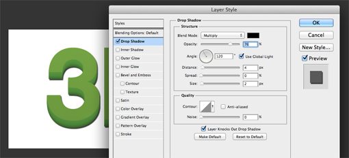
Now, in order to add another drop shadow effect, we have to separate the first one from the layer. We don’t want to delete it, we simply want to have Photoshop render it as a standalone layer. To to this, simply right-click on the layer containing the shadow and click on “Create Layer.”
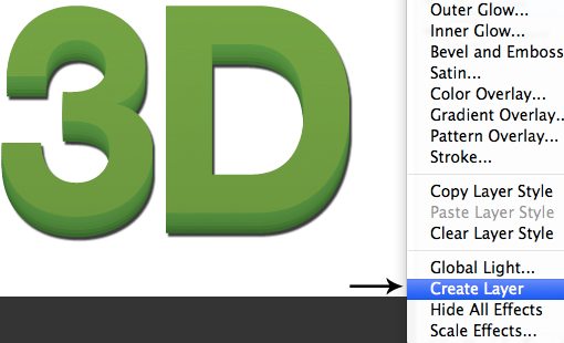
When you do this, the visual appearance of your document won’t change, but you Layers palette will. Notice that the letters layer now has no effects applied and there’s an extra layer containing the pixels that make up the shadow.
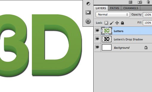
Now that the text layer doesn’t have any effects applied, we can go in and add another shadow. From here we simply lather, rinse and repeat. Before we started with a slightly soft, dark shadow close to the letters. Now we’ll add two more shadows, gradually increasing the softness and distance while reducing the opacity.

As you can see, the result is much more believable than if we had stopped at a single instance of the drop shadow.
Old Navy

The Old Navy effect is an interesting retro style that sort of looks like a screwed up print where the text fill wasn’t quite properly aligned with its stroke. The title for this one comes from the fact that I’ve often seen a similar effect used on store signage for the popular clothing retailer Old Navy.
Pulling this off is super simple using any number of techniques, but I like to build the effect using layer styles. To begin, type something out in Photoshop and reduce the Fill to 0%.
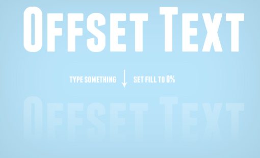
They might seem redundant, but there’s actually a big difference between fill and opacity. In this case, be sure the fill, not the opacity, is set to 0%.
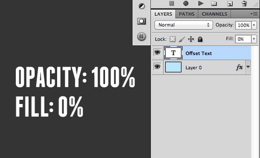
The reason for this is simple. Both make the text invisible, but reducing the fill to 0% will allow the layer effects to show while setting the opacity to 0% will hide the layer effects.
Once you have the fill set to 0%, go into your Layer Effects palette and add a stroke. I like to align the stroke to the inside of the letters to prevent unwanted rounding of hard corners.
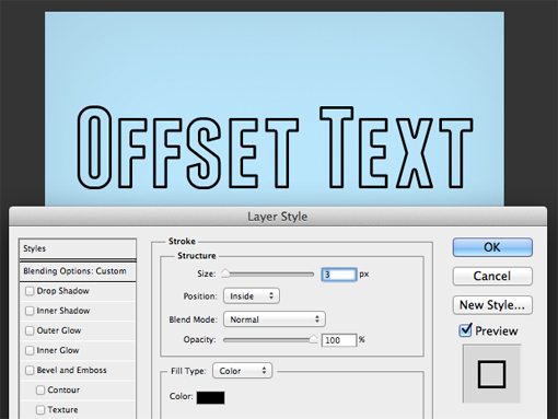
Next, go in and and a drop shadow effect to the text. You’ll want to make set the hardness to zero so that it will look more like a fill in the end than a shadow. Feel free to experiment with the position and set it anywhere you like.
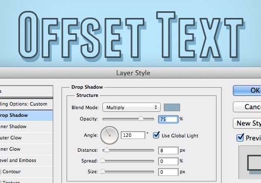
Notice that something strange is happening here. Our fill is set to 0% so you would think that the drop shadow would be fully visible in the area where the fill should be, but that’s not the case. Instead, the shadow is still hidden in parts just as if there were a fill applied. Weird right?
The solution to this problem is to return to our old friend “Create Layers.” Just like before, right-click on the layer and choose this option from the menu that pops up.
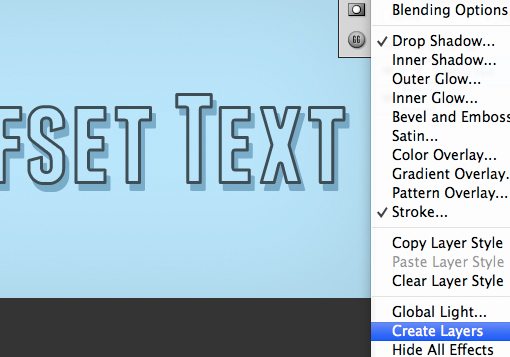
Once you do this, the layer, shadow and stroke will be broken into three distinct layers and the fill transparency will suddenly work exactly like we want it to.
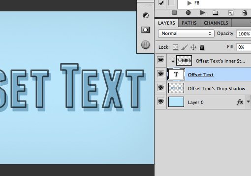
From here you can easily tweak each individual piece and shuffle them around as you wish. Experiment with adding to this effect and really making it your own. Try changing the stroke color or adding new fills to make the result more complex.

Burn It

This one is going to stretch your concept of a shadow a bit. The goal is to create an effect that burns the text into the parchment so it almost looks as if it were branded rather than written. To pull it off though, we’re actually going to use an outer glow. Wait, that’s not a shadow! The interesting part is that you can tweak the settings of an outer glow to make it work more like a shadow. The benefit is that it will be centered and not offset in any particular direction.

To begin, grab a nice parchment background and type out some text. I decided used a free font called “Angel Tears” but feel free to switch it up and use whatever you like.
Next, go in and set the fill to 90% and the blending mode to “Color Burn.” This is another important difference between opacity and fill, reducing the fill achieves much more interesting results with blending modes than you can pull of with opacity.
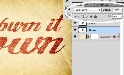
From here, click on one of your text layers and add an Outer Glow. By default, your glow is probably set to a light warm color with a blending mode of Screen. This doesn’t produce the effect that we want at all.
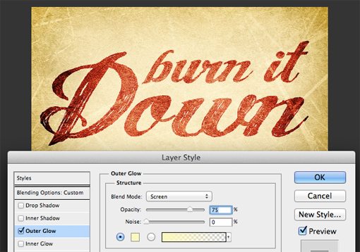
To change this, it helps to know how a the Drop Shadow layer effect is set up. Aside from the positioning, the main difference between a Drop Shadow and an Outer Glow is that the former is set to black with a blending mode of Multiply while the latter has the settings we just discussed.
So to make an Outer Glow work like a Drop Shadow, we need to change the color and the blending mode. This does indeed turn the glow into a shadow, but the effect still isn’t quite what we’re going for.
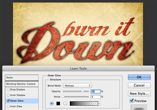
If you remember from before, the blending mode that we’re using on the text is Color Burn. If we apply this to our Outer Glow, the result is exactly what we want!
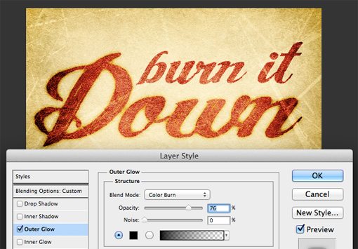
Repeat this step for the other line of text and you’ll be finished! Once again, be sure to play around and see if you can come up with your own unique result. Also be sure to consider how you can tweak other layer effects to be different than their default results.

Quick Vignette
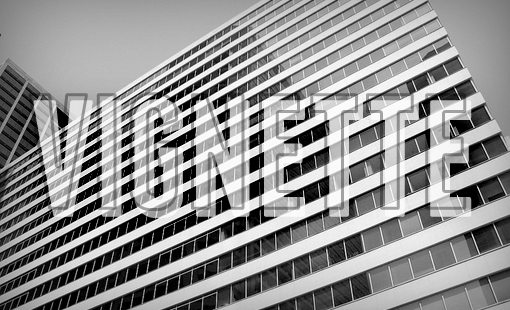
Photo source: Kevin Dooley
This one is the simplest effect of the bunch, it’s so easy that you can do it in less than ten seconds. It’s a bit obvious, but I thought I’d mention it simply because I use it almost every day and find it to be a really useful trick.
Any time you want to add a little interest or intensity to an image, a vignette goes a long way, and an Inner Shadow is the perfect way to bust out a quick, continually adjustable vignette. Let’s see how this works by starting with this image:
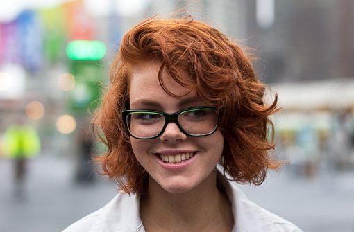
Photo source: Logan Campbell
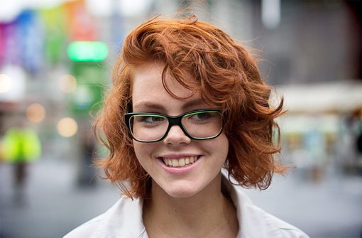
This is a good photo, but the lighting certainly isn’t ideal. The central focus point, the face, is pretty dark while the background is light. Typically, with light skinned models, this can be the opposite of what you want.
To help this out, I’ll start by adding a nice big vignette using the Inner Shadow layer effect. This will help bring the viewer’s attention in towards the center.
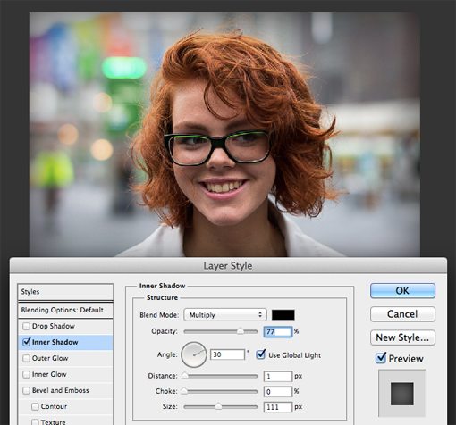
Next I add a Curves layer to boost the brightness only on the face area. This combined with the previous step has dramatically redefined the lighting conditions in the image.
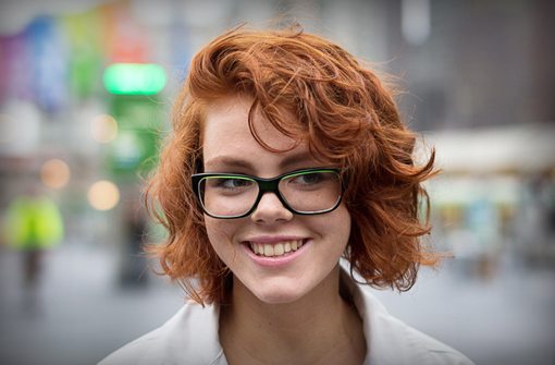
To really highlight the change, here’s an animated gif that shows the image before and after the changes. Notice how much more your attention is drawn inward in the vignette version.

To switch things up even further, try playing with the blending mode on the Inner Shadow. Here’s an alternate version with blend mode set to Color Burn like we were using in the previous example.
Letterpress
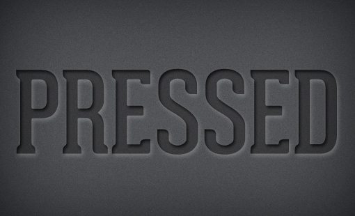
Our final shadow effect is a letterpress illusion that will make some text appear as if it’s been pressed down into the background. This one will use two different types of shadows to create the effect, which is probably a step further than you’d think to go on your own, let’s see how this works.
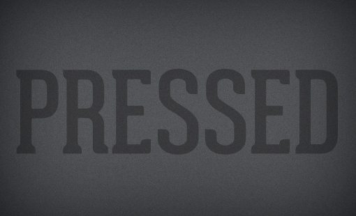
To begin, create some text that’s slightly darker than your background. I used the font “Geared Slab” in the example below.
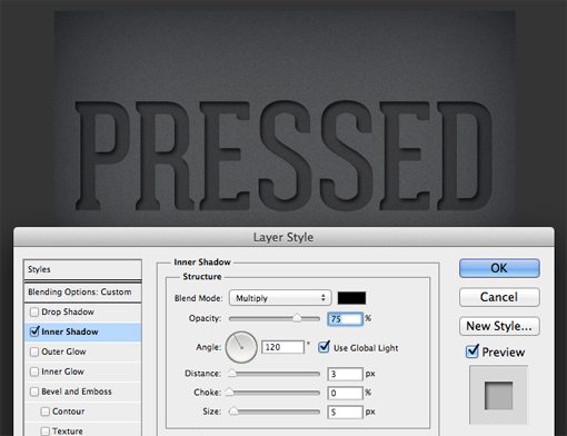
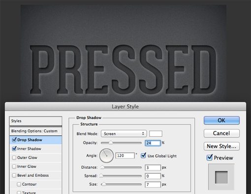
Next, we’ll add our first shadow. This one will be an Inner Shadow with the settings shown below. This alone creates a nice inset look but we can take the effect a little further.
Remember how before we made an Outer Glow work like a Drop Shadow? This time we’re going to reverse that idea and make a Drop Shadow work like an Outer Glow! To do this, add in a drop shadow, set the blending mode to Screen and change the color to white. Make sure you keep the opacity pretty low too. The result is a nice pillow effect for the edges of our text.
Show Us Your Shadow Tricks!
The purpose of this post was really to get you thinking about how Photoshop’s layer effects shouldn’t always be used in the way that you think. Instead of seeing them as one click ways to add something to your image, see them as building blocks for more complicated results.
Now that you’ve seen my five favorite shadow tricks, leave a comment below and tell me about yours. Be sure to link to a result if you have one!

