5 Former Design Trends That Aren’t Cool Anymore (So Stop Using Them)
If you’re like me, looking at your own design work from a few years ago can often result in some laughable or even cringe-worthy moments. Design styles have been steadily evolving and most of us can’t help but be affected by these changes. Who among us hasn’t piled on the cheesy Photoshop layer effects, all the while thinking the result was downright awesome?
However, some of us are a little slower to evolve than others. Today we’ll be taking a walk down memory lane and looking at five design trends that used to be super cool, but now simply tend to make your design look outdated and even ugly. If you’re currently still stuck on these trends, it might be time to move along! We’ll help you out with some modern alternative practices that you can use to bring your design skills into the current year in a hurry.
Let’s Make Fun of Design
We designers tend to take ourselves far too seriously. A post like this could easily lead to derogatory finger pointing and superiority complexes, but let’s go ahead and admit up front that we’ve all flirted with at least a few of these trends, many of us have jumped on board every single one of them.
The only way to escape this fact is to be a new designer, then all you’re doing is jumping on the trends of today. Don’t worry, you won’t regret or perhaps even acknowledge these decisions for at least another three to five years.
What Are Design Trends Good For?
The key to analyzing design trends is to remember that they aren’t inherently good or bad. Instead, they merely serve as a way to observe and remember the collective tastes of bygone eras.
In this way, they’re a fantastic history lesson on how styles have evolved over the years. Try to think of past design trends like fashion, something that was cool when you are young will eventually become deplorable, but don’t worry, by the time you’re old it’ll probably see a resurgence.
The practical lesson here is that by examining which design practices seem out of style and dated, you can avoid being that guy who still wears tie dye t-shirts on a first date. Is it the case that you should absolutely abandon all of the practices on this list forever? Absolutely not. Just like with that tie dye shirt, you can probably find a time or two where these seem appropriate, even if only ironically. And who knows? They could come back and become cool again before long!
Bevel and Emboss
I know it’s tempting. You open up that Photoshop Effects window and Bevel and Emboss is like a siren calling from the rocks, pleading with you to add a touch of realism to your design. Before you know it, you’re staring at something like this:
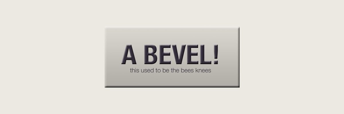
There’s almost nothing that screams late 90s/early 2000s design like a good old bevel treatment. We went crazy with these things and put them on everything we touched. Even beloved, age old brand logos weren’t safe from the far reaching effects of this trend.
Like that picture of you on Facebook with the skinny jeans, we now look back on this trend with a “what was I thinking?” attitude. Don’t knockout it though, you’ll do the exact same thing in ten years to whatever you’re working on today!
Do This Instead
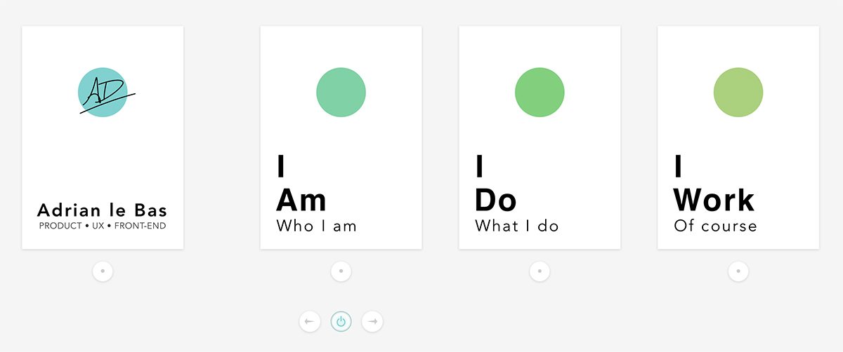
These days the trend across the board is much more minimalistic that it was ten years ago. We’ve gone past faux realistic bevels and, for the most part, dropped them completely. Now objects tend to have simple, uniform edges with almost no effects apart from the occasional subtle shadow. The World of Adrian Le Bas is a prime example:
Web 2.0 Gloss
The bevel and emboss trend wasn’t suddenly abandoned one day in favor of minimalism. Instead, it had to evolve into something even more ornate before we decided to run in the completely opposite direction.
Bevels alone tend to give an almost clay-like look to an object. Add in some shine though and you’ve suddenly got some fancy plastic and glass effects:
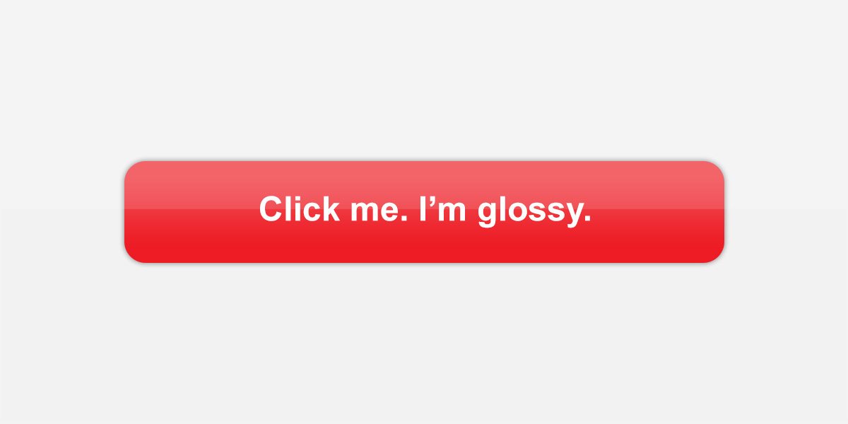
This one still hasn’t effectively been killed off, you need not travel far to find its influences. I’ll even gloss up a button or two myself from time to time, though certainly not to this extreme. The problem is of course that stylistically, designers have largely dropped this and are moving once again towards more subtle choices. Implementing a heavily glossed web 2.0 style on your site is a surefire way to make a brand new site seem like it’s already due for a design refresh.
Do This Instead
The good news is that “attractive” buttons are even easier to make these days. All you need is a little border-radius and a slight drop-shadow or gradient. The effect is a nice button style that stands out without being too flashy. Check out this example from Shopify.

It’s interesting to note how technology affects design trends. The Photoshop-centric effects of yesterday are giving way to CSS3 styles of today. You can expect this to continue as new possibilities come to light with pure code-driven design.
Lots of Cursive Text

This one is a possible exception to my earlier statement about design trends being neither good nor bad from a purely objective standpoint. If a trend actually stands in the way of the success of a design, then it’s easy to argue that it is in fact an example of “bad” design.
I find this to be the case with big blocks of cursive text. For some reason, this is a trend that simply refuses to die. Following this trend is a double whammy of ugly design. Not only does it make your site uncomfortable to browse and read through, it also tends to reflect many of the typeface woes of the 1990s. If there’s one thing you don’t currently want someone to say about your site, it’s that it looks like something from when developers with no real design experience were first beginning to apply basic styles to websites.
Do This Instead
Instead of hitting your visitors over the head with overuse of that fancy typeface that you found free online, try instead sprinkling it in extremely selectively. Elementary school taught you that cursive is for professional communication; they lied. In design it should be used very selectively as an occasional accent to more readable alternatives.
There are dozens of beautiful script and calligraphy fonts that have popped up in recent years from independent artists. The key is to choose one that’s readable, and don’t over-use it!
The Burst
This one has roots dating back to the early days of even print design. The burst is a tried and true way to grab your viewer’s attention. It says “hey, here’s some important information!” in a easy to implement and instantly recognizable way. The problem: it’s ugly and makes your design look like a marketing professor threw up on it.

My main problem with this is that it reflects a complete lack of thought and imagination. Instead of considering how to effectively integrate a logical and appropriate break into the design pattern, the designers who use this simply use the very first idea that pops into their heads. It would also be the very first idea of every non-designer as well, making it the most uncreative design element you could possibly use.
Do This Instead
The simple solution here is to put a tiny bit more thought into creating an element that fits with your overall design theme but still violates the page enough to grab attention. While there’s nothing worse than an invasive pop-over to promote a sale or discount, putting some thought into a stylish and well-designed solution can work well. PixelPop is a tool that does this perfectly, with thoughtful design and simple templates.
Retro Redemption
The real key to mastering design trends is to know what they suggest. Don’t implement a certain style just because you feel good about it today, instead analyze what it is that you want to achieve and what will work for and/or against that idea.
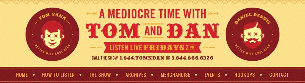
For instance, if you’re trying to create a modern e-commerce site that reflects current style choices in web design, you should avoid bursts like they’re an 80s rock-a-mullet. However, if you’re intentionally creating a retro look, then suddenly bursts once again become a perfectly legitimate and even attractive choice. Check out the Tom and Dan Show site below to see this idea in action:
Dramatic Drop Shadows
The story here is the same as that of the bevel. That Photoshop “Drop Shadow” layer style is just begging to be played with. If you start by tweaking the default effect, you’re likely to come up with something like this:
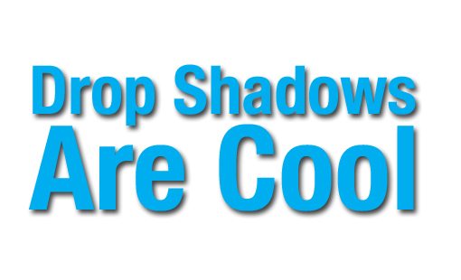
This shadow is big, soft, has plenty of distance and has a color that contrasts heavily with the background. Unfortunately, the result is a design that instantly reeks of cheesy fake lighting effects.
Do This Instead
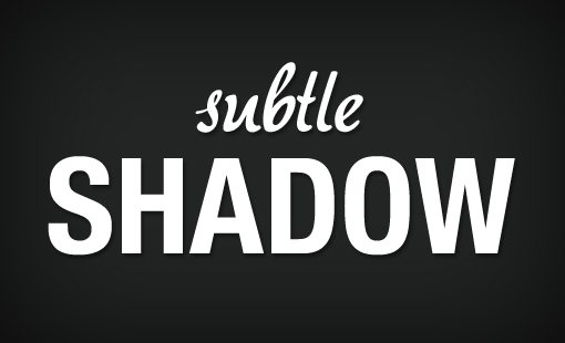
There are still a million different popular ways to use drop shadows, the above example simply isn’t one of them. If you like the soft, feathered edge look, try blending the shadow in with the background so that it serves to make the text a tad more realistic without being a major distraction.
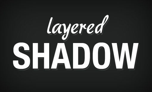
Another shadow treatment that’s popular right now harkens back to the days before it was common to use soft shadows. This effect uses a non-feathered drop shadow that has a little bit more of a retro feel.
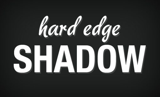
You can take this a step further by layering the shadow with a knock section in between the shadow and the text. Once again, this is leaning towards a refined aged feel.
Conclusion
The examples above should serve to illustrate the idea that following antiquated trends can in fact have a negative effect on your designs and the impressions they leave on your viewers. Once again, the main principal I’m trying to communicate is intentionality. As long as you know what it is your design style of choice is communicating, and that concept or time period is exactly what you’re going for, then you’re on the right track.
Also keep in mind that design trends wouldn’t evolve at all without pioneers that go against what’s currently popular and blaze their own trail. Don’t be too eager to jump onto the overused tricks bandwagon if you’re working on a project that merits some innovative thought. Go your own way and let everyone follow you!