5 Tips for Creating a Memorable Logo Design
A logo might be the single most important visual connection a brand makes with users. It identifies the company or organization and sets a basic tone for interactions with users.
From color to shape to words, every element in a logo design says something. (That’s why such a small element is so important to your brand.)
Logo design takes a lot of planning and thought and it is important to create a mark that represents your business and is something that users can identify and remember. It’s doubtful that you’ll develop the next Nike swoosh, but with the right approach you can create a memorable logo design.
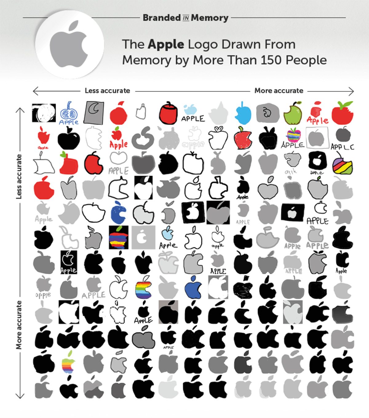
Branded in Memory
I recently saw a fascinating project called Branded in Memory. They asked asked over 150 Americans to draw 10 famous logos from memory as accurately as they could.
It lead to a collection of over 1,500 drawings created over a period of 80 hours. And the results aren’t what you might expect. These brands certainly aren’t stamped perfectly in our minds — they’re surprisingly fuzzy! Here’s an example of how people fared with the Apple logo, but be sure to take a look at all the other brands involved as well. The results are fascinating!
With that in mind, creating a memorable logo is more important than ever. Here are some tips to create a simple mark that resonates and sticks around:
1. Simple Sells
The best logo designs are classic, simple and easy to understand. They often include a simple mark and company name. And that’s it.
Think of companies like Apple or Google or McDonald’s – each uses a simple representation that people around the world can identify with. Users see the mark and think of the company. That’s the essence of a memorable logo.
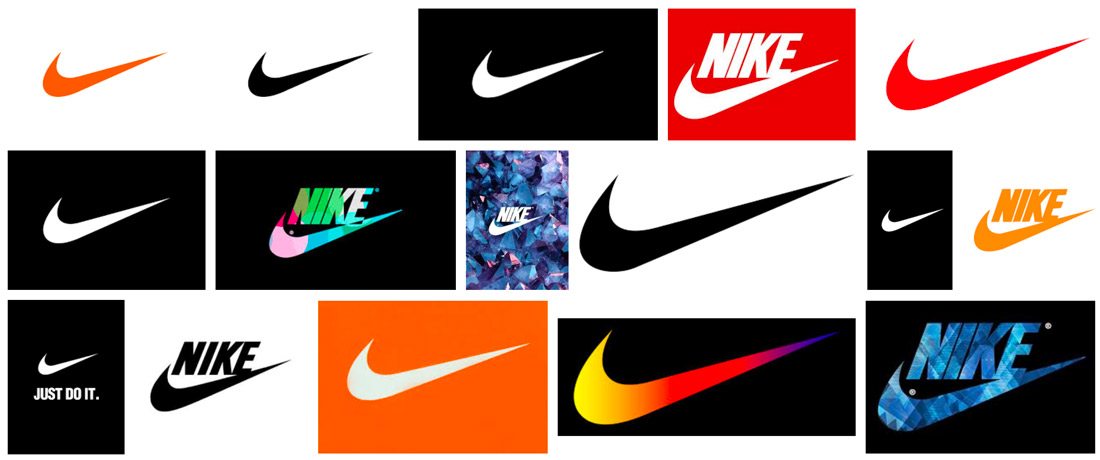
Simple logos also tend to work well in a number of applications and uses. Look at the mark for Nike, above, and all the different ways the mark is used. Regardless of the application, you know the brand every time.
The mistake that most designers make when creating a logo is that it contains too much information. To ensure simplicity in the logo design, consider these guidelines:
- Use no more than four words (or 30 characters).
- Stick to three or fewer colors.
- Don’t use more than one design trick or effect.
- Avoid thin elements for type and artwork.
2. Consider Who/What You Want to Be
It is important that your logo is an accurate representation of your company or product. It should have a meaning that’s unique to what you do.
Think about the meaning of colors and shapes when planning the design and how those associations can impact users. (You don’t want to communicate the wrong thing by mistake.) It’s also important to think about the logo in context of your overall industry.
- Does the logo show what you do or sell?
- Does the imagery communicate the right thing?
- Can it stand alone?
One of the best starting lists for how to think about imagery in a logo design comes from AdWeek. The magazine noted how certain logo marks resonated with users. Here’s a snippet from that article (go read the rest to learn more):
- Powerful: Geometric shapes
- Traditional/sophisticated/respected: Serif wordmarks
- Warm/caring/innovative: Organic lines
- Trendy/fun/cool: Illustrations
- Approachable: Shapes that touch
- Edgy: Initial lettering
3. Use Color Wisely
Color might be one of the most important elements of a logo design for two reasons.
- Color choices can draw users in to the design and say something about your brand.
- A good logo works in full color or in single-color applications.
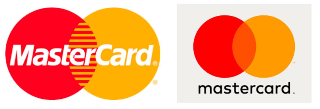
In the vein of keeping the logo design simple, stick to a simple color palette – no more than three colors – for the logo design. Flatter logo design styles are trendy right now. (Even MasterCard recently moved to a much flatter version of its pair of interlocking circles.)
Paired with flatter styles and logo design ideas borrowed from Material Design is the use of bright color. And that’s a good thing. Bold color choices can help draw users into the logo design. But don’t go too crazy.
You want to create something that you can use for years to come and using too many trendy elements or colors can date the design. Pick one trendy color to incorporate into the design. You can add a trendy accent color to the logo if your brand colors don’t have hues from trendier palettes.
It’s also important to remember that you won’t be able to use a full color logo all the time. Does it also work as a single-color element (often black or white)? If not, the logo design probably needs some more work.
4. Stay Away from Clip Art
If this is the only tip you pay attention to, read it closely: don’t use clip art. Not every logo will have a mark that’s as recognizable as Apple’s apple. That’s OK.
What every logo does need is original artwork that tells users who and what the company is. Whether it is a mark or logotype is up to you. (Some logos work best as a logotype because of an interesting name or lettering.)
Just don’t force it with clip art. The logo will look somewhat silly and amateurish. It won’t feel special in any way. And if you want to design a logo that memorable, it has to be special in some way. It has to be different from everything else out there and stand apart from competitors. Using clip art might be quick, but it won’t help you meet any of those other needs.
(This is why hiring an experienced designer to create a logo is your best bet. And designers: Have these conversations with clients so you can explain how to best create a logo that they can use for years to come.)
5. Create Something That’s Flexible

A memorable logo likely has multiple iterations that are clearly identifiable to the user.
Think about something as simple as the logo for this website. The gray letters of Design Shack on a white background are clear and easy to read on the site itself, which uses green accents throughout.
On social media, where logo space is more limited, the logo collapses to a simple “d” on the same green background used throughout the website. The colors and typography are the same and there’s an obvious connection. That’s flexibility, built into the logo design.
There are plenty of other places where logo flexibility is also important:
- Can you use it over an image?
- Can you add a tagline to it?
- Does it work really large or really small?
- Do you have in icon version for mobile devices or websites?
- If you make a product, does the logo work on labels?
Examples from the Design Shack Gallery
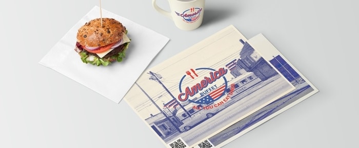
You don’t have to be a big company to have a great logo. Here are a few handpicked examples from the Design Shack Gallery that are quite memorable.

Conclusion
Creating a memorable logo isn’t something you’ll do overnight. It can take time and plenty of revisions. But stick with it. Don’t expect to get as lucky as Carolyn Davidson, who created the Nike logo, every time.
You can find success though with a simple design that uses typography, color and design principles well. The most memorable design is one that tells users something about the brand and business so it sticks with them. Good luck!