6 Famous Logos That Leverage Inconsistent Design
One of the most powerful tools that you can use to improve any design is repetition. Repeating colors, shapes and other visual elements throughout a design increases consistency and familiarity so that the design feels more attractive.
But what about the flip side of this idea? Is it possible to wield inconsistency in such a way that it improves the quality of a design? It turns out that lots of well known logos use this very tactic. Read on to see what they are.
Knowing When to Break the Rules
As I mentioned in the introduction, consistency and repetition are absolutely key concepts in “good” design. Understanding and becoming familiar these rules will, without a doubt, make you a better designer.
That being said, design rules are made to be broken. A skilled designer will not only learn to follow all of the rules, but test them thoroughly and learn when to violate them in a purpose-driven and meaningful way.
So how in the world can inconsistency be a good thing? In what scenario does this work and when is it not a good idea? To see how this works, let’s look at some examples that you probably see all the time and don’t even know it.
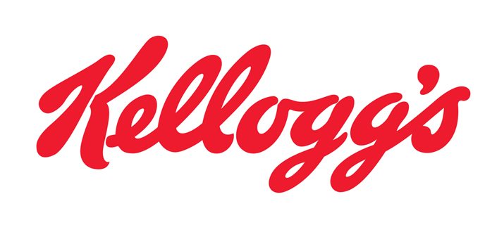
Kellogg’s Delicious Script
I’m a bit of a cereal addict so if there’s one logo that I spend plenty of time staring at, it’s that of Kellogg’s (you have to stare at the box while you eat, it’s the rule!).
I’ve always loved the custom script used here. It’s flowing, bold, rounded and completely timeless. It looks just as good now as it did two decades ago.
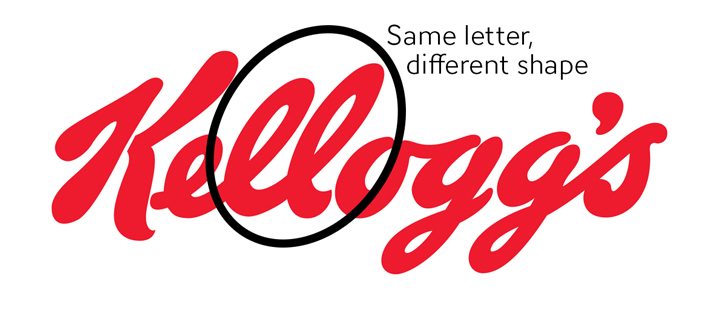
Whenever I look at this logo, I can’t help but think about the glaring inconsistency in the design. Can you spot it?
There it is, right smack near the center. Check out the letter “l”, or both of them rather. These two letter forms should be identical, but they aren’t! The second “l” is clearly taller. Why would they do that?
Imagine that you were tasked with creating the Kellogg’s logo. I’d wager that there are a thousand designers out there who would follow the typical low effort logo design process. Step 1: type out the word. Step 2: choose a font. Step 3: bill the client. Following this procedure, you might come up with something like this:
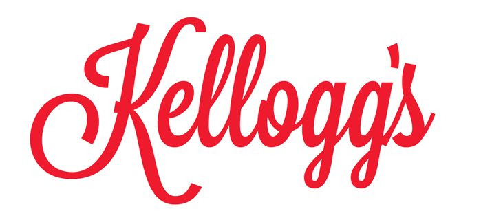
The typeface used here is Lavanderia, and it happens to be a script that I really like right now. Despite being a nice font though, this version of the logo has none of the originality and character that we see in the original design.
The letters don’t flow together nicely and they’re far too consistent to look handwritten. The consistency actually brings about a sterility that robs the brand of its friendliness.
Coca-Cola’s Completely Inconsistent Lettering
I’ll bet that Kellogg’s isn’t the only flowy red script that you see on a daily basis that leverages the concept of inconsistency. How about the most widely recognized piece of text on the planet Earth?

The Coca-Cola logo is hands down one of the best and most famous logos of all time. Take a close look, it’s perfect in every way. Or is it? Are there any major inconsistencies?
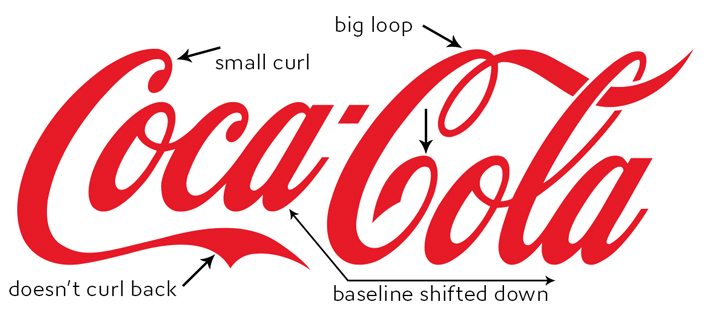
As we can see, the uppercase “C” shape is completely different from its first to second iteration. The first one uses a small curl at the top and a long flowing bottom while the second one uses a loopy, flowing top and a curled bottom.
Beyond these letters, also notice how the baseline on “Coca” has been shifted up considerably, making it profoundly uneven with that of “Cola”.
Somehow though, all of this inconsistency blends together to create an icon that simply couldn’t be improved. How fantastic is that?
Old School Pepsi Mixup
I promise that this is the last red script example! This time our specimen is the Pepsi logo, but not the current version, the one from way back in the 1940s. Back when people still called it “Pepsi-Cola” and the logo looked a lot more like Coke’s.
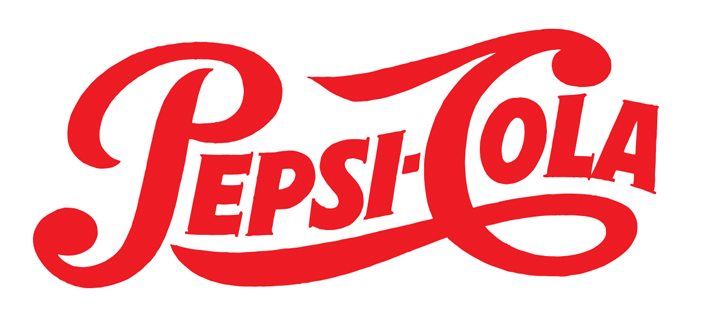
Can you spot the inconsistency here? It’s so obvious that it’s almost tricky to spot. One glance at this logo and you would call it a script logo, right? That’s even what I called it above. But take a closer look.
As you can see, most of the letters are actually standard, uppercase print. Only the first “P” and the “C” are script, but it performs this great trick that makes our brains think that the entire thing is written in cursive. I’d wager that if you asked a group of ten people who are familiar with this logo whether the words are print or script (without showing them of course), many or even most of them would remember a fully script logo.
eBay Ruins Its Logo
Above I gave you a hypothetical example of how someone could rob the Kellogg’s logo of its character by dropping the inconsistency. Now let’s look at a real life and extremely popular brand that did exactly that.
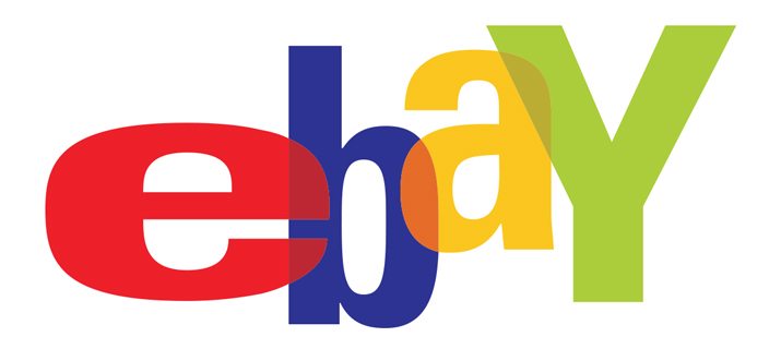
I don’t even need to point on the inconsistencies in this logo because the entire thing lacks cohesion and repetition. Through inconsistency in the letter shapes, sizes and colors, they’re telling you a story: you can find all kinds of crazy stuff on eBay!
Is this logo goofy? You bet. Could it use a facelift to make it more attractive? Probably. Unfortunately, this is what the secretary that they paid to create their new logo came up with in Microsoft Word:
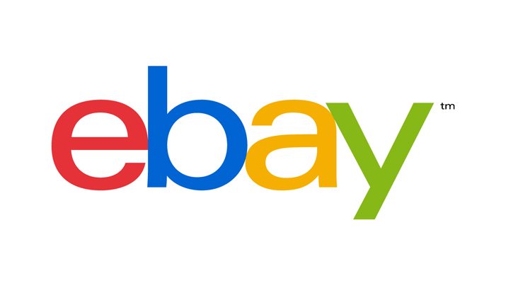
Admittedly, they’ve kept the color inconsistency (which seems much more Google-esque with this lettering), but they’ve dropped the crazy letters. This new logo is completely boring and void of all the life and character of the original. In the last few years, I’ve seen far too many brands abandoning unique, custom lettering in favor or a plain, sans-serif typeface. It breaks my heart folks, don’t give in!
Dell Turns the World On Its Ear
I was pretty harsh on sans-serif logos in the previous section. In truth, the new eBay logo does at least have a little bit of variation to it. Here’s another sans-serif logo that uses a dash of inconsistency:
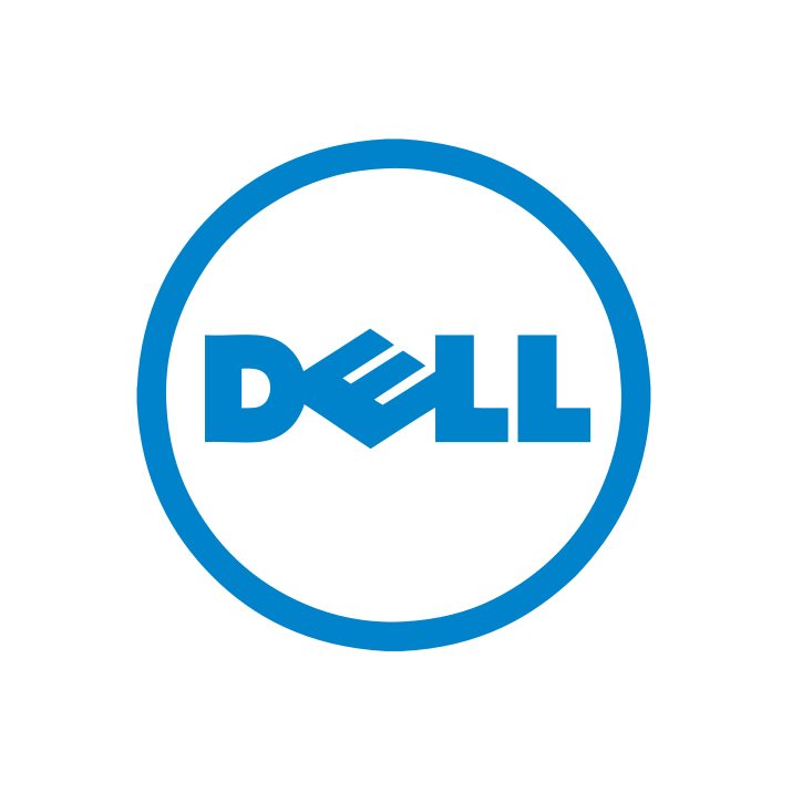
What’s with the crooked “E”? Though I found no official explanation on Dell’s website, the common story that is told regarding this inconsistency is that Michael Dell wanted the “E” to be crooked to represent his desire for Dell to “turn the world on its ear” with great products.
Some people really like Dell’s crooked “E” but I personally never cease to be reminded of another company that used the same idea:
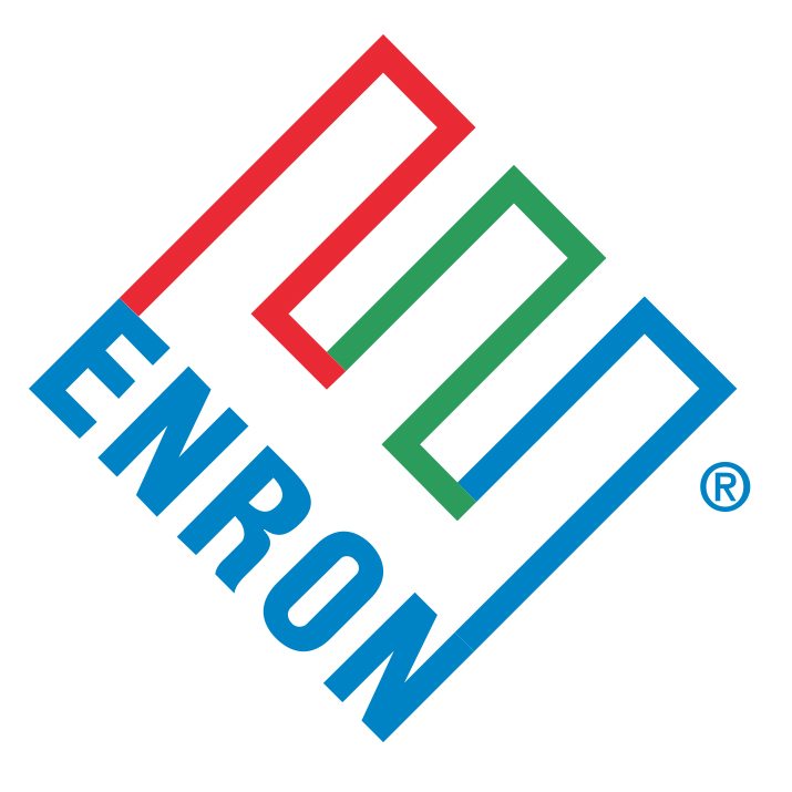
In the case of Enron, the logo proved to be quite the coincidence as all the senior executives in the company were entirely crooked themselves! Let’s hope Dell has better luck with crooked type.
What the Facebook?
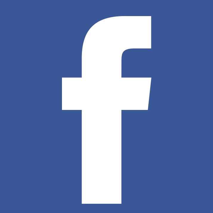
Facebook has become synonymous with the Internet. If you have access to the latter, the odds are pretty decent that you use the former. Given that their user base is literally in the billions, Facebook’s simple, no frills logo likely rivals Coca-Cola in its recognizability.
But what is it about that plain old logo that makes it so recognizable? Countless designers attempt to build a quick Facebook logo when they’re in a hurry by simply typing a lowercase “f”, but what they don’t see is that Facebook’s “f” isn’t as typical as you might think.
To a designer’s eye, the quirkiness of this letter should be instantly recognizable, but just in case you need some help, here’s a visual explanation:
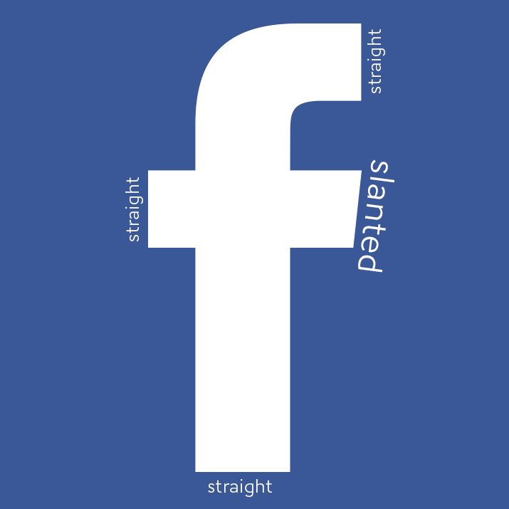
Desite the fact that every other endpoint in the letter uses a perfectly vertical or horizontal line, the right side of the center bar runs diagonal.
It would be a little awkward for that crooked “f” to crash into a vertical “a”, so the inconsistency here is balanced out by our old friend repetition. The “a” uses the same slant, which makes the two fit together nicely.
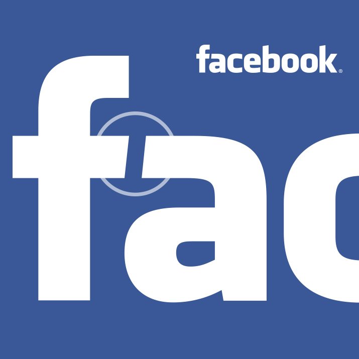
If you look close, you can see that the “b” and “k” also use diagonal lines, though at an even more extreme slant than the “a” and “f”. More inconsistency!
Where Else Do You See Inconsistency?
In this article, we took a look at six extremely famous logos that heavily leverage the concept of inconsistency to add a unique touch to their brand’s image. What other logos and designs have you spotted use this technique?
Have you designed any logos that are made better through inconsistency? We want to see them! Leave a link below and we’ll take a look.