8 Tips for Print Designers Switching to Web & Digital Design
More designers are working across platforms these days, switching back and forth between print and digital projects. Although much of the theory is the same, in practice there are a lot of technical differences when it comes to working on something that will be printed versus a website. It takes a specific set of knowledge and skills to work effectively and efficiently in both environments.
But it is possible. Here we share eight tips for print designers making the switch to digital projects. (And I can vouch for every single tip as a designer who has made the switch.)
Design is Fluid
One of the things that does not change in print design is size. Every document is designed and printed at a certain size. (And frequently on a single medium as well.)
This just is not how the web works. Every user could look at a website using a different browser width and height, or look at the site on a mobile phone or tablet. So every design must account for a variety of sizes and devices.
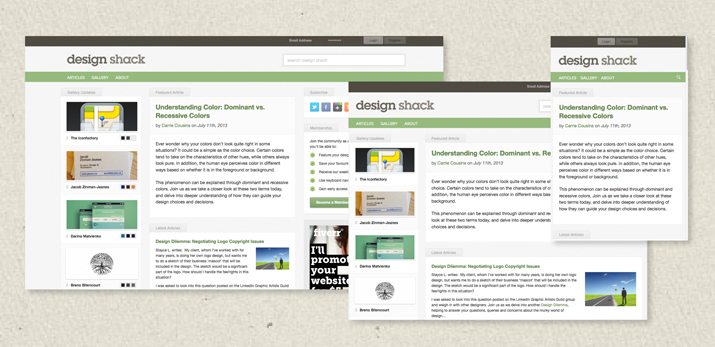
Familiarize yourself with responsive design, what it is and how it works. Responsive design (sometimes called RWD) is an approach to website design where sites are created to view optimally regardless of device – desktop, tablet or mobile. Designers create the design using fluid, proportion-based grid concepts and flexible typography and images.
In addition to size changes, space is “unlimited.” As a designer you are not stuck in the constraints of a 4 by 6 inch postcard or 11 by 17 poster. The canvas goes on for as many pages as you like and can scroll almost infinitely.
Learn a Little HTML
If you want to design for the web, you have to know the basics. And you can start by training yourself. (Check out this previous Design Shack article for a list of great places to start.)
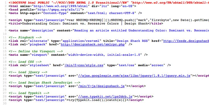
Start with a little HTML, the language of the web. With just a little understanding of HTML, you can learn to easily change colors, fonts and sizes on a website. HTML is the foundation that everything web-based is built on and without it, you will struggle in digital design.
Once you get comfortable with the basics of HTML, branch out to CSS and basic code. CSS, or Cascading Style Sheets, allow you to create and alter a set of styles for your website based on a style sheet. It creates a set of design rules and can be used to create website hierarchy and maintain visual consistency. Understanding basic coding concepts will help you understand why things work they way they do on the web. Although coding looks like gibberish at first, it makes sense once you really start to look at it.
You don’t have to be a master of HTML or CSS or code to create a great digital project, but it will help tremendously.
Create Dynamic Content
Print design is innately flat. Text and images are rest on top of some type of paper or other flat surface. Digital design is dynamic and active. Remember this and use it to your advantage.
Objects can move, include sound or links and even tools that make items pop up or hover when the user gets close to them. Web and digital projects should be designed for the user experience. This might be quite a change from some of the philosophies you are used to in the print world.
It is also important to use common visual cues and user interface actions so that your website works in a way that users expect and know how to use.
Color is Different
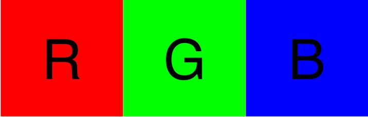
Print designers work in CMYK. Digital design is based in RGB or HEX color.
Just as CMYK color is explained using numbers to represent color values of basic hues to make every possible color, RGB works using the same concept. RGB – red, green, blue – are mixed in different amounts to create every color in the digital spectrum.
The difference is in how colors are created. CMYK – cyan, magenta, yellow, black – is created by combining colors in the printing process. RGB is a combination of colors displayed in light.
Colors are named with RGB values (from 0 to 255 or each color) to create 16 million different combinations.
HEX values are an extension of RGB color and every value corresponds to an RGB color. A HEX value is simply the HTML expression of an RGB color. Colors are named using # followed by a six-digit number, where each number pair refers to red, green and blue. (HEX values also contain letters to represent numbers greater than 99.)
Understanding Web Typography
Print designers may be used to the idea that they can use any font and have an unlimited number of typefaces available. (Depending on licensing, of course.)
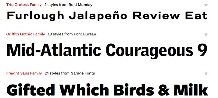
Web typography can be somewhat trickier, although it is improving all the time. The biggest challenge is understanding type and browser compatibility. Not every typeface will render the same way on different devices.
Then there are basic web standards and readability concerns that come from reading on a screen. Like it or not, sans serif typefaces are pretty much the standard when it comes to body text on the web. And the often-shunned typeface Arial, is everywhere. Why? Because it always renders as Arial. No surprises there.
The rest of the things you know about type remain the same. Practice good kerning, leading and tracking. Scale text proportionately to other type and elements in the design for a neat, clean overall look.
Image Size Matters
The web, once home to millions of low-resolution images, is beginning to evolve again when it comes to pictures thanks to the emergence of retina displays.
While the standard for most web images is 72 dpi – I know this seems very small to print designers, but smaller images load faster and they do look just fine – more sites are starting to consider images for retina display. These high-resolution web images are often still saved at 72 dpi, but are much larger when it comes to overall size.
Instead of saving an image at 600 pixels wide – a common standard thanks to Pinterest and pinned images – an image for retina display may be 1,564 pixels wide.
Web images are often saved in specific formats – JPEG, PNG or GIF – depending on image type and use. Common print formats such as TIFF are unacceptable for web use.
SEO Has an Impact on Design
Get familiar with search engine optimization. The way your site works and what text appears on it (and in hidden tags) can have a dramatic impact on who finds your site and how it is ranked by search engines. SEO is an important part of the web design process.
SEO relates to social media as well. Almost every brand with a web presence has corresponding social media. Keep this in mind during the design process so that all of the parts can be created and designed consistently.
Learn to Let Go
Print design is very precise. You can measure every space and detail and it will always look like you designed it. The web just does not work that way. There are some things that will look different in different environments. You have to learn to let go when it comes to these things.
Understand your medium and its limitations. Don’t sacrifice your design concept, but also learn that some things are going to work in ways that may be unfamiliar or look a certain way. Accept it and move on.
Conclusion
I started my design career in newspapers. Today, I design a little bit of everything and split my work between print and web projects.
Although it took some work on my part to “get it” when it comes to the world of web and digital design, it’s an invaluable skill set and necessity for designers in today’s market. I can’t express how important it is for designers to learn to work across mediums and understand the intricacies of each.
Being able to work with print and digital projects will make you a better designer. You will learn things that you carry across mediums to projects. You will become more marketable and hopefully remain satisfied and challenged as you learn and use new skills.
Are you a print designer who has started working on digital design projects? Share some of your tips and experiences with us in the comments.
Image Sources: Webtype and Jeff Eaton.