10 Tips for Perfect Brochure Design
Designing a brochure can be a rewarding project. There’s nothing like creating something that you can hold, touch, and read. Plus, the design is more than just an arrangement of parts—it includes texture and feel in a way that digital projects can’t convey.
Designing the perfect brochure can be intimidating. In addition to all the design considerations you normally think about, there are some things that are specific to printed projects.
Today we’re taking a look at ten useful tips for improving your next brochure design!
1. Understand Print Specifications
Unlike designing for screens, you need to know exactly what your budget allows in terms of printing. This can impact quantity, size and paper stock and effects.
Start by setting specifications for the brochure so that as you design on the screen (probably in Adobe InDesign), you are creating exactly what you need from the start.
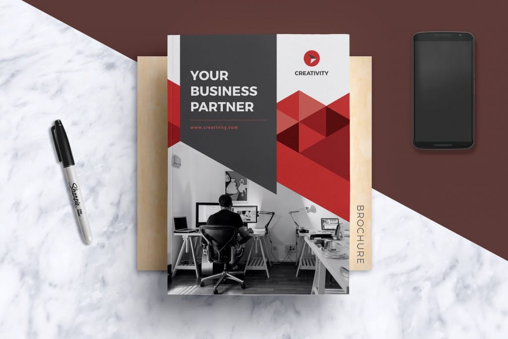
Think about paper size, folds and bleed. It’s vital to know the capability of the printer before you get too deep into the design process. For thick, more booklet style brochures, you might also want to consider assembly of pages.
2. Consider the Audience

The shape and distribution of a brochure design should reflect the audience who will receive it. Even designs that look like traditional paper brochures can be transmitted digitally with interactive features in a PDF.
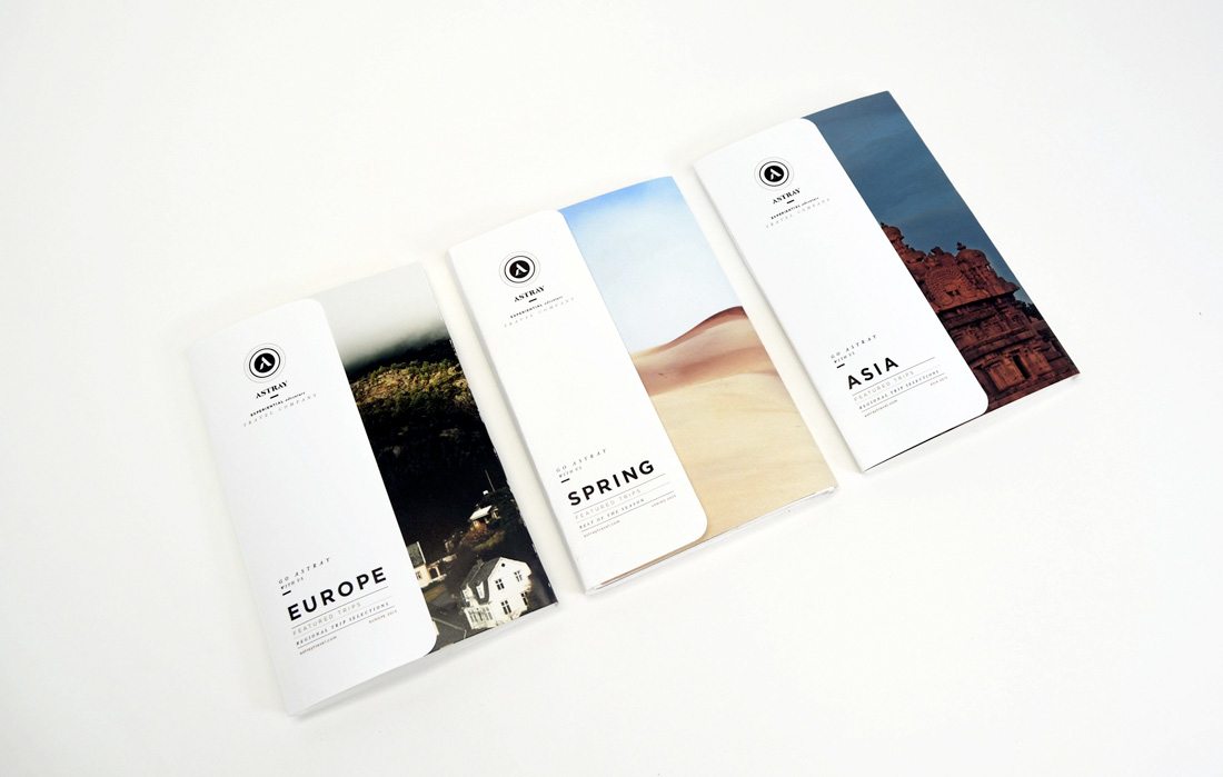
If you are handing out a brochure to people on the go, consider a size and format that’s easy to put in a pocket or bag. (Trifolds and postcards can be good options.)
Finally, for stakeholders or key partners, thicker or more robust brochures with multiple pages or in a larger size might be appropriate.
One final thing to think about in terms of audience: Consider the age of recipients. Are they younger or older? This can impact type size and overall feel of the design.
3. Use High Quality Everything
You can’t get away with low-quality elements when producing something for print. A low-res photo or illustration will become evident quickly. A demo typeface that’s not made for print will break apart.
You need to use high-quality, high-resolution everything to ensure that your brochure design looks great. That includes images, illustrations, icons and logos, typefaces and sharp color palettes.
While exact specifications will vary somewhat by project and print canvas and method, generally you want images and design elements to be at least 300 dpi on screen in the size they will be used. (None of those 72 dpi web images will work. Don’t even try.)
4. Use Texture
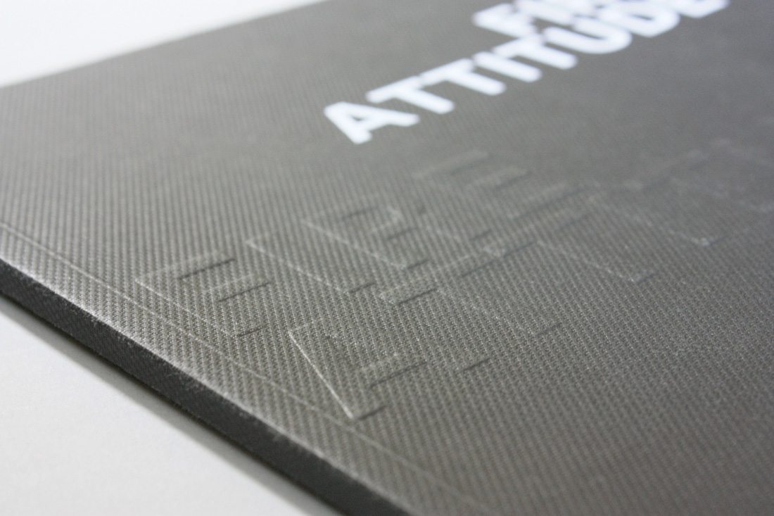
There are so many physical features you can include in a printed brochure design. These elements can help add perceived value to your message because of high visual appeal to readers.
Consider these effects:
- Foil: Shiny lettering or feature for a certain portion of the design
- Spot UV: A special gloss or matte finish on part of the design
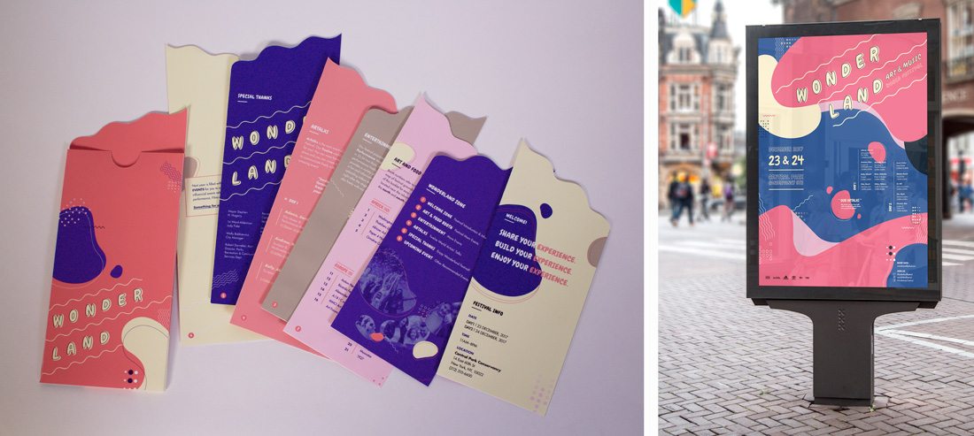
- Letterpress: Printing that makes an imprint on certain parts of the design, such as the brochure above)
- Folds: Bi- and tri-folds aren’t the only option, interesting fold patterns can encourage user engagement
- Paper: Paper types with different textures can set the tone of a project
- Die Cuts: Cutting out parts of the design so something else shows through creates a send of mystery
5. Don’t Forget the Call-To-Action
One of the elements most commonly left off in printed publishing is the call-to-action. What is the goal of the brochure? What should users do after they see or read it?
Make that action clear to them. Whether it is to go to a certain place for an event, or tear off a card and mail it in or call a phone number, establish what users are supposed to do and encourage that behavior throughout the design.
The more pages or panels the design has, the more times you will need to repeat the CTA.
6. Think About Display
Where will users see or pick up your brochure?
Create a design that works in that environment.
One of the most common issues with brochure design is forgetting that many brochures fit into some sort of container for display. (This is quite common with brochure designs such as tri-folds or maps.)
Make sure key visuals and messaging are easy to see and read before they are pulled from the container.
The other key consideration is size and scale. How big is the brochure? How far away will it have to attract the attention of people who need to see it? Design elements should be scaled accordingly.
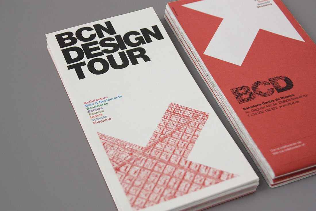
7. Stick to a Visual Theme
White or high color? Single design or multiple versions?
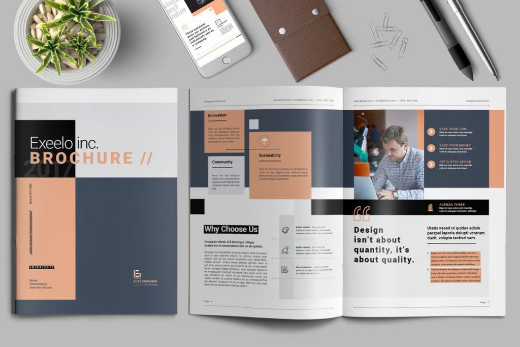
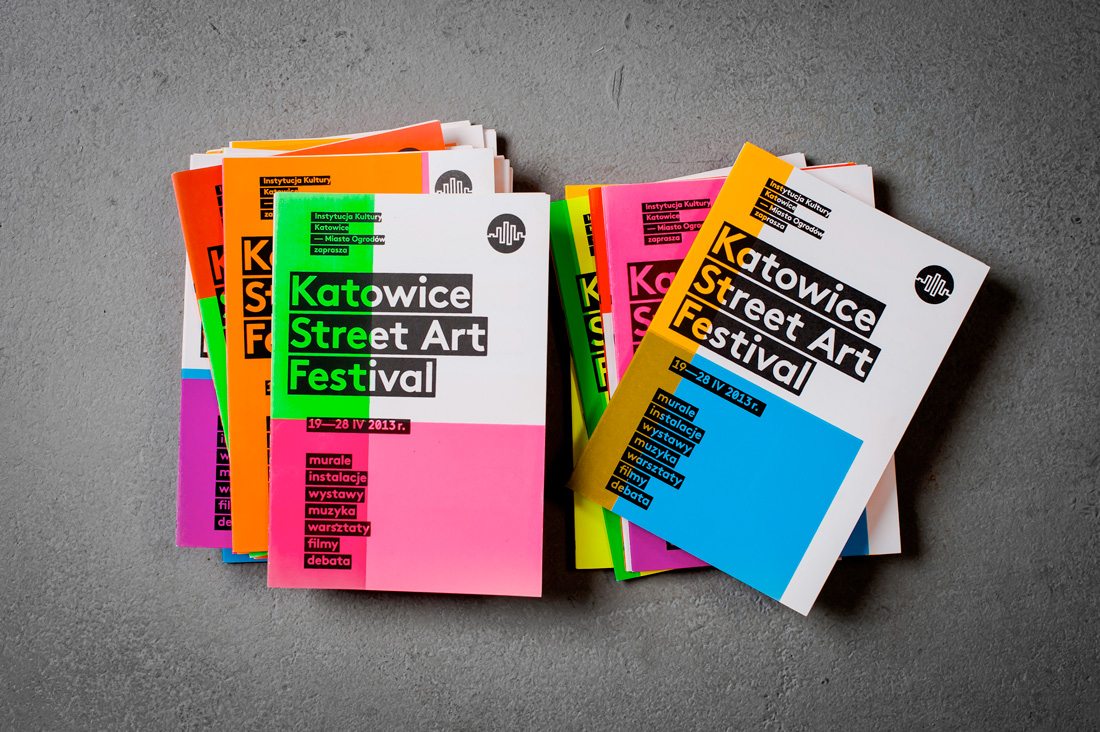
Find a theme for the brochure design and stick to it. This is true whether you are thinking about the design from page to page – yes the cover and inside pages should follow the same theme – or if you plan to create multiple versions of a similar brochure, such as the example above.
A solid theme sets the tone for the brochure and provides a consistent user experience for readers.
8. Proof It and Proof It Again
There’s nothing more embarrassing – or expensive – than finding a typo or mistake in a brochure design after it is printed.
Print and proof the design. Then give it to someone else and do it again. You can never proof the design too many times. Mistakes in print as quite costly.
9. Go For High-Quality Paper
The paper choice you make can impact how users receive the design. Additionally, it can impact the techniques used in the design process.
As a rule of thumb, heavier stock papers allow for more flexibility with color and printing techniques. They feel more expensive and impressive to users. But that doesn’t always mean the thick paper is better.
Sometimes you might want a lower stock print run, especially for high print quantities or mass distribution to a wide audience.
When picking a paper stock and style, think of what it says about the message the brochure is intended to convey. Do they match?
10. Design for Printing
Remember to design your brochure for printing.
Use CMYK color, create a bleed where necessary, pay attention to how elements will read across breaks and folds.
Sometimes it can be hard to imagine how a complex print design will look when it actually comes to life. Create a practice copy as best you can – even if you have to cut pages and tape them together – to make sure that elements and pages in the brochure look as intended.
Sometimes effects such as letterpress can look funny on the back or a die cut can create an odd space for design elements on the opposite page. Pay attention and look for special considerations that you need to address in the design process so that your print job is a success.
Conclusion
Brochure design can be a lot of fun, but there are plenty of considerations. (Especially if it isn’t something you do regularly.)
When in doubt, lean toward a more simple design. It can be easier to imagine how it will actually print and get everything ready for the prepress process. (Simple and minimal styles are often budget-friendly as well.)