Brutalism: A New Trend in Web Design
Some designs aren’t polished and clean. They are rough, jarring and ragged. Yet they still work and communicate effectively. This class of websites makes up the raw trend called brutalism.
While it is somewhat new to web concepts, it’s been around for decades as a popular technique for posters and art in the 1950s, 60s and 70s. Today’s brutalism is starkly different from what you are used to seeing … and that’s why it’s likely to catch your attention. Let’s take a look at what it is (and I’ll share why I’m already over it!)
Emerging Trend: Almost Brutalism
We’re actually going to look at a variation of brutalism first. Coined “almost brutalism,” these designs have a harsh look and feel but don’t go quite all in, like some of the examples later in this article.
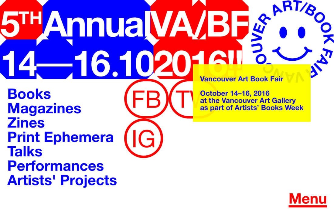
Almost brutalism is anything that uses the essence of a brutalist style, but with a few elements that give it a touch of modern softness. An almost brutal design might have a lot of the same roughness of true brutalism, but won’t result in the same emotional response because of a few softer effects.
Commonly a design that features almost brutalism, will include rounded typefaces or modern serifs, rather than strictly monospaced options. The overall color palette may be less harsh, with elements of softness or smooth motion.
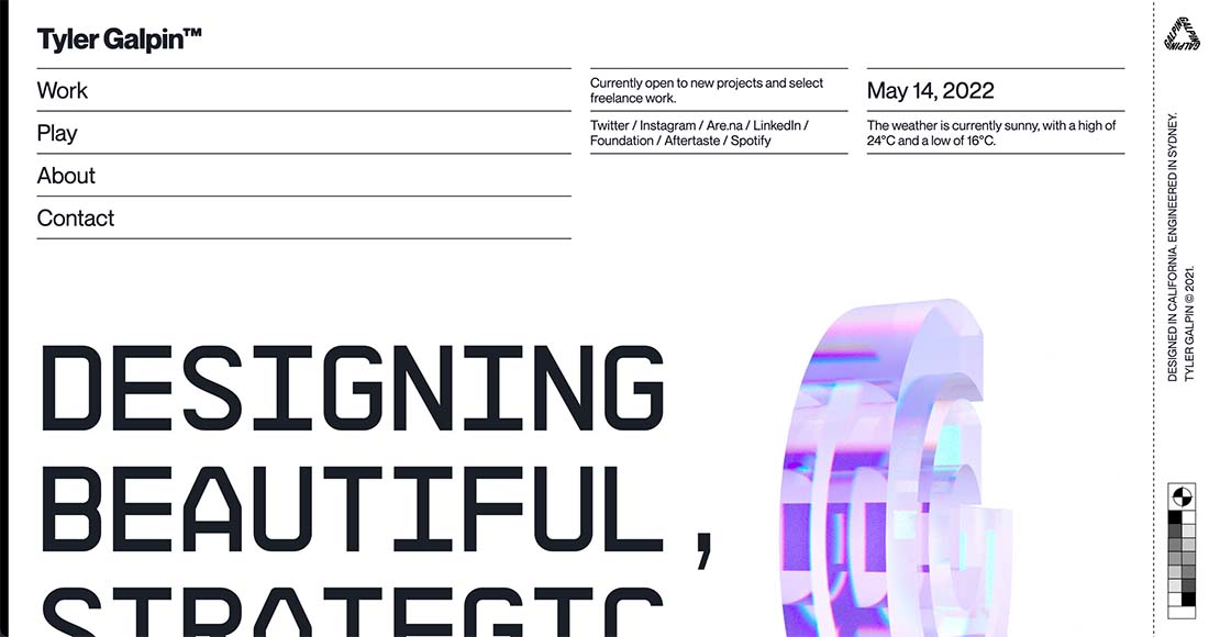
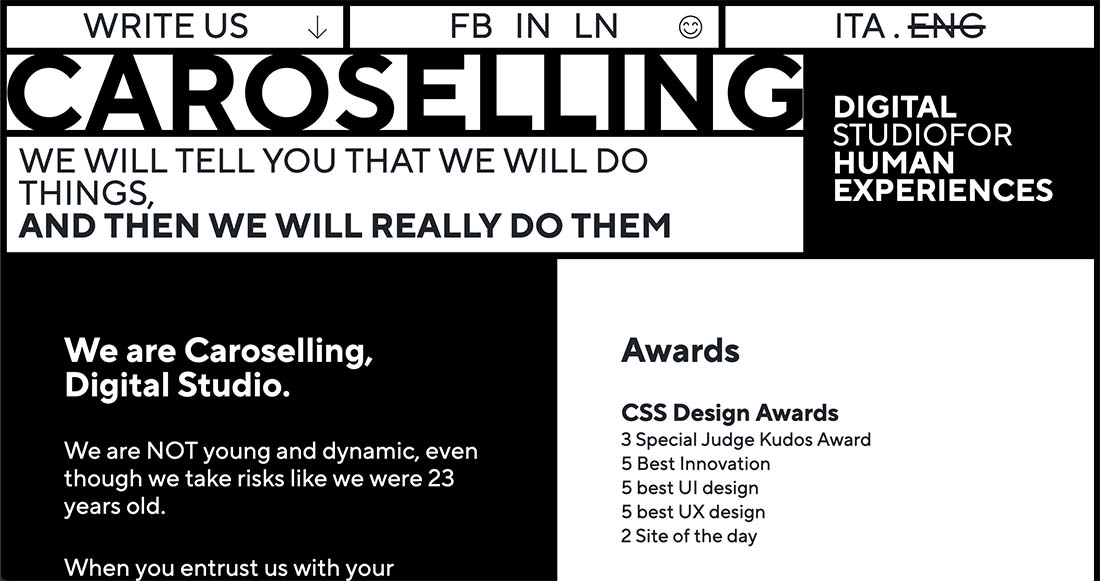
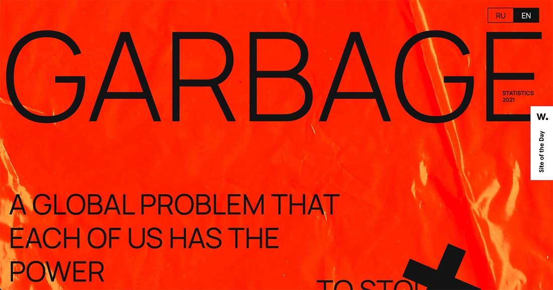
These designs may include other trendy effects in the examples above: From Tyler Galpin, as glassmorphism animation; Caroselling with clean typography and organization; or Garbage’s depth effect in the background image.
Almost brutalism is an easier visual to digest and won’t create some of the love it or hate it emotions that come with true brutalism. Compare these top examples to the others below to see for yourself.
Brutalism 101
Brutalism is minimalism on steroids. You can think of it in two ways:
- As a return to early days of the web, when many sites had a brutalist look, because that’s all we knew
- A trend to buck all the trends featuring clean lines and simple designs
Here are a few examples to kick things off and get you thinking along the right lines!


It’s popular, and still gaining popularity. There’s a brutalist website dedicated to showcasing brutalist website designs. Here’s how it describes the trend:
In its ruggedness and lack of concern to look comfortable or easy, Brutalism can be seen as a reaction by a younger generation to the lightness, optimism, and frivolity of today’s webdesign.
Design Characteristics
When it comes to brutalism, you’ll definitely know it when you see it. This is not a subtle design technique. But part of the reason it might appeal to some it because it is stark; it often mimics code visualization with a dark background, monospaced typography and white and lime green text.

But there’s an almost sliding scale for brutalism. Some will tell you that a truly brutal design does not contain images. Images aren’t a deal-breaker. They can be one component of a brutal design.
- Stark background, often black or white, with no texture or shading
- Lack of design tricks – no shadows or gradients or patterns
- Monospaced typography or a single font throughout
- Crowded design with text that seems too close or elements that aren’t padded
- No distinct hierarchy
- Elements that overlap, but seem unintentional
- Analog-style design elements
- Lack of symmetry or spacing
- No true color palette, but use of red and green are common
- The design looks like it has visual mistakes, such as alignment or overprint mishaps
- Lack of animation
- Imagery is also stark, often black and white, if used at all
- Simple or no navigation, often brutalist designs are one-page websites
- Nonconformist visuals often relate to a message of the same type
“Bad” Design
Is brutalism just an excuse to get away with bad design? It really is a super-stripped down model of a website. The stark nature might turn some away and doesn’t create the kind of emotional connection that many websites use to draw in visitors.
All the trends and elements that you read about and that design and readability experts say a design needs for usability have been thrown out the window. Is brutalism bad design? Or is it intentionally “ugly?”

Good for Conversions
One of the most interesting things about brutalism comes from Webdesigner Depot’s Marc Schenker, who argues that this design style can actually boost conversions. It’s not something that generally comes to mind when thinking about a design trend, but he makes a pretty convincing case if you find the style appealing.
Here’s what he has to say:
“Think about it: Without high-resolution images or lengthy videos, a site isn’t bogged down and can therefore load quicker than usual. How does this impact conversions? Research show that faster sites increase conversions. Kissmetrics’ infographic establishes the following:
- The longer it takes a page to load, the higher the abandonment rate will be
- 79% of shoppers who are unhappy with site performance are less likely to purchase from the same site again
- A one-second delay in page speed can cause a 7% drop in a site’s conversions
There’s more to his argument – but the numbers alone are pretty convincing. Would you be willing to give up design style for increased conversions?
What’s Next?
The big question with brutalism is can it ever be mainstream? The design style is so harsh, so in-your-face that users either love it or absolutely hate it. For brutalism to move beyond the realm of portfolio sites or one-off uses, it has to be a little bit softer and easier on the average user.
That’s where almost brutalism is truly coming into play. Expect this to continue as a dominant use of the trend.
Because of this, brutalism will influence design but not overtake some of the other more common design styles. More designs with brutalist concepts – typography styles, in particular, will become more popular. Some of the primary, bright color choices will infiltrate more designs.
Designers creating brutalist concepts will also begin to incorporate more modern flair into the stark aesthetic patterns, from hints on animation to extended navigation so increase usability. Calls to action will be a little more “designed” so that it is clear to users what they should do with a design like this.

Conclusion
I don’t know about you, but I am already over this whole brutalism thing. While the websites are somewhat interesting at first, they are a bit overwhelming. While I understand how they can increase conversions, in most of the designs it can be tough to even figure out what that conversion is.
The color and type choices don’t appeal to me. They lack emotional connection and overall most of the designs seem cold. Maybe brutalism is just “too brutal” for me? What do you think? Let me know on Twitter (and make sure to tag Design Shack).