Designing a Professional Business Card
Before websites, email blasts and banner ads, business cards were the central piece of design work for countless small businesses. This simple little piece of cardstock was a major representation of your company. In China, business cards are so highly regarded that it’s considered poor etiquette to write on someone’s card or even put it in your wallet! Typically upon exchange business cards will be placed into a small card case.
Though the digital age has dawned, business cards remain a fairly popular way to quickly provide someone with information about how to reach you or find out more information about your company. Today we’ll go over some common mistakes in business card design and explore a few practical techniques you can use to bring style and professionalism to your cards.
The Typical Business Card Design
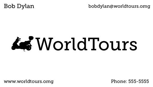
Inevitably, upon designing their first business card, many people will create something like the card below.

At first glance this card may not seem that bad. However, from a design perspective, there are several mistakes. Let’s take a look at these one at a time.
Don’t Get Cornered
The very first thing I notice when I look at this card is that the designer has pushed the majority of the content to the corners. For some reason, when we see the rectangle shape of a business card we have a tendency to think that the center and corners should always be full.
Many rookie designers will go so far as to devise extra content to fill an empty corner if they only have enough to fill three! What you need to learn is that whitespace (empty space) is your friend. Don’t be afraid of emptiness, instead use it as a primary element of the design.
Alignment
One of the main reasons you shouldn’t just go sticking content into every corner is that it destroys any sort of cohesive alignment.
Now let’s consider what we just learned: filling the corners is bad, whitespace is good, and clear alignment is good. You will now no doubt be tempted to create something like this:

Granted, this follows the advice I just laid out, however, it’s still a pretty poor design. It’s also a very boring design. Center-aligned text is boring, one font for the whole card is boring, and even the sizing of the various pieces is boring.
So what can we use to really liven this up?
Contrast
Ah yes, our old friend contrast. If you read Design Shack regularly you’ve heard me say again and again that contrast is the key to good design.
Remember that there are several ways to bring contrast into a design. Color, size, typeface, boldness, etc. can all be varied to create visual interest.
Let’s see what happens to our design if we toss in some contrast. First, we’ll vary up the fonts a bit and give the text a strong left alignment. Centered alignments, though seemingly the go-to option, are in fact the weakest choice in many circumstances.
We’ll also have a little fun with the logo. We can use the scooter graphic to introduce both size and color contrast. We’ll keep things grayscale to save on our budget but that doesn’t mean everything has to be pure black or pure white.

See how much more attractive that is than the original design? Not only is it more exciting, it’s more functional. The flow of information is easier to follow and the business name and logo are much larger.
Notice the difference between the way you read both cards. The first card had your eyes bouncing around with no clear path. The final card is carefully structured to lead you from the headline through the contact information with no searching.
Also notice that I didn’t just center that scooter graphic but pushed it off to the left. This is a bit more interesting visually and reinforces the left alignment.
Going Further with Contrast
If you wanted to take the contrast even further, you could create a strong footer that contains the contact information. This will draw the viewer’s attention down to the bottom if/when they actually pull the card out to use it and give your eyes a really bold visual difference to look at.

To accomplish this I increased the boldness on the footer text a little. When reversing small text out on black, the ink can often bleed a little (especially if you’re printing these yourself) so it’s a good idea to avoid any text that’s super thin.
Finally, if you really wanted to go nuts with contrast, you could duplicate the bottom bar up top and create a letterbox effect. Personally, I like the previous option a little better, but it comes down to personal preference.

The bold frame keeps your attention towards the center of the card. This can be a good or bad thing depending on your goals. Just make sure you understand where you are leading the viewer and whether or not it matches your goals for the card.
Go Vertical
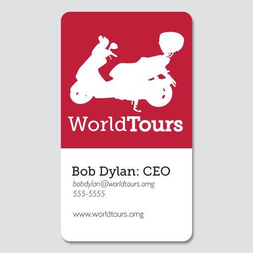
Even if you want to keep things classy and professional, there’s no need to stay with the traditional horizontal business card format. A vertical business card certainly isn’t groundbreaking but it’s still unique enough to catch the attention of the person you hand it to.
If you’ve got the budget, bring in some color and use it as a major point of contrast. You can also explore various rounded corner or even custom die-cut options to really make things interesting.

Using Photography
If you really want to up the quality of your business card, bring it into the 21st century by going full color and utilizing some beautiful photography. Check out the example below (photo source).

Here I’ve taken inspiration from the scooter graphic and found a photo to essentially replace it. The overall effect is a really attention-grabbing card that’s attractive enough that the receiver might just hold on to it rather than tossing it in the nearest recycling bin.
Notice that I’ve actually painted out the background a bit to make sure the text is legible. Never sacrifice the readability of your text for the sake of a pretty picture. In fact, if your background is proving too busy, consider using a color fill behind the text like I did with this next example.

Here I grabbed a dark color from the photograph, stretched it out behind my text and reduced the opacity a little to let a hint of the background detail show through. This allows the text to be much bigger than in my previous version which really increases the readability.
Conclusion
To sum up, when designing a business card the primary mistakes to be aware of are watching your alignment and arbitrarily filling the corners with content.
Implement contrast in size, color, and font choice to add visual complexity and draw the viewer’s attention to the right places. Also, don’t be afraid to break out of the box a little with the shape and layout of the card.
Finally, use professional photography if you really want to increase the perceived quality of the card (and in turn your business). Make sure you watch the readability of your text closely and take appropriate steps to ensure visibility.
Leave a comment below and tell us about the techniques you use when approaching a business card design. If you have any samples online leave a link so we can check them out!