How to Design Killer Micro-Content
The smallest parts of a design project can be the most important. It’s something we all know conceptually, right?
But do you ever get caught just filling in these details at the last minute? Does your micro-content suffer because you are ready to be finished with a project? Don’t let that happen. Plan out micro-content from the start to create better, more usable pieces that will help make the design better than you had hoped.
The Two Types of Micro-Content
Micro-content is small. In fact, it can be some of the tiniest bits of a framework and when it is done well, it’s often pretty invisible. (And that’s a good thing.) The definition of micro-content has expanded in recent years and what was just a term used to describe labeling and calls to action is much more in today’s landscape.
You are likely to associate micro-content with one of two things (or both):
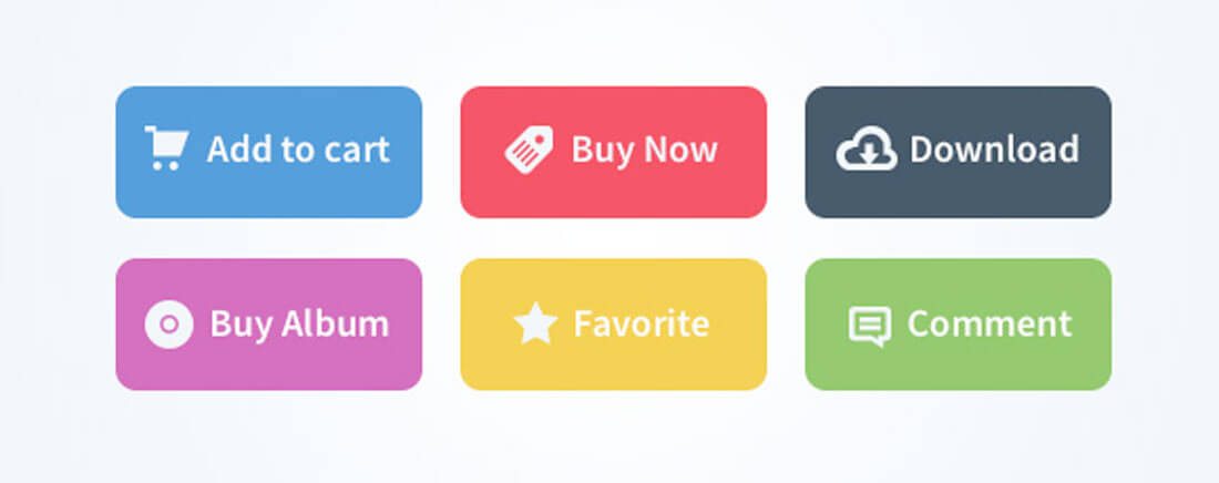
- Small clusters of words that provide information or direction within a website or app. These words or labels might include information on call to action buttons or directions on how to use a website or play a game.
- Single purpose images or animated clips that lead the user to a specific URL. An animated GIF, for example, is a popular type of micro-content. The concept is particularly popular with marketers and on social media.
The trick to micro-content is to think of it in fragments. Whether you are designing text or images or video, these bits should be short, easy to understand and inviting. Users should be drawn to micro-content because it is the driver of action from your design to what you hope users will do.
Think About the Words
Think about some of the most delightful websites that you’ve visited lately. What about them stood out?
It might be the tone of the site, or the images, but likely it’s in the connection that you feel with the site. It’s easy to use. You can find what you are looking for. And even if you get stuck or lost, there’s something there to help you keep moving.
Micro-content drives these things. The words inside each button, label, navigation menu, headline and so on are the key elements to understanding how to use the site in front of you. And the way these bits of text are written are of utmost importance.
- Use simple phrases and language.
- Use plenty of verbs and words that convey action.
- Directions should be direct.
- Consider tone and make sure it matches the rest of your site.
- Avoid jokes or puns that can get lost with a wide audience.
- Play up contrast so that words are easy to find and see.
- Instructions should be clickable (or tappable).
- The instruction “click here” is often perceived as junk; avoid it.
- Lead users – don’t shout at them – with instructions. They should want to click.
- Stick to commonly used phrases when in doubt. There’s a reason they are used, and it’s because they work and are understandable.
Think About the Images
Action words and images should complement each other. Sometimes, though, the image is the micro-content. It’s one of the great tricks that marketers use to repurpose content for multiple applications.
Think of it like this. You have a giant infographic on your website. That image would be difficult to share on social media, but a single piece of it might be perfect. So you cut up the infographic in to smaller usable tidbits for sharing and link them all back to your website. You can do the same thing with still images, video or animations.
What you get is a single piece of content that can be used multiple times for multiple audiences to drive traffic back to your website. Smart, right?
It takes the right kind of image to make this work effectively.
- Images have to live in some type of container and stand alone.
- Consider a card-style design for these parts.
- Use bright color and an eye-catching graphic.
- Keep text to a minimum.
- Crop purposefully. You should not see other parts of the image on the sides of the micro-content block.
- Link well so that the shared content matches the location where the link ultimately leads.
- Size content for the medium where it will be used. You might end up sizing an image multiple ways for different places such as Facebook or Twitter or Instagram.
- Include a call to action.
- Boil down complex images into something simple. One bit of micro-content should contain only one message or call to action.
Put It All Together
Now it’s time to put it all together. Combine images and text for digestible bits of content that people want to interact with.
It might sound more simple than it actually is.
This is a technique that you’ll probably end up experimenting with quite a bit. But I do have a suggestion: Think in cards. Card-style designs are really popular right now …. And for good reason. The design technique is easy for users to understand, and it helps organize your design thoughts. (We have a guide for you to get the most of card-style interfaces.)
One card equals one bit of content equals one action.
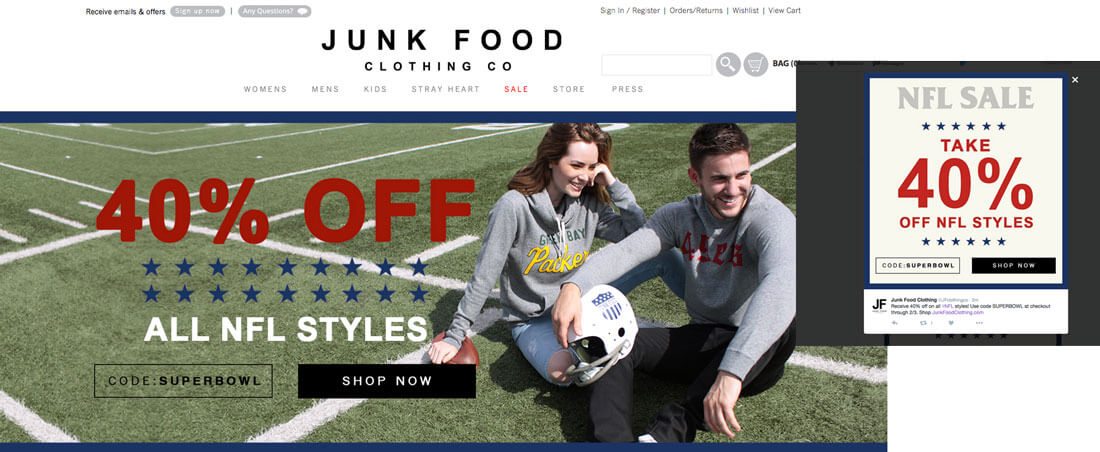
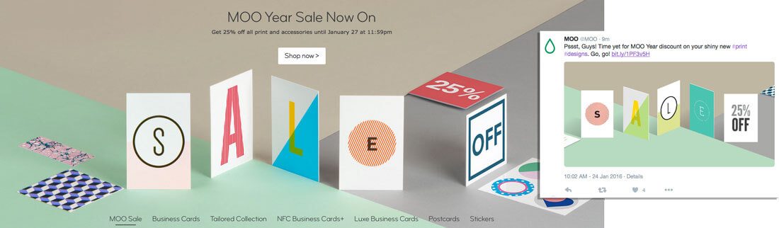
Look at how Junk Food Clothing is using this concept. The company uses cards of social media to take user to the website where there’s an image with a similar look at feel. They encourage the exact same call to action using the exact same language.
Once you start using cards, they’re pretty easy to repurpose. A card-style interface works great for a website or mobile design. Then each card can be shared on social media or turned into a business card, postcard or flier. Digital cards can include text, buttons and still or moving images. So you can use almost any parts from the design inside this simple tool. Now you can use and reuse content as much as you need.
And if you want to go the super-trendy route, consider a card in the Material Design style.
5 More Micro-Content Tips
Micro-content is everywhere. Once you finish the design, think about some of the other places where it comes into play (especially if you are sharing online).
- Remember to tag users with @mentions on social media.
- Create memorable hashtags for sharing or use related hashtags to get more exposure for your content. (Everyone loves a good #tbt.)
- Mix up content types. Share animations and still images.
- Be friendly. No one likes a grump online.
- Tell users what you expect them to do. (And make sure all the buttons actually work!)
Conclusion
Think small.
Don’t overlook micro-content when planning your projects. From elements within the website itself to the pieces that you’ll use as tools to generate traffic, micro-content is that personal touch that helps users better move around your design or entices them just enough to visit. Remember to reuse and repurpose the content you already have in interesting ways so that you have plenty of elements to share.