Is the Static Logo Dead?
There’s a bit of disruption happening in the world of logos. The single static logo isn’t enough to carry your brand anymore. You actually need a library of logos to meet all the needs of your brand.
This idea has been evolving for a while; just think of the variations for a website, social media and even that tiny favicon in web browsers.
It can be a lot to think about. So let’s try to organize those logo thoughts.
The Starting Point: Traditional Vectors
The starting point for logo design has not changed. Every brand needs a solid vector logo with full-color and single-color versions.
This is the foundation of your brand identity and all other logo variations should be built from this base branding.
A traditional vector logo is scalable and can be used for all applications – print and online. Color and single-color variations are the staples of the vector format so that it can be used in a number of ways. (There was a time when the vector logo package included everything you’d ever need in a logo.)
But that has changed quite a bit in recent years.
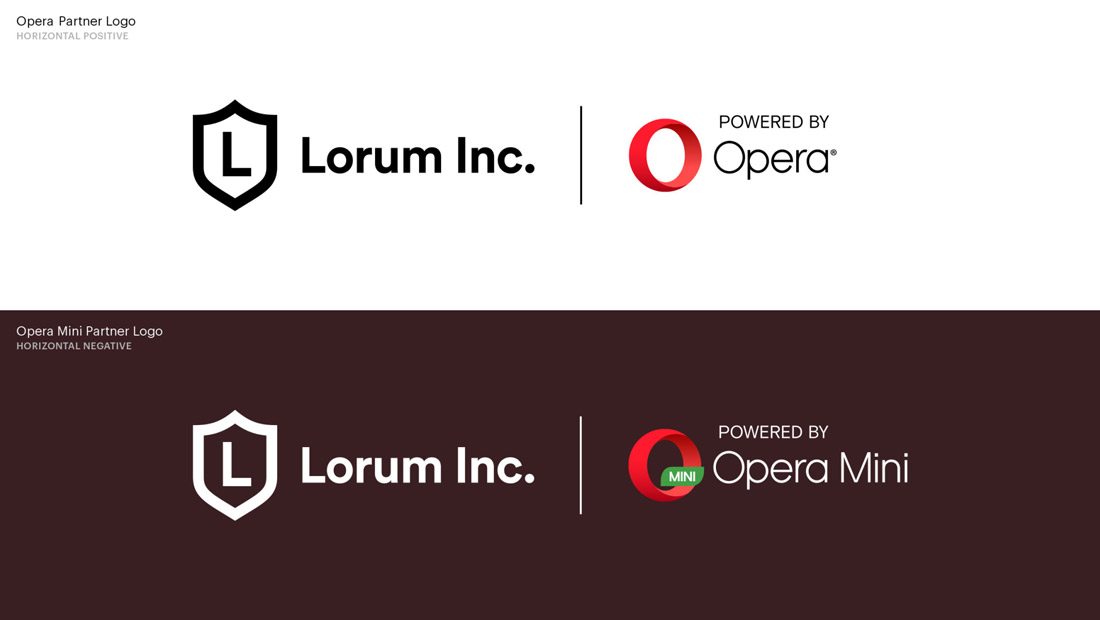
Depending on the shape of your logo, you may need a separate version for social media applications – many of which now use circular profile image spots which can result in odd crops of many logo shapes. Then there are apps, different website and device resolutions and even animations to consider.
Then Add: Multiple Sizes for Responsive Viewports
One of the biggest changes to logo design is responsiveness. The same logo size might not work for every device and viewport.
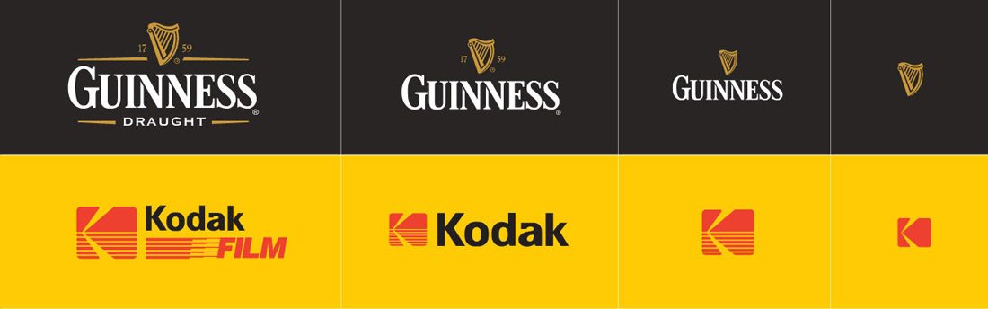
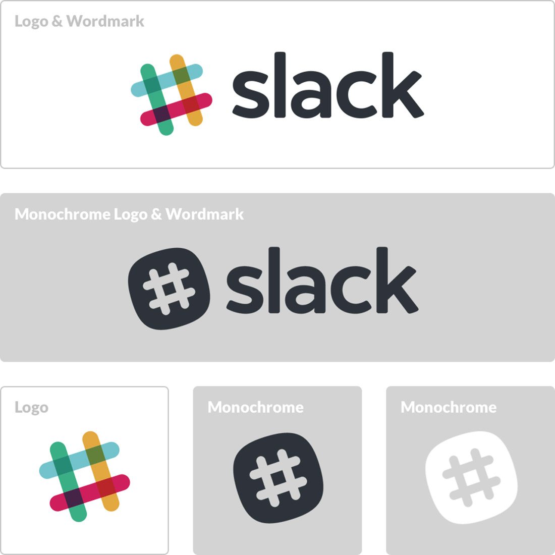
In many cases, designers are creating a primary logo (full size), a secondary logo (often for social media profiles and app icons) and a tiny logo (small icons and favicons).
How similar or not the logo variations are depend on the shape of the logo, readability of text or imagery in the logo and brand identity. All variations should be clearly identifiable as being from the same brand.
The result is a more dynamic logo. Dynamic logos are flexible in that the design allows for multiple combinations of elements with a common brand thread. In many cases that’s a drop cap, color or symbol that users connect with the full logo.
Dynamic logos can change color or shape based on context and were a popular – and trendy – option for a while. But the challenge is obvious – with so many variations, do users clearly identify the brand?
While some dynamism in logos is OK, it is best not to go overboard with changes to the base design.
And Add Again: Animated Versions
Animated elements are all the rage with website design. It seems like almost every website project has some sort of animated element in it. That extends to logos as well — even Facebook has started to allow animated profile photos!
Once reserved only for TV ads, animated logos are a popular option. In most cases the original logo has a small moving element. (Yes, the best animations are subtle; they aren’t full-fledged cinematic scenes.)
More animated logos are popping up in website design. From small divots in the corner to fully-animated logos that take center stage, movement in the design can delight users when done well.
Most of these design elements are made from animated GIF files or they are created using CSS and SVG. They can also help users remember your brand and add a little extra context or personality to the design.
How Do You Keep All Those Logos Straight?
Now that you are feeling overwhelmed by the idea of so many logo variations, how do you manage and keep the designs straight? How do you know what to design and how to ensure that it matches the brand and works in all the places where a logo is needed?
That’s where the fairly new concept of a logo system comes in. Evan Brown wrote a really nice primer on the topic for DesignMantic last year.
Here are a few of the key highlights:
- A logo system is an underlying framework to help shape logo variations. This is the key element of using logo systems well. You need to have a baseline for how the logo and branding work before you can create alternates.
- A logo system is “semi-dynamic,” meaning that logo variations can be different but are similar enough that they always visually connect users to the core brand image.
- A logo system must be consistent to be successful.
- A logo system can contain a series of similar logos in different shapes or have a more “collector style,” where they are fairly different with a common thread.
- A solid logo system “reflects the company’s character while remaining flexible enough to adapt to a variety of applications.”
Yes, The Static Logo is Dead
Quite simply, the days of the static logo are over. You probably need a logo system to handle all of today’s branding needs across a number of channels.
It might take a combinations of people to come up with everything you need for your complete branding package. A designer to handle the logo and an animator – sometimes the same person, sometimes someone else – to handle the logo with moving parts.
Then the key to pulling it all together is to create a style guide with use and applications for each logo style. (Otherwise you could end up with a logo mess.) Determine how and when each logo variant should be used so that everyone on the team is on the same page and users see a consistent brand identity across channels.
Conclusion
While the static logo might be dead, you still need a strong logo to carry your brand identity. A logo is the visual element that most users will immediately associate with your brand. Don’t you feel a little thirsty each time you see the red Coca-Cola circle?
To ensure that dynamic logos and even complete logo systems have the same feel, try to build all the pieces in concert. Building a vector logo today and an animation a month from now could result in unexpected problems that could change the overall design. You can’t always take this approach, but it is definitely best!
If you are adding logo types to a brand mark you’ve had for a while, try to maintain the integrity of the original mark in new versions. What’s the key visual element that users identify with? Make sure that element carries throughout every version of the logo design.