Minimalist vs. Maximalist Posters: Which Design Style Works Best?
Every poster tells a story, but how you tell it visually can completely change how it’s received.
Some posters lean into simplicity, letting clean space and subtle design do the talking. Others go all out, using bold colors, layered textures, and expressive typography to grab attention and make a statement.
These two design approaches, minimalism and maximalism, sit on opposite ends of the visual spectrum.
One isn’t better than the other; they just serve different purposes. Choosing between them isn’t about following a trend; it’s about matching the style to your message, your audience, and where your poster will be seen.
In this post, we’ll explore the differences between minimalist and maximalist poster design, look at when each style works best, and help you decide which one suits your next project.
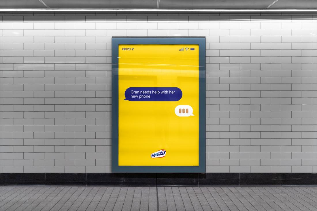
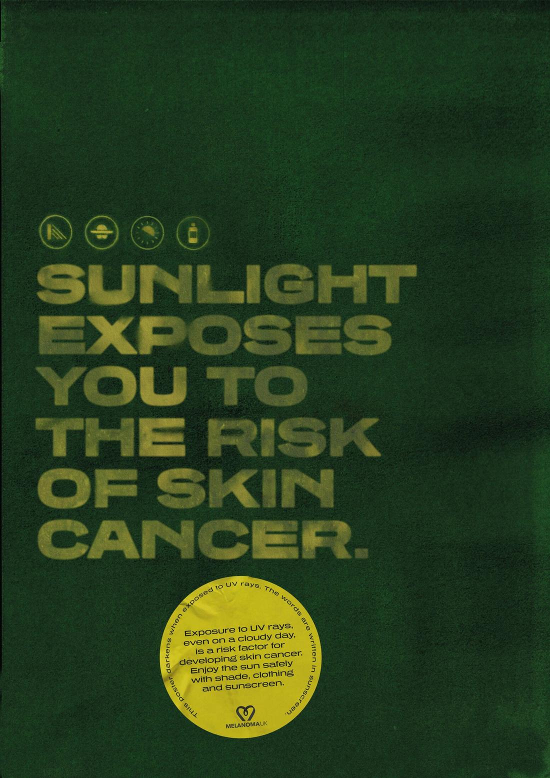
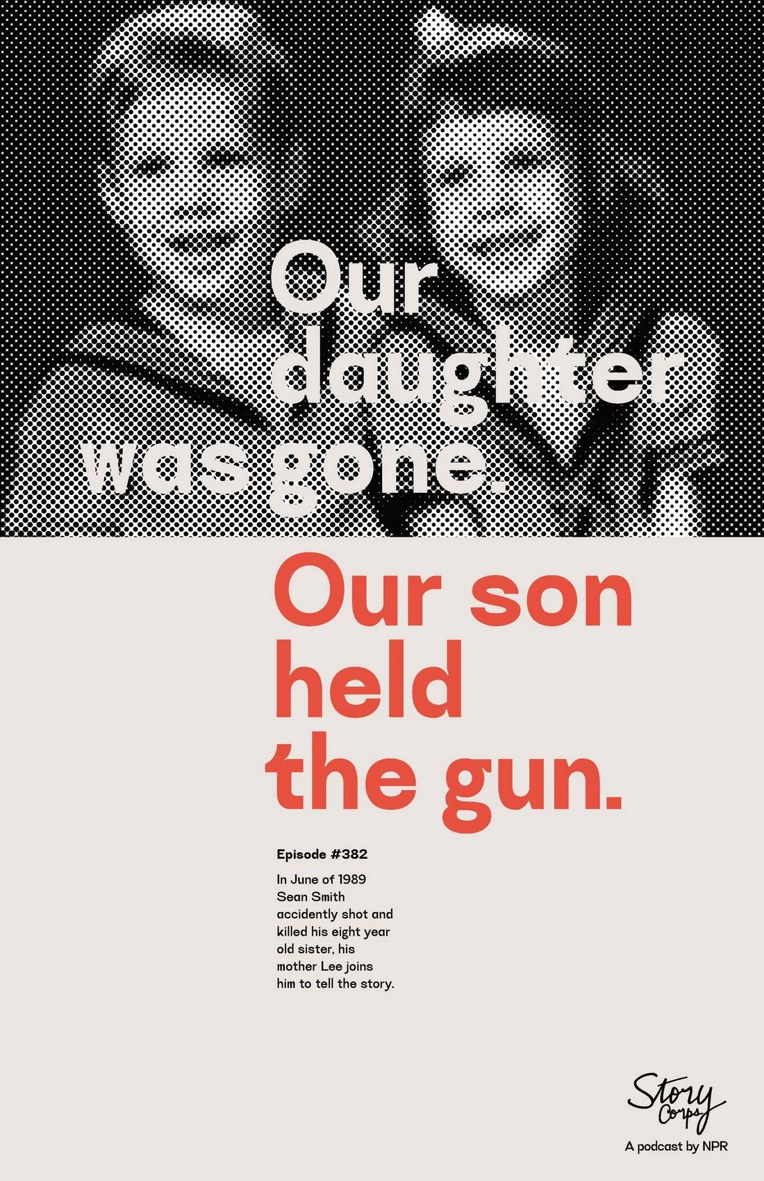
What Is a Minimalist Poster?
(Credit: Julien Renvoye)
Minimalist posters rely on restraint. They use the fewest possible elements to communicate an idea, often focusing on a strong visual or a clean line of text.
These designs typically feature lots of white space, limited color palettes, and simple typography.
The strength of minimalist design lies in its clarity. It strips away distractions and gets straight to the point. When done well, it feels confident, modern, and timeless.
When Minimalist Posters Work Best
Minimalist posters are especially effective when:
- You have a bold, recognizable message or image.
- The poster needs to be easily understood at a glance.
- You want to evoke sophistication or elegance.
- It will be displayed in a space where visual noise is already high (like a busy wall or gallery).
For example, film festivals, fashion shows, or gallery events often use minimalist posters to keep the focus on the brand or message.
The clean look invites curiosity and creates a sense of importance.
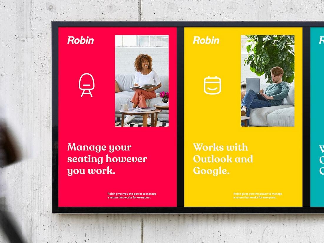
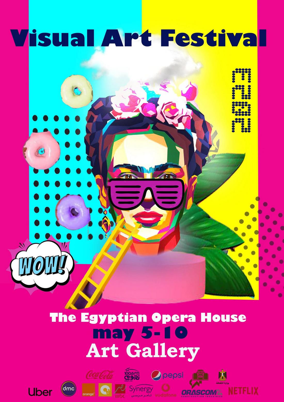
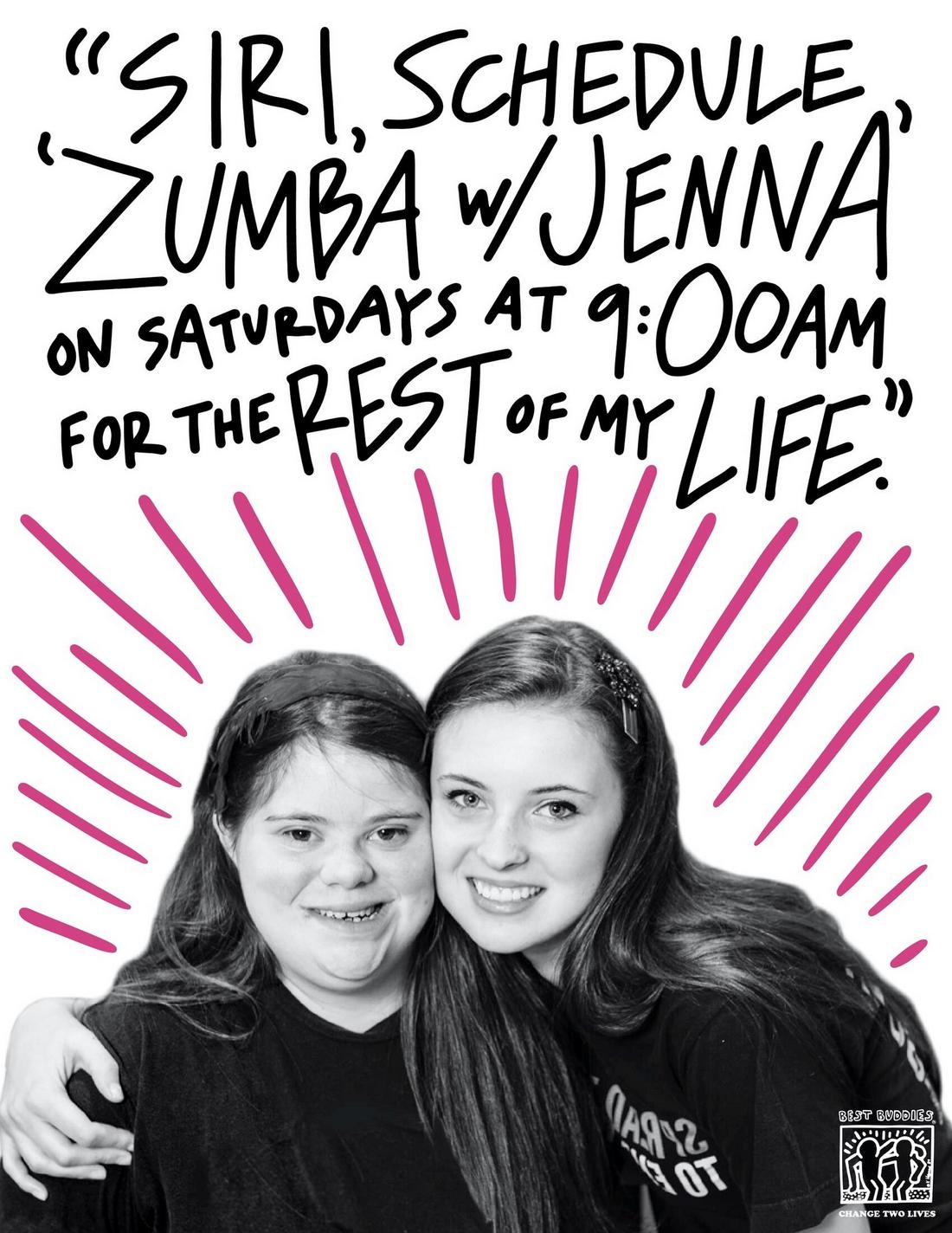
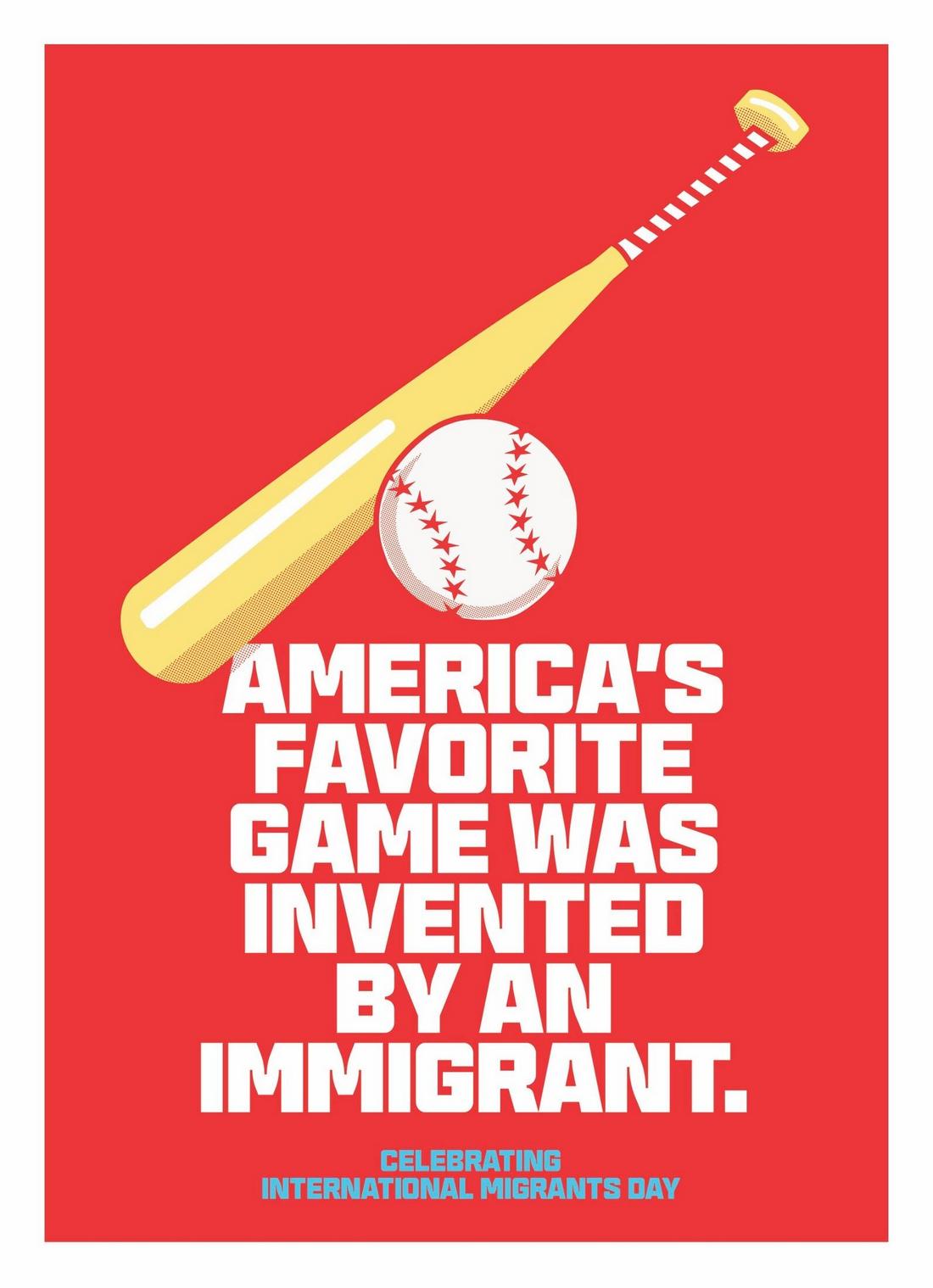
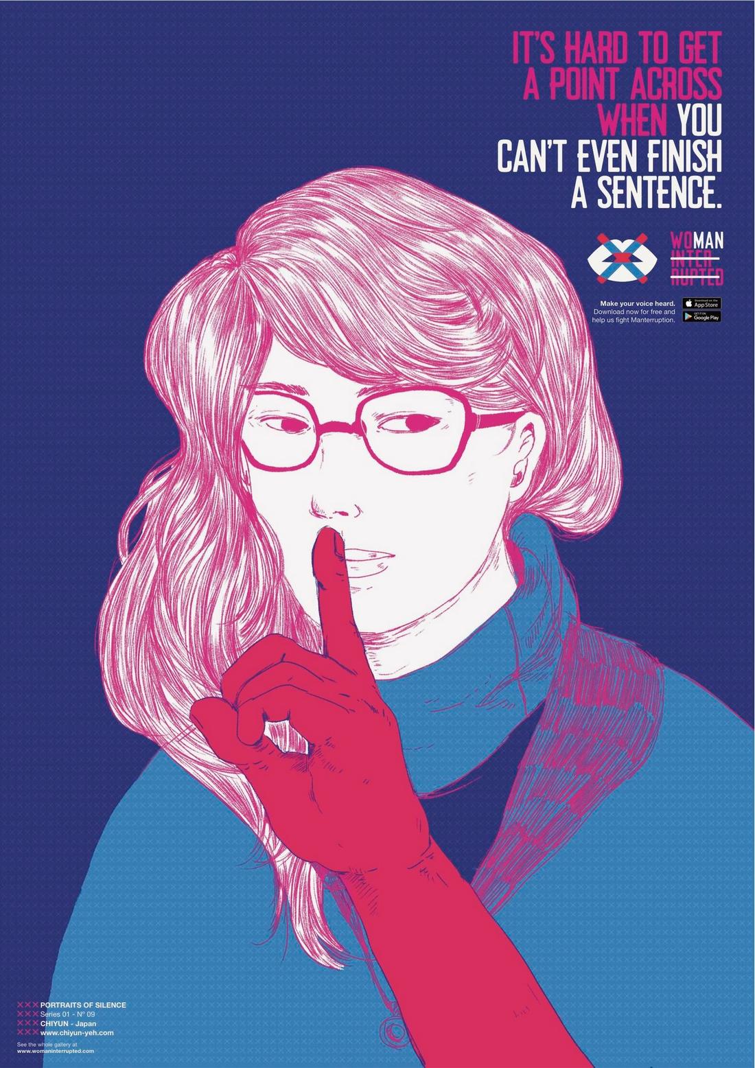
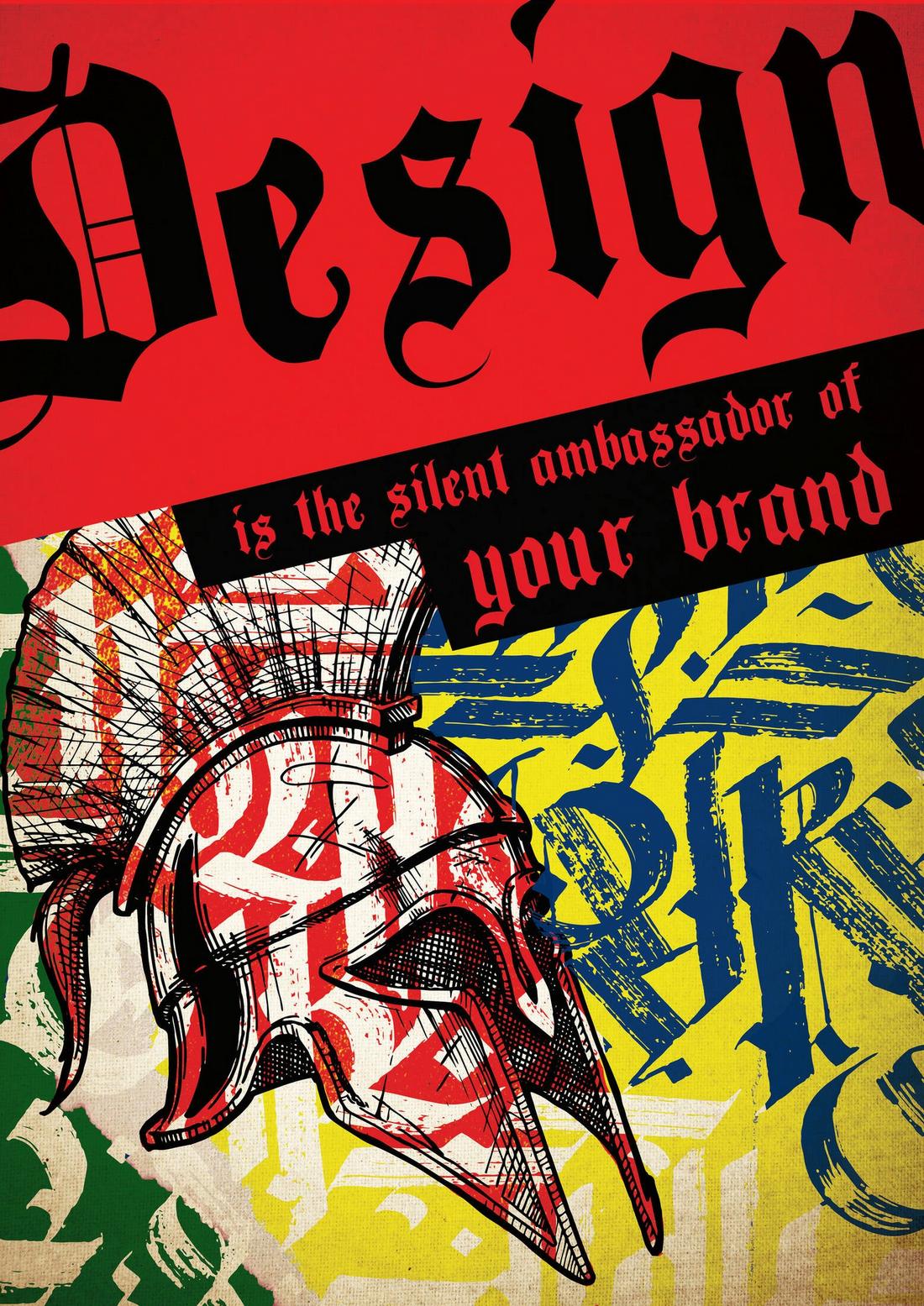
What Is a Maximalist Poster?
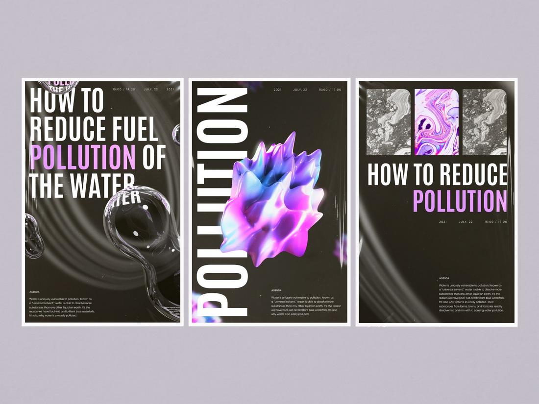
(Credit: Sophie Tomash)
Maximalist posters do the opposite—they fill the space with expressive visuals, layered elements, bold colors, and sometimes chaotic energy.
This style embraces detail, diversity, and decoration to create something visually rich and often unpredictable.
Maximalism doesn’t mean messy—it’s about intentional complexity. It allows designers to break the rules, overlap elements, and create an immersive visual experience.
When Maximalist Posters Work Best
Maximalist posters shine when:
- You want to create immediate impact and visual excitement.
- The subject matter is playful, loud, or expressive.
- You’re targeting a younger or trend-aware audience.
- The poster needs to stand out in digital formats or social media feeds.
Music events, art shows, pop culture events, or promotional campaigns for creative brands are great spaces for maximalist design.
It grabs attention, creates emotion, and encourages longer viewing.
Minimalism Vs Maximalism
While minimalist and maximalist posters live on opposite ends of the design spectrum, they each bring distinct strengths and choosing between them often comes down to the tone and intent of your message.
Let’s break down how they differ in key design areas:
Color Use
Minimalist designs often stick to a limited color palette. Think monochrome, black and white, or a few muted tones.
This intentional restraint helps keep the focus on the message or focal visual and adds a sense of calm and sophistication.
In contrast, maximalist posters thrive on bold, unexpected color combinations.
They might use clashing hues, gradients, or even full-spectrum palettes to create a sense of chaos, joy, or intensity. Color becomes part of the message, not just a supporting tool.
Typography
Typography in minimalism is clean, simple, and usually easy to read.
Designers often rely on one or two typefaces—typically sans-serif or modern serif fonts—to maintain visual consistency and clarity. The type is spaced out, precisely aligned, and never over-decorated.
In maximalist posters, typography is often expressive and experimental. You might see hand-drawn letters, decorative fonts, or even multiple font families used in a single composition.
Type becomes a visual element, layered with graphics or distorted for effect.
Layout
Minimalist layouts follow strong grids and balanced spacing. Every element has its place, and nothing feels accidental.
These posters often have lots of negative space, which helps key visuals or text stand out.
Maximalist layouts embrace more fluid, layered, and experimental arrangements. They might feel dense or crowded, but when done well, there’s still a clear sense of structure.
These layouts often challenge traditional balance, overlapping images and text in creative ways.
Visual Tone
Minimalist posters convey calm, control, and modernity.
They often feel refined, intellectual, or high-end—perfect for luxury brands, editorial design, or formal events. The vibe is deliberate and unhurried.
Maximalist posters are all about energy, personality, and expression. They tend to feel rebellious, youthful, or artistic—great for concerts, pop culture events, or creative campaigns that want to make a loud statement.
These designs ask the viewer to stop, look closer, and soak it all in.
Attention and Retention
Minimalist posters grab attention through restraint. The simplicity invites curiosity and stands out against a cluttered background.
But they rely on strong concepts or visuals to leave a lasting impression.
Maximalist posters demand attention through boldness. They often pack so much into one image that viewers might spend longer exploring the details.
When done well, they’re memorable for their creativity and intensity—but when overdone, they risk becoming overwhelming.
How to Choose the Right Style
Choosing between minimalist and maximalist design should be based on the goal of your poster—not just what’s trending.
Ask yourself:
- Who is this poster for?
- What emotion do I want it to evoke?
- How much attention does the poster need to demand?
- Where will it be displayed (physical space vs. digital)?
- Is the message bold and fun, or sleek and refined?
1. Consider the Tone of the Message
Is your message bold and expressive, or subtle and refined? A minimalist design often feels calm, polished, and confident, making it ideal for upscale events, formal campaigns, or thoughtful causes.
Maximalist designs, on the other hand, lean into energy and emotion. They’re perfect for promoting something exciting, loud, or youth-oriented—like music festivals, fashion events, or creative workshops.
Think about how you want people to feel when they see your poster.
If you want to spark intrigue or create a sense of calm focus, minimalism is the way to go.
If you want to energize or provoke a strong reaction, maximalism may serve you better.
2. Know Your Audience
Who is this poster for? A minimalist design might appeal more to professional or design-savvy audiences who appreciate clean lines and thoughtful layouts.
Maximalist designs often connect better with younger, creative, or trend-conscious viewers who are drawn to expressive visuals and experimental styles.
Cultural context also plays a role. In some cases, a highly expressive poster might feel fresh and exciting, while in others, it may come across as chaotic or overwhelming.
Always consider your audience’s tastes and expectations when choosing a style.
3. Think About the Viewing Environment
Where your poster will be seen matters. A minimalist poster can cut through the noise in a crowded public space or gallery wall because of its simplicity.
Its calmness stands out where everything else is busy.
Maximalist posters tend to thrive in more isolated settings, like being the centerpiece of a room, a digital carousel, or a printed handout.
They invite closer inspection and offer more to explore, which works better when the viewer has more time and space to engage.
4. Evaluate the Content You Need to Include
How much information needs to be on the poster? If you only have a few words or a single image, minimalism helps highlight that content without unnecessary distractions.
If you have multiple elements—photos, quotes, event info, or layers of messaging—maximalism gives you more room to play without everything feeling forced.
However, be cautious. Maximalist doesn’t mean throwing in everything you can.
It’s about intentional complexity, not clutter. Know what’s essential and let the rest support it.
5. Match the Style to the Brand or Theme
Is the poster part of a brand campaign or themed series? Make sure the design style fits into the larger visual identity.
A minimal layout may work better for a luxury brand that values simplicity and elegance, while a maximalist approach can bring life to a bold, youth-focused campaign.
Even if you’re not designing for a brand, keep your theme consistent.
A vintage movie night might benefit from a bold, retro maximalist look. A meditation retreat would likely call for something more calm and clean.
Can You Combine Both Styles?
Yes, you don’t have to go all in on one or the other. Many modern posters blend elements of both approaches.
You might use a minimal layout with one maximalist focal point, or a busy background with minimalist text overlays.
The best designs often break the rules strategically.
There’s no one-size-fits-all answer when it comes to minimalist vs maximalist posters. The key is to align your design style with your message and audience.
Minimalist posters whisper with confidence. Maximalist posters shout with intention.
Either way, when used thoughtfully, both can create posters that don’t just look good, but are also memorable.