Pepsi vs Coke: The Power of a Brand
Today we’re going to jump into an age old rivalry between the two biggest soft drink companies on the planet and their flagship products: Pepsi and Coca-Cola.
The main theme will be brand evolution. We’ll take a look at how both brands have changed over the years and which seems to have the better strategy.
A Rivalry Born in Sugar
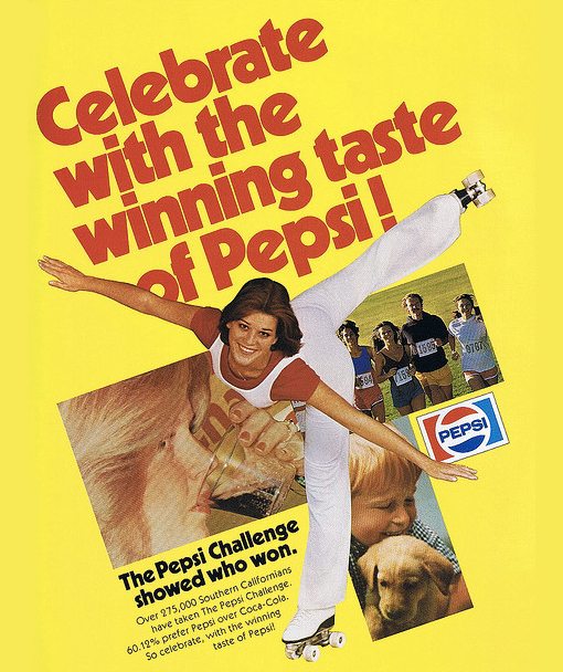
For my entire life I’ve understood the concept of brand rivalry because of two iconic companies: Pepsi and Coca-Cola. For as far back as I can remember (and much further) these two cola brands were slinging mud at each other. Here’s a print ad from 1979 about the “Pepsi Challenge” which repeatedly pitted Coke against Pepsi in a blind taste test with Pepsi emerging as the victor.
As a customer, I’ve never been quite able to decide which side I’m on. The truth is that I like both colas and often go through periods of drinking one exclusively while imagining that I like it better only to try the other and realize that I’ve been missing out. In fact, I like Fentimans Curiosity Cola better than either Coke or Pepsi, but I digress. The beauty of being a consumer is that I can enjoy both major brands and don’t really have to conform to the theoretical ideas of brand loyalty discussed in marketing boardrooms.
However, ever since I took an interest in design, I’ve observed this rivalry from a new point of view: I constantly compare the design styles of Coca-Cola’s marketing to that of Pepsi. Unlike with taste, in this game I always see a clear winner. Before we see which it is, let’s take a look at each brand individually, starting with Pepsi.
The Pepsi Brand
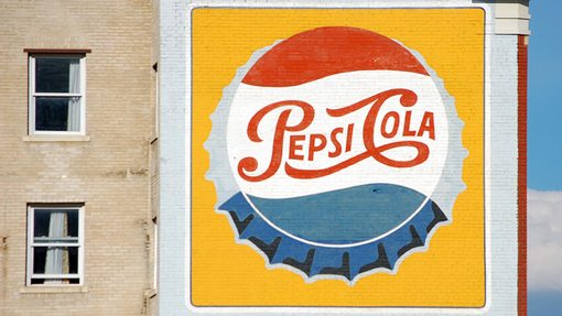
The Pepsi soft drink was invented way back in 1898, a little over a decade after Coca-Cola came on the scene. Looking back, the very first iteration of the Pepsi logo was a little strange. It looks a bit like something Tim Burton would come up with:

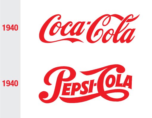
This version of the logo didn’t last very long and the script slowly evolved into the friendlier version we’re now familiar with from this time period. By 1940, Pepsi’s image was looking very close to that of Coke, which had also been gradually evolving since around 1900.
The Pepsi Globe
Around the early to mid 1940s, WWII sparked a little patriotism in the Pepsi Company and they began using the updated version of the script in conjunction with red and white ribbons to show pride in their beloved country.
This marked the arrival of the Pepsi Globe, which would become Pepsi’s primary icon and remain very similar in concept long after the script died. That is until the big brand overhaul of 2008, but we’ll get to that soon.
Pepsi Logo Evolution
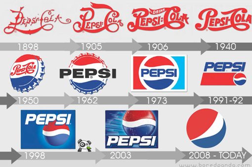
The folks at BoredPanda.com created the following image that clearly shows how the Pepsi logo evolved from its inception to the current form that we know today.
As you can see, by 1962, the “Pepsi Cola” script was gone and in its place was a simpler font with a simple message: “Pepsi”. As with most popular brands at the time, the Pepsi logo starting becoming ornate in the late 90s with subtle gradients that were made easier by advancing computer graphics software. By 2003, the Pepsi Globe was a glossy button with realistic highlights, shadows and water droplets. This form perfectly represents popular design styles of the early 2000s.
Brand Personality
Pepsi has always had a young target audience. Many of their ads were historically targeted at teens and even pre-teens and are injected with fun, sports and most often, music. Pepsi has leveraged all manner of musical celebrities over the years, from Ray Charles to Britney Spears.
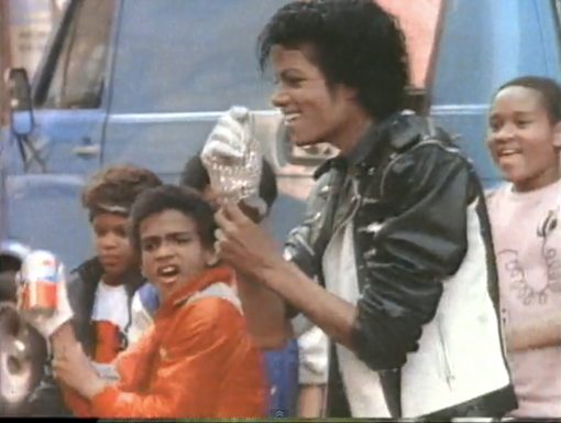
Check out this fantastic commercial I dug up on YouTube featuring Michael Jackson and a group of kids that are probably far too young to legally target for such a sugary product these days!
When Pepsi wasn’t using musical celebrities, humor was their weapon of choice, again utilizing young kids in the ads. Who could forget the lovable little girl telling the bartender, “I asked for a Pepsi Pal” in the voice of the Godfather?
2008: Pepsi Changes Everything
In the evolution image above we saw Pepsi roll along with popular design trends as they introduced Photoshop-centric gradients, shadows and highlights. As with every good design trend, this was firmly rejected by the designers of the next decade.
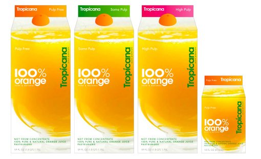
The design community’s eventual response was a full-throttle rebirth of minimalism. Every brand that made their logos look shinier in the late 90s suddenly hit command-z and started stripping their personalities through thin, sans-serif fonts and simple, solid colors. Even today we are still in this stage as brands like Gap, Tropicana and more seek new life through more generic looking designs, often with results so hated by consumers that the companies immediately revert to their old brand image.
By now we’re all familiar with Pepsi’s foray into this trend. After decades of refining, they hit the Pepsi globe with the ugly stick, trashed the familiar bold typography and gave us this:
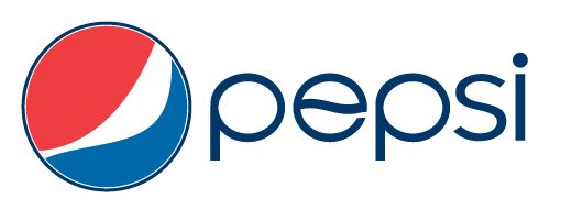
Years later I still can’t muster up anything but disdain for this rebranding project. Call me old fashioned but I think Pepsi took a baseball bat to their brand heritage. Meanwhile, they made the “e” in Pepsi mirror the old logo! It might be an attempt at cleverness, but it seems indecisive. And don’t get me started on “Mtn” Dew!
Emotional brand ties aside, I simply don’t see the logic behind this project. Keeping your image young and fresh is one thing, wasting millions of dollars to twist and smudge your iconic logo is another. I wasn’t completely against Pepsi reverting to a simpler design, but they had a really strong and recognizable logo to revert to and I’m not sure rethinking it so dramatically was either necessary or effective in any way.
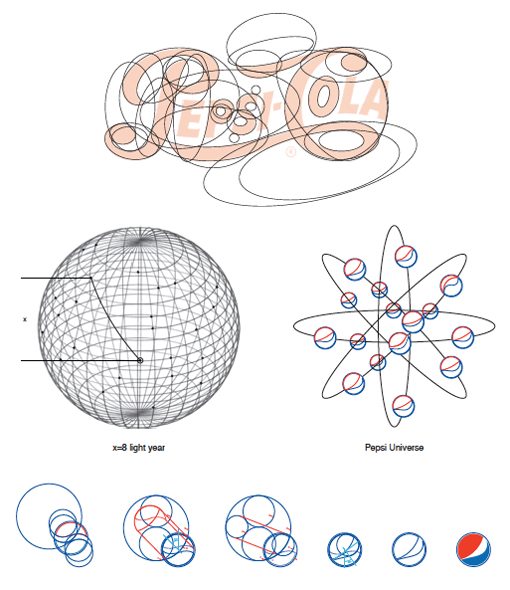
What makes this overhaul absolutely laughable is the explanation behind it from the Arnell Group. Shortly after the rebranding went public a PDF was leaked which is amazingly nonsensical in its attempt to be sophisticated.
Pepsi has since recovered from the public’s hatred of their new brand simply by trudging on. The redesign of their entire line of drinks has stuck with the exception of Sierra Mist, whose strange foggy forest design has already been abandoned for a new look that is actually quite attractive by comparison.
Meanwhile, Pepsi’s overall personality has stayed pretty much the same as they continue to primarily use humor and music in their advertising. This year’s Super Bowl featured several humorous Pepsi Max commercials and the Pepsi website prominently features an index of “emerging artists”.
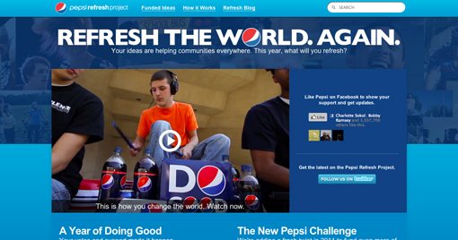
The biggest brand goal change that took place with the rebranding project was the Pepsi Refresh Project, which continues on today. Through this initiative Pepsi gives grants to people with great ideas for how to improve their community. It’s an excellent project and a great direction for Pepsi. More and more, big companies are expected to use portions of their mountains of cash to make the world a better place and the Pepsi Refresh Project is doing exactly that.
From this we can also see the effects of their branding in action. Notice how they consistently use the new logo as an “O” in various places. Honestly, despite rejecting the drastic change of their logo I do like the consistency of the visual direction they’ve gone in ever since.
The Coca-Cola Brand
Coca-Cola is as American as Thanksgiving day. It has been around since 1886 and has since become impressively tied in with the American identity through its massive growth and worldwide adoration.
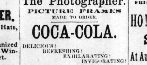
Though many will tell you that the Coca-Cola logo has been the same since day one, it has in fact undergone a few major overhauls. In fact, the original method of writing out the brand name was much less ornate than the script we now know:
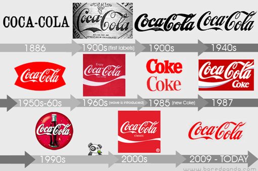
In the same article as the Pepsi logo evolution shown above, BoredPanda.com also published a Coca-Cola logo evolution. As you can see, the Coca-Cola script (which is simply a form of Spencerian Script) began life quite thin and irregular, then became much thicker and didn’t thin again out to the refined version we’re now familiar with until around the 1940s. Notice that it wasn’t until the 60s that the ribbon below the letters made its way onto the scene and its presence has since been a little inconsistent.
It’s interesting to note that Coke also followed the same evolutionary path that we saw from Pepsi, though to a less extreme degree. By 1987 a hint of shading had made its way into the Coca-Cola swoosh and by the mid 90s we had gradients, gloss and water droplets, sound familiar? This was of course followed by a period of dramatic simplification in the early 2000s which was taken even further in 2009.
It’s important to remember that alongside the logo, Coca-Cola has always had an important piece of brand history in its contour bottle, which despite taking many shapes early on eventually found stability and became a major icon for the company that persists even to today.
New Coke
Pepsi may have thrown a wrench in its brand, but Coke very nearly killed their product! In 1985 Coca-Cola underwent a major reformulation that resulted in a supposedly improved taste. The Coca-Cola soft drink was rebranded to the simpler “Coke” name and the new badge indicated a fresher, sweeter taste closer to that of Pepsi.
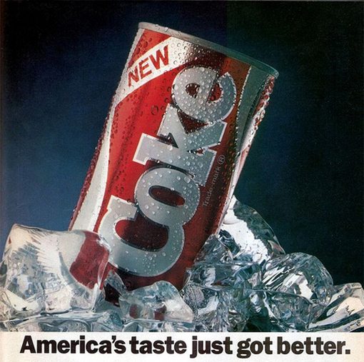
Contrary to popular belief, New Coke wasn’t originally a side project, it was simply the new form of Coca-Cola that actually ended the production of the original formula. Though New Coke led to an initial boost in sales, the public disdain for the abandoning of such a sacred American tradition grew rapidly and three months later Coca-Cola went back to the original formula.
Amazingly enough, the disaster actually resulted in a resurgence of love for the Coca-Cola brand. When Coca-Cola tried to destroy its own heritage, people saw it as an opportunity to stand up for something and built the kind of emotional bonds with the product that can only come from a triumphant battle in the name of tradition.
New Coke was rebranded Coke II in the early 90s but saw little growth and was abandoned quickly.
Brand Personality
Though to a degree, Coca-Cola and Pepsi have always been similar in their “fun and young” personalities, the two companies have consistently stayed on separate paths over the decades. On the whole, Pepsi has stuck with its high energy, music and comedy-driven strategy while Coke can be seen constantly gravitating towards the emotional side of branding.
Coca-Cola ads depict human experience in two primary ways. First, long before global branding was the trend it is today, Coca-Cola was embracing diversity. This can be clearly seen in its long-running “I’d like to buy the world a Coke” series of ads, depicting people from all over the globe joining together in Coke and song.
Further, Coca-Cola has long been available in one form or another in countries all across the world and it’s even rumored to be the most recognizable brand, logo and even word on the planet (the latter with the possible exception of “ok”).
When Coca-Cola ads aren’t targeting worldwide diversity, they still possess a strong sense of community and overcoming differences and hardship through universal similarities such as a love for Coke. Click on the image below to see a recent Simpson’s-themed Coca-Cola commercial using this tactic.
The second way that Coke has leveraged the human experience throughout the years is through a strong emphasis on families. Pepsi always stayed aimed right at children but Coke seems to know that Mom does the shopping and to get her you have to use an emotional appeal that makes Coca-Cola not only something that the whole family desires, but something that is literally an integral part of the family’s life experiences.
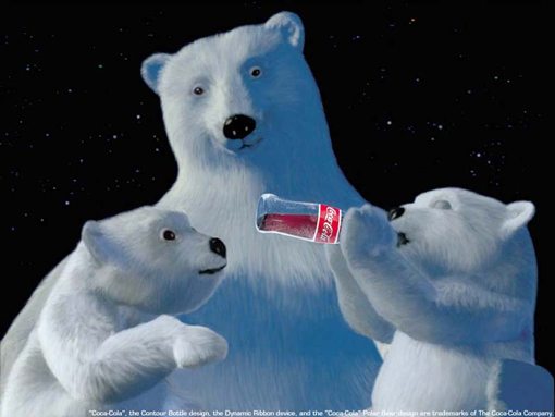
This occurs all over Coca-Cola’s advertising throughout the years but is never more evident than in Coke’s Christmas ads. Whether its an endearing scene of a father and son watching the Santa Coke truck go by or a family of polar bears consistently being brought together by Coke, the Christmas ads are aimed right at the hearts of American consumers.
Coke Simplifies
By now you can probably see that one of the main themes of this article is to showcase the major design trends in the past twenty years, which are clearly represented in the brand evolutions of both Coca-Cola and Pepsi.
In the early 2000s, Coke underwent a process very similar to Pepsi’s rebranding project that we saw above. Like Pepsi, Coca-Cola would undertake a branding project that would essentially undo the clutter that had made its way into the brand identity and strip it down to a meaningful and simplified version.
In a case study released by San Francisco design firm Turner Duckworth, the problem with Coke was clearly portrayed:
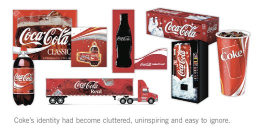
The Turner Duckworth team responded to this problem in a drastically different way than the Arnell Group handled the Pepsi refresh (for starters, their logic actually made sense and wasn’t a bunch of circles). Arnell did in fact simplify the Pepsi brand, but in the process they redefined it into something that it has never been before. On the surface, this sounds great but as we saw, the execution felt more like a gunshot to the heart of the brand.
Turner Duckworth on the other hand, didn’t attempt to redefine the most valuable brand on the planet, they simply brought it back to its roots. The result was a strengthening of the core features of the logo and product imagery.
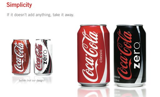
As a designer, you might laugh at the idea that someone could get paid to produce such a simple result. However, they didn’t stop there. Turner Duckworth realized that the heart of the brand didn’t just lie in the logo itself but something physical that we had all experienced in a very real way over the years: the coke bottle.
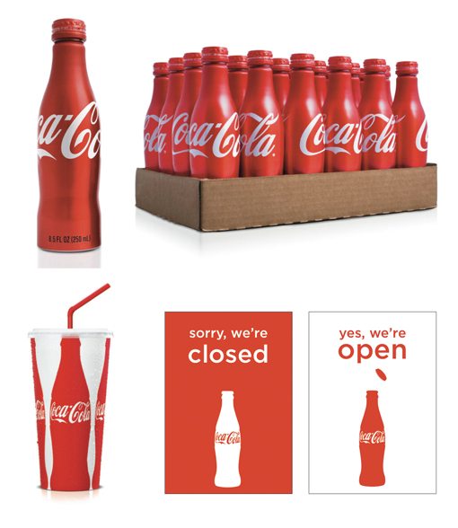
This idea of leveraging something physical is very important. We’ve all had Coca-Cola from a can, paper cup and plastic bottle before, but there’s something magically nostalgic about that old glass bottle. Not only did they apply their newly simplified look to the glass Coke bottle, they made the silhouette of that bottle the new brand hero and began using it in new and innovative ways. Below we can see the awesome Coca-Cola aluminum can bottles and the application of the Coke bottle silhouette onto other representations of the Coke brand such as paper cups and door signs.
Key Takeaways
What lessons can we learn from the stories of Coca-Cola and Pepsi? For starters, branding is a fascinating area of design that clearly depicts the shifts in design trends through the decades. Coke and Pepsi are huge players not just in following brand design trends but in setting them.
Further, branding is a dangerous game. Each evolution of a brand can either result in neutrality, which seems like a waste of money, improvement or a decline in the eyes of the public. Both Coke and Pepsi have sought to redefine their brands in major ways in the last decade. Both saw simplification as the answer and sought to remove the clutter that the previous twenty years had piled on.
Pepsi changed everything in a drastic way and took their brand in a completely new direction, even to the point of altering the basic structure and personality of their widely identifiable icon. Though some loved the boldness of the new direction, a huge portion of the media, blog and even public attention given to the refresh questioned Pepsi’s strategies and mourned the passing of the old icon.
Having learned in the past the consequences of drastically redefining a cultural icon, Coca-Cola reverted to and heavily leveraged the roots of its brand. They perfectly targeted what people see as the core of the Coke image and magnified it by stripping everything else away. The result was yet another resurgence in the public’s love for the Coke brand and a flurry of design awards and praise from magazines, blogs and various media outlets.
As we can see, redefining a brand, even through simplification, is not as easy as it seems. Others following in the footsteps of Coke and Pepsi have learned this the hard way. Tropicana, another Pepsi brand, received such a rapid and intensely negative response from its new packaging that it pulled the products almost immediately.
Similarly, Gap recently received a barrage of insults for their attempt to axe their brand image by replacing the classic, compressed-serif typeface with the incredibly cliche Helvetica Bold. They too sought to ease the mob’s anger by abandoning the project.
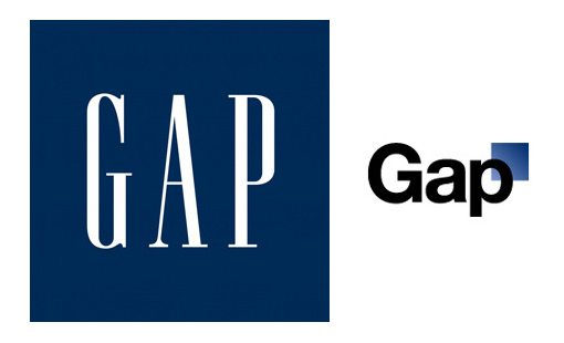
Meanwhile, as we saw in yesterday’s article, Starbucks has taken a page from Coke’s book and recently simplified their brand in a way that amplifies the strength of their instantly recognizable icon.
Conclusion: Look for Good in a Brand Before You Kill It
The key questions not asked by the companies that ruin their brand image are what value they place on ubiquity and what gains they will receive from abandoning that position. Everyone recognizes the Gap logo. It’s classic yet sexy and therefore perfectly matches the image with which we’ve come to equate the company.
My question is, why mess with a good thing? If you’re a few years old and have a poorly defined brand, maybe it’s time to reinvent yourself. However, if you’re a company that’s been around for decades looking for a way to revitalize your image, it might be a better idea to attempt to ascertain what is and isn’t a key positive aspect of your public perception. From here you leverage the good and drop the bad.
Perhaps, like Coke, Tropicana had in fact become too cluttered. However, the orange with the straw in it is a fantastic image that we all know and love. Why not build it up by dropping the fluff and making it more of a hero on the packaging? What’s the argument for dropping everything we’re familiar with about the company and making Tropicana look like a store brand?
In your next branding project, learn from both the mistakes and the successes of Coke, Pepsi, Tropicana, Gap and Starbucks. In your attempt to cut the fat from a brand, don’t stab its heart.
