8 Tips for Creating a Logo With Purpose
With so many logo design concepts, trends, and examples out there, how do you sort through all the clutter to create a logo that has a purpose for our brand or company?
It’s not always an easy task. The best and most memorable logos are not just designed well, they have purposeful meaning that creates a connection between the mark and organization it represents.
This can happen quickly with a brand that grows in popularity fast or steadily over time as a mark is established.
Here are some things to think about as you tackle creating (or recreating) a logo so that it has a purpose.
1. A Logo Should be Identifiable

When planning what your logo mark or brand, think about the user first. Approach it like you would a UX problem.
A logo design should be identifiable in a way that connects the symbol to the company or brand. You don’t need to see the word Nike to know the swoosh or Airbnb to understand the looping A. Think of the universal icon for recycling, above. You’d know that mark anywhere and know exactly what it means.
The key component of identification is with your target audience.
Think of a brand you interact with all the time. You can probably spot the logo quickly, knowing just what it means. But that might not be as universally true as a big brand. Regardless, it is equally effective. The logo is identifiable to the audience it serves.
2. It Should be Modern but Not Too Trendy

To connect with audiences, a logo design should have a modern look and feel, but shouldn’t be overly trendy. That’s mostly to protect the mark.
A trendy logo will force you to redesign frequently if trends change so that design isn’t dated. How will you establish a purposeful and memorable brand design if it is constantly changing?
The Spotify logo, above, is a good example because it has a flat style and bright color – both trending design elements – but the mark isn’t too trendy. The circle is something that seems like it can hold up over time if trends change.
3. A Logo Should Tell Me How to Feel

Do you identify with the logo? You might even have a sticker with the logo on a water bottle or phone case.
The connection or community feel, tie people to a brand emotionally. It can be through color or imagery. (Think of the smile below the word Amazon. It’s all about creating the right emotion. Shopping makes you happy.)
4. It Should Connect to Your Business/Brand/Organization

Does your logo say anything about your brand or business? Does the imagery connect to what you do?
Even something as simple as including green for a nature-friendly brand or using a funky font for something new and innovative can help establish the purpose of your company. People pick up on dozens of visual cues and these little things can communicate a great deal.
Just be careful not to overdo it. You don’t have to create a full mural describing your business for a logo. Subtle cues can be much more effective.
5. A Logo Should be Simple

A logo design should be simple. Just think of how much quicker the mark will be identified, connecting your brand to its overall mission and purpose by users.
A complex logo can be a challenge to read and understand, which can get in the way of what you want people to see and take away from your mark.
A simple logo can stand out in a crowded world of visuals. Plenty of space, a simple color, and interesting overall aesthetic can go a long way to pulling attention toward your image, rather than away from it.
(RED) has a simple design that has become synonymous with AIDS research. This simple design includes a simple word and a single color. Note that a simple logo can be text- or image-based.
6. It Should Create an Impression

A logo with purpose creates an impression. (Ideally, it will be a positive impression.)
The impression will last from the first time someone sees your logo – did they engage or ignore? – and can influence the relationship they establish with your brand.
Even though you’re not supposed to judge a book by its cover, think about how often that happens. You buy a product or investigate a company because something about the way it looks appeals to you. The impression likely started with a logo.
Think about the strength that the Stand Up to Cancer logo, above, showcases. That’s a distinct impression that’s created from color, type style, and even the directional arrows.
7. A Logo Must be Flexible

With so many needs and uses for a logo today – print, online, static, dynamic, varying shapes – the design needs to be flexible enough to show the brand in different ways.
The applies to the shape of the logo as well as color and ability to adjust for specific situations. Can your logo serve multiple purposes? Will users still know you and your brand if you make these adjustments?
That’s creating flexibility in the logo and branding.
Note how the Windows logo, above, has evolved over the years. The design provides just enough flexibility that changes to the color or structure of the shapes doesn’t make it unrecognizable.
8. It Should Show What You Stand For

While the main purpose of a logo itself is to identify and establish your brand, it can also represent what you care about. A purposeful logo also communicates what you stand for.
This can be a tall order for a mark that supposed to be simple and memorable and timeless and flexible…
But it’s doable.
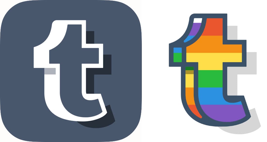
For Pride Month, Tumblr adjusted its logo, above. It’s an obvious representation of brand values and meaning. But there’s no mistaking that the logo is still for Tumblr. The design checks all the boxes and shows purpose.
Conclusion
To create a logo design with purpose, start with what you want people to know about your brand or business. Then incorporate all the tenants of good visual design to get there.
A logo or brand probably won’t explode overnight, but if you are connecting with the right people and the visual message resonates with them, you are doing something right.