30 Eye-Catching Logo Color Schemes
Color can have a significant impact on logos. It can communicate meaning and help users identify your company or brand. And just like other design trends, what styles and colors are used in logos tend to change over time.
The trend now is toward more streamlined logos without much color (often single color) or the exact opposite – rainbow-style color palettes for brand marks.
Here’s a look at 30 logo color schemes that are sure to catch your attention.
1. Miami Dolphins
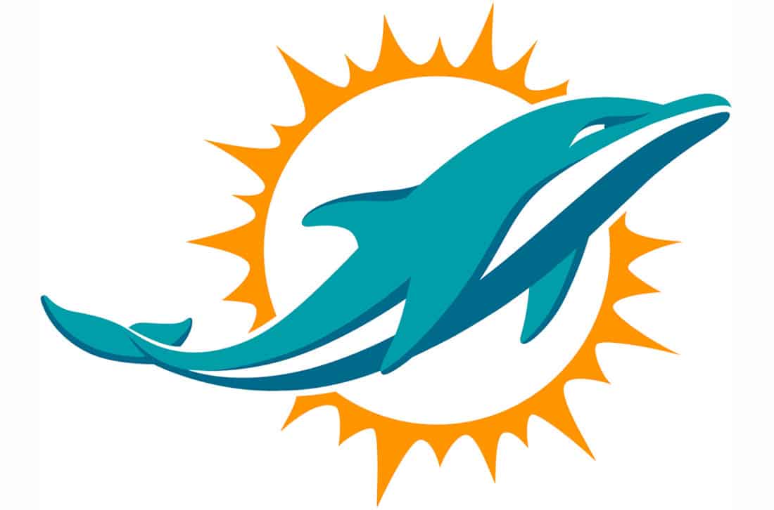
Some of the most interesting color combinations you’ll find some from sports teams. Athletic logos combine colors that are often not generally used together. The Miami Dolphins use a nice combination of teal and orange that’s bright, sunny and fits the logo mark well.
2. Slack
Slack represents the rainbow-style color trend. The logo uses four distinct colors and there’s even a prominent secondary purple. While this palette has a lot happening this quad of colors – rooted in the Material Design palette – is extremely popular among lots of brands.
3. Outdoor Women’s Alliance
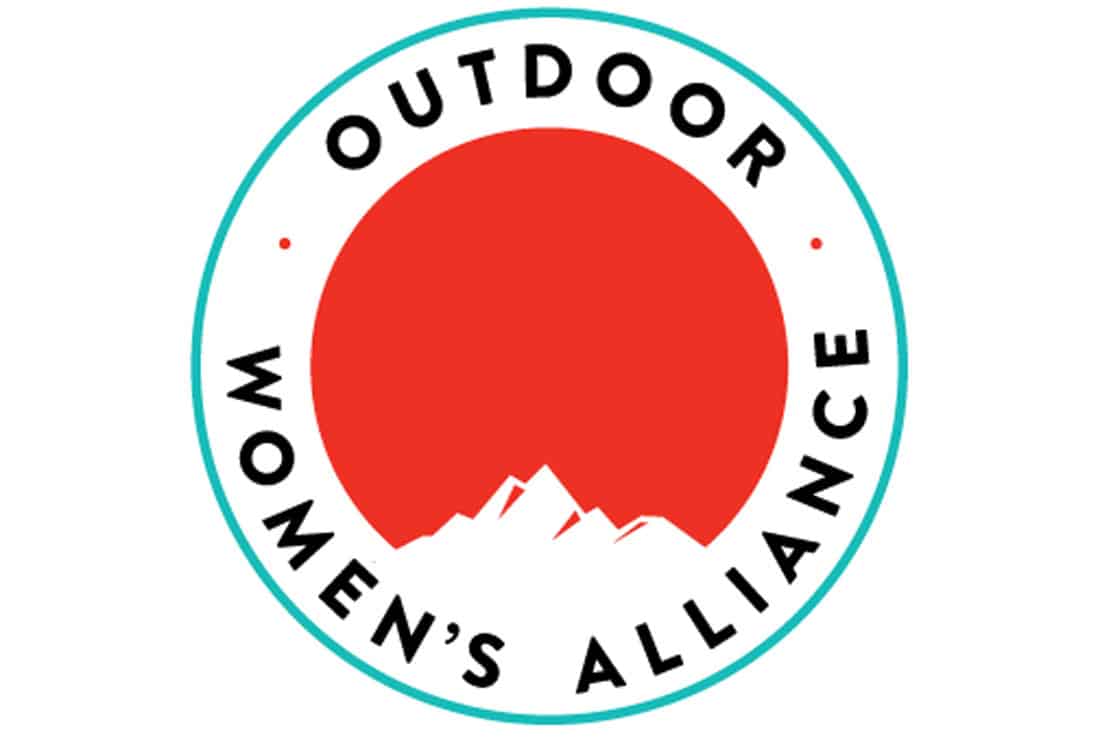
Colors that’s just a little unexpected can really make a logo. The Outdoor Women’s Alliance uses a combination that evokes a sense of nature but opts for boldness rather than colors that could be more cliched.
4. PayPal
Blue is the most popular logo color of all time. It creates a sense of trust and harmony. PayPal uses a trio of blues for that very reason.
5. Starbucks
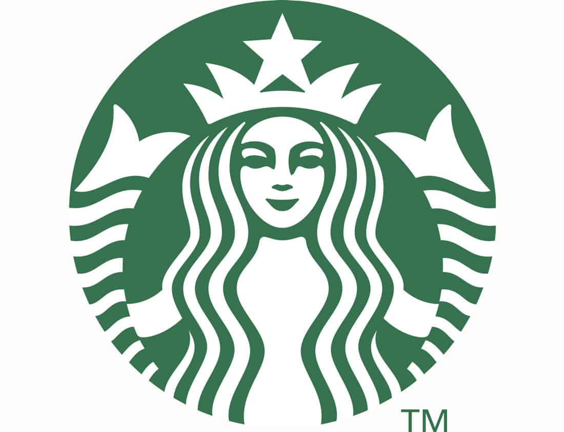
Single color logo design, especially with flat elements, is the most popular logo trend right now. Starbucks does this well with a color that is synonymous with the brand. The streamlined color palette is easy on the eye … and even easier to convert to black or white for alternate versions.
6. Trader Joe’s
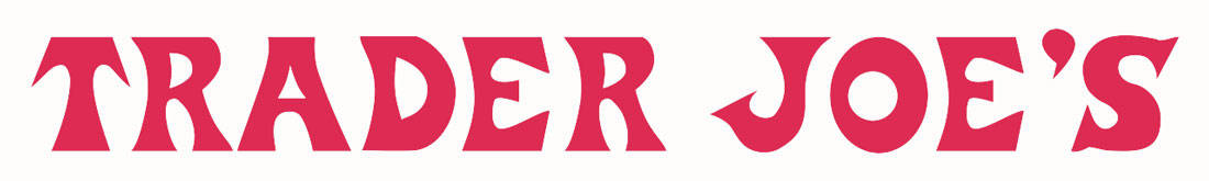
Trader Joes follows the same logo design philosophy as Starbucks, but shows that a single color design can work for text as well.
7. Mountain Dew
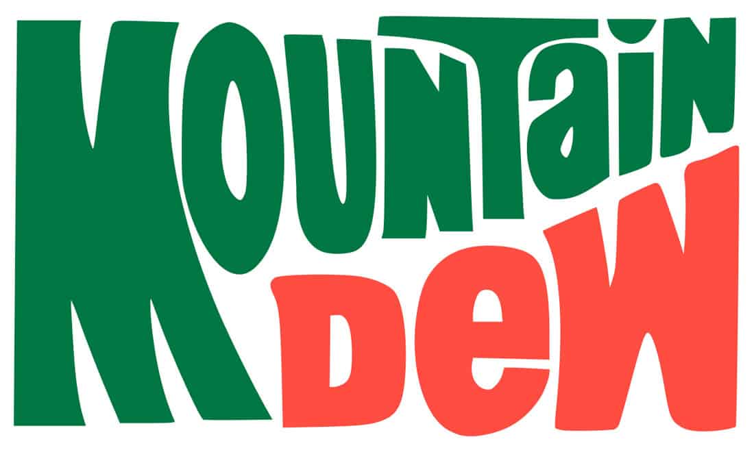
The classic style Mountain Dew logo is a mashup of brights. This more classic color style has a less trendy, but timeless feel.
8. Thrive Global
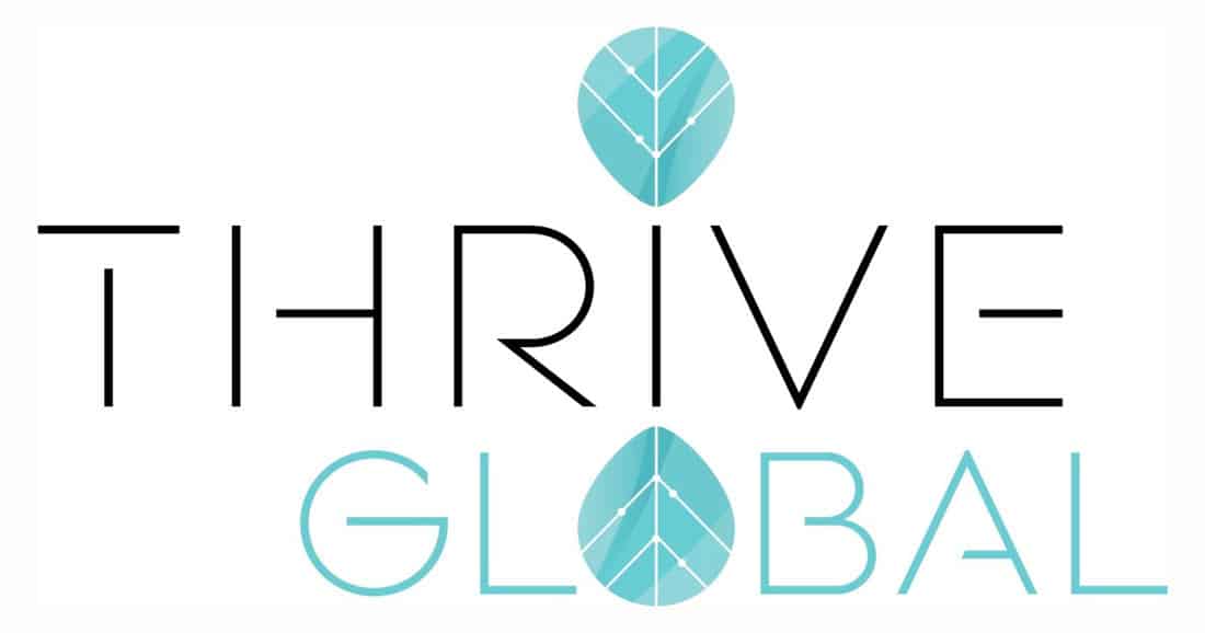
Thrive Global uses black and a blueish green combination for a simple logo mark with a monotone color scheme. What’s really nice about this color palette is that it mimics a gradient style without using gradients.
9. Amy Poehler’s Smart Girls
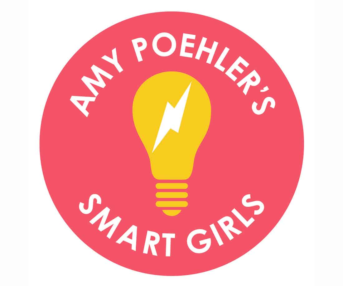
The bright pink and gold of Amy Poehler’s Smart Girls is sure to jump out at you. The color combination has a feminine feel without being too girly, which works well for the brand.
10. Stitcher
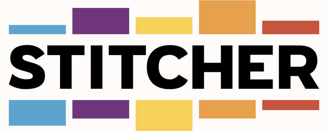
Stitcher is another rainbow-style design. The palette uses colors you might not normally put together, but here it works because color drives the eye across the logo design.
11. South Carolina Humanities

South Carolina Humanities uses a classic color combination for a simple logo that feels trustworthy and modern.
12. Ally Bank
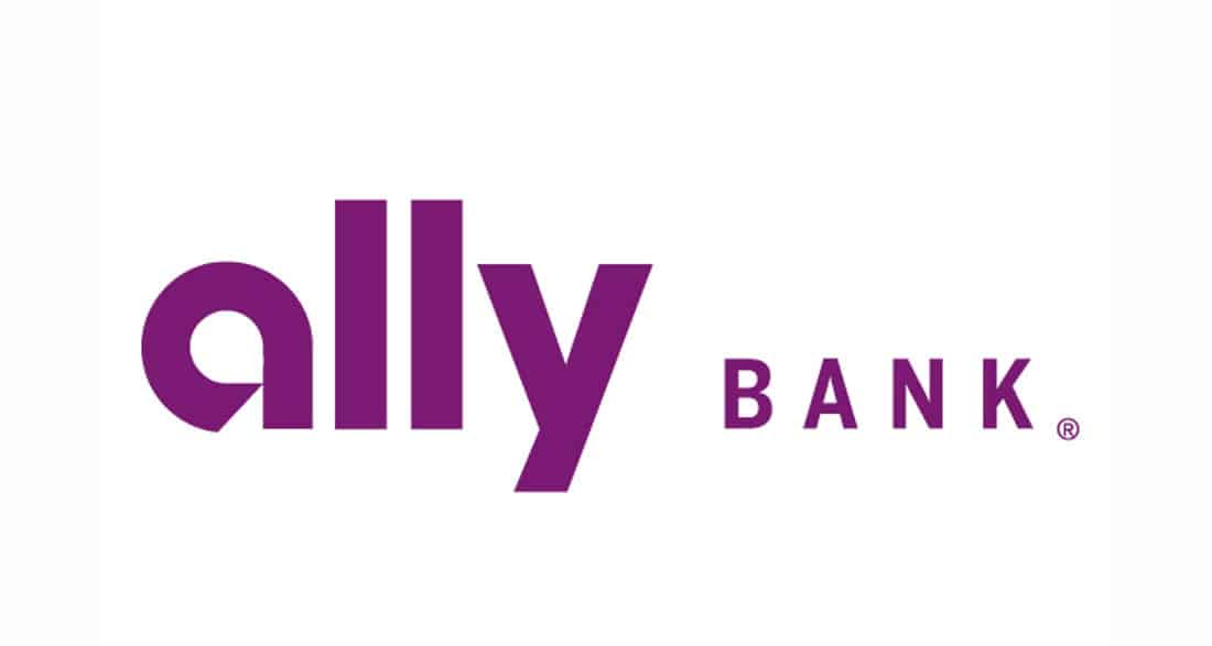
Ally Bank bucks the trend with financial logos with a single purple wordmark. Most financial instutions, such as PayPal (above), opt for blue.
13. All That Grows
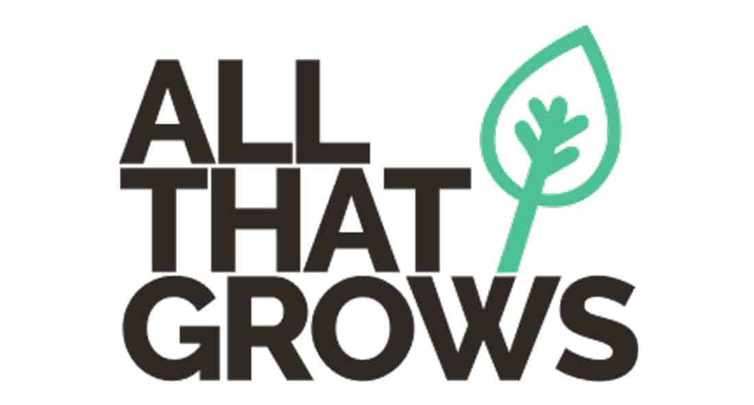
All That Grows uses a simple bright green with black for a sleek logo design that has just enough color to draw the eye. This can be an effective option that adds a little more visual interest to a single-color design.
14. Breckenridge Brewery
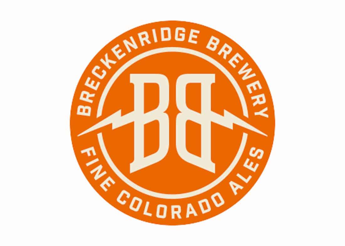
Breckenridge Brewery trades white lettering and accents for a warm beige. The color works well with the primary orange and creates a badge-style logo that contains all of the design elements in a neat package.
15. Dogs Trust
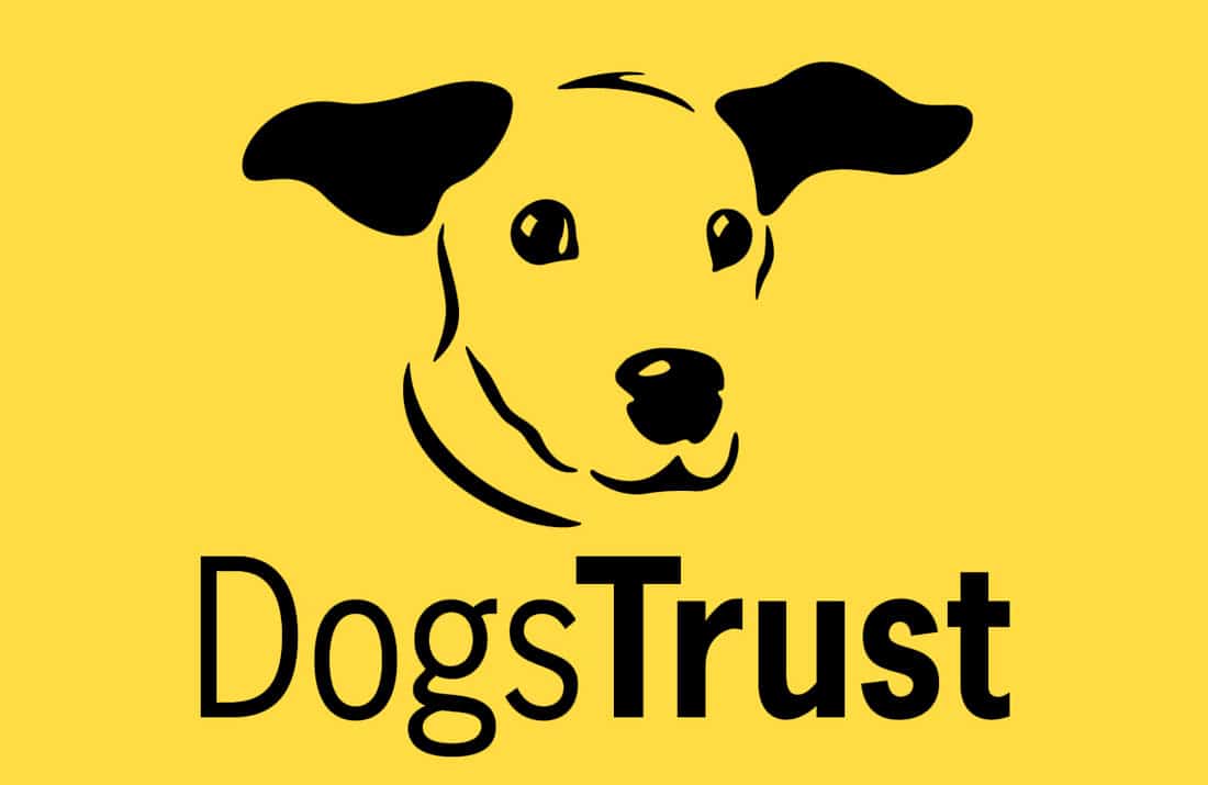
A gold and black color combination can be harsh and difficult to use, but Dog’s Trust does it in a way that stands out and establishes the right feel. A combination like this can also stand out in a crowded logo color space of blues, reds and greens.
16. Stand Up To Cancer
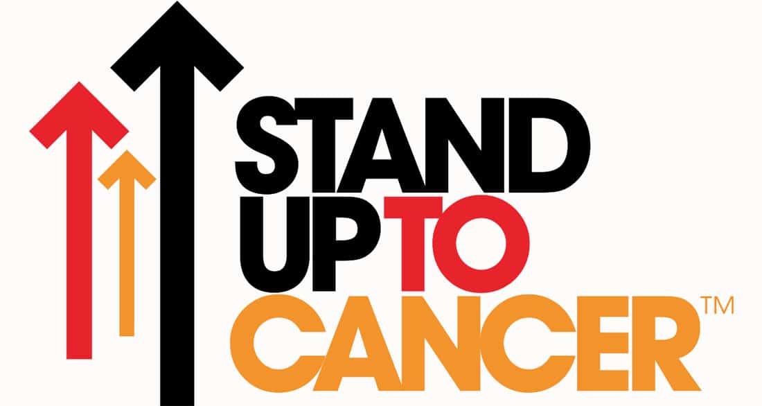
Bold choices with color – black, red and orange – sets the tone for this mostly text logo.
17. Feeding America
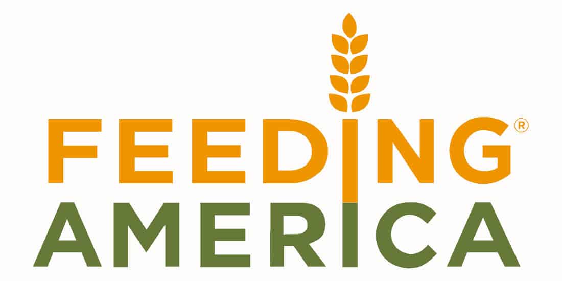
Feeding America uses an orange and deep green combination that perfectly matches what the nonprofit does and imagery in the design. The orange makes you think of wheat (in the top of the logo) and green connects with nature and farming (food generation). The green also serves as a nice neutral against the orange, which can be harsh.
18. Pampers
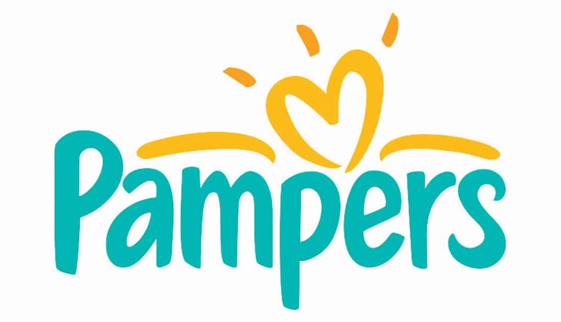
Another trendy color combination with teal and gold creates a sense of fun and adventure, great for a brand aimed at new parents.
19. Core Hydration
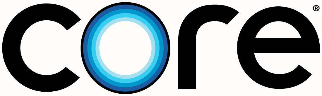
Core Hydration uses a great monotone blue color palette that includes all the blues you might think of when it comes to water. Pair those with color black lettering for maximum impact in the logo design.
20. Seattle Sounders

The Seattle Sounders use a calming blue and green combination. These colors almost have a neutral feel without being bland.
21. Credit Karma

Credit Karma uses a bright green that’s a new spin on what you might think of for money.
22. TikTok
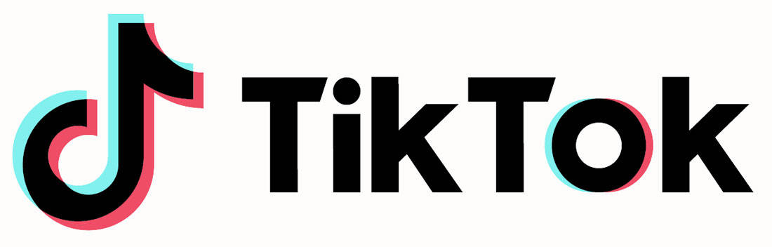
TikTok uses simple black text with cyan and magenta accents to represent the video social channel. The colors are bright and trendy and help push black lettering to the forefront.
23. Dunkin’
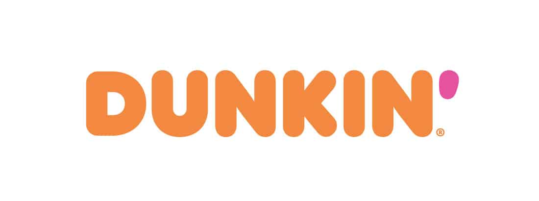
There’s nothing like a color pair that doesn’t match to make you look at a brand. That’s just what Dunkin’ has been doing for years with a bright orange and pink color combination.
24. Wonder Woman
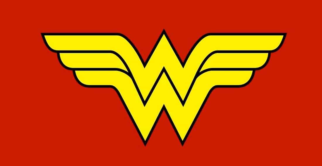
The class DC Comics Wonder Woman logo uses a red and yellow pair that brands have used for generations. Red is a popular logo color because of its impactful nature and the addition of yellow makes it even more attention-grabbing.
25. NBA

The NBA uses another classic color commination – red and blue. You could say these colors go together in logo design the same way that peanut butter and jelly go together on a sandwich.
26. Nike
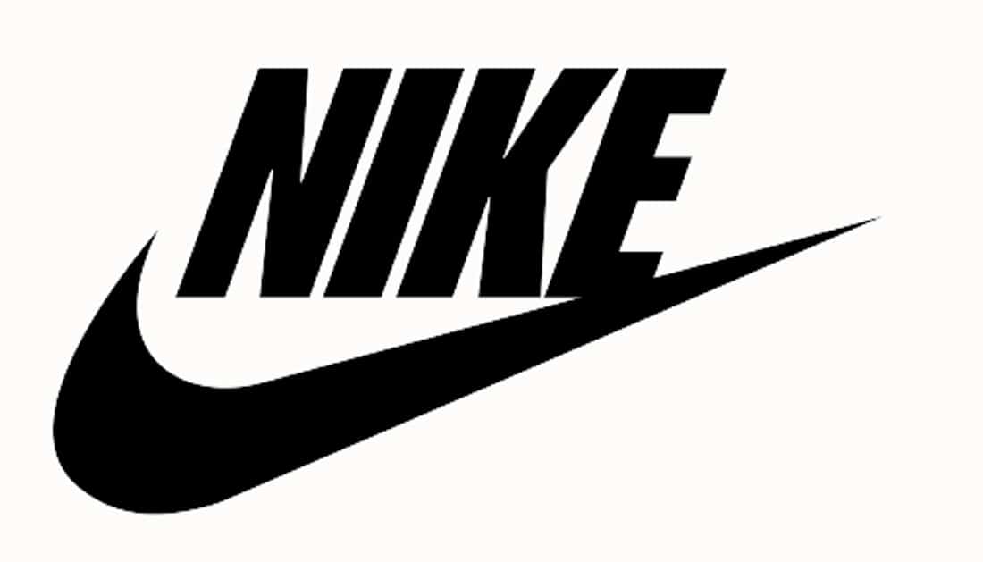
Nike’s iconic logo design uses no color at all. If you start scanning websites, this is something you’ll see a lot of right now.
27. Lord + Taylor
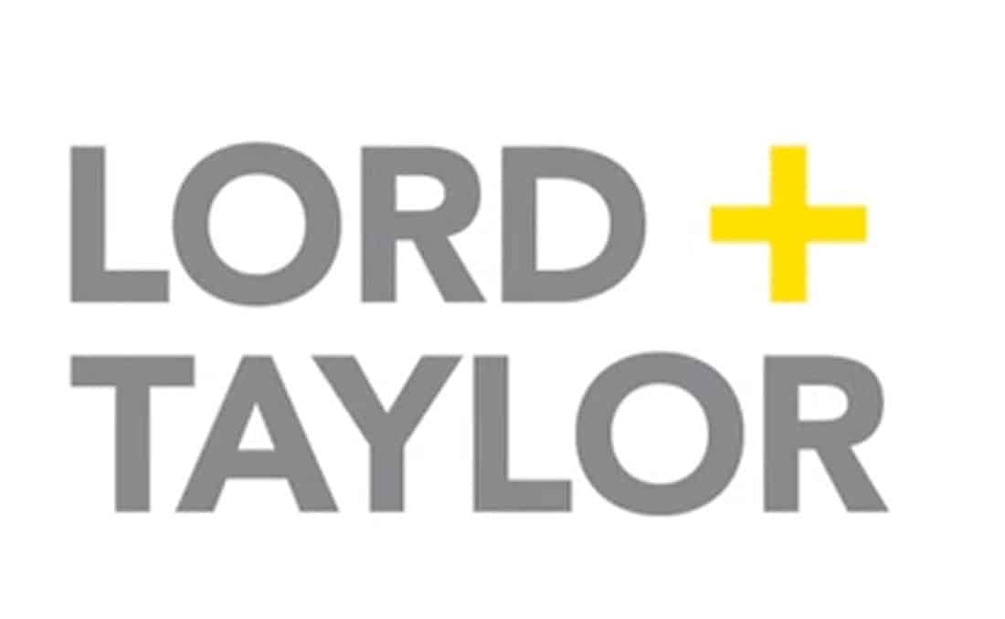
Lord + Taylor uses a softer version of black and gold. The gray and yellow logo is inviting and a nice alternative to all the in-your-face designs that are more popular.
28. Sanzaru Games

Sanzaru Games uses a line green with black to grab attention. While lime was once dubbed the “new neutral,” it’s not overly popular and stands out for this reason.
29. Chipotle
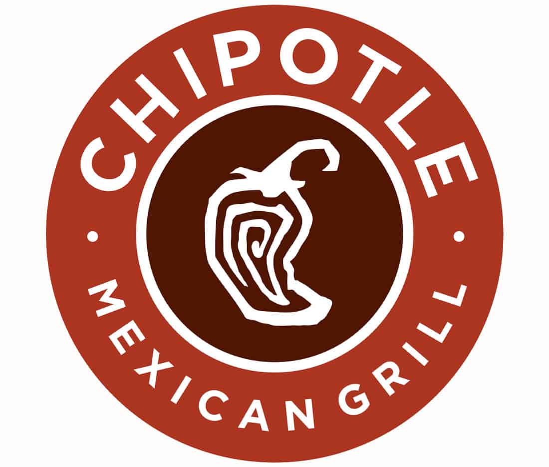
Chipotle uses two reds for the restaurant chain logo. It’s an effective use of color – red is said to stimulate the appetite and it goes with the Mexican food theme.
30. Salty Turtle Beer Co.
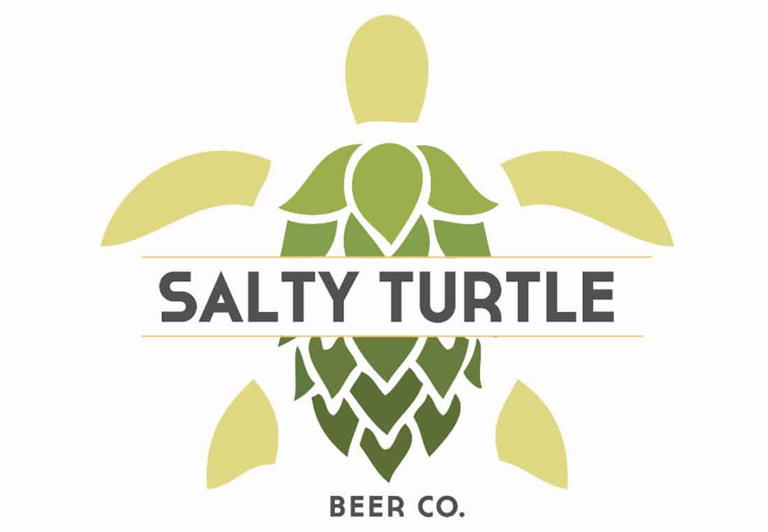
Salty Turtle Beer Co. uses several neutrals in a visually interesting way. The greens and beige are the colors of the iconic animal in the logo and color of hops, which are used to make their product. Color choices help the user “see” the design.