10 Crucial Elements for Any Website Design
While every designer may have a different plan when it comes to building a website, they do have a common checklist. No matter how you try to avoid it, there are a few elements every website should (and usually does!) include.
From plenty of whitespace and great images, to search functionality and clear calls-to-action, these common elements are the things that users expect when it comes to using a site with ease.
Today we’re taking a look at ten elements you should prioritize on your website, perfectly designed examples of each, and tips on how to use each in your next website design project. As the saying goes, “the devil is in the details.”
1. Space
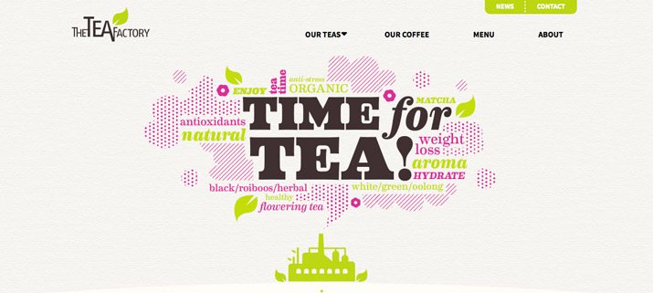
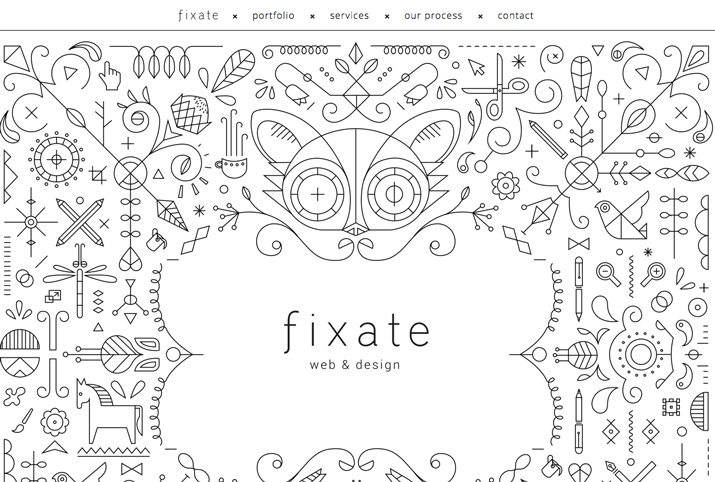
Space is one of the most important design tools because it dictates everything—from flow to readability. Designers are beginning to use space in ways that we did not see on the web a decade ago. More site designs include vast spaces, increased spacing between lines of text, and an overall use of open space.
Key spatial relationships include consistency in spacing. Similar elements should include similar spacing. The amount of space between lines in a paragraph should be the same, as should the amount of wrap around images.
Space is also important when it comes to creating a focal point for users. An image or piece of text surrounded by white space will appear larger and more important than one that is crammed into a smaller or tighter location in the design.
It is also important to note that space is not always white. It refers to the lack of elements, and could equally be a background colour or a texture.
How To Use It: Start with key elements such as navigation menus, for example. Make sure elements are organized in a way that includes set spacing between elements. This will make each button or word stand out more clearly on its own.
2. Simple Navigation
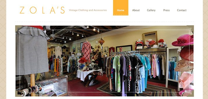
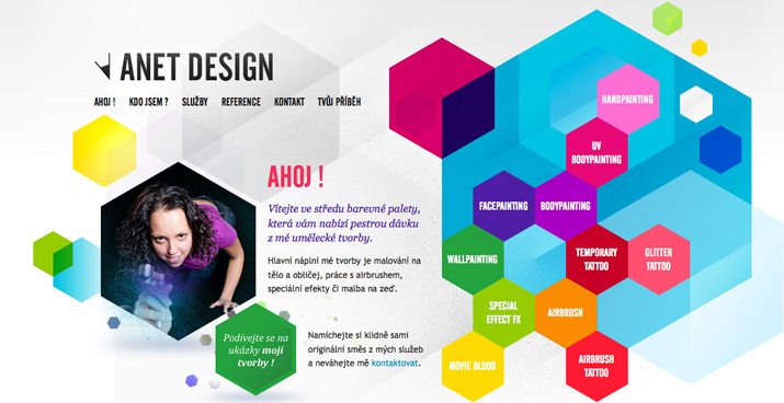
Navigation does not need to be complicated. It should be easy to identify and easy to use. It is also important to keep navigational menus to a minimum so you don’t overwhelm users. Depending on the type of site, five to ten menu navigation items are the top end of what you should aim for.
Navigation also includes tools that help users navigate through a site. Sites with parallax scrolling, for example, often include directional arrows to make the site more user-friendly. The easier it is for people to use and navigate throughout your site, the longer they are likely to interact with it.
The above examples show two very different types of navigation: Zola’s, which includes a simple menu and progress navigation with clickable text as buttons, and Anet Design, which displays a funkier, more creative button style. What both sites have in common is that the main navigation never moves or changes, creating consistency and flow on each site.
How To Use It: Use simple navigation as the framework for your website build. Remember users want a few key things from navigation: knowledge of where they are on the site, a way to go back (or home), and directions (if your site has an unusual or more complicated interface).
3. About Us
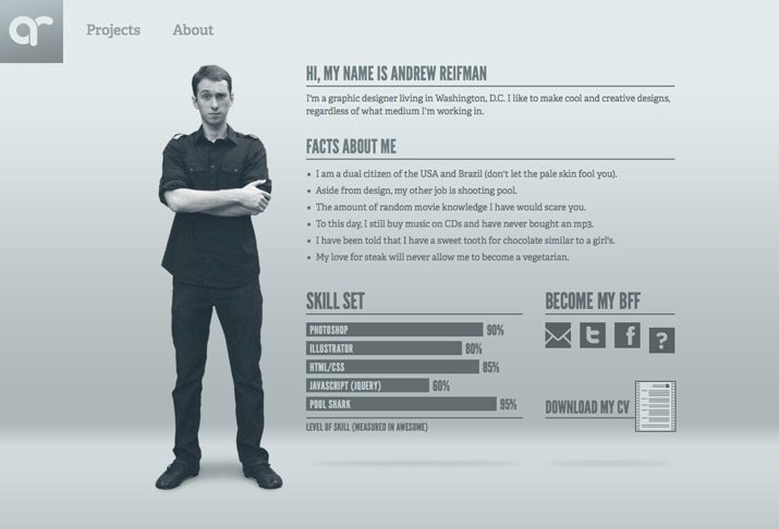
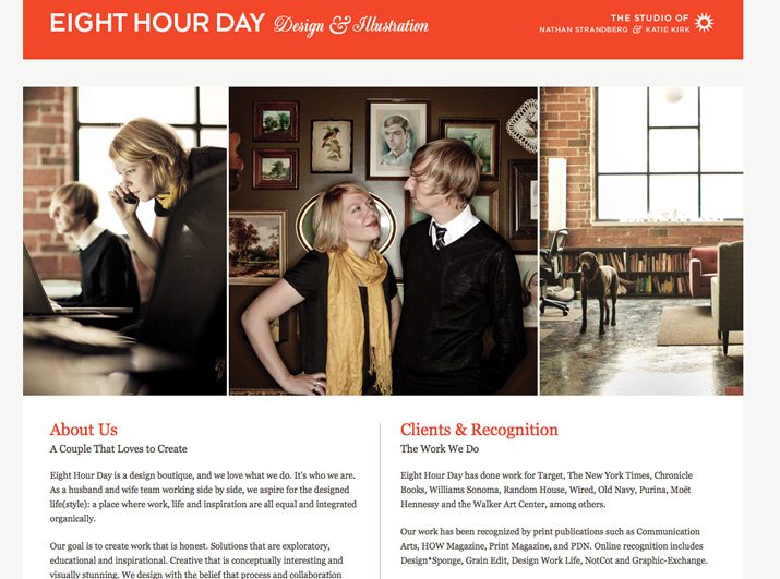
It is especially important for a small business or site owner to tell users who they are. (This is less important for major companies that are household names, although it is still a common practice.)
The “About Us” page should tell users who you are and what you do. It can outline company philosophies or goals or how the site came to be. This page can also be the place for customer or user testimonials, and success stories. This type of page can also serve as a gateway to related pages or even social media profiles.
The one problem that often happens with About Us pages is that they get long and wordy. Keep the page simple; give users just enough information to be interested but not bored. And remember to keep the design interesting.
How To Use It: Use the About Us page to give your brand a little personality. Consider including photos of your team and a short company biography.
4. Contact Information
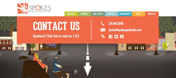
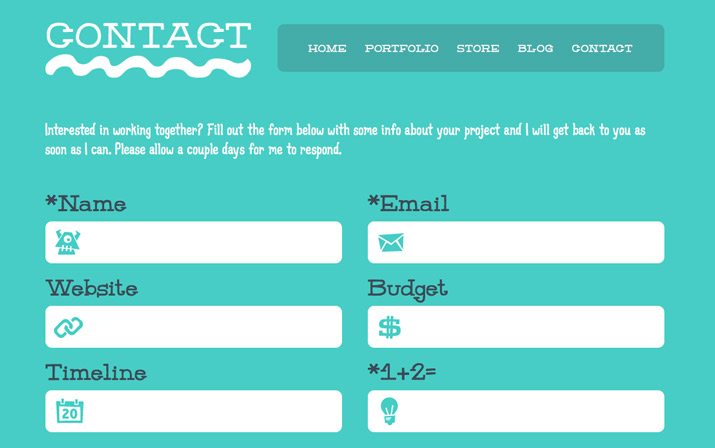
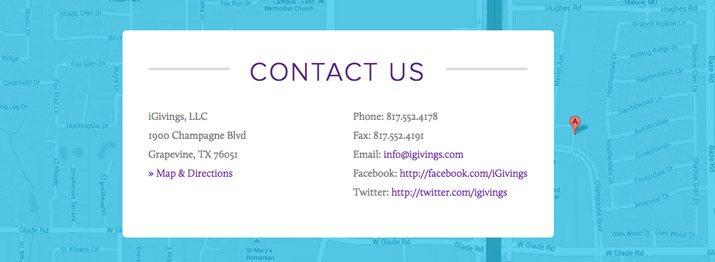
Contact information commonly appears in one of two ways – in the header / main navigation, or as a Contact Us page with a form or expanded information. Either option can work well, depending on your site design.
The key is making it highly visible. Having contact information such as a phone number, physical address, or form to contact the website owner adds legitimacy to your site and business. It can be frustrating for users to want to find you and the information not be clearly listed on the site.
How To Use It: Add contact information to all static headers and/or footers. If you have a physical business address, include location information. Consider a contact form so users can email directly from the website.
5. Call to Action (or Signup)
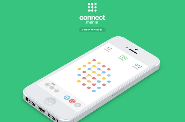
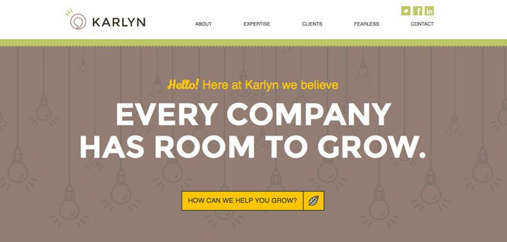
In most instances, a website is the gateway to an action – make a sale, provide information, and gather contact information. To ensure this action, calls to action prompts need to be obvious and strong.
First, determine what your site is supposed to do. Then design it so that the action is obvious and leads users to it. Techniques such as color, contrast, and space can help lead users to the “right” buttons. Connect Mania, for example, wants users to download an app. The only clickable space about the scroll on the landing page takes you to the App Store.
Another popular call to action is a signup form. If this is your goal, place the form in a prime location and size it prominently. Make the form simple and quick to fill out. (If you need more than two or three pieces of information, consider a follow-up email rather than a complicated signup form.)
How To Use It: Make calls to action obvious. Placement should be in a highly visible part of the page and next to the item it relates to. Buttons should be of a contrasting color and say exactly what you should do: Buy Now, Join, Download, Sign Up Free.
6. Search


How many times have you wanted to find older information or something you remember seeing on a favorite website? That’s where search comes in. The tool is vital for repeat users. Design the box in a way that is unobtrusive but easy to use. Make sure the box is big enough to type terms from your website. If you use an icon for search, there’s no need to invent something new; use the standard magnifying glass.
How To Use It: Design a simple box that lives at the top of your website for search. The top right corner is the most popular location, using that space is expected and easy for users to find.
7. Informational Footer
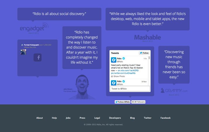
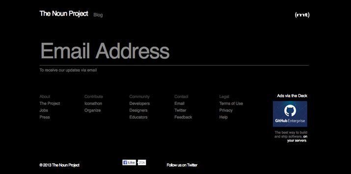
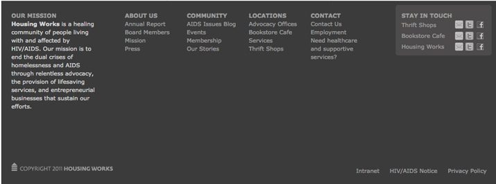
A footer is how you can connect to your audience with a wealth of information without getting in the way of the design. Because the footer is at the bottom of the page, it is a logical location for a small site map, company or contact information, links and context for your site.
Make the footer useful and keep it simple. Whether you opt for a couple of buttons or a link-style design, the footer should be designed to mesh with your site but may have a much more minimalistic feel. Make it easy to use.
How To Use It: Some of the best footers combine many of the above elements. The footer is often a repeat of elements found elsewhere (such as adding search to the top of the page in the main navigation and again in the footer). It can also introduce some of the above elements and house them if there is no other logical location in the design scheme.
8. Style for Buttons

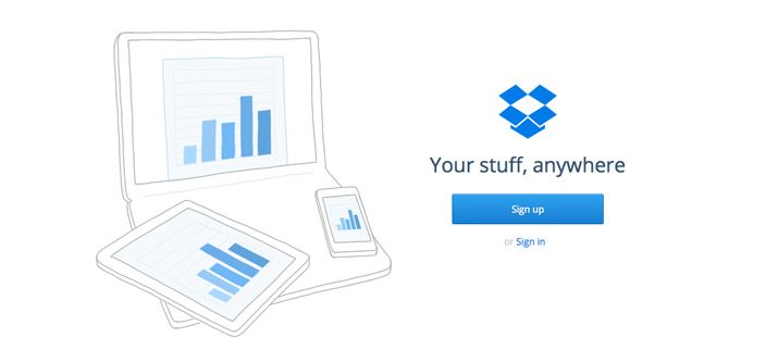
Every button on a site should be recognizable as a button. They should have the same shape, design effects, and feel regardless of purpose or location. Creating a distinct set of buttons can be somewhat of a daunting task for sites with a lot of clickable items. Consider using a design kit to create a consistent set of elements.
How To Use It: Develop a set of buttons unique to your site. Create a consistent color theme – every button is a single hue – or overall style, such as shape or texture.
9. Great Images
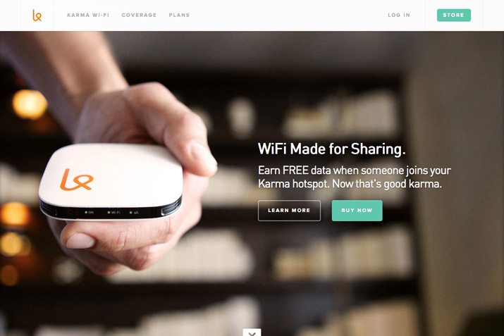
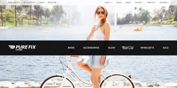
People love to see things in action. Create stunning visuals to draw users in to your site. Great images or illustrations are one easy way to do this. With a relatively small set of great photographs, you can show products, people, or whatever to entice users to your site.
Both of the sites above do a great job with images that show their product and style. This type of custom imagery is important. Be cautious of using too many stock images, because your site could end up looking just like something else.
How To Use It: Hire a photographer or illustrator to develop and create a great set of images for your site. Rely on custom images rather than stock images for a unique visual experience.
10. Web Fonts
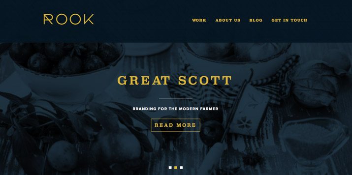
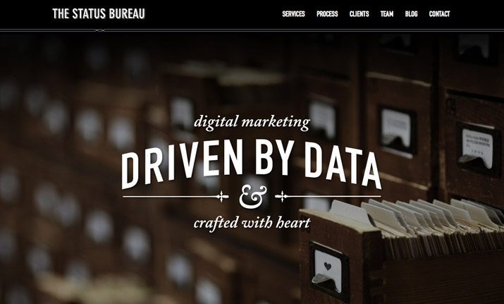
The web was once filled with a handful of typefaces – Arial and Courier come to mind – because they were readable by most computers and browsers. That is no longer a limitation for designers. But web fonts are still important for two key reasons – compatibility and licensing. By using a web font service, type is type on the web, which is important for search engine optimization, and designers don’t need to make images out of their type to maintain a certain look.
How To Use It: Start with a service such as Google Web Fonts, which is free, to implement a set of beautiful and interesting typefaces into your site design without having to spend a fortune on licensing, or worry about compatibility issues.
Conclusion
While there are a lot of important components to effective website design, including these ten key elements can make a difference. Take care designing with space, simple navigation, about us, contact information, calls to action, search, footer information, buttons, images, and web fonts. These often overlooked details can make or break your complete site design.
Image Sources: Tagxedo.com, The Tea Factory, Fixate Web & Design, Zola’s, Anet Design, bagaball, Andrew Reifman, Eight Hour Day, Spokes Pedicabs, Denise Chandler, iGivings, Karlyn/a>, Connect Mania, Tastebook, Tennessee Vacation, The Noun Project, Rdio, Housing Works, Campaign Monitor, Dropbox, Karma Wi-Fi, Pure Fix Cycles, Rook and The Status Bureau.