Design Trend: Experimental Navigation Patterns
Long gone is the idea that navigation menus must be fixed at the top of a website design. While many designers opt for the safe, consistency of all caps navigation across the top of the screen with sans serif typography, more designs are breaking out of this pattern.
Experimental navigation patterns can be fun and interesting if they are intuitive enough for users to understand reasonably quickly. Different navigation styles can add interest to websites that are small, don’t have a lot of content or want users to move around in a specific way.
While experimental navigation isn’t for every design, it can be a fun alternative for the right project.
Side Navigation
There are plenty of ways to do side navigation. It can be static or dynamic and can be almost any width.
While it doesn’t seem like moving the nav from the top to the side is all that experimental, it can throw quite the wrench into your design because it changes the aspect ratio of the canvas.
Then you have to consider how this often-skinny navigation bar will look on other screen sizes. And what do you do if the navigation menu contains long words (you don’t want a nav bar filled with hyphens)?
There’s a lot to consider.
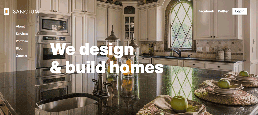
The best side navigation is simple, with short words and a fixed space. Too much scrolling in nav is jarring and difficult to understand. The example from Sanctum, above, is simple and clean. The nav stays in one place as the user scrolls, with the text adjusting only from light to dark as the background changes.
The nice thing about this example is that the vertical navigation pattern encourages users to first look at the name and logo and then move in s straight line down the screen to see what navigation options are available. It’s well-designed and functional.
Hidden and Pop-Out
One of the big things that has emerged from the prolific use of hamburger and other hidden icon-style navigation is pop-out menus.
Click or tap the button and the navigation swings out covering part or all of the screen (often depending on screen size).
In itself, this isn’t truly experimental. But the fact that so many designers are doing it so many different ways is. While users are arguably getting used to hamburger icons, these patterns are still somewhat unfamiliar. And with designers using varying icon types, there’s a little bit of a challenge there as well.
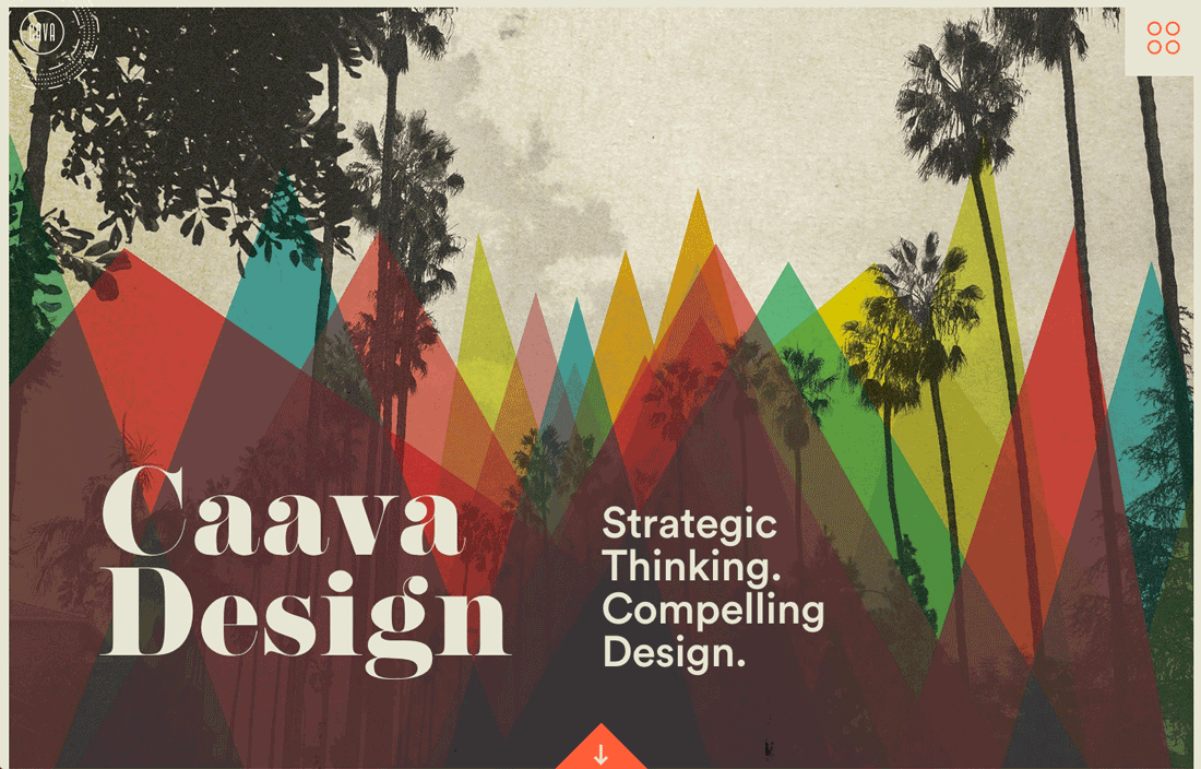
Nevertheless, the pop-out style from Caava Design, above, is interesting. Whereas most designers are going with flat, simple pop-out variations, this one has more depth to it. The design helps users find the most important parts of the navigation to lead them through the design.
Horizontal Scroll
The first few times you run across a horizontal scrolling site can be a little odd. It takes a specific design for this flow to feel right because of the strange difference in physical and visual movement.
To make this most of horizontal scrolling navigation, designers should use visual cues to help make the idea more comfortable for users. Arrows or other directional tools can be helpful.
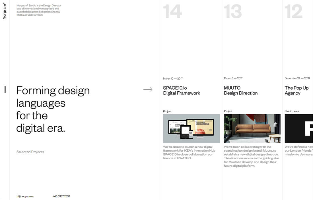
Norgram, above, also uses a partial image as a visual cue that there is more content on the side of the screen with a fixed top to bottom look. The content is structured in such a way that the horizontal movement seems much more natural because of the visual cues provided.
No Navigation
Some websites are eliminating navigation altogether and opting for an everything on the screen style. It can be a tricky pattern for sure. Will users know what to click and what actions to take?
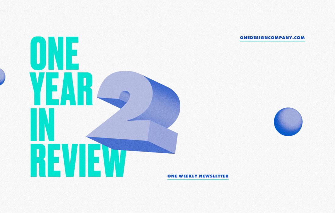
The “no navigation” navigation pattern works best for super small sites that are directing users to do one thing. It can work for a coming soon page or a thank you/recap style website such as the year in review page above. With just a handful of clickable items and a short scroll, it’s easy to figure out.
The simple animation in the design also helps. (You could arguably call it navigation because it encourages user movement). This can be a tricky pattern to say the least.
Single Page with Markers
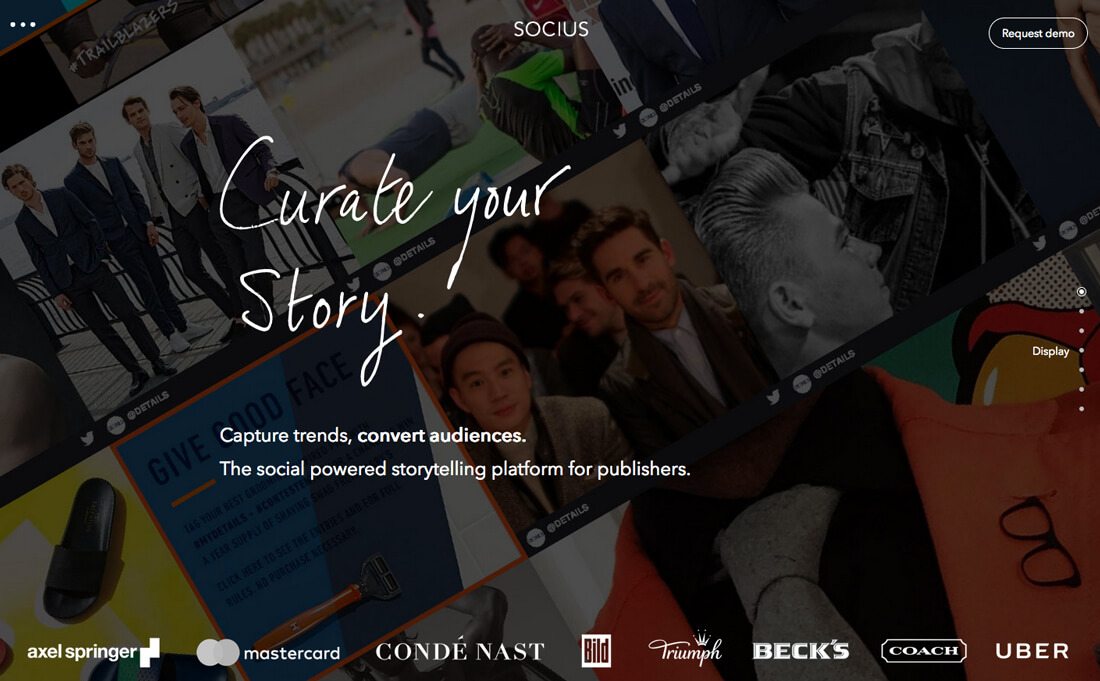
Many of the experimental navigation patterns in use are being deployed on single-page websites. And for good reason: It is a lot harder for users to get lost in the one-page format.
To provide direction and help users feel like they are making progress in the design, many of these one-page navigation patterns rely on markers. Just like the traditional slider format with a dot or bar to note progress, this navigation style uses that same concept.
Socius, above, does a very nice job of this with markers on the right side of the page that include hover text that tells users what each dot represents. (This is a feature that’s often lacking in with this style of navigation.) Users can use the hover effect and dots to jump to specific information or scroll through the seven “screens.”
The trick to this style of design is to make everything feel quick. Slick scrolling effects and a digestible design, as shown in this example, help guide users through the content.
Subtle Edge Nav
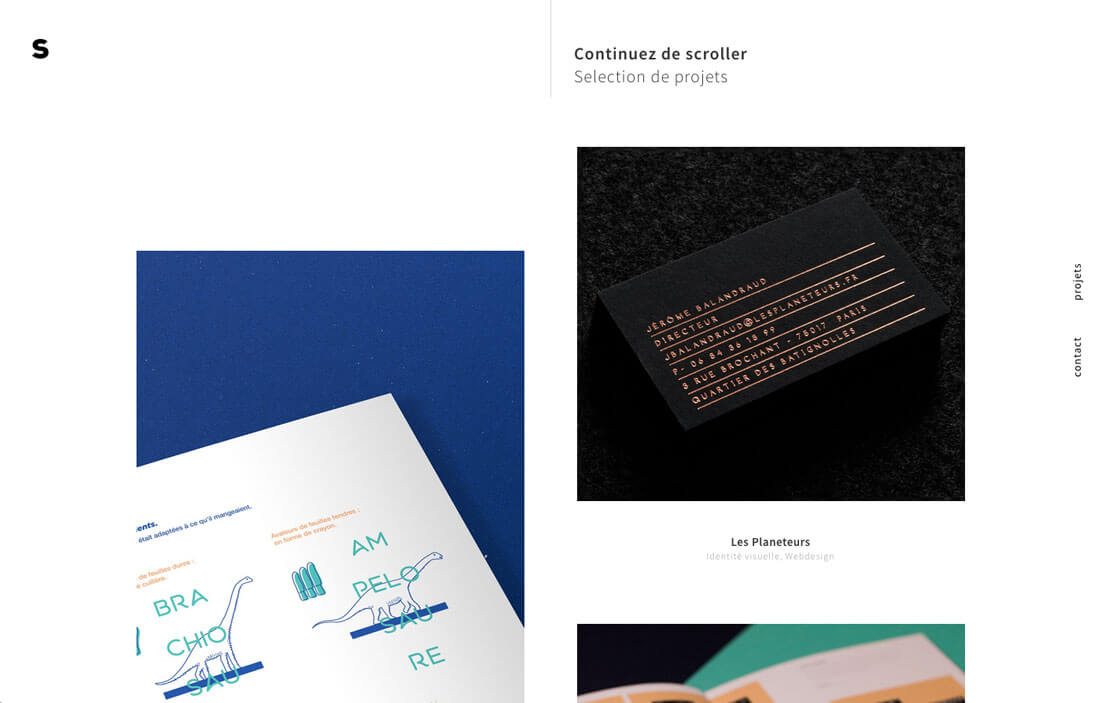
Some designers are turning navigation 90 degrees and anchoring it to the right edge of the page. It’s a subtle trick that is primarily for small or portfolio-style websites that is popping up more commonly.
Navigation elements in this style tend to be text only, include just a handful of items and are generally small. The rotated navigational text can point into or out of the design, based on other elements on the screen.
Just like with vertical navigation, this idea can change the overall aspect ratio of the design because a sliver is cut from the side for navigation. The worry about this style is that navigational elements are subtle and small, making them easy to miss.
Conclusion
Are you more of a traditionalist when it comes to navigation, or are you willing to try something a little different? Experimental navigation patterns are one of those trends that seem to be gaining traction.
As more designers try these kinds of techniques, users get accustomed to the change and adapt. But there’s always that worry about users that “don’t get it.” I’d love to know what you think about different navigation styles. Let me know on Twitter and tag @designshack.