How to Break the Grid Without Making a Mess
A grid is the foundation of almost any website design. These invisible lines help create rhythmic space and visual flow, so each project carries a sense of organization and harmony.
But you don’t have to stick to the grid 100 percent of the time. You can even break the grid from time to time without making a total mess. Here’s how you do it, while still keeping a website that’s a pleasure to use!
Understanding Grid Systems
Before you can break the grid, you need to understand why it exists. Regardless of what type of system you use, the grid is a fundamental part of the design process. Grids help you determine where to place elements, how elements might break or stack on different screen sizes and generally help keep things organized.
The grid is an invisible foundation that helps you design something that feels organized, clean and is easy for users to follow.
Designers have been using grids pretty much forever. Go back and look at old newspapers and books – text is lined up in columns. Even old writings on tablets include this harmonious structure.
Grids can do the following:
- Keep content organized and flowing. Users are used to elements that line up horizontally and vertically and follow that left to right (and back), top to bottom approach to reading.
- Make design work more efficient because you’ll just see where to place elements and the space between them.
- Help a website look consistent from page to page.
- Create just the right space between elements so the design remains uncluttered.
- Balance is less challenging. Follow the grid and elements will almost fall into place as you scale elements within the set parameters.
So why would you even think about breaking the grid?
Breaking the grid can add extra emphasis to a specific element. It’s one of those design rules that when sparingly broken can enhance the meaning of a project. When breaking the grid, it’s important to follow many of the other “rules” of design. (Use just this one trick to make the most of it.)
Create Layers
Layering elements allows you to move off the grid while maintaining unity in the design. Because elements touch and cross planes, they feel like part of the same unit.
This technique has gotten pretty popular recently, thanks to Material Design influences and more designers taking chances with elements on the screen. It can be tricky though; elements that overlap in some way must remain distinguishable in order to work effectively.
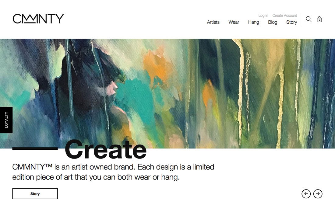
Cmmnty does this with a wide line and text, creating a sort of offset balance using typography and white space. You can almost see multiple tiny grids in the design, such as the navigation and alignment of text elements on the left, but no consistent pattern. This breaking of the grid is perfectly balanced and easy for the user to understand.
Design Purposeful White Space
One reason to move off the path of a grid is to create more white space with more emphasis in the right places. This might be to highlight text elements or branding or a stellar image.
One thing that is often mistaken for moving off the grid is odd alignments. While seamless alignment can be an integral part of using a grid system – horizontally or vertically – elements can be aligned while moving away from the grid.
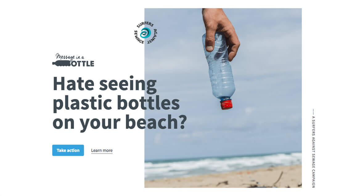
When breaking the grid to add white space, consider keeping everything else in alignment. It will help create an element cluster that draws the eye, such as the text and call to action from Surfers Against Sewage, with enough space that the element feels more important than others. The example above works wonderfully because the space helps draw users to the call to action.
Put Elements Inside a Container
When elements are contained in some way they feel together even when the grid is broken. This can include using a colored background, putting elements in boxes or layering text on a photo or video, such as the example above.
The nice thing about any container element is that it provides a cue to users that everything therein is related in some way. The elements link.
Going off the grid in a container-style pattern is a visually interesting way to break up what often ends up looking like a playing card. Many container-style designs end up with a perfectly symmetrical design; going off the grid is a surefire way to add spark to the design and break the monotony.
Play with Specific Elements
The best way to go off the grid is with a simple detail. If the whole design lacks a grid system, you’ll likely end up with a mess. (And that’s precisely what we are trying to avoid.)
Start with a background or accent element to draw attention. Cool swashes or interesting shapes are a good place to start. Consider adding a bold color as well to highlight the element.
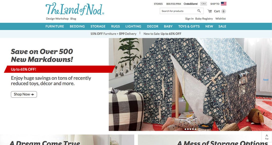
The Land of Nod does this effectively with thick angled lines to show users where great sales are throughout the website. These lines are sometimes contained within images and sometimes cross white spaces into images. The variance is visually interesting and ensures that the occasional grid-breaking is unusual enough to draw attention, but matches the rest of the design enough to feel like it belongs.
Move It Around
Use motion and movement to take elements off the grid, or maybe even just shift it a bit. Simple animations or elements that work in concert with video can make a grid appear less grid-like.
This concept works really well with designs that focus on a single element.
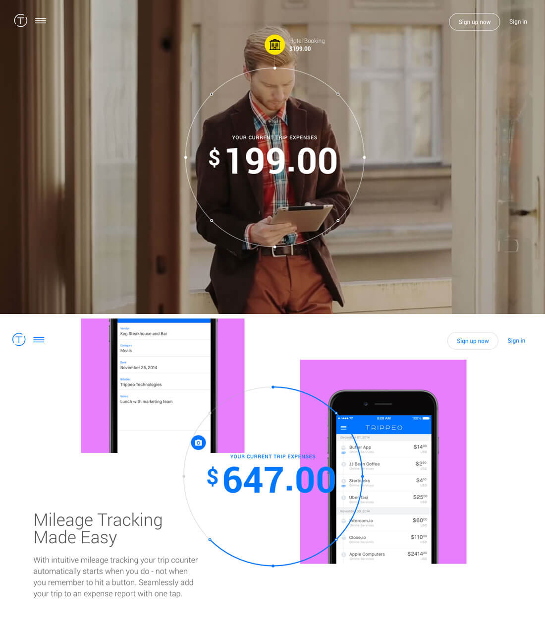
The emphasis of Trippeo, above, is the trip expense graphic. It does not change location throughout the site design. But everything else around it moves, from the video on the home screen to information about the app that zooms in using clickable parallax scrolling. This element holds together the rest of an off-balance, off-grid style design with modern whimsy and flair.
Create an Illusion of Breaking the Grid
You can break the grid without breaking it at all.
Use a small vertical grid to create interesting combinations of shapes and alignments while staying on the grid (even if it does not look like it).
The nice thing about not breaking the grid to create this type of design is that you retain all the benefits of a grid-based design while doing something that’s a little different. The best options often include designs that work in off multiples of the grid – three, five, seven, etc. – so that shapes never exactly line up, but always feel similar.
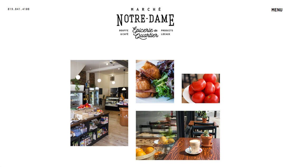
Marche Notre Dame, above, uses this concept to showcase images from its location. The off-grid, grid pattern is used vertically and horizontally to create a collage with just the right white space. This is a good way to break out of the same-old masonry patterns for photos that seem to be practically everywhere.
Conclusion
Breaking the grid is not always easy to do. Many times it can end up turning into quite the mess.
The best uses are applied to one page or set of elements to keep the design from getting out of hand. This is also helpful when thinking about responsiveness and how to deal with elements that might not fit well on smaller screens because you won’t have as many oddities to deal with.
Breaking the grid – when done well – can be a fun and engaging way to try something different.