How to Create Patterns in Design Projects
Think of how many patterns you follow in your daily routine. From waking up and getting ready for work to falling asleep each night, the day is filled with these small repeating elements that create order and calm. Patterns in design do the very same thing: These repeating elements can bring order to a project and create a sense of calm (or chaos) to set a tone.
That’s the true appeal of a pattern. It helps direct users through an aesthetic by following the pattern or series of objects and tells users how to interact with something. Designers can create patterns in a number of ways – with backgrounds, objects, color, words, panels or by using a combination of these elements.
What is a Pattern?
“An arrangement of repeated or corresponding parts, decorative motifs, etc.” – Collins English Dictionary
A pattern can include any fashion of repeating objects, words, colors or shapes. For design purposes, a pattern involves any elements where you can see some connection or repetition in the overall aesthetic. While many assume that patterns equate to ordinal and symmetrical arrangements, this is not always the case. Patterns can fall in any array; sometimes disorganization is the pattern itself.
Patterns can be recognized by any number of the senses. Visual patterns are often more chaotic than created ones. Natural patterns include spirals, waves, cracks and rotations. Almost any textile or perfect pattern is created specifically for visual harmony even if the basic shapes are derived from nature.
With Backgrounds
One of the first things that comes to mind when talking about patterns is backgrounds. Made popular by wallpaper (the home and desktop varieties), small or subtle repeating patterns are popular ways to add depth to the basic space in a design project. Some designers do opt for bigger or bolder background patterns as well, although this is not as common. (To much activity in the background can distract from the message in the foreground.)
So what are some common techniques for creating an appealing background pattern?
- Simplicity: Simple background patterns are effective and add depth without users actually focusing on that aspect of the design. The best backgrounds fall into the scenery, per se, and serve only to highlight the main part of the design.
- Logos: For many brands, small repeating logos are a common background style. (Although there are quite a few that go oversized with a background logo as well.) Repeating logos can help establish brand connection.
- Neutral palette: Color is one of the most common factors in background design. And neutral palettes are overwhelmingly dominant. Even with the trend of using blurred images for backgrounds – which is very popular right now – color and shapes are blurred to the point of neutrality, where objects and colors just blend into each other.
- Symmetry: Background patterns often fall into ordinal shapes. With repeating elements, the pattern could often be shifted, titled, reversed or altered in any number of ways and still have the same overall look and feel.
- Repetition: Repeating objects are also popular in background patterns. This simple technique can add depth to an otherwise flat schema.
By Grouping Objects
Similar shapes and objects almost seem to fall in line with each other when used in close proximity. While the obvious choice for grouping objects for patterns is to group objects of the same shape and size, that’s not always necessary.
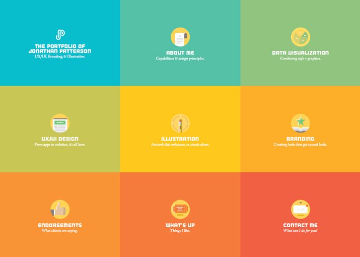
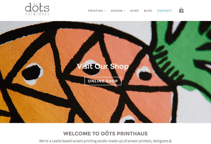
In the images above, Jonathan Patterson’s portfolio creates an obvious pattern with nine identically shaped boxes that contain shapes of the same size. The pattern is clear and appealing. The pattern use in the image for Dots Printhaus is less “perfect” but just as obvious, with a set of similar shapes in varying sizes.
This goes to show that objects can be grouped in different ways but still create a sense of pattern:
- Similar shapes
- Varying shapes in similar sizes
- Shapes arrange to create an object
- Shapes connected by lines or other elements
- Shapes with similar number of points or ends
By Repeating Color

Pattern can be established by creating a theme with color. This includes objects or elements of the same color or even working with elements that have similar color “feels,” such as saturation, lightness or hue. Color patterns are often used to tell users what to do with a design. In website design, for example, it is common for all clickable buttons to be a single color. This creates a pattern aesthetically and for user behavior (i.e. you click everything that’s red).
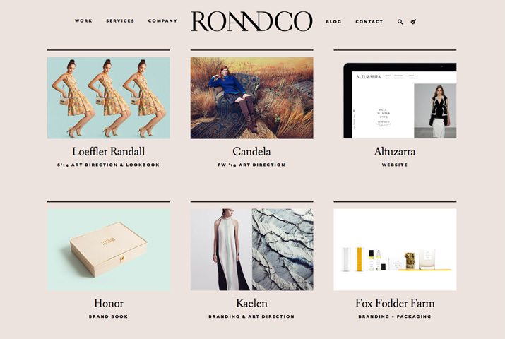
In the examples above, color is used in distinctly different ways. Brand Aid Design uses color to distinguish elements and to create a pattern with icons of varying shapes and sizes. Ro and Co uses color for a background and the same color tone for smaller images throughout the site. This color connection ties each of the smaller images to the overall design in a pattern that has no symmetry and very little obvious distinction.
Use color to create patterns to:
- Establish connection among objects
- Create a sense of how to use a design
- Set a visual tone
- Add a pattern where none might exist otherwise
- Draw users from one object to the next
With Repeating Words
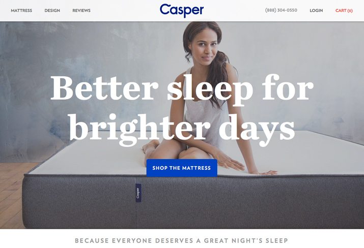
Repeating words can create a visual or audial pattern. By seeing the same word over and over you will start to connect it to the design or message. (The Casper Sleep site, for example, uses the word “Sleep” twice in a design that contains less than 20 words. It also uses the brand name twice.)
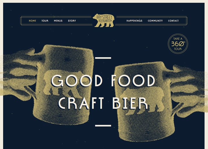
Bay Street Biergarten does something similar, but plays on you reading the site out loud. The repeating image of a bear and connection to beer glasses and words “craft bier” all start to play out the same pattern. Every element in the design says beer. (Clever, huh?)
Use words to create patterns in other ways as well:
- Repeating words or phrases
- Words that have a similar look (lots of the same letters)
- Words and images that say the same thing
- Multiple words that have the same meaning
- Words of similar length (such as many long or short phrases to create rhythm)
With Similar-Sized Panels
Design trends such as card-style projects or parallax scrolling websites have made way for panels to create patterns in design projects. From groups of cards to Pinterest-inspired tiles to scrolling “screens,” groups of panels create obvious patterns for users. These panels establish differences and connections between objects and let users know about changes in the information they are seeing.
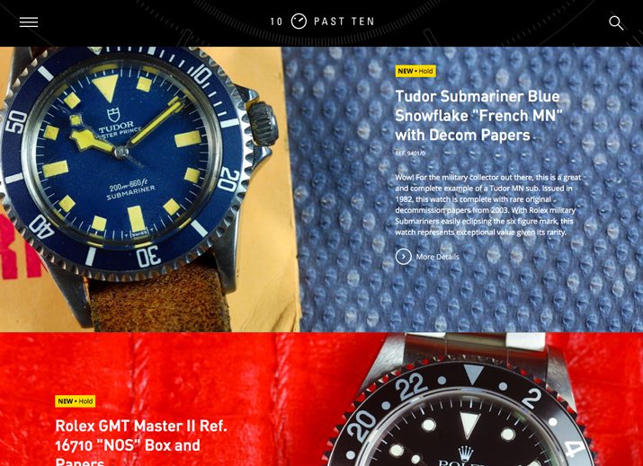
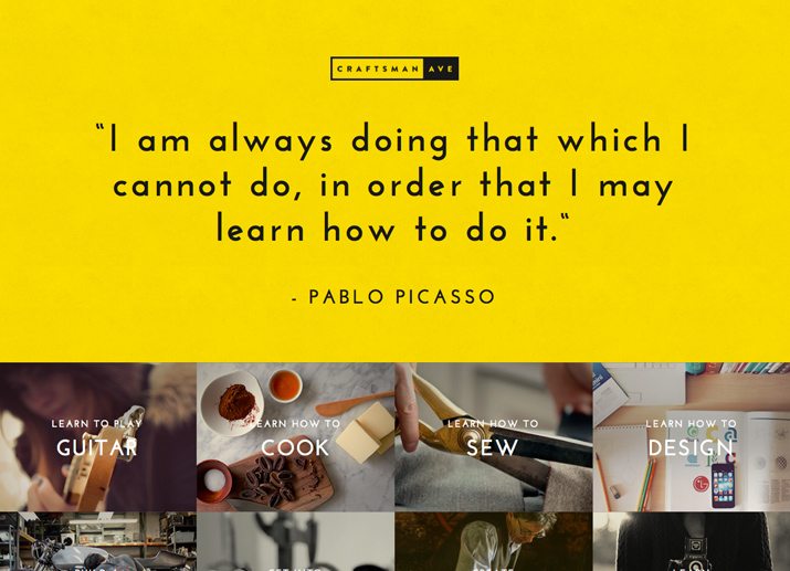
These panels can be of any shape and size, vertical or horizontal, and of varying colors. The 10 Past Ten website does a great job of establishing distinct panels in a parallax framework with color and product positioning so users can clearly distinguish one idea to the next. Craftsman Ave. takes a slightly different approach with a design that features a large panel, followed by panels inside of panels, in an alternating fashion for a pattern in pattern style.
Use panels to:
- Link like elements
- Set scenes
- Create a flow of information
- Establish dominance using multiple images
- Tell a visual story
Conclusion
Patterns can be designed in a number of ways for varying impact. Create patterns that work with the tone you want a project to have. Symmetrical groupings are organized and calming, more randomly paired elements can feel disruptive and excited.
Don’t feel like you have to stick to one type of pattern. Mix and match varying types of patterns for impact in different places. Different parts of the same project may include different types of patterns in different locations. (And that’s totally acceptable.)