Popular Web Design Trends in 2011: Over 50 Inspiring Examples
December is here and it seems we’re finally wrapping up 2011. It’s been a year filled with new and exciting forefronts for the web. CSS3, HTML5 and responsive design were at the top of the most-discussed topics. We also mark the passing of the old ways. Flash, Silverlight and similar proprietary plugins received an all out assault in 2011, one that they may never recover from.
To end the year with an informative retrospective, we’ve scoured the web in search of patterns and trends that emerged or became increasingly popular throughout 2011. Follow along as we examine over fifty websites in an attempt to spot similar tricks and themes. I guarantee it’ll be difficult to read without spotting a few trends that you jumped on in your own projects this year!
Top Trend: Responsive Design
In 2010, Ethan Marcotte coined the term Responsive Design and wrote an enlightening and persuasive article about it on A List Apart. By mid 2011, Responsive Design had completely taken off as the hottest new trend in web design.
This is no mere style fad like the others on this list, it’s a new approach to creating content on the web aimed at creating the best possible experience for the maximum number of devices. While some designers wave this idea off as extra work, an ever growing number go so far as to say that if your site isn’t responsive, you’re doing it wrong.
Here on Design Shack we’ve been no stranger to the topic of responsive design this year, here are a few of the articles we’ve posted on the topic:
- 20 Amazing Examples of Using Media Queries for Responsive Web Design
- Practical Design Considerations for Responsive Sites
- How to Build a Responsive Frankenstein Framework With LESS
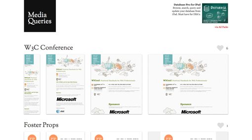
I could easily provide you with over a hundred examples of responsive designs that have cropped up this year, but plenty of others have already been hard at work for months gathering such collections. My current favorite responsive design gallery is Media Queries, which has over 200 examples!
Responsive design definitely stands out as the design trend of 2011, but there are some other, much smaller trends that are worth taking a look at as well. The following represents a few that I’ve noticed.
Dashed Lines
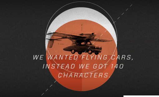
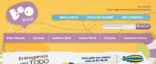
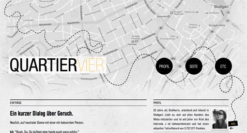
Dashed lines received growing attention from designers in 2011. Though occasionally straight, the more typical use case is a winding, meandering path that draws your attention and leads it where the designer wants you to go.
I’ve mentioned this trend in several articles this year as a great way to achieve a resemblance of order in an otherwise organic design. It provides the perfect way to turn chaos into an easily followable line of thought.
Founders Fund
Yes!

Boo Bebe
Quartier Vier
AskLela.org

Circles
I hesitate to mention this one simply because I’m not sure you can ever refer to a basic shape as a design trend. After all, circles have always been present in all types of design and always will be.
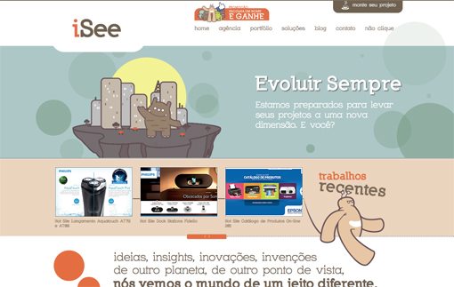
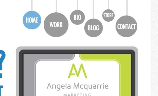
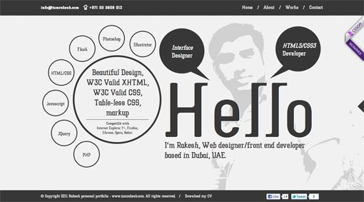
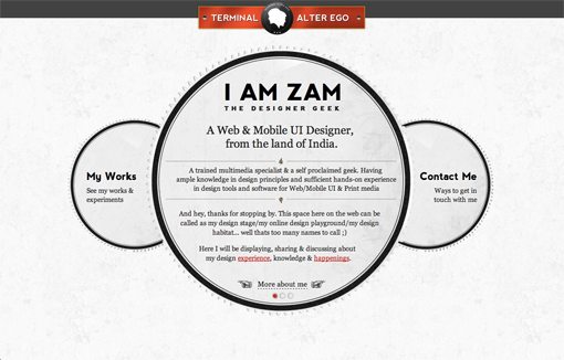
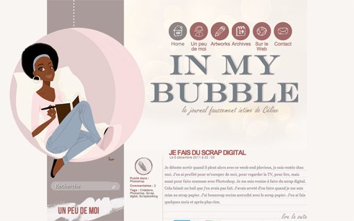
Nevertheless, I definitely noticed an increase in the use of circles as primary design elements. It’s very evident that many of the designers below intentionally chose circles as the crux of their theme and built off of that simple but elegant idea. The result is often fairly organic in nature but as you can see below several of the designs are still quite structured and use circles arranged in a straight line simply as an alternative to the age old rectangle thumbnail.
Carnette
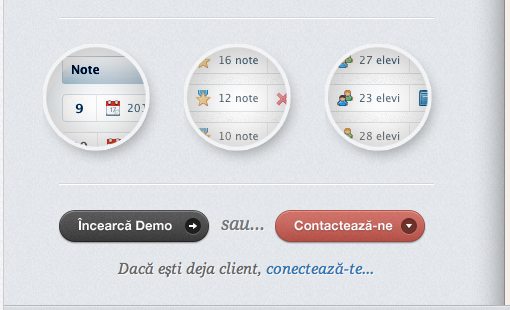
Lisi Design
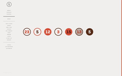
Pistachio Sketching
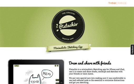
TaosPuso Foundation
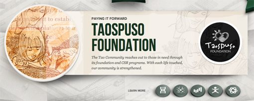
English WorkshopLanguage Learning

Air Protect

Agência iSee Interactive Group
Decode

Sleek Design
Rakesh
I AM ZAM
In My Bubble
Clean, Sophisticated Retro Type
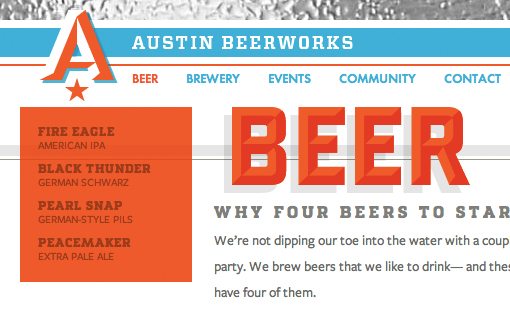
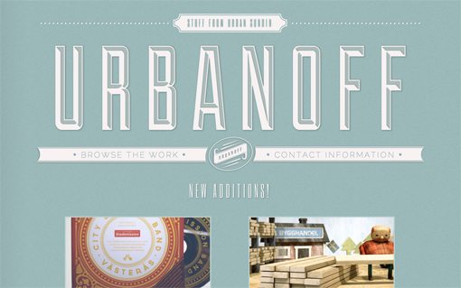
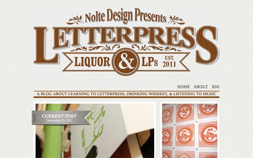
I’m beginning to think that retro is a trend that will never die. We’ll always look back at design styles from bygone eras with interest and nostalgia. The really interesting revelation though is that modern and retro design styles actually evolve together.
In years past, retro designs and specifically typography often involved a very grungy, distressed look like what you’d expect to see on an Old Navy t-shirt. However, as clean, minimal designs began to take hold in modern design, retro design made a similar leap into sophistication. These days retro typography is classy and clean with no distressing. Shadows are almost always present and completely void of blur, many are comprised of diagonal lines or some other simple pattern as opposed to a solid color.
Big Bite Creative

Beerworks
Urbanoff
Noltedesign
Ribbons
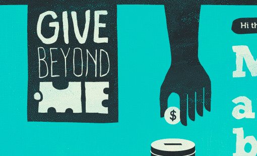
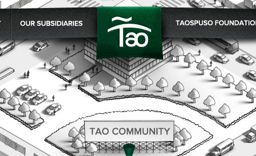
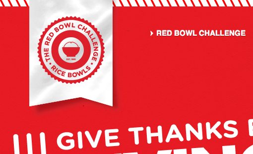
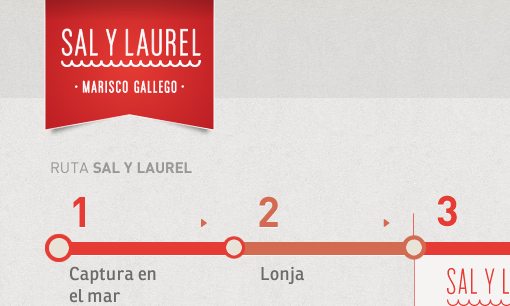
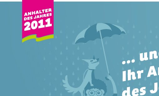
The single most important design element in 2011 has to be the vertical hanging ribbon. This thing popped up absolutely everywhere as a nicely integrated way of holding a logo, icon or some text while helping it stand out from the background.
The typical shape has two triangular points at the bottom, but designers have experimented with all manner of ribbon metaphors. One example below even takes a familiar ribbon shape and gives it an unexpected twist by turning it into a shirt pocket.
Change Nation

GiveBeyond.Me
Tao Community
Red Bowl Challenge
Marisco Gallego a Domicilio
LoadUp 2012 by PuddleDrop

DigitalSafe

Anhalter des Jahres 2011
Goatee Joe

Jopp

Sunday Best Websites

HarryFord
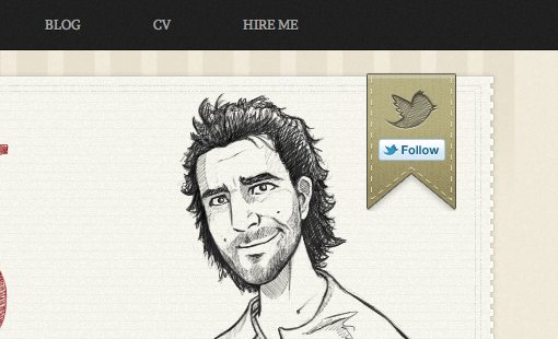
Kitchen Sink Studios

Three Things
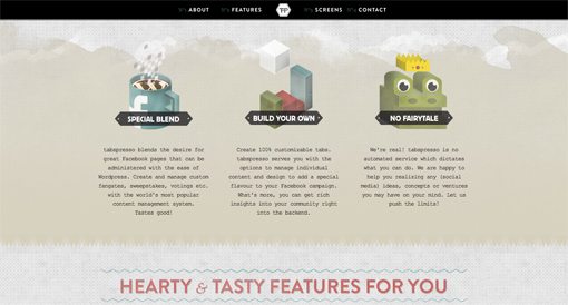
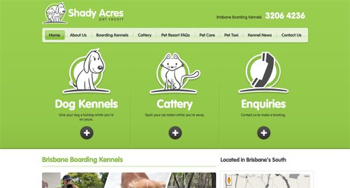
Every designer knows that three is a magic number and this was very evident in web design this year. A very popular layout technique that you see again and again uses three prominent sections or objects to convey a process, list of features, or other concept.
I really like this trend because it forces designer to simplify the information presented to the user and divide it up into a few easily digestible chunks. The result is often a very attractive page that seems both informative and well balanced.
Tabspresso
Treehouse

Shady Acres
Sellfy.com

Curled/Folded Paper
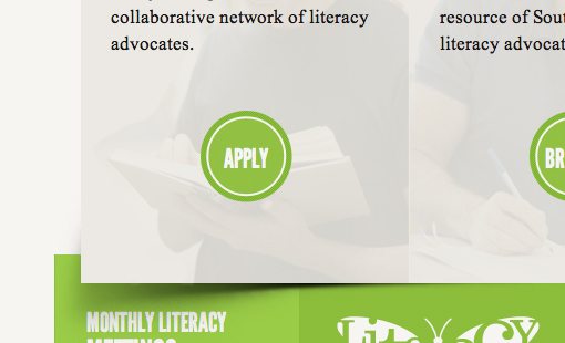
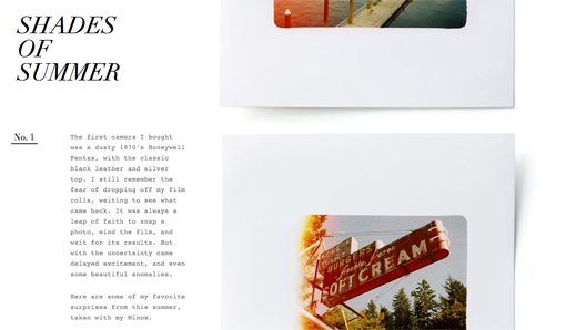
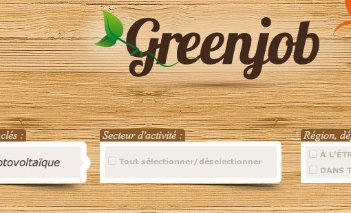
The drop shadow has evolved. This design trick uses a simple illusion of a curved shadow to make the otherwise flat object above it look like curled paper. It’s such a believable little lie that even when you know what’s happening, it’s hard to make your eyes see what is really a straight edge. The shadow instantly makes your brain perceive a curve, no matter how straight you know it to be.
It’s an easy effect to pull off in either Photoshop or even CSS. Here are a few pages that use this trend effectively:
Literacy2030
Edits Quarterly
Greenjob
Borderless Grids
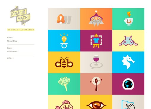
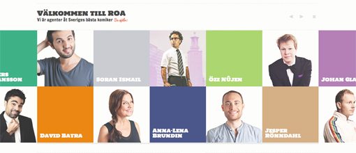
Another increasing visual trend is the disappearance of borders or margins on a grid of images. Historically, we more often than not lined up images in a nicely spaced grid but these days it’s quite popular to simply cram them all together.
I really like this look as it gives the separate images a very integrated feel. It’s an example of synergy at work where the whole is something greater than the sum of the parts.
Fuzzco
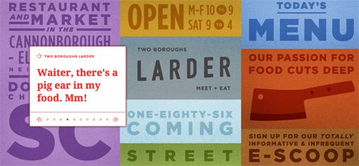
Ignacio Macri
CARLOS5TO

ROA Produktion
Diagonal Design
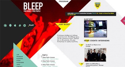
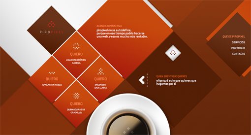
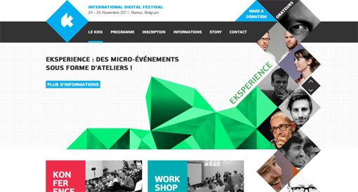
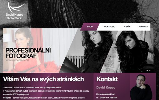
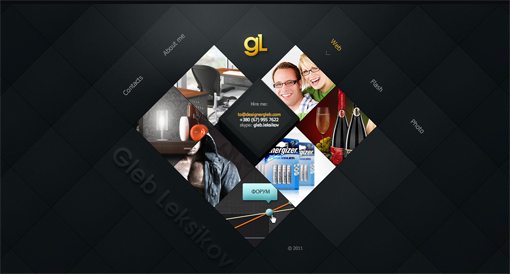
Our final design trend is the emergence of fairly chaotic looking designs that heavily leverage diagonal lines. Expect to see this design trend continue into 2012. Why? Because it represents a sharp turn away from the clean, heavily structured, minimal designs that have permeated the web design landscape for the past few years.
Looking back through history, you can clearly see that design trends are reactive. Something becomes cool because it’s different than the norm, then it becomes so popular that it is the norm. What was once rebellious is now commonplace, so someone comes up with a response that represents a clear departure. For instance, the minimal fad that I just mentioned arose as a response to the overly crazy, messy, and colorful design of the 1990s (see: Saved By the Bell). The current diagonal trend harkens back to these days while still maintaining an attractively sophisticated feel.
Bleep-Radio
Piropixel
Kikk Festival 2011
David Kopec
Marshes Shopping Centre

Wixel

Designer Gleb
What Did We Miss?
This represents only a handful of the many popular web design trends in 2011. Now it’s your turn to help out. Leave a comment below and tell us about any trends that you noticed or even took part in during the year.
Which trends were your favorite? Which did you hate? If possible, leave a link and show us an example!
