Sticky vs. Dynamic Navigation: Which Improves Engagement?
Navigation is one of the most important elements in web design. It’s how users explore your content, interact with your brand, and ultimately decide whether to stay or leave.
But as websites have evolved, so have the ways we design navigation. Two approaches in particular, sticky and dynamic navigation, have become common in modern interfaces.
Both styles aim to make the user experience smoother, but they take different paths to get there.
Sticky navigation keeps key links always visible, no matter how far you scroll. Dynamic navigation changes as the user interacts, creating a cleaner and more adaptive experience.
So, which one actually drives better engagement? And how do you decide which is right for your site?
In this post, we’ll break down the pros and cons of each, look at where they work best, and help you choose a navigation style that supports your content, your audience, and your goals.
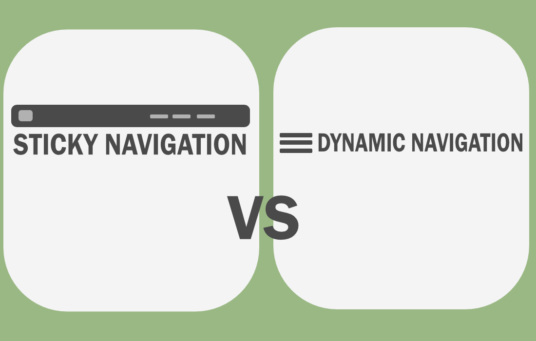
What Is Sticky Navigation?

Sticky navigation refers to a menu or header that remains fixed at the top (or side) of the screen as users scroll down the page.
It “sticks” in place so the user always has access to key links or actions, no matter how far they scroll.
This type of navigation is especially useful on content-heavy pages where users might scroll for a while before needing to jump to a new section.
It reduces friction and keeps important navigation elements easily accessible.
In short, Sticky navigation stays visible at all times, offering constant access to links or tools. It’s more static but always available.
Benefits of Using Sticky Navigation
Sticky nav can improve the overall user experience, especially on long pages or resource-heavy websites.
Here’s why:
- Keeps key actions, like “Contact” or “Sign Up”, always within reach
- Reduces time spent scrolling back to the top
- Improves usability on mobile, where screen real estate is limited
- Increases visibility of important links, which can improve conversions
It works especially well for e-commerce sites, blogs, dashboards, and landing pages with one long-scroll format.
What Is Dynamic Navigation?
Dynamic navigation changes based on user behavior or the content being viewed. It may appear, hide, shrink, or expand depending on how the user interacts with the page.
For example, a navigation bar might hide as the user scrolls down and reappear when they scroll up, or it might shift in style or content based on the page being viewed.
Dynamic navigation is often more interactive and tailored to the user experience. It responds in real-time, creating a sense of flow without taking up too much screen space.
In other words, Dynamic navigation adapts to the user’s movement or context, making the experience feel lighter and more responsive.
Benefits of Using Dynamic Navigation
Dynamic nav feels modern and user-aware. By adjusting based on behavior, it gives users space to focus on content while still offering guidance when needed.
- Reduces visual clutter and gives more space to the main content
- Creates a sense of motion and interaction
- Can guide users based on where they are in their journey
- Feels more polished and aligned with progressive web design trends
It’s a smart choice for portfolios, creative agency sites, product pages, and content platforms where immersive experiences matter.
Sticky vs. Dynamic Navigation: Which Generates Most Engagement?
Both sticky and dynamic navigation have the potential to improve engagement, but in different ways.
The key lies in understanding your users’ behavior and what kind of experience you’re trying to create.
Sticky navigation tends to boost engagement by increasing accessibility and reducing friction.
When users always have access to the main menu, CTAs, or search bar, they’re more likely to explore deeper pages, complete actions, or stay on the site longer.
For example, an e-commerce site with a sticky cart button makes it easier for shoppers to check out quickly.
On a SaaS landing page, a sticky “Get Started” or “Book Demo” button keeps the conversion point visible at all times, gently encouraging users to take action without forcing them to scroll back up.
“Website users spend an average of 6.44 seconds focused on the main navigation menu” – Forbes
Dynamic navigation, on the other hand, creates a smoother, more immersive experience. It feels less intrusive, allowing users to focus fully on the content or storytelling.
This can lead to higher time-on-page and stronger emotional engagement, especially when paired with beautiful visuals or interactive content.
Users are free to scroll, explore, and absorb information without being distracted by fixed UI elements. When the navigation reappears at just the right moment, like when scrolling up, it feels responsive and intentional, guiding users without overwhelming them.
Ultimately, it depends on the type of engagement you’re measuring. If you’re aiming for task completion, conversions, or quick decision-making, sticky navigation tends to perform better.
If your focus is on content absorption, brand perception, or user satisfaction, dynamic navigation may offer a better fit.
Which Navigation Style Should You Use?
Choosing between sticky and dynamic navigation often comes down to what kind of experience your website is offering. Both styles can be effective, but they shine in different scenarios.
When to Use Sticky Navigation
Sticky navigation is especially effective on websites where users need constant access to tools, categories, or actions. These sites often have long pages, high interaction rates, or conversion goals that benefit from always-visible navigation.
E-commerce Sites: Sticky menus help keep product categories, search bars, and shopping carts visible as users browse. This makes it easier for shoppers to explore more products and check out without unnecessary clicks or scrolls.
SaaS or Product Landing Pages: Many software and app websites use long-scroll formats to walk users through features, benefits, and testimonials. A sticky header with a persistent CTA like “Get Started” or “Try Free” ensures the conversion path is never out of reach.
Blogs and Publications: Sticky nav can help users jump between sections, topics, or categories while reading. It also keeps the brand, search, or share buttons accessible, improving engagement and session duration.
Multi-step Forms or Wizards: In signup flows or onboarding processes, sticky progress bars or help buttons guide users through each step while showing where they are in the journey. This reduces drop-off and improves completion rates.
When to Use Dynamic Navigation
Dynamic navigation is a good fit for websites that prioritize immersive content, modern aesthetics, or storytelling. These sites often use animation, video, or large visuals that benefit from minimal UI interference.
Creative Portfolios and Agency Sites: Designers, photographers, and agencies often use dynamic navigation to let their work shine. A nav bar that hides on scroll and reappears subtly helps keep attention on the visuals while still offering navigation when needed.
Editorial and Story-Driven Pages: When the goal is to draw readers into a narrative—like long-form articles, documentaries, or campaign storytelling—dynamic nav stays out of the way and lets the content take center stage.
Homepage-First Experiences: Brands that use fullscreen visuals or intro animations on their homepages benefit from dynamic nav that fades in after a scroll or interaction. This creates a more seamless first impression.
Mobile-First Interfaces: On mobile, screen space is precious. Dynamic nav bars that appear only when scrolling up, or that collapse into icons, help maximize usable space while still keeping navigation accessible.
Conclusion
Sticky and dynamic navigation both have their strengths.
For many websites, the answer lies in blending both approaches. Sticky headers that shrink on scroll, nav bars that hide and reappear, or context-aware menus can give users both convenience and focus.
Whichever style you choose, the goal is the same: make it easier for users to find what they need and take the next step, without making them think too hard to get there.