Design Trends: When to Use Them + When to Ignore Them
We showcase a lot of design trends here at Design Shack. Not only is it fun to look at examples of new work, groundbreaking projects, and things that are growing in popularity, but it can also serve as a bit of design inspiration.
You can use trends to determine if your projects look modern, classic or just plain dated. But design trends aren’t for everyone all the time. That trend that looks amazing for one brand or project might be a disaster for another.
So how do you know when to use design trends (and when to just ignore them altogether)? Here’s your primer!
What Makes Something a Trend?
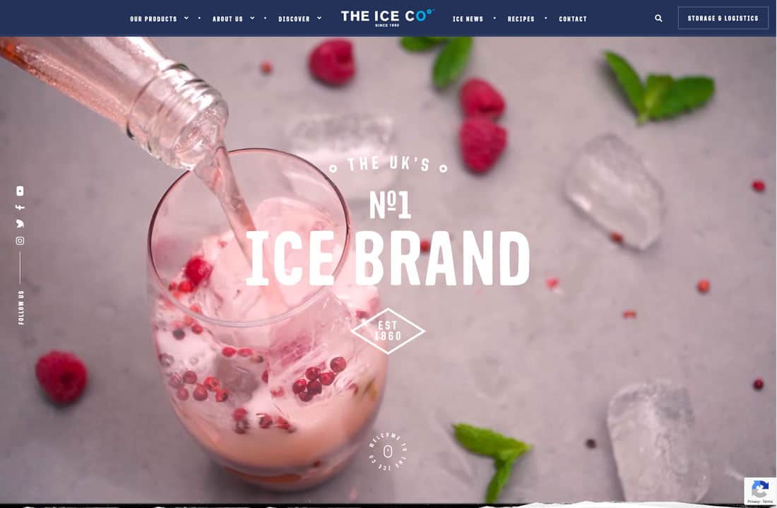
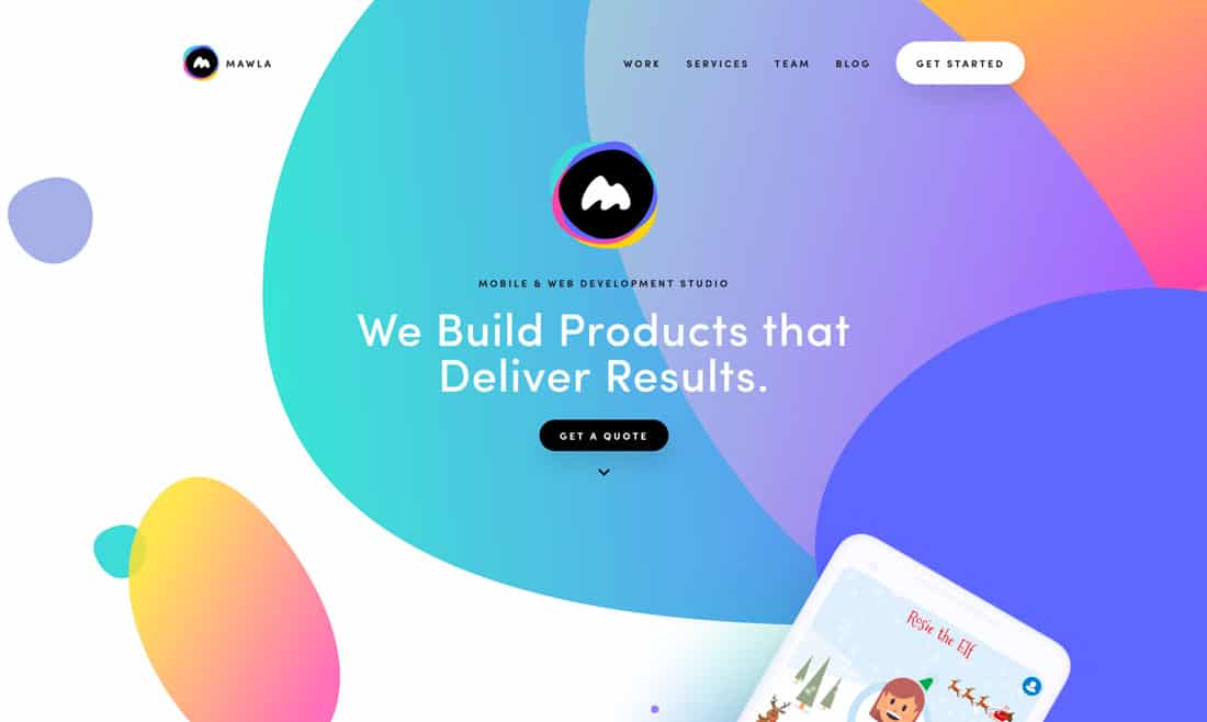
We talk a lot about trends, but how do you know when something is trending?
A trend is a distinct change – one that’s noticeable, such as designers using more gradients or hamburger icons for menus – that can happen suddenly or over time. Sometimes a trend happens without you even realizing it until it’s everywhere. (That was the case with gradients which seemed to pop back into designs almost overnight after flat obliterated them for a short time.)
Forbes cited three things that can make trends:
- Striking an emotional chord
- Empowering social influence
- Channeling cultural relevance
The big thing with trends is that they actually have influence. Say Apple shifts from a minimal website tomorrow or Google decides to use color, rather than a white background. And imagine for a minute that both companies use orange backgrounds. It’s highly likely that others will start to follow these leaders, and a trend is born.
But it’s not always that obvious. It doesn’t always start with a big company. Sometimes it starts with one cool project and then someone else puts their spin on that design idea and so on.
Browsing through design galleries, you can almost pick out the elements that are trending. You might notice things like multiple designers using oversized typography or a certain color or style of animation. That’s a trend.
And they are everywhere.
Sometimes they last – minimalism is one of those classic styles that trends and fades and trends and fades. Others – think long shadows or ghost buttons – are gone almost as quickly as you start to notice them.
The trick to using trends well actually happens before you ever start designing: It’s deciding when to use trends and when to skip fads altogether.
When to Use Design Trends
Using design trends isn’t as simple as just picking something and redesigning.
You need to use a trend that works with your brand and the content on your website. Bright colors, for example, have a certain mood and might not be appropriate for a super serious website. It’s important to pick a trend that fits seamlessly into the design elements already in place or with the content on hand for redesigns.
Consider a design trend if:
- It adds to the overall aesthetic
- It enhances usability
- It creates a better visual flow
- It’s a style that appeals to you
- It makes your content easier to understand
- It matches the voice and tone of your brand
- It better shows users what to do and how to interact with the design
- It adds a modern feel to a design that’s a little stale
- It is a landing page or single page design for a timely event or project (that way it won’t look dated
When to Ignore Design Trends
Some design trends are almost made to be ignored. The reason many trends first pop up on portfolios (in website design) is that they can often be unusual and somewhat risky.
Many trends take a chance by breaking design rules or trying something a little bit unusual.
Sometimes they pay off big time and become a “thing.” Other times, these trends rise for a short period and then fall away again. Portfolio sites are often easy to adjust – there’s not a lot of corporate branding or cost to consider – making it a great place to look at trends and changes in what’s popular among designers.
But some of these trends you can (and should) ignore. Stay away from a design trend if:
- You don’t have a specific reason to make a change; it’s “pretty” or “someone else is doing it” isn’t justification
- It doesn’t match the tone of your brand or design
- It seems difficult to read to understand
- It is too loud, busy or impractical
- Uses too many resources, from bandwidth to space on the screen
- It doesn’t translate well between devices for website design
- It offends anyone on your team
- It hinders the ability to use the design or impacts overall page traffic and interactivity negatively (pay attention to analytics!)
Bonus: Design Trends We Love in 2019
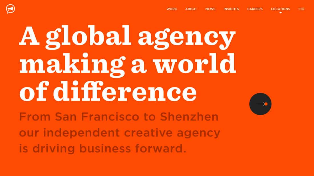
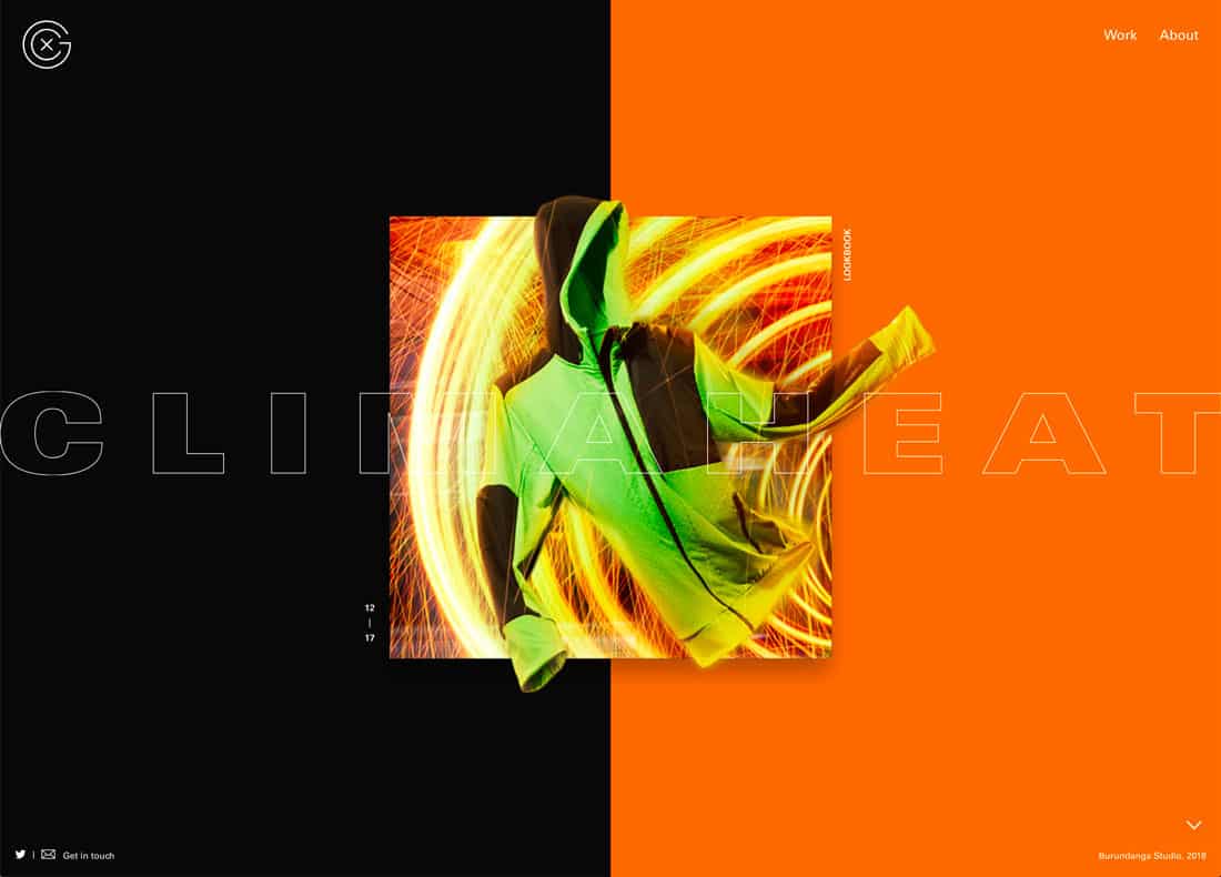
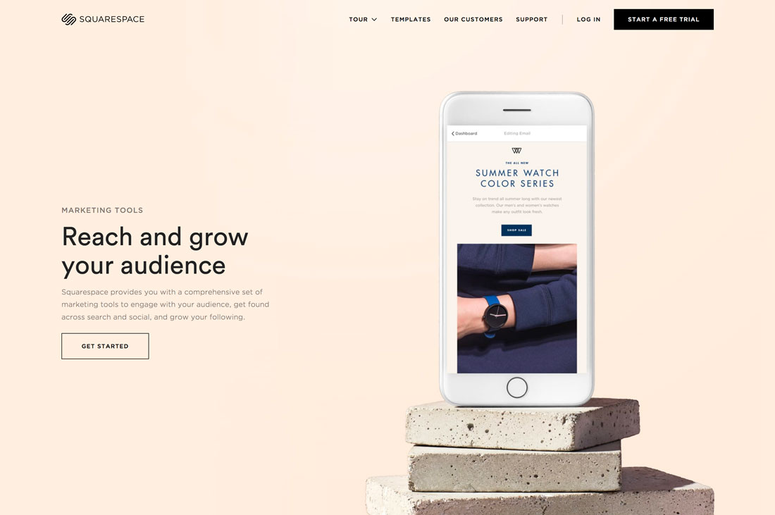
There are plenty of super cool trending things happening in design this year. Here are a few of our favorites, with links to where you can find even more website and graphic design trends.
- Serifs: From short, simple serifs to elaborate lettering with longer strokes and tails, this type is designed to be read. Serifs are classic, have a traditional feel and seem to ooze with personality.
- Split Screens: The pairing of elements helps drive users across the screen to take in everything in front of them. It’s a great solution for creating a this-or-that option for users.
- Three-Dimensional Still Life Elements: Imagery has gotten both more authentic and more staged. This trend is somewhere in the middle with product placements or images that are “staged” on a background. These elements can be real or created.
Conclusion
When it comes to design trends, whether to jump in or hold back is the same as with any other design element. Ask yourself if it is right for the project. Will it make this design better?
If the answer is yes, go for it. The worst thing that can happen is a trend can go flat and you have to adjust later.