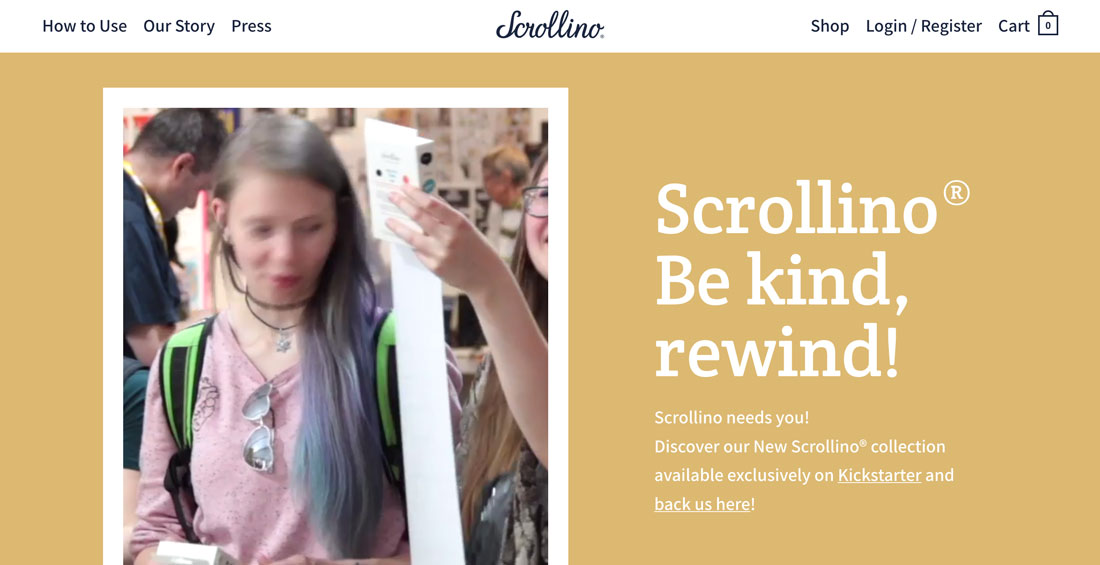
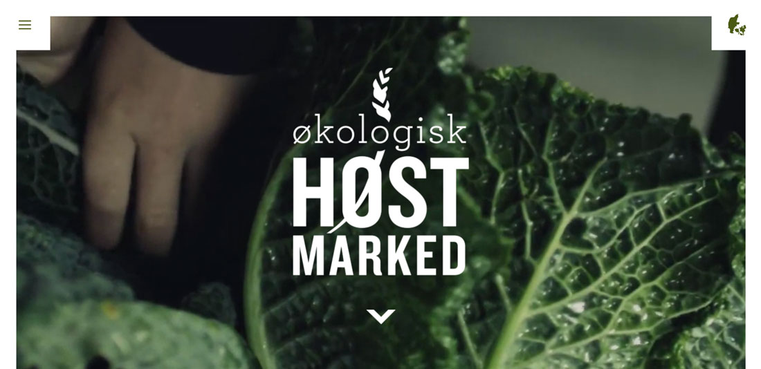
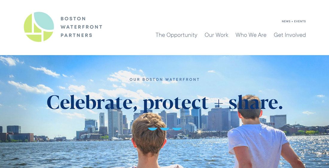
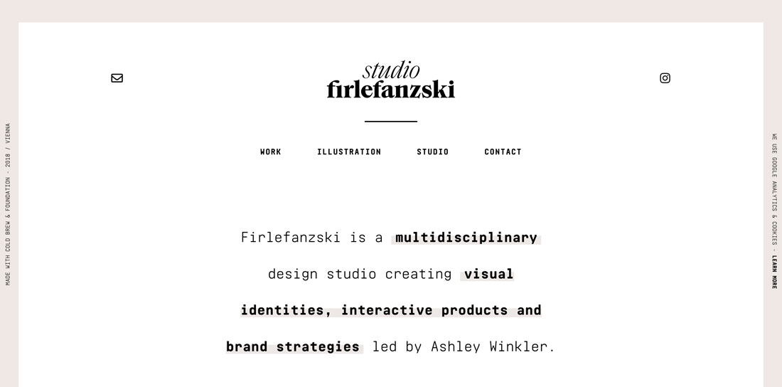
Choosing the Best Logo Fonts: 10 Tips & Examples
The font a brand selects for their logo can evolve into lettering that people identify with a company or product. Just think about the typefaces for Coca-Cola, Disney or even eBay. Even if you see those typefaces without the brand names, there’s still an immediate connection.
That’s the value of choosing the best logo font for your brand. So how do you do it?
Here are ten tips to help you choose the best logo font you can with examples of logos that feature amazing typography.
1. Match the Font to Your Personality
When browsing fonts for a logo design, it’s important to find a typeface that matches the personality of your brand.
As a general guideline, you can start by picking a type category:
- Serif: Class and traditional
- Sans serif: Modern, simple
- Script: Feminine (most commonly), elaborate
- Novelty: Funky, unusual
2. Avoid Trendy Fonts
It’s best to avoid super trendy typefaces when picking a logo font. Chances are that you will want to use the words in your logo for quite a while.
A trendy logo font can make a design look dated or lose its “trendy” appeal quickly.
If you want something with a more modern flair, opt for a font that’s had some longevity in the trend space. Better yet, pick a typeface with characteristics that you like from something trendy, but without using that exact font.
3. Consider a Custom Design

There are some iconic brand fonts that were created just for the company they represent. If you have a nice budget and plenty of time for a bit of custom work, this can be a great option.
A custom font for a logo is something that’s completely yours. You won’t have to worry about other brands using the same thing. And if you find the right fit in a typographer they can create a character set that represents your logo vision.
This can be a worthwhile option although it’s not practical for everyone.
4. Make It Special

Even if you can’t commission a completely customized logo font, look for a typeface with special characters or glyphs to give lettering a more personal flair.
You can also try techniques such as filling letters, changing the stroke or design of a letter to customize a typeface for your logo.
There are plenty of great character sets out there as well with special elements as part of the font package. Browse sites such as Typekit (part of your plan for Adobe Creative Cloud users), MyFonts, FontSquirrel and Typewolf to see plenty of fonts to help imaging your logo.
5. Try It in Color and Without

A good logo font should be versatile enough to work well in both color design uses and without color.
Once you have a typeface or two to try, start with your logo lettering in black. Do you like what you see? If so, then move on to a color option as well. If you don’t like the single color logo font, keep trying other options until you find one you like.
Remember, you’ll probably end up using a single color logo font almost as often as color. So it’s important to be equally happy with both options.
6. Keep It Simple
You don’t need a crazy, elaborate or insanely unique logo font to be effective. The best option is probably one that’s the most simple and easy to read. (You want people to know your company or brand name, right?)
Go back to that Coca-Cola font. Even though it is a custom script, it’s extremely easy to read and understand. That’s how you keep it simple.
7. Create the Right Emotional Connection
Choosing a logo font is more than picking out pretty lettering. It can establish the emotional connection users have with your brand, product or service.
When choosing the best logo font, thinking about the emotional connection it will set is important. Here are a few common guidelines to think about:
Positive Type Associations
- Serifs with thin strokes
- Rounded lettering
- Novelty typefaces
- Long tails or flourishes
- Fancy scripts
- Open lettering
- Modern typefaces
Negative Type Associations
- Thick strokes
- Harsh strokes or lines
- All caps (although becoming less common)
- Messy handwriting or shaky strokes
- Ransom lettering (using mixed typefaces)
- Tight lettering
- Blackletter or old-style type styles
8. Research Your Competitors
The last thing you want when picking a logo font is to choose something that looks just like another company that does the same thing. Do your homework.
Pay attention to the style and type of fonts that your competitors use in their logos. While you might opt for a sans serif logo font just like a competitor, it is important to pick a different font.
You don’t want people to confuse your brand with theirs.
Even using a font of the same style provides plenty of opportunity for picking out something different that represents your brand.
9. Quality Matters
Don’t just settle for any old font for your logo design. Quality matters.
You need a high-quality font that will render sharply and crisply at any size. The words in your logo might be tiny on a business card or social media icon or larger than life on a billboard.
The font has to hold up and be just as easy to read and understand in any application.
10. Only Use Your Logo Font for Your Logo

If you really want your logo font to be special, pick out a typeface that you want to use for your logo and stick to it. Only use a logo font for a logo.
Logo fonts shouldn’t be used for headlines or body text or other parts of the design because it can diminish the importance of the font for the brand mark.
Not only will it make the logo font more special in itself; it will help it stand out among other elements in the design. It can also help keep the font fresher in your eyes for a longer time because of the limited usage.
Conclusion
When it comes to a logo font, take plenty of time to find something you love. Don’t settle for a typeface in a hurry or if you aren’t quite sure. This is something you’ll probably have to live with for a while.
The most important factors in choosing a logo font might be to make sure it reflects your brand personality and has a little something special that makes it yours.