7 UX Tips You Might Not Have Considered
Great user experience starts early in the design process. It is in no way a last minute add-on — it’s something you need to consider right from the outset!
Creating experiences that users want, and that they will stay engaged with, is a delicate balance between giving users just what they want and a little something extra they didn’t even know they needed. Here are a few ways to think about UX that you might not have considered.
1. Focus on the 20 Percent

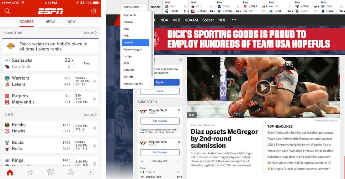
Have you heard of the 80/20 rule? In a nutshell, 80 percent of users will use just 20 percent of the features or functionality of your website. Think of most users as browsers that graze the content and grab tidbits that interest them.
That 20 percent is vitally important. It’s where most of your clicks will be and is the content and interaction area that should be near perfect in your design.
You can use data and analytics to determine what parts of your design fall into this 20 percent. For just-launched sites, this might require some data gathering after the site has been live for a few weeks and subsequent revisions.
You can also help guide users to the 20 percent you want them to interact with. Create calls to action that are large and visual to draw users, incorporate fun visual divots or surprises and offer something in return for clicks (or taps) to create interest areas in the design.
2. Think Architecturally
Building a website is a lot like building a house. It starts with a solid foundation, then a frame for where everything will go and is finished with decoration. This same architectural style of thinking applies to creating a site outline.
And here’s the thing: You don’t have to create something that’s never been seen before in the framework. Commonly accepted patterns of navigation and element placement exist for a reason. It’s OK to use them.
Once the architecture is in place, use that same idea for building content. The main text is the foundation in this setting; support it with great headlines, images, calls to action and other secondary elements.
3. Don’t Ask for Too Much
Because we live in such a data-driven world, there might be a tendency to ask users to register and provide a lot of information so you can better your site and user experience. Avoid this trap.
Think about it like a user for a minute. You’ve just landed on what looks like a pretty cool website that relates to some of your interests. To move to the next page you have to register and the form includes 10 fields:
- Name
- City
- State
- Country
- Phone
- Twitter handle
- Website
- Job title
- How did you find this site?
What do you do? Many users would abandon the website at this point because the user experience asks for too much.
But what if they form included just this:
- Sign up with email or Facebook
Would you be more willing to move forward? Most users would.
4. Delight with Micro-Interactions
It is likely that you engage with micro-interactions all the time, even if you don’t think about it.
- A pop-up from Google Calendar to remind you of a meeting
- A message notification
- An alarm
- A like or follow on social media
We could list them all day, right? These little reminders or divots help the user do something or experience delight. They are unobtrusive and often wanted distractions.
Incorporate these divots into the design in ways that will benefit the user. What does your website or app do that users will want to know about in flashes or need to be reminded of?
5. Make Easy Enough for a Toddler
If you were designing something for a small child, what would it look like? You would probably focus on things like fun color, large sized pieces and easy labels or puzzle-style connectivity.
These are the exact same things you should think about when designing any website or app project so that it is as usable as possible. Make the design so easy a child could do it (or a not-so-web-savvy-adult).
Oversized design elements and labeling are key factors here. These visual cues help guide users through the most pertinent parts of the overall experience. Add in bold color choices to further encourage clicks and exploration.
If it is easy, users will continue to experiment and play. If the design is tough to understand or navigate, they are more likely to leave it behind. If your site will contain complicated patterns or content, start with a few easy clicks with a simple homepage as a starting point. This might help users get more comfortable before they delve into the more complex sections of the design. (And since they are already somewhat invested, they might stick with the concept a little longer.)
6. Tap or Click?
While this post is not about correcting design mistakes, there is one that happens frequently across devices. Remember when working with responsive websites to account for click or tap so that actions are appropriate for the device.
Too many mobile websites miss the mark here, harming usability and functionality.
Tap buttons often need to be larger and more prominent for ease of use as well. (Go back to No. 5 and make them toddler-sized.)
7. Think Like a User
We say this all the time: “Think like a user.” But it is actually quite difficult to step outside the design and interface and do that very thing, because many of us just don’t think in the same way our users do.
Talk to other people – outside design and development circles – to see how they interact with websites and apps. You might be surprised to see how different their ideas about how things should and should not work are. Take that information back to your projects. It will make them better and help you craft a much more enjoyable user experience.
Conclusion
We’ve been talking about user experience a lot lately – and for good reason. It truly is at the root of delighting users and creating highly usable websites and apps.
If you want to learn more, make sure to look at other recent posts with a UX focus:
Do you have more great UX tips? Share them with me on Twitter; just tag @carriecousins and @designshack.