Designing for Touch: How Finger-Friendly UI Enhances UX
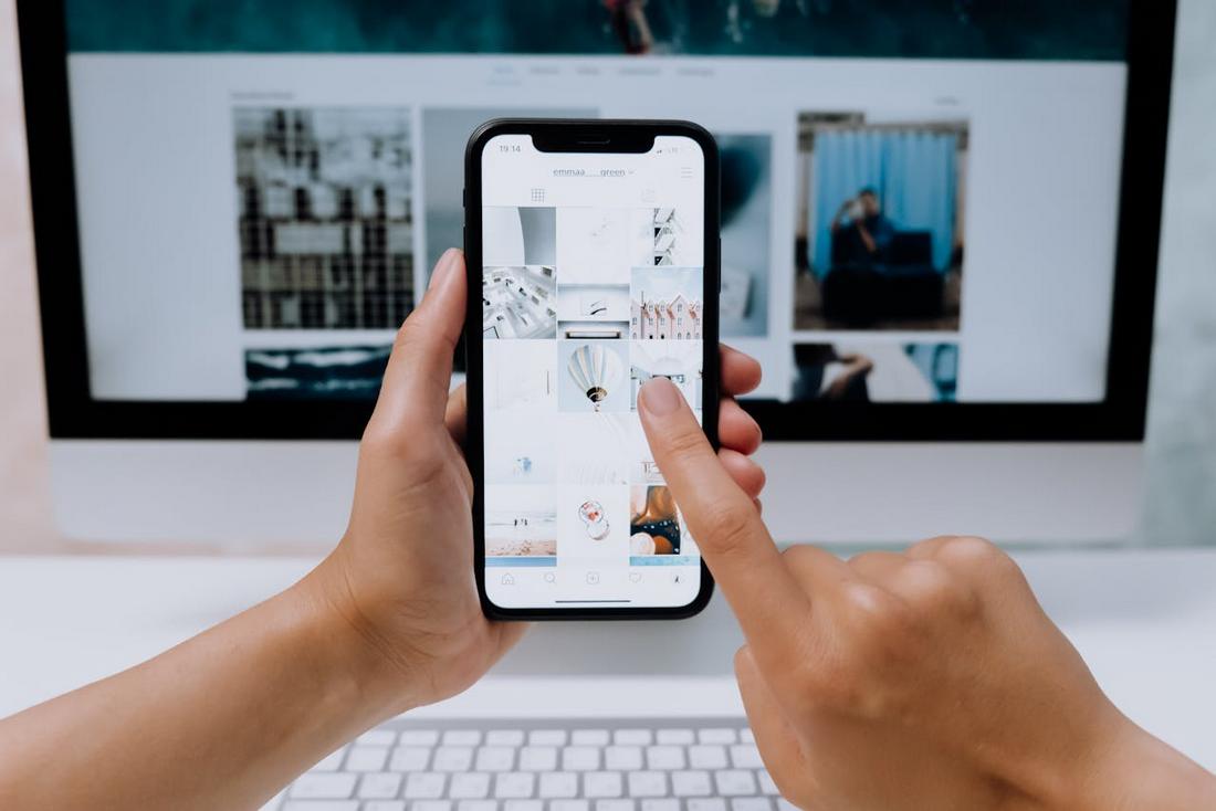
With mobile devices dominating the way we interact with apps and websites, touch-based design has become more important than ever.
Whether it’s tapping a button, swiping through a gallery, or dragging a slider, users expect smooth and intuitive interactions that feel natural on their fingertips.
That’s why designing for touch isn’t just about layout—it’s about usability, comfort, and a frictionless user experience.
In this article, we’ll look at what it means to create finger-friendly interfaces, why it matters, and how designers can build touch-first experiences that feel effortless for users across all devices.
Why Touch-First Design Matters
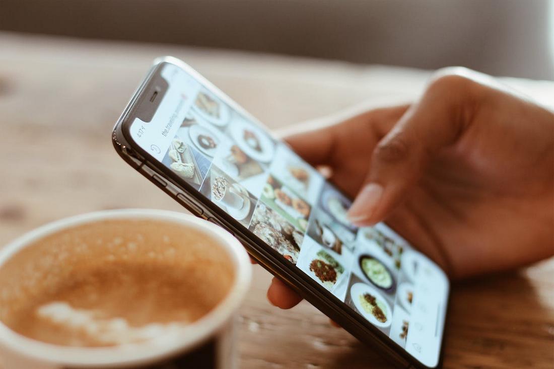
Most users today access the web through mobile devices, which means their primary way of interacting is through touch.
“96.3% of internet users access the internet using a mobile phone” – Exploding Topics
If your design doesn’t work well for fingers, if buttons are too small, if elements are placed too close together, or if gestures aren’t responsive, it leads to frustration, misclicks, and users dropping off.
Touch-first design improves accessibility and ease of use. It creates interfaces that feel responsive, reduces cognitive load, and helps users complete tasks faster and with more confidence.
Whether it’s navigating a menu or filling out a form, users should feel like the interface was built with their thumbs in mind.
How Finger-Friendly UI Enhances User Experience
Designing with fingers in mind leads to smoother, more intuitive interactions.
Improved Accuracy and Fewer Mistaps
Larger tap targets and well-spaced elements reduce the chance of accidental taps, which is one of the biggest frustrations in mobile design.
When users can confidently hit the right button without zooming or retrying, it leads to smoother interactions and a more satisfying experience.
Faster Task Completion
A finger-friendly UI streamlines user journeys by making actions easier to perform.
Whether it’s completing a form or navigating a menu, intuitive touch interactions help users get where they need to go quickly, without stopping to figure out how things work.
Greater UI Accessibility for All Users
Designing with touch in mind naturally supports users with limited mobility or larger fingers.
It also aligns with broader UI accessibility goals by reducing fine motor requirements, making your app or website usable for a wider audience.
Higher User Satisfaction and Retention
When an interface feels comfortable and intuitive, users are more likely to enjoy the experience and come back.
A finger-friendly design reduces frustration and builds a sense of trust, which is especially important for mobile apps and ecommerce platforms.
Better Engagement on Mobile Devices
Mobile users interact differently than desktop users, often with one hand, on the go, and in short bursts.
A touch-optimized UI encourages deeper engagement by making that experience seamless, responsive, and easy to navigate from the start.
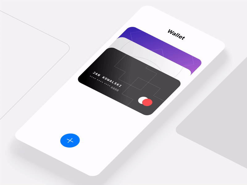
The Basics of Finger-Friendly UI
(Credit: Sebastiano Guerriero)
At the heart of good touch-based design is sizing and spacing. Interactive elements need to be large enough to tap comfortably without precision, and they need breathing room to avoid accidental touches.
According to common UX guidelines, a target size of 44 x 44 pixels is considered a safe minimum for tappable areas.
And they should always follow the fundamentals of finger-friendly UI:
- Tap targets should be large enough for thumbs, not mouse pointers
- Important buttons should be placed where fingers naturally rest, especially near the bottom of the screen
- Avoid placing too many interactive elements close together
- Use visual feedback like hover states, shadows, or vibration to confirm interaction
- Keep navigation simple and easy to reach with one hand
These simple adjustments go a long way toward making your UI feel intuitive and enjoyable to use.
Designing for Thumb Zones
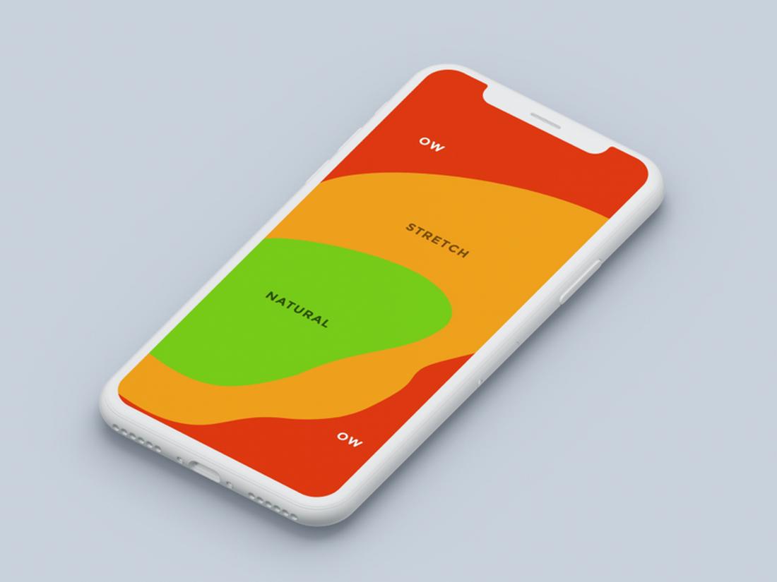
(Credit: Thuy Gia Nguyen)
One of the most overlooked aspects of mobile UX is the “thumb zone”, the area of the screen that’s easiest to reach with your thumb.
Most users hold their phones with one hand, and their thumbs naturally rest in the lower center of the screen.
Anything placed at the top corners or far edges can be harder to tap without repositioning the hand.
Designers should prioritize placing key controls, like navigation menus, CTAs, and important links, within the easy-to-reach zone.
Avoid hiding essential actions in hard-to-reach corners, and make sure frequently used interactions are comfortably placed.
Responsive Feedback for Touch
(Credit: Bart Bak)
Feedback is critical in touch interactions because users don’t get the physical cues they would with a keyboard or mouse.
Visual and tactile feedback let users know their action was recognized.
In touch design, this can include:
- A button briefly changes color when tapped
- Animations to confirm a swipe or drag
- Haptic feedback when long-pressing or dragging an item
- Subtle shadows or motion effects to create a sense of depth
Without feedback, users may not know if their input was registered, which can lead to confusion or repeated actions.
Testing Your Design for Touch
The best way to know if your interface is truly finger-friendly is to test it on actual devices. What works on a desktop might feel cramped or awkward on a phone.
Here are a few things to look for when testing:
- Are buttons easy to tap without zooming?
- Can users navigate the app with one hand?
- Do swipe gestures feel responsive?
- Are touch targets spaced far enough apart?
- Is it easy to complete common tasks without frustration?
Get feedback from real users and iterate based on what they find tricky or uncomfortable. Even small changes, like adding space between buttons, can make a big difference in the overall experience.
In Conclusion
Designing for touch means designing for comfort, clarity, and responsiveness.
A finger-friendly UI isn’t just about accessibility; it’s about building trust, reducing friction, and helping users enjoy a smoother digital experience.
No matter what type of mobile design you’re working on, keeping touch in mind will make your design more intuitive and user-friendly for everyone.
FAQs About Finger-Friendly UI Design
These frequently asked questions about finger-friendly UI will help you get a better understanding of the concept.
1. What is a finger-friendly UI?
A finger-friendly UI is a user interface designed specifically for touch-based interactions. It prioritizes larger tap targets, intuitive layouts, and spacing that accommodates finger sizes, making it easier and more comfortable to use on mobile and tablet devices.
2. Why is tap target size important?
Small tap targets can lead to accidental taps or missed interactions, especially on mobile devices. Ensuring buttons and links are at least 44×44 pixels helps improve accuracy and makes the interface more accessible to users of all ages and abilities.
3. How do I test if my UI is finger-friendly?
Test your design on physical devices with real users. Look for issues like buttons that are hard to tap, elements placed too closely together, or controls that are awkward to reach. Gather feedback and observe how people naturally interact with your interface.
4. What is the thumb zone?
The thumb zone refers to the area of a phone screen that’s easiest to reach when holding a device in one hand. Designers should place key controls like CTAs and navigation within this zone for more comfortable, one-handed use.
5. Can finger-friendly design improve accessibility?
Yes. Making your UI touch-friendly improves accessibility for users with limited dexterity or those using assistive devices. It supports better usability across a wider range of physical and cognitive abilities.
6. Are finger-friendly designs only for mobile apps?
No. While mobile is a primary use case, finger-friendly design also benefits tablet apps, touchscreen kiosks, smart TVs, and other devices where users interact directly with the screen.
7. Should I design separate layouts for mobile and tablet?
In many cases, yes. Tablet users have different interaction habits and screen real estate, so adapting your layout for the device type ensures better usability. Maintain consistent branding, but adjust placement and sizing as needed.
8. How can I balance design aesthetics with usability?
Start with usability, then style your design around it. A clean, visually appealing layout is important, but never at the cost of function. Ensure that aesthetics enhance the experience rather than compromise touch interaction.