Poster Design / 1 Sep 2021
Typographic Posters: 100 Stunning Examples
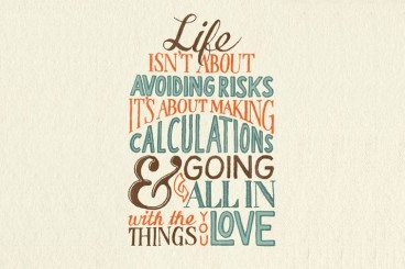
Typography is all about delivering art and information in a beautiful medium. Designing typographic posters is no easy task, and arranging and modifying each individual component is a skilled task.
Not only that, special care has to be taken when it comes to the legibility and aesthetics of the fonts being used in the poster, choosing a type that works well together and conveys the right impression.
To pay our tribute to all the experienced typographic artists in today’s post, as well as inspire you to try your own hand at this type of art, we have come up with a grand compilation of a hundred typographic posters from around the web.
Read on to browse through some delightful inspiration and beautiful art.


