25+ Best Distressed Fonts
ChatGPT Distressed Fonts Add texture and character to your designs with our distressed fonts collection. These fonts feature worn, rough edges and textured effects that evoke a sense of history and ruggedness. Ideal for projects that aim for a vintage, industrial, or handcrafted look, these fonts provide an authentic touch to posters, apparel designs, and branding that seeks to stand out with an edge.
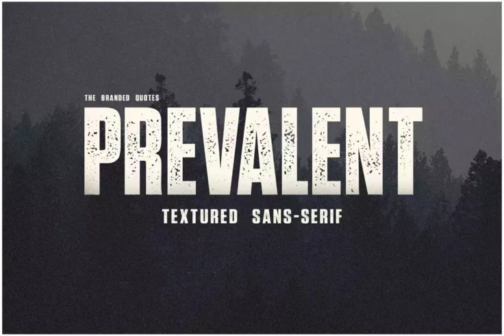
Prevalent Textured Font
Prevalent Textured Font offers a unique blend of modern design with vintage elements, resulting from a rise in automatic color-grading techniques appl...

The Northwest Textured Vintage Western Font
This is a pair of old western fonts that feature rough textured letter designs. You can choose from a font with rounded corners or regular character d...
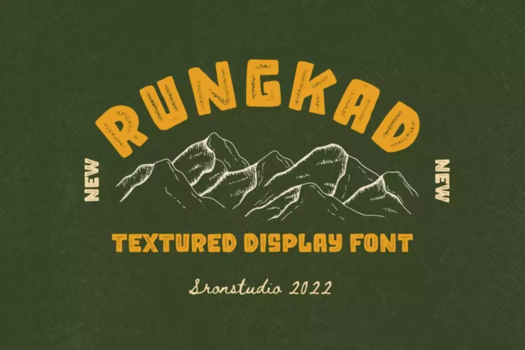
Rungkad Font
Introducing Rungkad, a highly versatile and distinct textured display font. Designed with a rough, weathered aesthetic, this typeface perfects the ble...

Rebaston Distressed Font
Rebaston Distressed Font is an elegant, display serif typeface that offers an infusion of vintage ambiance into your creations. Its exceptional ligatu...
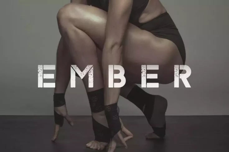
Ember Typeface
Ember is a poster stencil font that comes in two different styles that will fit in well with digital and print designs. It has a rough post-apocalypti...

Arinoe Rough Distressed Font
Arinoe Rough Distressed Font is a distinctive display typeface that encapsulates both originality and authenticity. Charlie’s Type Foundry introduce...

Bolandes Vintage Font
Presenting Bolandes, a skilfully put together vintage monoline font. Taking inspiration from vintage signage, this font expertly combines the aestheti...
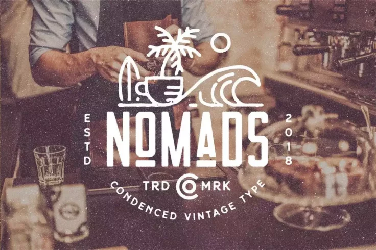
Nomads the Farmer Original Typeface
Nomads font comes with a retro-themed design and decorative elements. It has the ideal look and design making monogram badges. The font is available i...
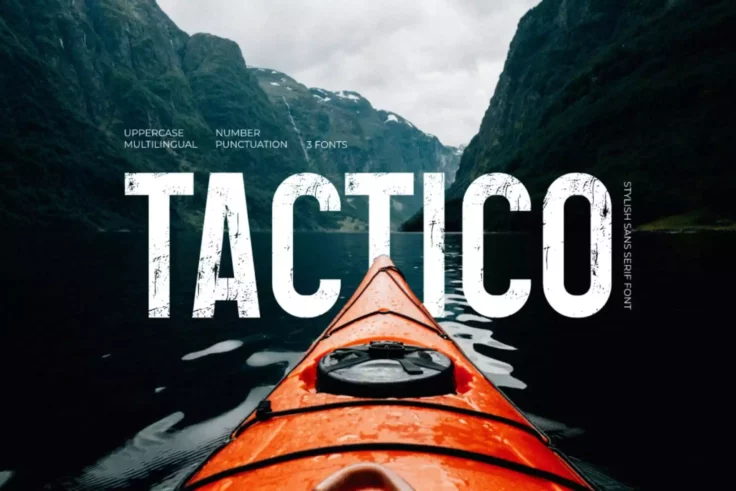
Tactico Modern Font
Tactico Modern Font is a purposefully designed sans serif typeface that offers a distinct style, making it perfect for a wide array of creative applic...

Riborn Rough Font
The Riborn Rough Font is an evocative embodiment of vintage aesthetics, merging beautifully with contemporary design sensibilities. Its rough and stam...

Wolder Handcrafted Vintage Typeface
Wolder is a handcrafted font that features a vintage design with a worn-out look. It’s perfect for vintage badges, t-shirts, logos, labels, post...

Bargers Distressed Font
Step back in time with the curvaceous, rugged allure of the Bargers Distressed Font. This dynamic typeface presents a unique blend of both retro and c...
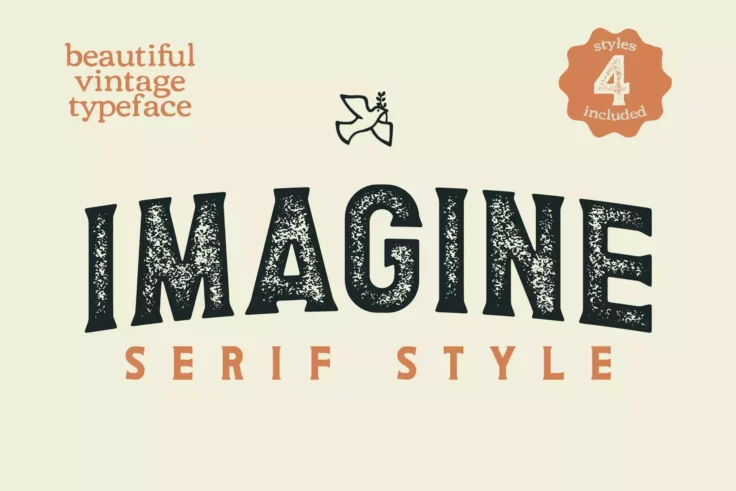
Imagine Distressed Serif
Imagine Distressed Serif is an artistic take on the classic serif font. Embedded in the uniqueness of its detailed design, this font carries a strong ...

Westpart Distressed Font
Introducing Westpart, a distinctive brush font born from the fusion of Northen, Easttalia, and Southen. Westpart communicates a remarkable style compl...

Roughwell Font
Dive into the unique world of typography with Roughwell Family, a roughly hand-drawn display font with a retro stamp feel. Its carefully crafted style...

BlockPress Font
Introducing BlockPress, a dynamic and distinctive uppercase sans-serif letterpress grotesque type font. Designed by mint pixels, this vintage decorati...
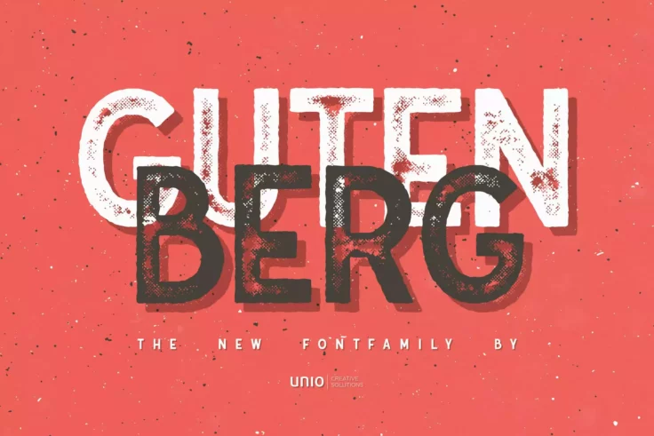
Gutenberg Font Family
Introducing the “Gutenberg – Font Family” presented by Unio, truly a homage to the father of the printing press, Johannes Gutenberg....

Western Grit Vintage Old Western Font
This font comes with a vintage western lettering design that will give your own designs an authentic old western look. This font is ideal for product ...

ReRun Font Family
ReRun is a family of industrial style stencil fonts that can be used for album covers, film titles and video games. It features uppercase letters, pun...

Imprimo Letterpress Font
Experience nostalgia and add a dash of vintage charm to your text with the Imprimo Letterpress Font. Inspired by the charm of old world printmaking, t...

Destone Retro Font
Destone Retro Font brings a unique blend of old school charm and modern aesthetic to the table. Available in two distinct styles, regular and slab ser...

Disctactor Font
The Distractor Font gives your projects a robust and tactile touch, bringing a unique and edgy aesthetic to your designs. As a hybrid of woodtype and ...
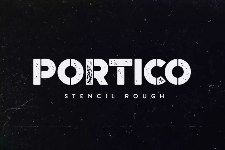
Portico Stencil Rough Font
Portico is a stencil font with a classic design. It features a rough and grunge style design that will add more depth to your designs. The font can be...
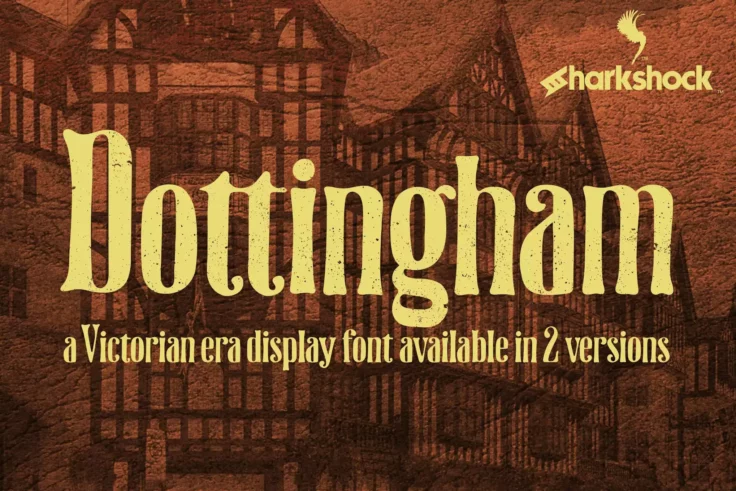
Dottingham Victorian Era Font
Dottingham is a vintage style display font that authentically encapsulates the essence of the Victorian era. This exquisite typeface draws inspiration...
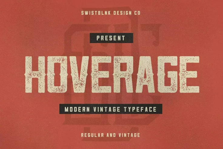
Hoverage Distressed Font
Take a step back in time with the Hoverage Distressed Font. Imbued with a sense of rich history, this typeface combines the timeless design influence ...

Rust Core Distressed Font
Introducing RUST CORE, an innovative and distinctive distressed font that defies the norm. This mechanical font comes with four built-in styles – Cl...

Forest Trophy Font
Are you on the lookout for a font that imprints a natural and vintage aura? The Forest Trophy – Classic Display Font is your go-to option! Its rough...

Hansel Rough Distressed Font
Hansel Rough Distressed Font is a versatile and unique typography staple with dual style facets – rough and textured. These attributes combined ...

Mystic Forest Font
Unveiling Mystic Forest, a truly unique decorative font that brings a distinct distressed style to your designs. Perfectly crafted for the artisticall...
FAQs About Distressed Fonts
What Are Distressed Fonts?
Distressed Fonts are typefaces that feature an intentionally worn, rough, or eroded appearance, mimicking the look of aged, weathered, or decayed text. These fonts are designed to convey a sense of ruggedness, authenticity, and vintage charm, often evoking a feeling of nostalgia or a connection to the past. Distressed Fonts can vary in the degree of their 'distress,' from lightly textured to heavily damaged, making them versatile for different design aesthetics.
They are commonly used in designs that aim to reflect a historical period, a handmade quality, or a raw and edgy vibe, such as in band posters, vintage clothing labels, thematic restaurant menus, and rustic branding projects.
How Can You Use Distressed Fonts in Your Design Projects?
Distressed Fonts can be effectively utilized in projects where a touch of character, age, or edginess is desired. They are excellent for creating eye-catching headlines, logos, and display text in contexts where a polished and clean look is less desirable. Distressed Fonts work well in thematic designs, such as for retro or vintage-inspired projects, as well as in more contemporary settings where a contrast to sleeker elements is needed.
When using Distressed Fonts, it's important to balance their texture and complexity with simpler design elements to ensure that the overall composition remains legible and visually coherent.
Are Distressed Fonts Suitable for All Types of Projects?
Distressed Fonts, due to their unique and stylized nature, may not be suitable for all types of projects. For formal, corporate, or minimalist designs that require a clean and clear presentation, a distressed font might not align with the intended message or aesthetic. However, for projects that aim to evoke a sense of history, authenticity, or ruggedness, or for creative and artistic endeavors, Distressed Fonts can add a significant visual impact.
It's essential to consider the project's context, audience, and objectives when deciding whether a Distressed Font is an appropriate choice, ensuring that the font supports rather than detracts from the design's goals.
How Do You Pair Fonts with Distressed Fonts in Design?
Pairing fonts with Distressed Fonts involves selecting complementary typefaces that balance the design and enhance readability. A common approach is to use a Distressed Font for impactful headings or standout elements and pair it with a more legible, clean font for body text or secondary information. Sans-serif fonts or simple serif fonts can offer a visual break from the textured appearance of Distressed Fonts, providing a harmonious contrast within the design.
When pairing fonts, consider the overall visual weight and texture of each typeface to ensure they work together cohesively, supporting the design's theme and narrative without competing for attention.
What Are the Best Practices for Using Distressed Fonts?
Best practices for using Distressed Fonts include using them sparingly to emphasize key elements of your design, such as titles, logos, or calls to action. Due to their textured and intricate nature, Distressed Fonts are best reserved for short text sections to prevent legibility issues. Ensuring sufficient contrast between the Distressed Font and the background is crucial for maintaining readability, especially in print materials where fine details may become lost.
Testing your design across various mediums and sizes is also important to ensure the Distressed Font's effectiveness in all intended applications, from digital displays to large-format prints. Additionally, consider the font's level of distress in relation to the overall design aesthetic, opting for a font that complements the project's tone and message.