Code an Awesome Animated Download Button With CSS3
Follow along as we create a simple and fun download button using some fancy CSS3. Our button will use lots of fun goodies including border-radius, box-shadow, linear-gradients, z-index and transitions to achieve a unique double sliding drawer effect on hover.
As we go, I’ll discuss why some techniques that you might think to use should be avoided. Transitions are tricky to work with and are quite prone to refuse to work with certain properties. Read on to find out more.
The Concept
Loosely based on this idea, I wanted to create a download button with a cool sliding drawer effect where originally hidden information pops out when the user begins a hover event. To put my own spin on it, I decided to double the effect and create a drawer on both the top and bottom of the button (click here for a sneak peek of the finished result).
Here’s how it will work: using a combination of HTML and CSS, we’ll create three separate pieces. These include the main button and two smaller info panels. The smaller panels will initially hide under the larger button, then when the user hovers, one will slide upward and the other downward.
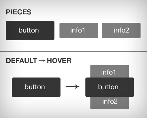
As you can see, this will be a pretty easy project that is perfect for beginners that are looking to up their CSS skills. Especially worth learning is how we’ll utilize absolute positioning and stacking via z-index.
What Won’t Work
As I planned out this project, I came up with a couple of ways to make my concept work. Given that I’ve been on a pseudo element kick lately, the way that I chose to structure the project initially was through the use of :before and :after.
With these pseudo elements, we can code only the download button in our HTML and then add in the wings using pure CSS. It seems like an optimal solution and indeed it worked great… until I tried to animate the transition. No matter what I tried, I simply couldn’t get the transition to work.
After a little research I discovered that that only Firefox supports CSS transitions on pseudo elements. This is a real bummer that really limits the fun we can have with :before and :after, but on the upside I learned a valuable lesson that will save me a lot of time and trouble in the future.
In tutorials like this one you don’t often get to hear about where the author failed, but I think it’s important to communicate these failures so you can learn from them as I have. Now the next time you want to animate a pseudo element you’ll remember that it won’t work in most browsers!
Failures aside, let’s jump into a method that will work.
The Button
To begin, we’ll create and style our button. Once we have this in place, it’ll be easier to form the other elements. All we need in the HTML department is a single div containing a link. We could simply use the link for the button but we’ll need to group multiple objects together so a div is necessary.
<div class="button">
  <a href="#">Download</a>
</div>
Button Shape & Size
The HTML above should simply provide you with a plain text link. We’re going to transform this into a button with a set background shape and size. To do this, we start with some dimensions, add some color and set the display value to block.
.button a {
  display: block;
  height: 50px;
  width: 200px;
  background: #00b7ea;
}
Here’s a look at what your button should look like after this step. It doesn’t look like much yet, but it’ll be a fancy looking button before you know it.

Type Styles
The first ugly thing about the button above that we’ll need to fix is the type, it’s currently a mess. Fortunately, this is easy to address. All we need to do is set the color to white, declare a font, and center it.
.button a {
  display: block;
  height: 50px;
  width: 200px;
  background: #00b7ea;

  /*TYPE*/
  color: white;
  font: 17px/50px Helvetica, Verdana, sans-serif;
  text-decoration: none;
  text-align: center;
  text-transform: uppercase;
}
There are a couple of interesting things to note here. First, notice that I’m using the “font” shorthand rather than running through reach font property individually. This is a great way to save space and keep your type styles nice and succinct. The order here is as follows:
Here’s another nifty trick: I set the line-height to 50px to center it vertically in the button. Also notice that I removed the text underline and transformed the type to be uppercase. Why didn’t I just type it out in all caps in HTML? Because this is really a style choice and could change with a future redesign.
Now our button is looking much better!

CSS3 Magic
At this point our button is still looking a little plain. If you’re cool with the minimal look, you can skip ahead. Otherwise, let’s make it a little more interesting. The first thing we’ll do is round off the corners. Make sure you add all three browser prefixes:
-webkit-border-radius: 10px;
   -moz-border-radius: 10px;
        border-radius: 10px;
Next up, we’ll toss in a box-shadow. Once again, we’ll need three versions to cover the various browsers. The shorthand value order here is horizontal offset, vertical offset, blur and color.
-webkit-box-shadow: 2px 2px 8px rgba(0,0,0,0.2);
   -moz-box-shadow: 2px 2px 8px rgba(0,0,0,0.2);
        box-shadow: 2px 2px 8px rgba(0,0,0,0.2);
Finally, we’ll toss in a gradient. Unfortunately, this requires a whole mess of code. The way gradients work recently change so not only do we need multiple prefixes, we also need multiple syntaxes to make sure we support everything. I’m going to be honest, I rarely code this stuff by hand. Instead, I use the Ultimate Gradient Generator and paste in the generated code. Here’s the result:
background: -moz-linear-gradient(top, #00b7ea 0%, #009ec3 100%); /* FF3.6+ */
background: -webkit-gradient(linear, left top, left bottom, color-stop(0%,#00b7ea), color-stop(100%,#009ec3)); /* Chrome,Safari4+ */
background: -webkit-linear-gradient(top, #00b7ea 0%,#009ec3 100%); /* Chrome10+,Safari5.1+ */
background: -o-linear-gradient(top, #00b7ea 0%,#009ec3 100%); /* Opera 11.10+ */
background: -ms-linear-gradient(top, #00b7ea 0%,#009ec3 100%); /* IE10+ */
background: linear-gradient(top, #00b7ea 0%,#009ec3 100%); /* W3C */
filter: progid:DXImageTransform.Microsoft.gradient( startColorstr='#00b7ea', endColorstr='#009ec3',GradientType=0 ); /* IE6-9 */
Now our button is completely styled and looking fine. Here’s the result:

Adding The Drawers
Now that our primary button is done, it’s time to add the little drawers that will slide out from the top and bottom (perhaps “wings” is the appropriate term). To do this, we’ll start by adding a little bit to our HTML:
<div class="button">
  <a href="#">Download</a>
  <p class="top">click to begin</p>
  <p class="bottom">1.2MB .zip</p>
</div>
As you can see, I basically tossed in two paragraphs, each with a unique class that makes them easy to target (you could use some pseudo selectors instead if you really want to get fancy).
Default Paragraph Styling
Now jump over to your CSS and we’ll style the paragraphs. To start, we want to focus on the styles that both paragraphs will share. Styling both at once where possible helps keep our code clean and less redundant. Here’s a big chunk of code to think over:
p {
  background: #222;
  display: block;
  height: 40px;
  width: 180px;
  margin: -50px 0 0 10px;

  /*TYPE*/
  text-align: center;
  font: 12px/45px Helvetica, Verdana, sans-serif;
  color: #fff;

  /*POSITION*/
  position: absolute;
  z-index: -1;

  /*CSS3*/
  -webkit-border-radius: 5px;
     -moz-border-radius: 5px;
          border-radius: 5px;

  -webkit-box-shadow: 2px 2px 8px rgba(0,0,0,0.2);
     -moz-box-shadow: 2px 2px 8px rgba(0,0,0,0.2);
          box-shadow: 2px 2px 8px rgba(0,0,0,0.2);
}
Now, this is a lot to throw at you all at once so I’ll walk through it step by step. The first thing we do is give the paragraphs shape, color and type styles exactly like we did on the button. The main difference is that these are smaller and use some margins to push them into place.
Next are the positioning styles. These are very important so be sure you understand them clearly. In order to make the wings appear behind the button, we need to apply z-index, which affects the stacking order of the elements. Think of this as a “send to back” sort of command. To make this work, we need to apply absolute positioning.
Finally, we added the same border-radius and gradient styles that we did before. I’ve kept these separated from the previous styles to keep things simple and clear, but to make things DRYer, you would probably want to rewrite your shared CSS3 styles to something like this:
.button a, p {
  -webkit-border-radius: 10px;
     -moz-border-radius: 10px;
          border-radius: 10px;

  -webkit-box-shadow: 2px 2px 8px rgba(0,0,0,0.2);
     -moz-box-shadow: 2px 2px 8px rgba(0,0,0,0.2);
          box-shadow: 2px 2px 8px rgba(0,0,0,0.2);
}
Basically, any time you find yourself repeating or pasting styles multiple times, you’re making your code unnecessarily complex and should attempt to simplify.
At the end of this step, you’ll strangely see no change in your preview from last time. This is because we’ve hidden these elements behind the button. They’re there, you just can’t see them yet!
Hover and Active Styles
What we want to do next is take the wings that we just created and move them outward when the user hovers over the button. To accomplish this, we simply need to adjust the margins on each paragraph. Here we target each of the classes that we created, then move the .top one up and the .bottom one down. The .top class also required a slight line-height adjustment to look right.
.button:hover .top {
  margin: -80px 0 0 10px;
  line-height: 35px;
}

.button:hover .bottom {
  margin: -10px 0 0 10px;
}
While we’re here, we might as well throw some active styles on as well. These will take effect during a mouse down event.
/*Adjust Gradient*/
.button a:active {
background: #00b7ea; /* Old browsers */
background: -moz-linear-gradient(top,  #00b7ea 36%, #009ec3 100%); /* FF3.6+ */
background: -webkit-gradient(linear, left top, left bottom, color-stop(36%,#00b7ea), color-stop(100%,#009ec3)); /* Chrome,Safari4+ */
background: -webkit-linear-gradient(top,  #00b7ea 36%,#009ec3 100%); /* Chrome10+,Safari5.1+ */
background: -o-linear-gradient(top,  #00b7ea 36%,#009ec3 100%); /* Opera 11.10+ */
background: -ms-linear-gradient(top,  #00b7ea 36%,#009ec3 100%); /* IE10+ */
background: linear-gradient(top,  #00b7ea 36%,#009ec3 100%); /* W3C */
filter: progid:DXImageTransform.Microsoft.gradient( startColorstr='#00b7ea', endColorstr='#009ec3',GradientType=0 ); /* IE6-9 */

}

/*Pulls in Wings*/
.button:active .bottom {
  margin: -20px 0 0 10px;
}

.button:active .top {
  margin: -70px 0 0 10px;
}
As you can see, what I’ve done here is adjust the gradient so that the top color stretches a little farther, then I brought the wings back in a little bit so that there’s a contracting effect when you click.
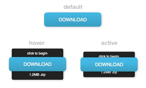
Now our button is looking awesome. All three of our states are working. When you’re not hovering, it looks like a plain old button. When you are hovering, the wings or drawers pop out. When you click, the wings come in a little and the gradient changes ever so slightly.
Final Step: Add The Transition
At this point, everything appears to be working just fine. The only problem is that the hover effect takes place instantly and of course we’d like it to be a little more gradual. To accomplish this, go back to your paragraph block and add in a basic 0.5 second transition using all of the required prefixes.
p {
  background: #222;
  display: block;
  height: 40px;
  width: 180px;
  margin: -50px 0 0 10px;

  /*TYPE*/
  text-align: center;
  font: 12px/45px Helvetica, Verdana, sans-serif;
  color: #fff;

  /*POSITION*/
  position: absolute;
  z-index: -1;

  /*CSS3*/
  -webkit-border-radius: 5px;
     -moz-border-radius: 5px;
          border-radius: 5px;

  -webkit-box-shadow: 2px 2px 8px rgba(0,0,0,0.2);
     -moz-box-shadow: 2px 2px 8px rgba(0,0,0,0.2);
          box-shadow: 2px 2px 8px rgba(0,0,0,0.2);

  -webkit-transition: all 0.5s ease;
     -moz-transition: all 0.5s ease;
       -o-transition: all 0.5s ease;
      -ms-transition: all 0.5s ease;
          transition: all 0.5s ease;
}
With this addition, the button will transition very nicely between the three different states.
See It In Action
We’re all finished! You should now have an awesome animated CSS download button that is sure to impress. Check out the live demo below or check out the code on Tinkerbin.
Demo: Click Here to Launch
Want an even better version of the button with six different versions to choose from? Check out the awesome free download at our new sister site Design Curate.
Conclusion
Thanks for reading and following along. If you made it all the way through, pat yourself on the back for a job well done.
I hope you learned a thing or two about z-index or cool CSS3 tricks. If not, at least you got an awesome button out of the deal! Leave a comment below and let us know if you enjoyed the tutorial.