The Importance of Designing for Readability
Text is not an afterthought in the design process. It should be your first consideration.
Readability should be one of the top concerns when it comes to any design project. If text can’t be read, then why are you designing in the first place? Good design delivers content in a way that is understandable; readability is a big part of comprehension. Today we’ll be discussing how you can plan a design around the words, so that your projects are easy to read.
What is Readability?
We talk about readability a lot when it comes to design. But readability, and readable or legible text, are not quite the same thing. If someone can make out letters, text is considered readable. That does not mean, though, that words are necessarily easy to read or comprehend; they are just decipherable.
Readability is the ease with which text can be read. Comprehension is a key factor in terms of readability, as is being able to quickly look at — and understand — lettering. Readable text can be scanned quickly, from a distance.
Readability also factors in the words themselves and how easy they are to comprehend and understand. (Some experts recommenced that text written for general consumption should not exceed an eighth-grade reading level to maximize readability.)
Let’s take a look at a few more of the visual standards that contribute to readability.
Line Length

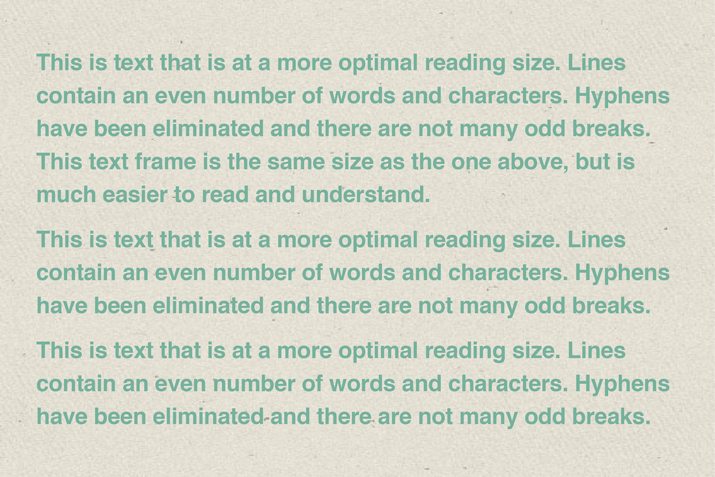
Lines of type, especially in large blocks, that are too long can cause the eyes to tire and make reading difficult. Line that are too short often result in awkward breaks. If hyphenation is used, short lines will also result in many hyphenated words, which can also break up the flow of reading.
Where you want text to fall is somewhere in that happy medium. Text should be large enough to read with ease, but not so large that it causes odd pauses or breaks in reading.
There are a variety of standards that contribute to the perfect line length (and even a few mathematical formulas). One of the best takes into account the width of a text frame (this works best for printed projects but applies to anything using picas as a measurement tool), and divides it in half to determine the optimal font size. You can typically adjust the point size up or down a couple of points in either direction from that starting point.
So if a column is 36 picas wide (in print), the text would be about 18 points.
What About Digital Projects That Measure in Pixels?
You can apply the same formula, but it gets a little more complicated: There are 16 pixels per pica. So if your frame is 600 pixels wide, the text would be 18-19 points. (600/16 = 37.5/2 = 18.75). Personally, I think this leaves type a little on the large side. That brings us to option #2 for digital projects. Set type in terms of characters (and spaces) per line.
When it comes to body text, the optimal number of characters per line is 50 to 60, according to one of the timeless typography textbooks, “Typographie: A Manual of Design” by Emil Ruder. That range can be extended somewhat depending on the style of type used and device it is being viewed on. For most projects the safe range for desktop devices is 45 to 75 characters per line. The optimal range for mobile devices is 35 to 50 characters per line.
Space and Contrast
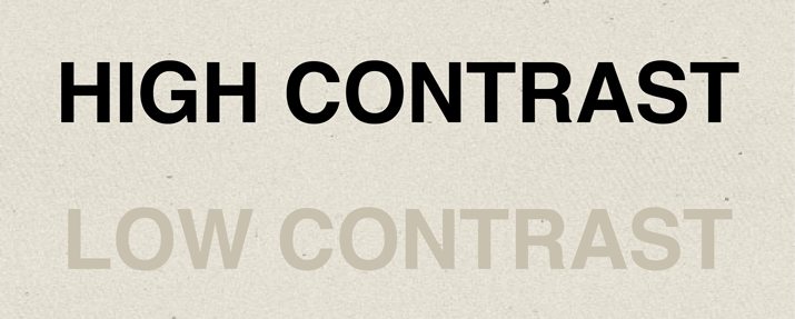
Space and proper contrast are key components when it comes to readability. Lettering must live in its own space – not share with other lettering or images – and the color of text and the background must be different enough to be distinguishable.
As with line length, space between lines is important. It is recommended that the space between lines of type (called leading) is at least equal to the point size of type and most digital designers opt for a minimum of 150 percent of text size. This leaves plenty of space for each line in large blocks of text to be read. As with line length, too much or too little space between lines, can make comprehension difficult.
Designers should also pay particular attention to the space between blocks of text and other objects. Be aware of text wraps and text that crosses into the boundaries of other objects. Text wraps – both vertical and horizontal – should be at least equal to the line spacing used for a block of text. Avoid allowing text blocks to touch other objects or elements, or run across or on top of images.
Don’t forget about the margins. Remember to leave some white space around the entire text frame, creating an almost invisible halo. This margin will help set text apart from other “noise,” easing the reader into the copy.
Think about contrast as well. Space is one way to create contrast; another is color. Black text on a pale background is a popular choice for blogs and books because large copy blocks need to stand apart from the medium (paper or screen). When it comes to blocks of text for reading, stick to simple color choices such as black, white or gray that stand out from the background. Reserve colored type for big or oversized words or logos.
Hyphenation and Word Breaks
One of the most irritating things to come across as a reader is a giant hyphen in the middle of a headline or a subhead that spans three or four lines deep. Pay particular attention to these details when setting type because they can be both aggravating to readers and difficult to comprehend.
Hyphens cause readers to stop and pause in the middle of a word. They should be eliminated from large type and furniture – anything bigger than 25 points – and used with care in small type.
A few hyphens are acceptable in large copy blocks, but consider setting a limited number of hyphens per paragraph.
Poor writing and word breaks can be just as jarring for readers. Try to keep headlines and subheads short, simple and direct. Avoid long phrases and keep wording terse. Give readers a taste of the text to come, enticing them to read more.
When working with digital and web projects, consider plenty of breaks and subheads for large amounts of copy (you will see we do that here with Design Shack articles). These breaks make text easier to digest visually and makes longer copy seem less intimidating to read.
Alignment
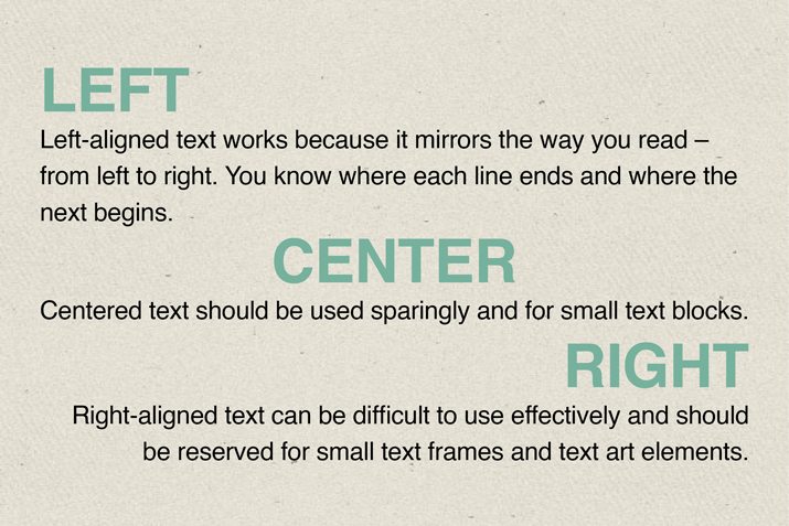
Whether text is in the center, to the left, or to the right side of a document or screen, is also important and can greatly impact readability. Generally speaking, the strong alignment for text is left-aligned. Left alignment works because it mirrors the way you read – from left to right. You know where each line ends and where the next begins.
Right and justified alignments can be the most difficult to use. Right alignment is best reserved for small blocks of text, such as big quotes or artistic text elements. Justified text requires pinpoint-perfect hyphenation and justification specifications and is best used in a non-fluid environment, which is why you see it most commonly in the confines of print design.
Centered text, while popular, does not lend itself to readability. It can work for small text blocks but should not be used for more than a few lines. (Check out this previous Design Shack post on How to Use Centered Alignments for ideas and examples.) The difficulty with centered text is that it can be hard for the eye to know where things start and stop since lines are ragged on both sides of the copy block.
Readability Tools
- The Readability Test Tool: Enter a URL (or block of text directly) and get a mathematically calculated readability score. You get quick and easy-to-understand results, such as reading grade level and scores on a number of readability indices, plus an overall analysis. The tool also includes a nifty bookmarklet.
- Readability: This web browser plugin and app turns any web page into a clean view for reading and allows you to collect pages to read later.
- Juicy Studio Readability Test: Learn more about all of the different readability tests and algorithms and how to understand what each means and how it can relate to your projects.
- Information Architects “The 100% Easy-2-Read Standard:” This article written in 2006 includes a readability checklist of sorts. While it primarily applies to web design, many of the tips are thought-provoking and are still applicable today.
Conclusion
Design for readability or don’t bother using text at all. If you want your content to be effective, it must be readable. By designing with readability in mind, you are doing your readers and users a service.
With so much information out there, users tend to look (or click) away from text that is not easy to understand in a flash. Those are readers, or potential customers, that you may never get back.