Designing Accessible Forms: Small Fixes, Big Impact
Accessible forms are a crucial part of inclusive design.
They help ensure that everyone, whether using a keyboard, screen reader, voice input, or assistive device, can complete the same tasks as any other user.
But too often, forms are designed without considering how users of all abilities will experience them. The result? Frustration, mistakes, and even abandonment.
The good news is that improving form accessibility doesn’t require a complete redesign. In fact, small adjustments can make a huge difference.
In this post, we’ll explore practical ways to make your forms more accessible, easy to use, and user-friendly for everyone.
“1 in 4 forms are missing descriptive labels for people with disabilities” – AudioEye
Why Accessible Forms Matter

Web accessibility isn’t just a legal requirement in many countries; it’s also about creating a better user experience for all. Accessible forms help:
- People with visual impairments or low vision navigate your site using screen readers
- Users with motor disabilities fill out fields using alternative input devices
- People with cognitive impairments understand labels, instructions, and errors
- Everyone else, because accessible forms tend to be clearer, easier, and faster for all users
When your forms are accessible, you expand your audience, increase conversions, and build trust in your brand. And since forms are often where the user journey ends (checkout, sign-up, or contact), making this experience inclusive is critical.
1. Start with Semantic HTML
A strong foundation makes form accessibility much easier. Always use proper structure when designing your forms.
Ensure every field has a clear and visible label, and avoid using placeholder text alone to describe a field.
Placeholders disappear when a user starts typing, which can cause confusion. And screen readers may not always interpret them as helpful instructions.
2. Label Fields Clearly
One of the simplest but most important fixes is adding proper labels. Every form field should have a clear, visible label that explains what the user should enter.
Associate labels with inputs (example: label for=”field-id”), or by nesting the input inside the label.
This ensures that users of all devices and screen readers know exactly what each field is asking for.
3. Provide Helpful Instructions
Sometimes fields need extra context, like formatting hints, example text, or guidance on password requirements. Provide these instructions near the field, either above or below it.
Avoid vague or overly technical language. For example, instead of “Invalid input,” say “Your password must be at least 8 characters and include a number.” The clearer the instructions, the less likely users are to get stuck.
If instructions are critical, make sure they are announced by screen readers using proper ARIA (Accessible Rich Internet Applications) attributes like aria-describedby.
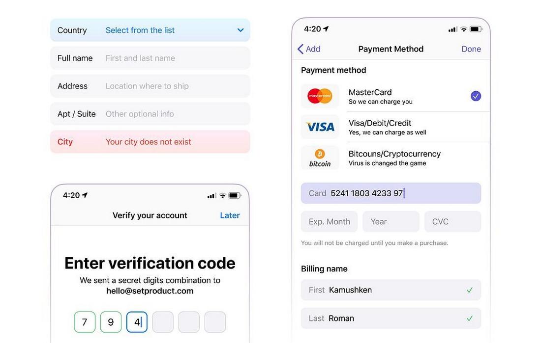
4. Make Errors Clear and Helpful
Error handling is one of the most common points where accessibility breaks down in forms.
Here’s how to make errors more accessible:
- Display error messages near the problematic field, not only at the top of the form.
- Use clear language that explains what went wrong and how to fix it.
- Use a combination of visual cues (color, icons, bold text) and text, not color alone, to indicate errors. This helps users who are color-blind.
- Ensure error messages are programmatically associated with fields (again, using aria-describedby where appropriate), so screen readers announce them correctly.
If users can’t figure out why their submission failed, they will likely give up. Accessible error handling keeps them moving forward.
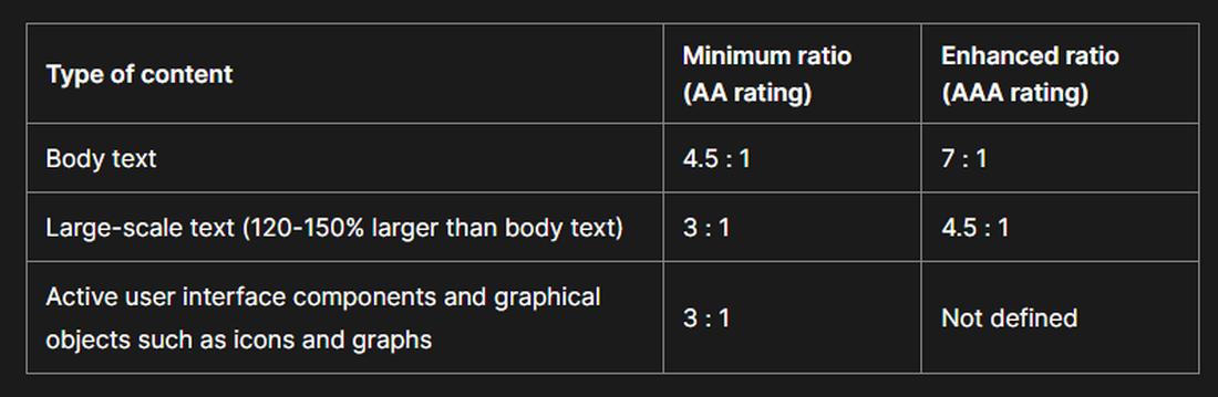
5. Ensure Sufficient Color Contrast
Color contrast affects readability for users with low vision, color blindness, or poor lighting conditions. WCAG (Web Content Accessibility Guidelines) recommends a contrast ratio of at least 4.5:1 for normal text and 3:1 for large text.
This applies to:
- Field labels
- Placeholder text (if used)
- Error messages
- Focus states (such as borders or highlights around active fields)
- Disabled fields and buttons
Check contrast using tools like the WebAIM Contrast Checker. Small improvements here can make a huge difference in legibility.
6. Support Keyboard Navigation
Many users navigate forms using only a keyboard.
Your form should fully support this behavior:
- All fields and buttons should be reachable via the Tab key.
- The tab order should follow a logical sequence: left to right, top to bottom.
- Interactive elements like radio buttons, checkboxes, and selects should be operable with keyboard controls (spacebar, arrow keys).
- Skip hidden fields or decorative elements in the tab order using tabindex=”-1″.
Test your form by navigating it without a mouse. If you get stuck or confused, so will your users.
7. Provide Clear Focus States
A strong visual focus indicator helps keyboard users know where they are in the form. By default, browsers provide a focus outline (often a blue ring).
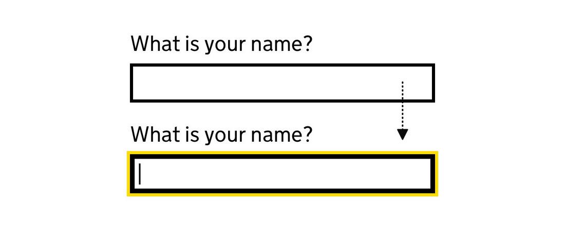
Don’t disable this outline unless you replace it with a custom, highly visible alternative.
Consistent focus styles not only improve accessibility, they also help users stay oriented and move through the form more efficiently.
8. Group Related Fields
When your form contains related fields, like payment details or shipping address, group them with clear headings or fieldsets.
- Use “fieldset” and “legend” for semantic grouping. This helps screen readers announce the purpose of the group.
- Visually group related fields with spacing or borders to reinforce the structure for sighted users. Clear grouping improves understanding and reduces cognitive load, making it easier for users to process complex forms.
9. Be Careful with Timeouts
If your form times out (such as for security reasons), give users clear warnings and an easy way to extend the session.
People with disabilities may need more time to complete forms, and unexpected timeouts can be frustrating.
Use accessible modals or alerts to notify users before timeout occurs, and make sure these messages are announced properly by screen readers.
10. Use Accessible CAPTCHA Alternatives
CAPTCHAs often present serious accessibility barriers. Image-based CAPTCHAs can’t be read by screen readers, and even audio CAPTCHAs can be difficult for many users.
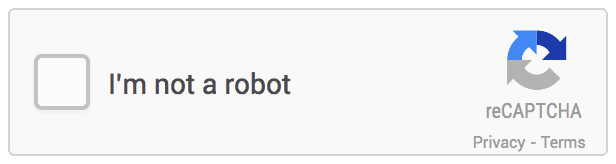
If you must use a CAPTCHA, choose an accessible alternative, such as a simple math question, a honeypot field, or Google’s reCAPTCHA v3 (which works invisibly in the background).
Test the experience carefully to ensure that all users can complete your form successfully.
11. Test with Real Users and Assistive Tools
No checklist replaces real-world testing. Use screen readers (such as NVDA or JAWS) to experience your form as users with visual impairments would.
Also, test with:
- Keyboard navigation only
- Zoomed text (up to 200%)
- High contrast mode
- Mobile screen readers (TalkBack or VoiceOver for iOS)
Whenever possible, recruit users with disabilities to test your form and provide feedback. You’ll learn far more from a real-world test than from automated audits alone.
Conclusion
Clear labels, helpful errors, good contrast, keyboard support, these are changes that benefit every user, not just those with disabilities.
When you prioritize form accessibility, you’re creating a more welcoming, inclusive experience for everyone who interacts with your brand.
You’re also improving usability, reducing errors, and building trust, all of which lead to better results for your business.
Start small. Audit your forms. Apply a few of these fixes. Over time, you’ll build more accessible forms by default and make the web a better place in the process.
FAQs About Designing Accessible Forms
1. Why is placeholder text not enough to label a form field?
Placeholder text disappears when users start typing. It also doesn’t provide proper programmatic labeling for screen readers. Always use a visible, persistent label alongside any placeholder text to ensure all users know what each field is for.
2. How do I test if my form is accessible?
Start by navigating your form using only a keyboard. Next, test with a screen reader (such as VoiceOver, NVDA, or JAWS) to hear how fields and instructions are announced. Also, check color contrast and focus states to ensure visual clarity. Real user testing with assistive technology users is highly recommended.
3. What’s the best way to show error messages?
Use text that is readable by screen readers and support it with visual cues like icons or bold text. Never rely on color alone to indicate an error. Programmatically associate the error message with the field using ARIA attributes when needed.
4. Is it okay to use custom-styled form controls?
It’s possible, but it requires extra care. Custom form controls must be fully keyboard accessible and correctly labeled for screen readers. Whenever possible, start with native HTML controls and style them with CSS, they’re easier to make accessible and behave more consistently across browsers and devices.
5. How can I make CAPTCHA more accessible?
Traditional image-based CAPTCHAs often present major accessibility barriers. If a CAPTCHA must be used, always offer an accessible option such as an audio challenge or bypass for trusted users.
6. What is the recommended contrast ratio for form text and elements?
According to WCAG guidelines, normal text (including form labels, placeholder text, and error messages) should have a contrast ratio of at least 4.5:1 against its background. Large text (18pt or 14pt bold and above) should have a contrast ratio of at least 3:1.