Designing Your Resume: Create the Perfect First Impression
Resume design is as much about content design as aesthetics. It’s great to have a resume that stands out and makes a potential employer say “wow,” but that wow factor has to keep flowing as they read through the contents of your work history.
It’s a delicate balance between design and content. Treat developing your resume as you would any other design project. Start with the content first. Develop all the things that need to be on your resume and then let that drive the look of the words on the page. (And we all know resume design can be a challenge because there is so much text.)
Create an Outline or Framework
You don’t have to dread working on your resume. Think of the positives – it could lead to a better gig and is a way to practice some design skills that might be getting rusty. Tackle this project just as you would any other design project and sketch it out.
Every resume has the same basic skeleton:
- Contact information (name, address, phone, email, social, website)
- Work experience (from current to old and may or may not include some description of the work performed)
- Skills and strengths
- Software skills
- Portfolio or links to work
- Education
- Awards or honors
- References
Now fill in each of the blanks. At this stage, you might have more information than you need, but you can pare down later as you start putting your content into the design framework.
Think About Your Audience
Where are you submitting your resume? What type of job is it? What is the salary range?
These are all important questions. You want your resume to draw the attention of the person (or people) looking at it. If you are applying for a job that comes with a $100K compensation package, you might tailor the design differently than an entry-level job.
Use language that will appeal to the reader of the resume. The way you communicate your qualifications might be just as important as the qualifications themselves. If you are not sure how to set the right tone with language, start perusing plenty of job listings for similar positions in similar salary ranges. Look at the types of works used. Latch on to a few of them so that your resume will “speak the language” of the potential employer. You want to toss back skills and professional traits that match the company feel and the job description they have created for the position.
Skills to Include
Skills can be one of the trickiest resume areas. Often, designers take for granted their competency level with software and tools that they use every day and actually forget to list these skills on their resumes.
If you are a master of Adobe Creative Suite, list it. If you have created social media marketing plans using specialty tools such as Hootsuite or Buffer, list that as well. If you can code in multiple coding languages, list each one.
What you probably don’t need to include is how fast you type or that you can use Microsoft Word or an email client. Use the skills section to set yourself apart with the types of technical ability you possess as well as ways to put your talents to use.
The other thing to think about here is projects. Have you completed a redesign for a website, published an article or paper in your field or spoke at a conference? All of these are relevant skills that can make you stand out from other job candidates.
To ‘Design’ or Not to Design?
Now for the big question: Should you “design” your resume? There are two pretty vocal schools of thought on this topic … and they are of opposing views.
As someone who has hired designers, I am in the middle. It depends on the job and work environment.
But regardless of what you choose, your resume has to look nice. It has to be clean and neat and use space and typography well. If it’s on white paper with no color, that’s OK. But type and space problems can make me toss your application in a heartbeat.
If you are really looking to impress, color is a nice option. Just make sure it will render and print well. And for PDFs, it needs to render nicely on screens.
If you are considering a true resume design, here are my top three tips:
- Avoid the silly clichés, such as resumes that look like a Facebook page or are designed with visible pixels to show that you design websites.
- Opt for a style that is trendy but classic, such as a minimal style. (Seriously, minimalism never goes out of style.)
- Make sure it is professional. Even if the best thing in your portfolio is a bikini-clad self-portrait, leave it out (unless that’s what you will be doing at the new job). Your resume is a first impression; do not make the mistake of crossing the personal-professional line.
Think About That First Impression
Your resume really is the first impression you make with a potential employer. (Or with a conference committee if you are submitting a resume to speak.) So don’t take it lightly.
It can be tough to get excited about (especially after you have printed and mailed 25 of them). But you need to take special care.
Email a few copies to friends and family and ask for their opinion. Don’t ask if they think it is good. Ask what did you see first? Does that fall in line with what you want the resume to showcase?
Ask more questions. Was the format easy to understand? Did they notice that you had (pinpoint a key skill)? You want to ensure that every detail comes across in the way you think it does. It can make the difference in getting an interview or having your resume tossed in the reject pile.
5 Common Sense Resume Design Tips
With so many options for resume design out there, it can be tough to get through all the clutter. There’s also a lot of bad advice floating around out there. So here are my five “common sense” tips for polishing off your resume design.
- Keep it to a page and use a normal-sized typeface. If you have to start dropping old jobs off the resume, do it. (Your high school jobs are likely irrelevant to a potential employer in the design business.)
- Proofread it at least three times. Spelling and grammar mistakes are interview killers.
- If you must use a template, keep it basic and simple. Don’t buy some resume mockup online that is black with reverse type and rainbows. It will look silly. Your resume design should reflect your style; design it yourself.
- Don’t embellish or exaggerate your skills. You’ll get caught and it won’t be pretty.
- Use a standard size paper. While odd paper sizes can make your resume stand out, they do not print well. (And think of how many digital resumes you send that the user prints.) If you want to package something nice to send out, use a high-quality paper. It will impress without being annoying or obtrusive.
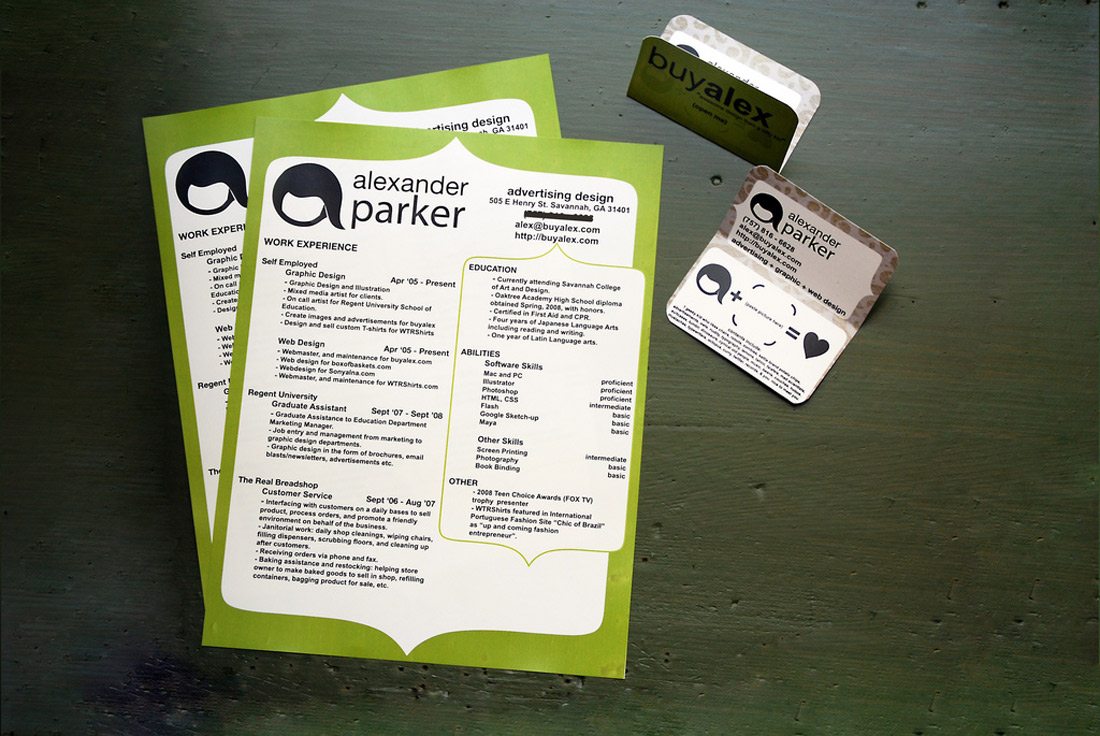
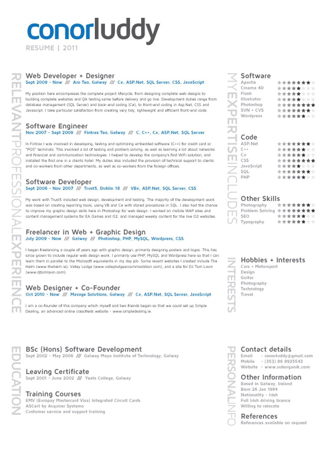
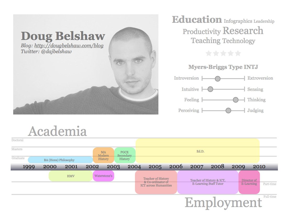
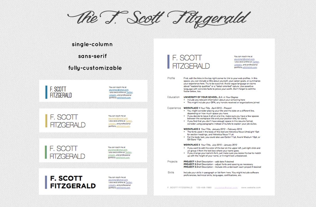
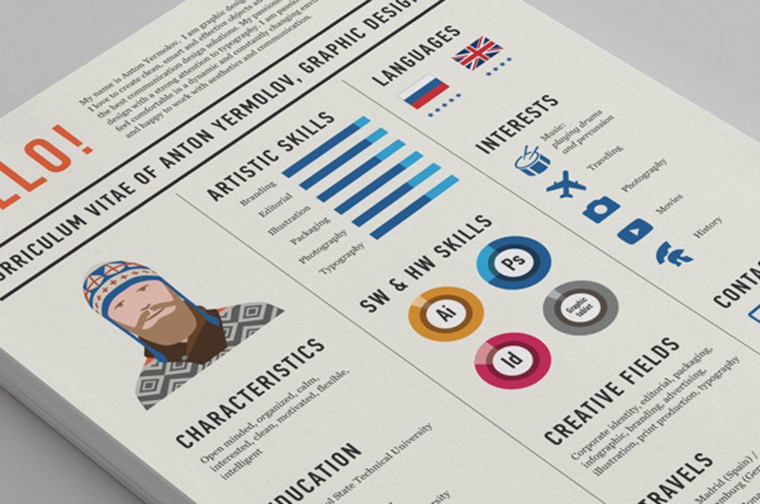
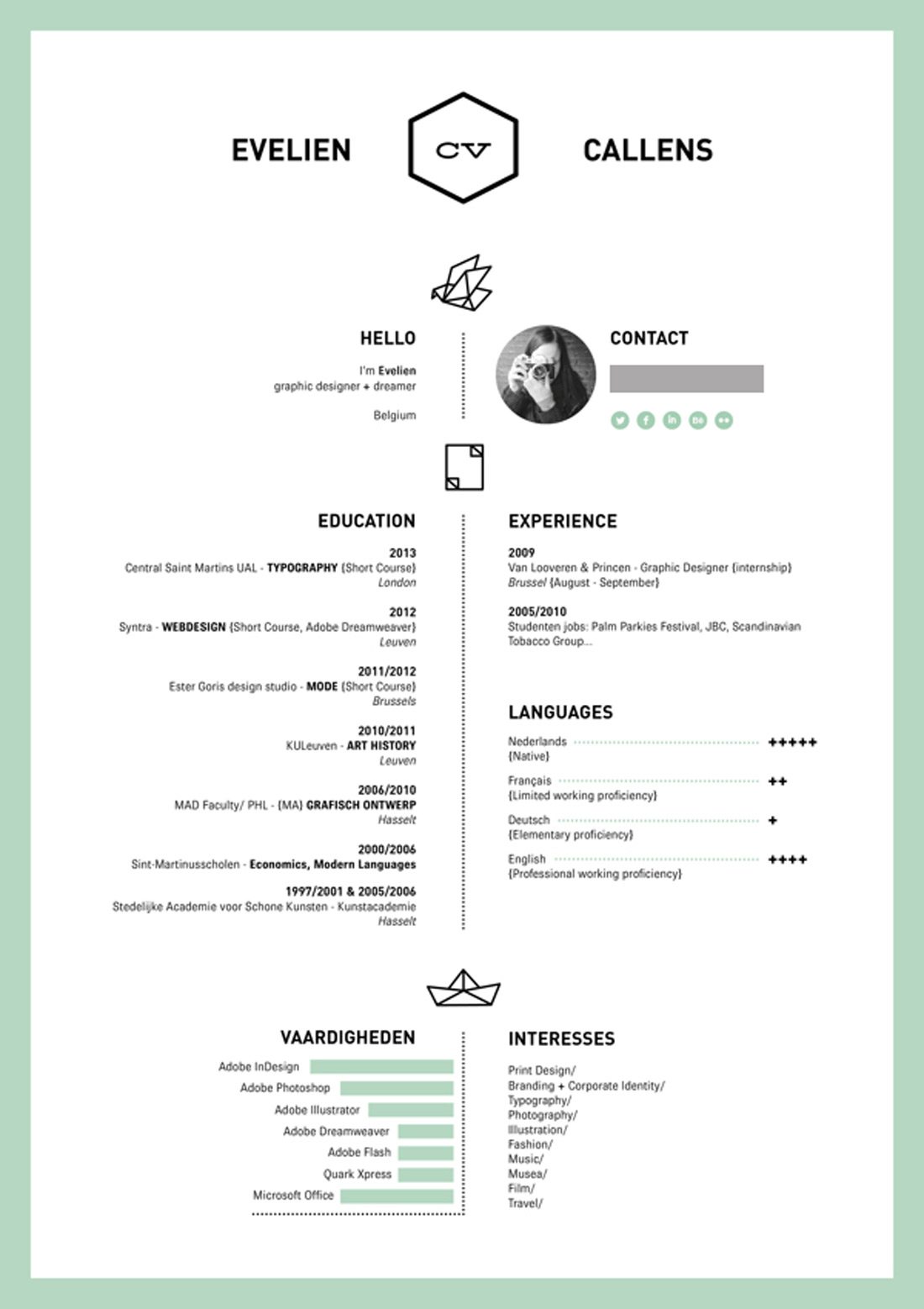
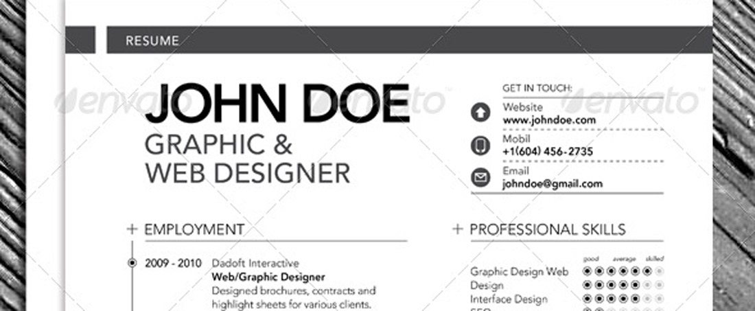
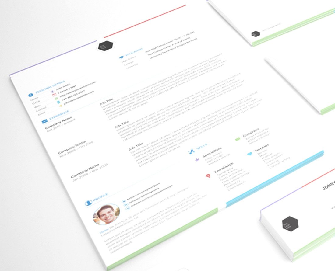
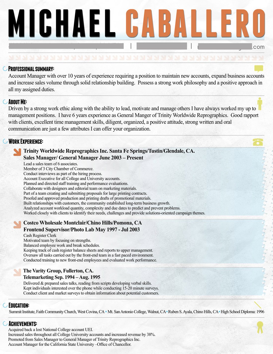
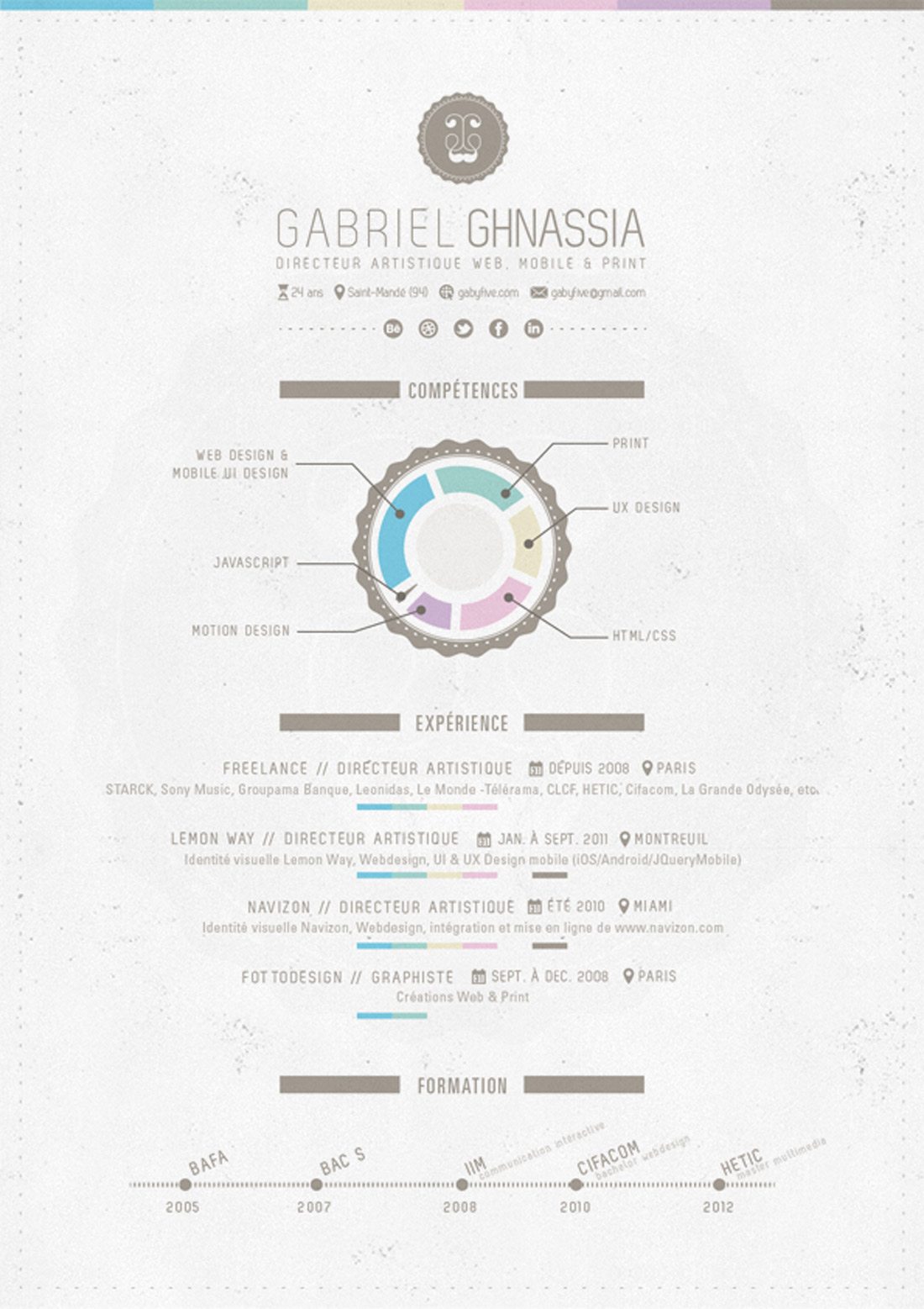
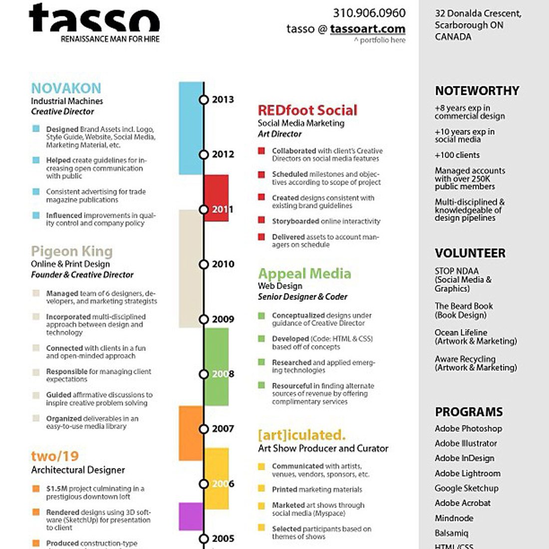
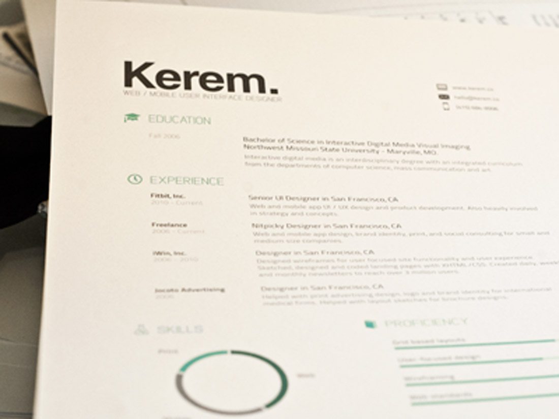
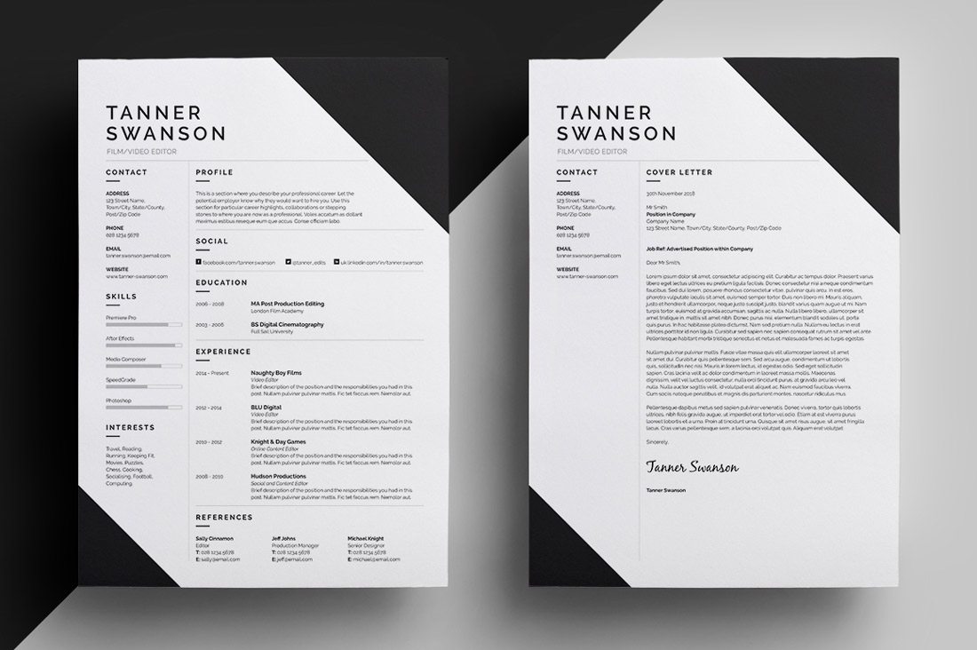
Resume Design Gallery
Now that you are feeling the need to update your resume this weekend, we have a few bit of inspiration from you. Each of these 10 resume or portfolio designs was selected for one reason – because they create a great first impression.
Some of these resume and portfolio site designs are specs, while others are actual designer resumes. Either way make sure to click the links and show some love to designers that you appreciate.
Conclusion
Good luck creating or re-creating your resume. We’d love to see what you are working on (and so would other designers).
Are there other design elements that you need help with? Or are you lacking inspiration. Drop me a line so I can plan some future posts around what you would like to see more of here on the Design Shack blog.
Image Sources: Flazingo Photos, Conor Luddy, Amy Dozler, Doug Belshaw and buyalex.