What’s the Best Font for Your Resume or CV?
It might sound a little silly at first, but the typeface you select for your resume design can speak volumes to potential employers. The font represents your design style and professionalism. It can also impact how the person looking at your resume perceives the information at hand.
The typeface you select makes a first impression with every person you might meet in the interview or hiring process. (They’ll likely see your resume before they ever meet you.) Make sure to set the right tone from the start.
We’re exploring the best free fonts for resumes today. Here are a few top-notch font choices that are resume-ready, and all completely free!
Serif Resume Font Options
Serif fonts are those will additional strokes at the end of each character. They can be subtle or somewhat defined.
Most people associate serif typefaces with professionalism and timelessness. Serif typography options have been around for a long time – back to the Romans – and for that reason have an old-school feel to some people.
For a while, serif font options were used mostly for printed elements, such as books and resumes, and not for digital purposes, but that has changed thanks to higher-quality screens that make every style equally readable.
Use a serif font option for your resume if you want it to have a classic, polished feel. People looking for higher-level jobs might also opt to use a serif font because of the more established nature and feel of these typefaces.
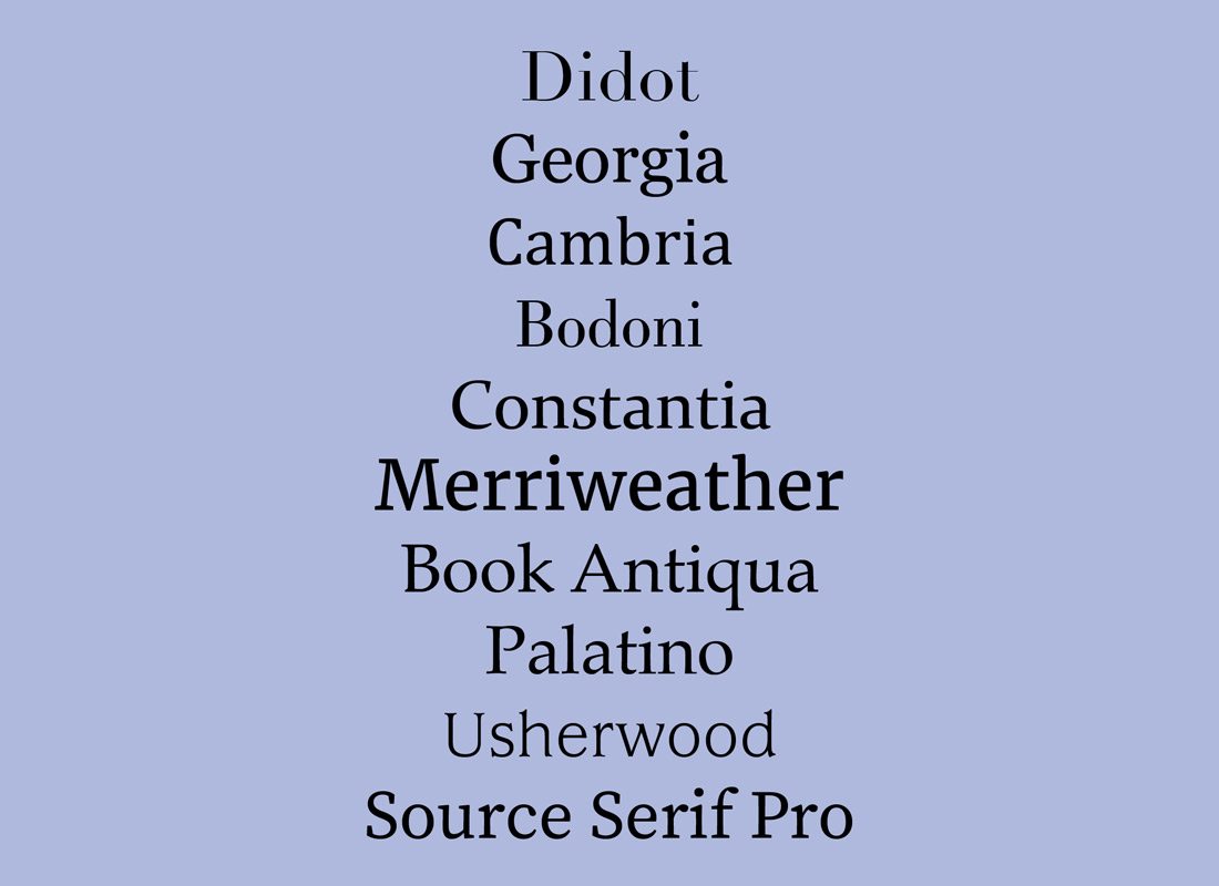
Try these 10 serif fonts for your resume (shown above in regular weights):
- Didot
- Georgia
- Cambria
- Bodoni
- Constantia
- Merriweather
- Book Antiqua
- Palatino
- Usherwood
- Source Serif Pro
Sans Serif Resume Font Options
Sans serif fonts are those with a simple, more plain design. They do not include any embellishments on the ends of strokes like serifs.
Sans serif styles are quite popular online and with digital publishing because of the ease of readability that comes with the simple style. These fonts are viewed as a more modern and trendy option by many.
Use a sans serif font option for your resume if you want it to have a modern and contemporary look and feel. These fonts are acceptable for resumes at any hiring level and almost any job type. The one thing to be aware of is that condensed or lightweight sans serifs can be somewhat difficult to read and should probably be avoided.
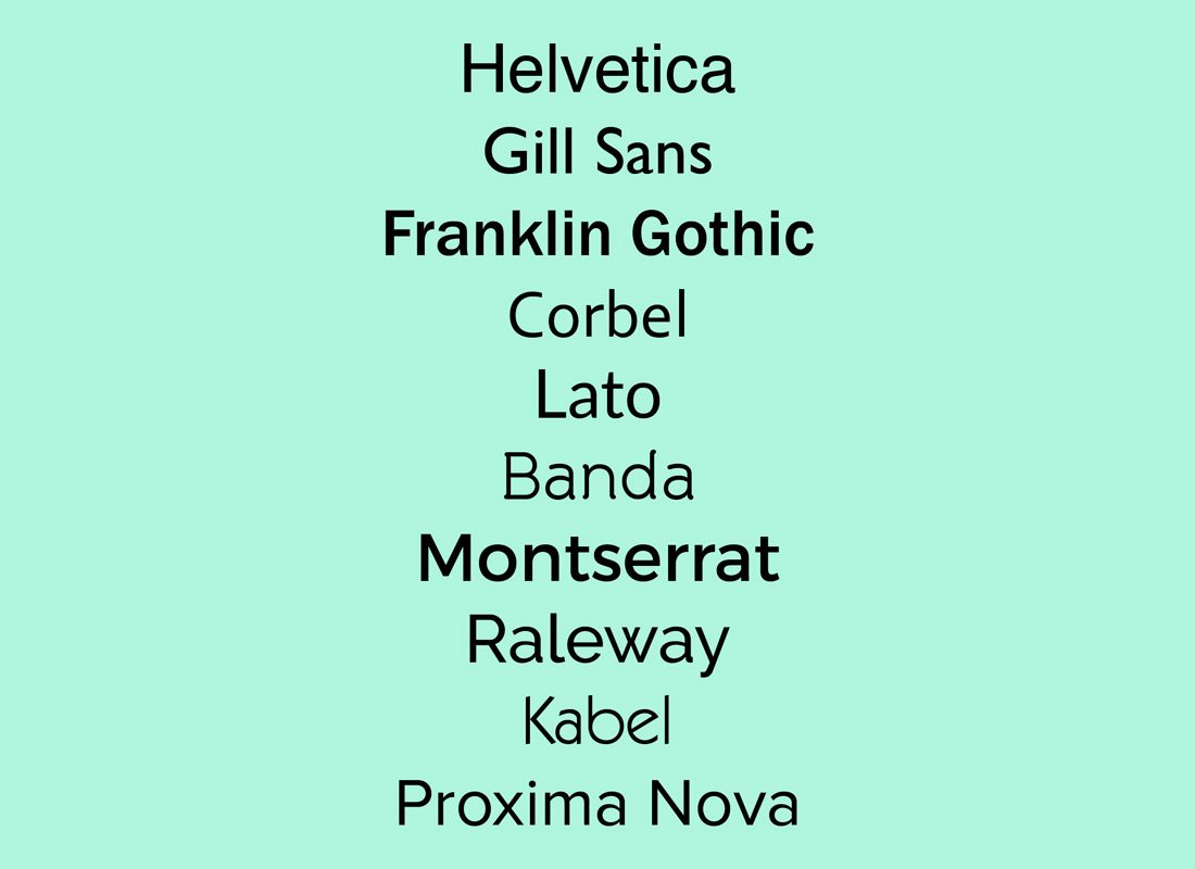
Try these 10 sans serif fonts for your resume (shown above in regular weights):
- Helvetica
- Gill Sans
- Franklin Gothic
- Corbel
- Lato
- Banda
- Montserrat
- Raleway
- Kabel
- Proxima Nova
Pair Two Typefaces
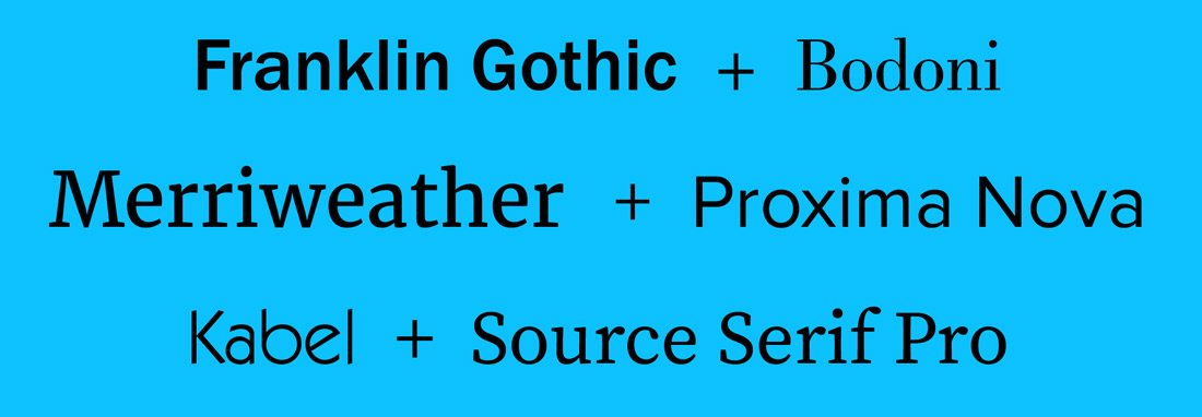
As with almost any other design project, one typeface probably isn’t enough. Most of the time you will pair two fonts to maximize visual impact and readability. The same is true of resume design.
While you can pair fonts of the same type – a serif with another serif or two sans serifs – you can also pair fonts of two different styles. The trick is picking lettering styles that have some similar characteristics, such as overall letter shape (round versus oval), as well as distinct contrast, such as the weight of each stroke.
Pick a role for each different typeface. Use one option for the main body of your resume. Mix regular and bold options to create variance and establish importance throughout the descriptions of your skills, experience, and accomplishments.
Use the other typeface for information such as your name and contact information or footer details. You might also sprinkle in this typeface for major headers throughout your resume.
The goal should be to create a visual flow with two resume fonts so that hiring managers can scan the content of your resume to figure out if you are a match for their job. The biggest elements of your resume in terms of font-weight should be your name and key headings, such as past work experience and skills.
Be careful not to go overboard with fonts. To many typography changes, weights or styles can be jarring and take away from the effectiveness of what you are trying to communicate. When in doubt, opt for fewer options rather than more.
What Size Should the Text Be On My Resume?
Now that you’ve picked the perfect font for your resume, how big should it be?
While your name can be almost any size – that’s the header of your resume – the size of the body text is important. If the text is too small, it becomes difficult to read. If the text is too big, it looks like you probably don’t have enough qualifications to fill one page. (Note that most resume professional recommend a one-page resume for most job seekers.)
The happy medium is somewhere between 11 and 13 points, depending on how wide and thick the letters are in the font you select. Headings should be 4 to 5 points larger than the body text. Supporting text, such as dates at a job or brief descriptions can be as small as 10 points, but small fonts should be used sparingly.
Think about size as well if you plan to replicate your resume online. (Many job seekers – particularly designers and website developers – maintain a resume and portfolio website.) Make sure to use plenty of size for the fonts here as well. Bonus points for fonts that are a match to your printed resume. This can create a consistent look and feel that might impress potential employers.
Fonts to Avoid on Your Resume
You probably know all the jokes about Comic Sans and that you should not use it as your resume font. But there are other categories of fonts that should be avoided in most cases as well. (The exception is for actual type designers, you can showcase almost any font you like.)
Fonts not to use on your resume include:
- Elaborate scripts: They can be difficult to read.
- Handwriting fonts: Most handwriting styles aren’t formal enough for a resume.
- Novelty fonts: Lack of readability or informality can be a concern if you want to make a professional impression.
- Slab typefaces: Super thick, bold options can overpower other text elements on your resume.
- Old-word style fonts: In most cases, these can be difficult to read and are not resume-appropriate.
Conclusion
In the job market? Need even more resume help? We can help you there. Make sure to check out these related articles to make the most of your job search.