Interesting Trends in UI Design
I’m always on the lookout for new design trends. It’s fascinating to me how certain ideas get picked up by so many designers and implemented in countless different ways.
Today we’re going to specifically explore the world of user interface design and see if we can spot any currently popular trends. Almost more than any other area of design, interfaces are extremely subject to the ever changing whims of designers and if you’re not in the loop, you could find yourself creating UI that feels outdated. Read on to see what’s trending!
Are Trends Good Or Bad?
People typically read trends posts in one of two ways: as a list of examples of things to try or as a list of clichés to avoid. Which is the correct way? If something is a trend, does that mean it’s good or bad?
My answer is that trends in general are fairly neutral. They’re not necessarily intrinsically good or bad, they simply represent what lots of people think is cool at the moment. That being said, trends often reach the point where they’re so overused that they leave a bad taste in your mouth.
For this reason, I always recommend that every designer constantly look around and take note of what’s currently popular in design. Being familiar with these constructs will make it easier to do your job, whether you’re looking to fit in with the crowd or do something completely unique (you have to know what isn’t unique to create something that is).
With that in mind, let’s check out those trends!
iOS Inspired Everything
It’s difficult to say that Apple’s iOS platform “owns” a certain aesthetic, but generally the hard working developers behind the great iPhone and iPad apps we all know and love have carved out a pretty specific visual style, perhaps led by Apple, or perhaps Apple is following the third party guys.
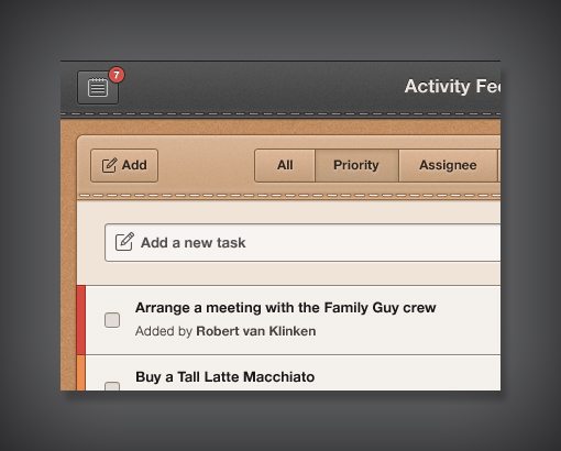
Regardless, from rethought widescreen multi-column layouts to what some have deemed an overly skeuomorphic aesthetic, you can typically identify an iOS interface when you see one. At least that’s how it used to be. With Lion and the upcoming Mountain Lion, Apple has been integrating similar visual ideas into OS X, and they’re certainly not the only ones jumping on the idea of bringing this style to desktop UI design.
The gorgeous Dribbble shot from Robert van Klinken above is a perfect example. Given the design of the buttons and the use of stitching, I would swear this was an iPad app. However, it’s actually a design for a web-based productivity app for desktop computers.
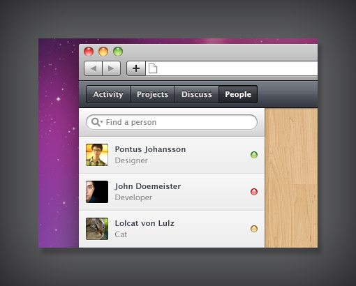
Even if we take a step back from the faux realism style, there are plenty of other examples of Apple-inspired web application UIs. The shot below from Pontus Johansson is similar to the increasingly subtle gradients in Finder windows and app chromes from OS X.
Wooden Backgrounds
This one is by no means new, Garage Band showcased a sort of wooden texture ages ago and I’m sure there are plenty of other examples before that. However, this trend is definitely at the height of its popularity. In fact, it’s probably the closest thing 2012 has to the overused glossy web 2.0 look from a few years ago.
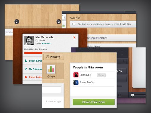
Designers: Ix Techau, Pontus Johansson, Pavel Maček, Levi Wintering, and Max Schwartz.
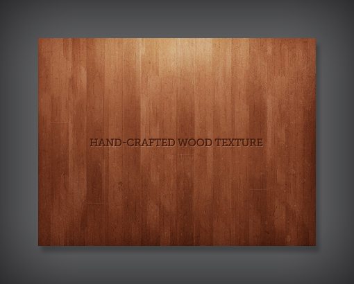
The long and short of it: wood is the UI texture of choice at the moment (though linen/canvas textures are also extremely popular). You’ll see it in iOS apps, Mac apps, web apps, Android apps; everywhere. One of the things feeding this tendency is the widespread availability of really fantastic and free textures.
Much of this started with a Matthew Skiles shot that was uploaded to Dribbble way back in July of 2010. It was beautiful, detailed and free to use in any project without attribution.
The result was quite a few apps picking this up for their interfaces, which led to others releasing similar free textures and those being picked up by interface designers, and the cycle is still continuing two years later! Do I think this trend is overused? You bet. Have I jumped on board myself? Of course!
Retro Interfaces
All the trends that we’ve pointed out so far seem to be taking the “realism” perspective of making software interfaces feel like real world physical interfaces. Within this tendency, there are sever sub-niches as well, the most drooled over of which tends to be anything retro.
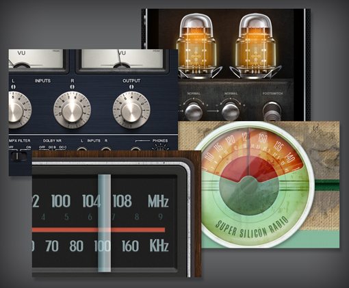
Designers: Callum Chapman, Mike | Creative Mints, Gökhan Kurt, and Gianluca Divisi
Designers absolutely love rebuilding the devices from decades past using pixels. There are definitely ups and downs within this area of UI. Some of the interfaces end up feeling rushed and clunky, with the retro aspect being more of an annoying hindrance than something that actually furthers the experience.
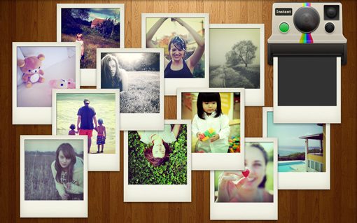
That being said, some retro interfaces are flat out delightful to use. Here the retro component is the key aspect to the enjoyable nature of the application. For instance, in the Mac app “Instant“, you drag your photos to an old Polaroid camera, which then spits out the photo while you wait for it to “develop” just like in the old days. It’s not ideal for normal photo processing but for making retro Polaroid shots, it’s super fun.
Notification Boxes
I’m always fascinated when a basic shape suddenly takes off and becomes popular. In a post from last year, we looked at how ribbon shapes were taking over the web. These days, I’m seeing tons and tons of this shape, which I’ll refer to as a notification box for lack of a better term.
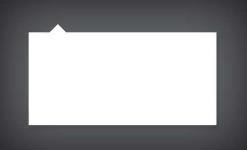
As you can see, it’s basically just a box with a triangle popping out of it. The triangle helps tie the contents of the box to a form, button or other piece of content and can be located on any edge of the box. Don’t believe me that this shape is suddenly super popular? Here are a few examples that I found in about two minutes of searching.
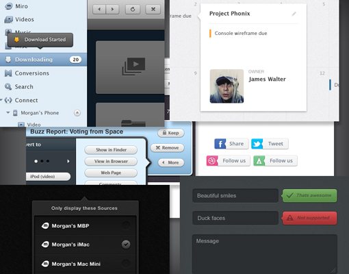
Designers: Morgan Allan Knutson , Jason Wu , Justalab and Mikael Eidenberg
I can’t seem to locate it now, but I even saw an little web app the other day that allows users to customize and generate this shape in pure HTML and CSS. It’s funny how little things like this catch on and suddenly you see them everywhere.
Update: The aforementioned site is CSSArrowPlease. Thanks to commenter Jack for pointing this out!
Snow White UI
The “minimal” movement is alive and well in the UI world, with many designers taking the route of going almost completely colorless and instead opting for a completely light gray or white color scheme.
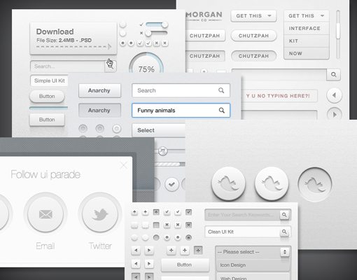
Designers: Matt Gentile, Daryl Ginn, Morgan Allan Knutson, Norm
As you can see in the examples above, buttons and form elements are prime territory for this trend. Subtle gradients, single pixel outlines and shadows that are often inset define the aesthetic. The result is a very light, airy experience that feels fairly formal.
It’s also interesting to note the ever increasing popularity of UI kits. I’m not sure who the first person was to toss a bunch of UI elements into a free download, but the idea has certainly caught on and continues to be a favorite of freebie finders everywhere.
What Trends Have You Seen In UI Design?
This collection is a completely random scattering of ideas that I’ve been seeing a lot lately. I’m sure I’ve missed a ton of other popular trends that UI designers are jumping onto and I’d love to hear your feedback.
What types of design have you been seeing a lot of recently? Do you also find that the minimalism of a few years ago (e.g., Google) has led to a dramatic response of realistic interfaces like those coming from the Apple iOS/OS X camp? Leave a comment and let us know!
