10 Web Design Trends to Watch for in 2018
As 2017 winds down, it’s a good time to reflect on the accomplishments of the past year and start thinking about designs yet to come.
Looking at more recent designs, redesigns and even just design tweaks, a few distinct trends are starting to emerge as the front-runners heading into 2018. Here’s a look at some of the web design trends that will likely become popular (and many of these concepts can be used for print design as well).
1. Asymmetrical Grids
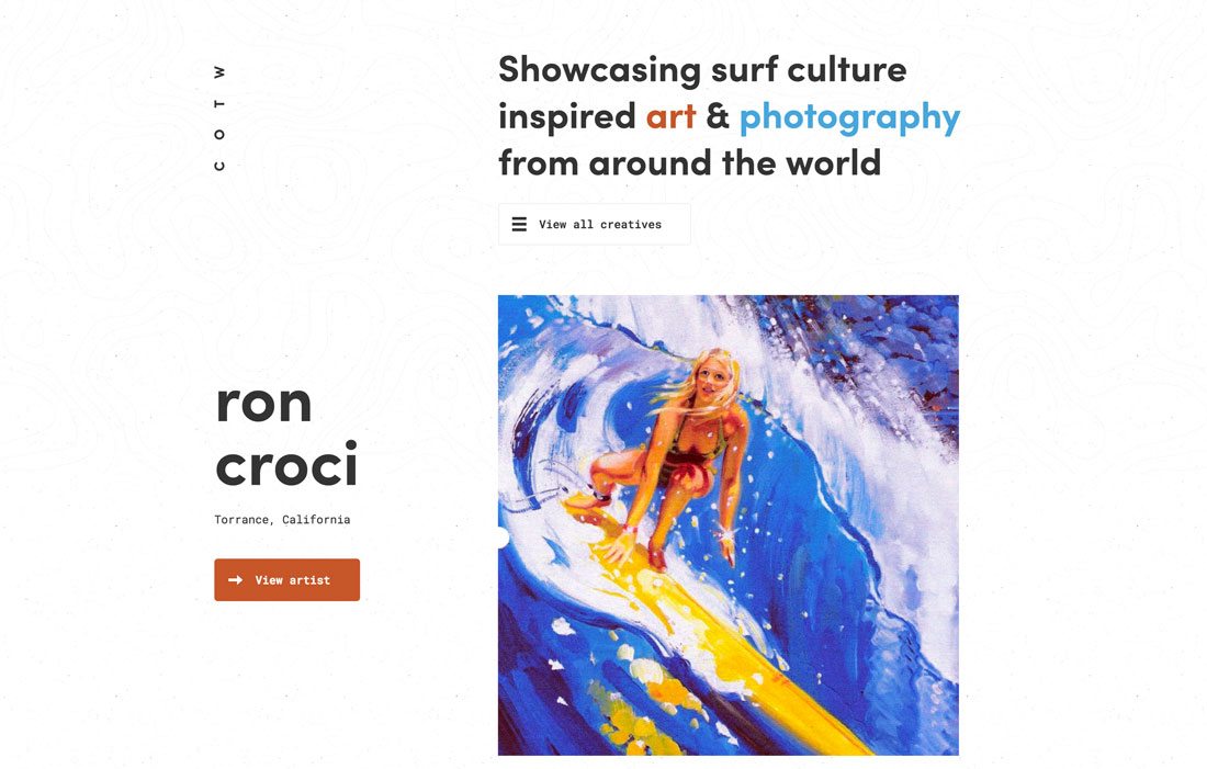
The age of perfect symmetry is over. While split screen designs were a big trend in 2017, that perfect half-and-half visual outline is evolving.
Designers are splitting the visual elements on the screen with a more asymmetrical grid pattern.
To make this concept work, there needs to be a distinct balance of elements so that one side of the design isn’t overpowering. Space and text elements often balance visuals to help draw the eye across the design.
And it all comes together because the designs still live on a grid, which helps keep everything organized. (The elements in the Club of the Waves design, above, is organized in such a manner which is why the asymmetrical design feels so balanced.)
2. More Bright Color
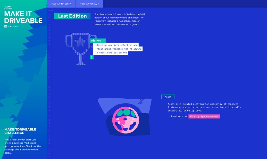
Bright color seems to be the design trend that just wants to stick around. It was a big part of flat design and equally important to Material Design, and both concepts are still a part of a lot of projects.
Even without characteristics of flat or Material, bold color is eye-catching and can help draw a user into a design. Bright and bold color choices have a fresh feel and appeal to younger users.
These color choices can also create an unexpected aesthetic and create a funkier vibe for websites and companies that might not be known for this tone. Ford, above, doesn’t come to mind as a progressive, hip company, but the design for the Make it Drivable microsite exudes these emotions.
3. Bottom Sticky Elements
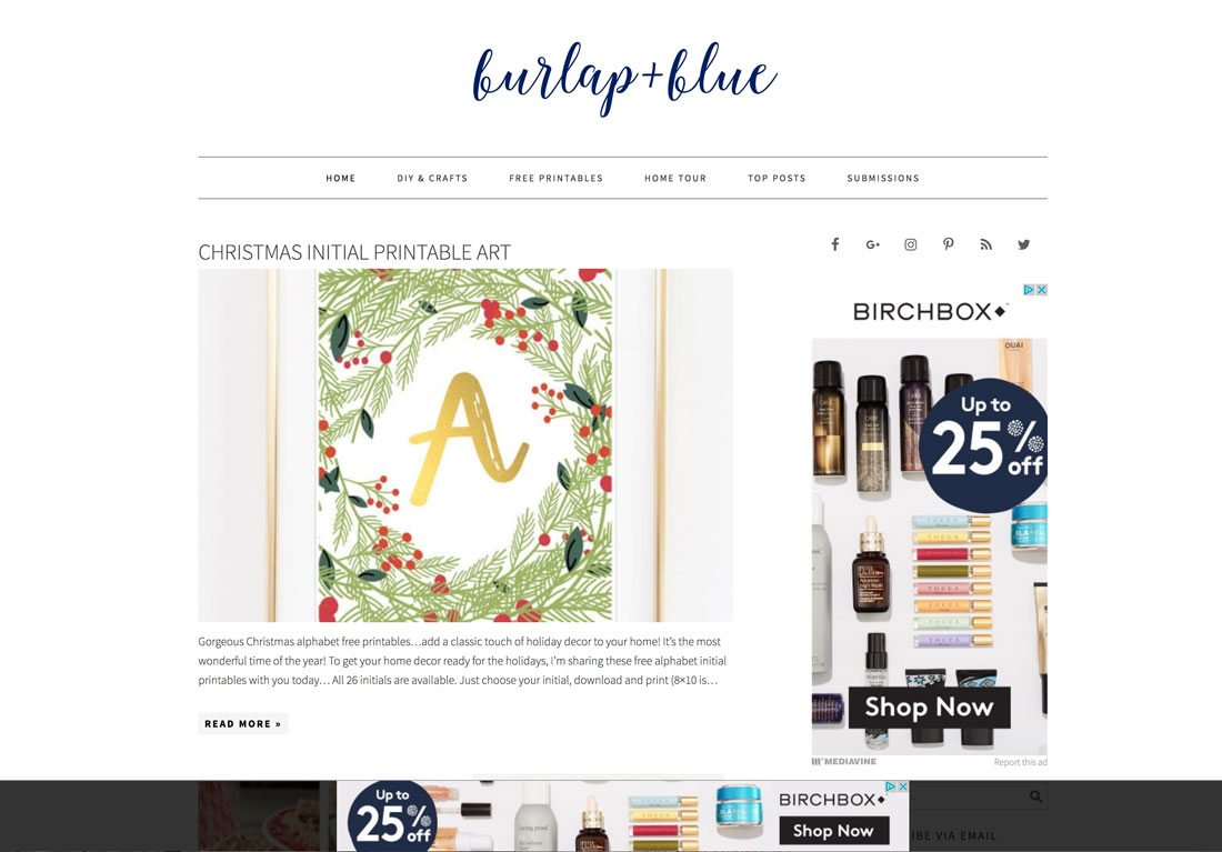
All those tiny ads at the bottom of apps and mobile websites are making their way to desktop and tablet designs as well. And it’s not just ads in this down screen location, chat boxes, pop-ups, notifications and even navigational elements are sticking to the bottom of the screen.
This less obtrusive location is a prime viewing area and mobile usage has trained users that these types of placements are acceptable.
And if works. An ad at the bottom of the screen, such as the one from the Burlap and Blue blog above, just seems so much less in the way (and less in your face) than a nameplate banner. The user still sees it, but it doesn’t obscure content.
4. Voice and Natural Language Search

The future of web design isn’t 100 percent visual. Some of it will be audible.
From designing interfaces that can “hear” and understand voice commands to incorporating search terms that mimic natural language, integrating a world of voice and language will be imperative for website design projects.
And while some of these other trends might not be even more popular at the end of 2018, voice and natural language search is only going to grow in usage and popularity. You should start planning for it now so you’ll be able to incorporate it into future projects with ease.
5. Fluid Shapes
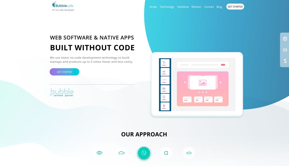
While sharper poly shapes and geometry were big in 2017, softer shapes with a more fluid look and even animations are gaining popularity.
Smoother lines are a natural progression of the polygon trend. When Design Shack featured the poly shapes trend earlier this year, the description read “one of the best parts of this versatile trend is that each of these designs is so different. … Polygons are typically flat, two-dimensional shapes, although in website projects some polygons animate move and seem to have more 3-D characteristics.”
The same characteristic hold for more fluid shapes; the key difference is that instead of sharp intersecting lines, each shape is made of smooth curves that flow throughout the design.
6. Subtle Animation
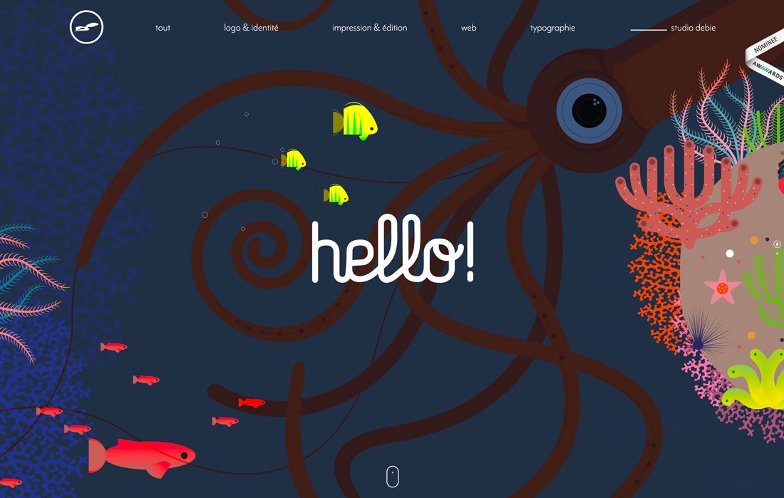
Small, simple animations can surprise and delight users. They can also help provide information and lead the user through more active engagement with the design.
But subtle animation isn’t about a loading feature that hides lagging time, it’s movement within the design itself.
From hover states to cinemagraphs to illustrations that seem to come to life, subtle movement can be a great tool to help create user engagement. To make the most of subtle animation in the design stick to a couple of basic rules: pick just one animation “trick” and stick to it, animation should feel realistic and mimic the laws of physics, don’t force sound or click actions to motion and make sure the animation plays on a reliable loop so users know when the animation is complete. (That’s a sign that they can move on to do they thing they came to the website for in the first place.)
7. SVG Images
Scalable Vector Graphics are becoming more common as the de factor image type for websites. SVGs are lightweight vector images that ensure graphics, icons and logos look pixel perfect regardless of screen size or resolution.
All the high-resolution displays are contributing to the rise of this file format.
SVGs also work well with still and multimedia image experiences, including 3D images, cinemagraphs, logo animations and 360-degree photography.
8. Split Screen Desktop, Stacking Mobile
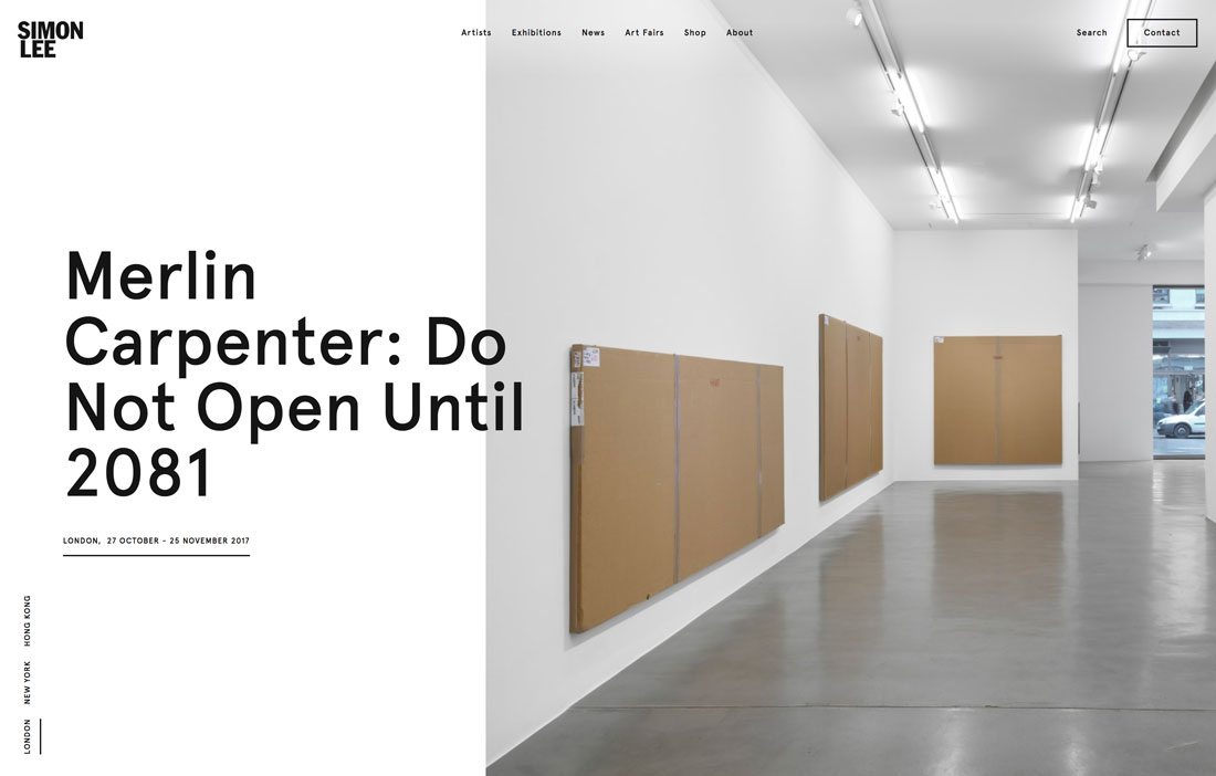
Split-screen design patterns are only growing in popularity. Even the more perfectly split styles.
These designs are so popular because they provide great experiences on both desktop screens and mobile devices because the split content displays side-by-side and stacked equally well. (That way there’s a consistent, but device-specific experience for users.)
While many early split-screen designs were truly split, many designers are opting for a split screen, plus an additional top layer with text or branding to provide an effect that has more depth.
9. More Scrolling Animations
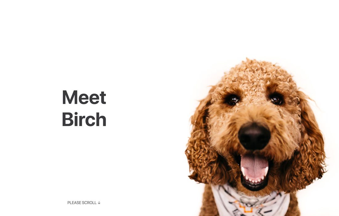
Parallax scrolling animations have been so popular that some designers are starting to shy away from them. But that doesn’t mean you have to ditch scrolling animations altogether.
There are plenty of other ways to use scroll to encourage user engagement. (And you can mix in a little parallax too; just don’t go crazy with it.)
Doggo for Hire, above, uses a scrolling animation that drops confetti on the dog pictured as users scroll. The scroll dictates how fast confetti falls (and even the expression on the dog’s face as it happens). Scroll quickly for a video-style experience; scroll slower to take in all the content on the left side of the screen.
Looking for more scroll-action inspiration? Find it here.
10. White Space Without Minimalism
Designers love white space. (Plenty of us also love minimalism … even if clients don’t love it so much.)
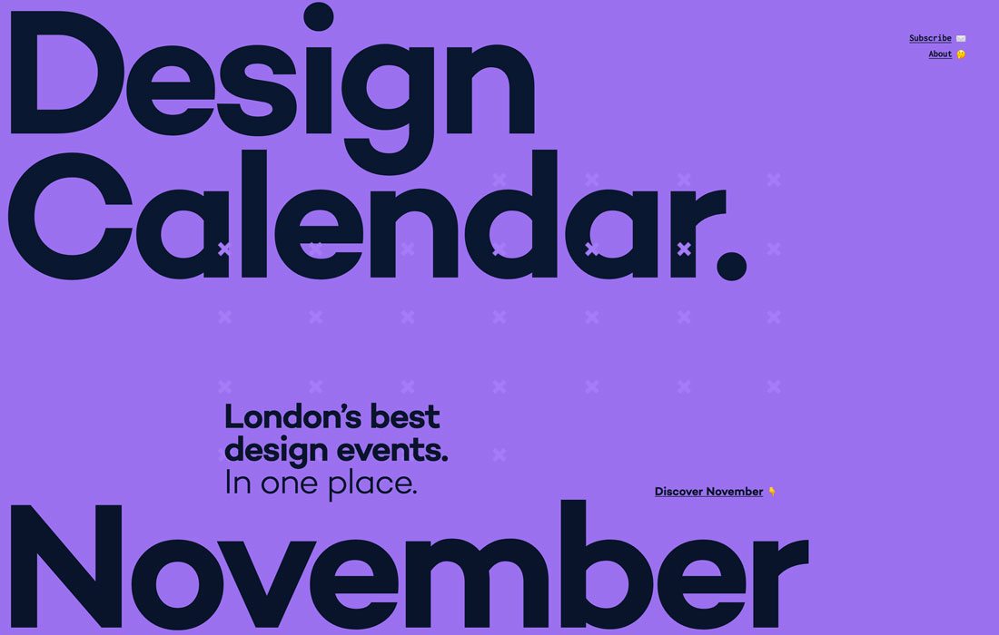
The compromise is designing with plenty of white space, but with a much less minimalistic feel. By adding more color and design elements to a design with a lot of space, it can feel more full.
Design Calendar does a great job using space and packing it with content and elements at the same time – make sure to click on the example and scroll through to see it in action – so that there’s plenty of room for oversized elements to breathe.
Designers are working with white space in plenty of other ways as well. Take a look back through many of the other aforementioned trends and how much white space plays a role there as well.
Conclusion
Does that start of a new year inspire you to try something new? Will it be one of your resolutions?
Just make sure to use design trends with care. Sometimes the best ideas can grow dated quickly. Others end up with a more timeless feel; voice interfaces are probably here to stay for a while. Try them out, make a change to an existing design and have fun. That’s what playing with design trends is all about.