Grids & Type: Structuring Typography for Visual Harmony
Typography isn’t just about choosing the right font, it’s about how that type lives on the page.
When type is placed within a grid, it gains structure, rhythm, and consistency. And when done well, it gives a layout a sense of balance that feels almost invisible, but undeniably effective.
Grids and typography go hand in hand in everything from editorial layouts to digital interfaces. A well-structured grid creates order. It helps guide the eye, reinforce hierarchy, and make complex content feel easy to read.
Whether you’re designing a landing page, a magazine spread, or even a social post, understanding how to align your type with a grid can completely change how people interact with your design.
In this post, we take a closer look at the relationship between type and grids, and how it helps create structure for typography.
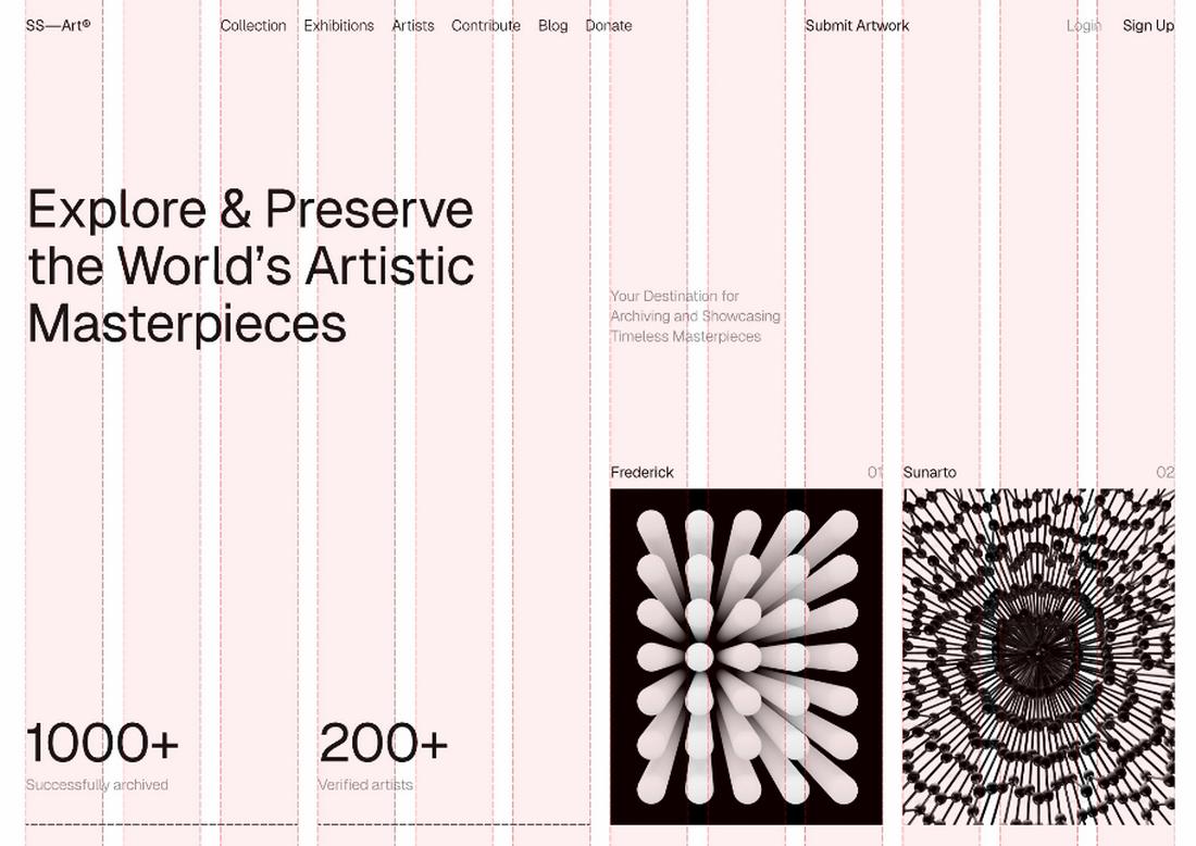
What Is a Grid in Design?
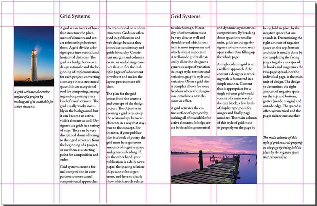
(Example: Multi-column grid / Source: DesignYourWay)
A grid is a system of horizontal and vertical lines that help organize content on a page.
These lines act like invisible guides, helping designers align text, images, and other elements in a consistent and thoughtful way.
Grids can be as simple as a single column or as complex as a 12-column system with gutters and margins.
There are a few common types of grids:
- Manuscript grids for dense text blocks
- Column grids are used in magazines and web layouts
- Modular grids with consistent horizontal and vertical spacing
- Baseline grids to align type across multiple sections
Each grid type serves a different purpose, but the goal is the same: to bring structure to the layout and create harmony between the elements.
Why Grids Matter in Typography
When typography follows a grid, it feels more deliberate. Type alignment becomes cleaner. Spacing becomes predictable. And visual flow improves.
Grids help with:
- Consistency: Paragraphs, headlines, and captions line up across sections, making the layout feel more polished.
- Hierarchy: You can use grid columns to give emphasis to headers or pull quotes while keeping supporting text readable.
- Balance: Proper spacing between text blocks prevents overcrowding and makes the content feel approachable.
Without a grid, layouts can feel chaotic, even if the individual elements are well designed. Grids give typography room to breathe and offer a sense of visual calm.
Aligning Type to the Grid
One of the most important steps in working with grids and typography is aligning your text to the grid’s structure.
That means more than just snapping to lines; it involves making sure font sizes, line heights, and text blocks follow a consistent rhythm.
Start with your base font size, then set a line height that works with your grid spacing.
A common practice is to use multiples of a base unit, like 4px or 8px, to build a consistent vertical rhythm. That rhythm ensures that type sits evenly across rows and columns, reducing visual tension.
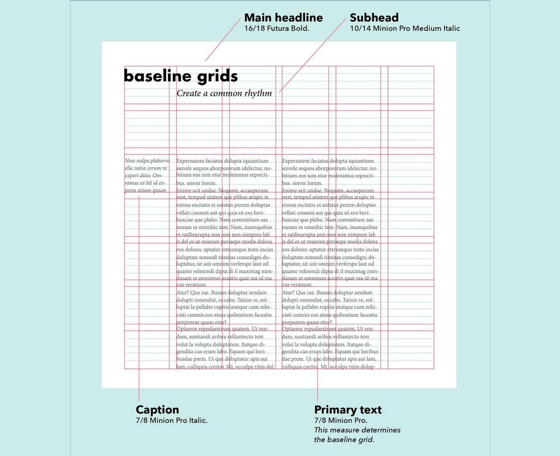
(Example: Baseline grid / Source: Visme)
If your layout uses a baseline grid, align the baselines of your text to the grid to make sure lines of text across columns match perfectly.
This is especially helpful in multi-column designs like brochures or newsletters.
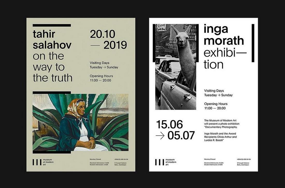
How to Choose the Right Grid
Not every project needs the same type of grid. The best grid is the one that supports your content and format.
For web or UI design, a 12-column grid is a flexible standard. It works well with responsive design and allows you to break content into halves, thirds, or quarters.
For posters or title-driven designs, a simpler two or three-column layout might be enough to keep things structured.
Think about how your content will be used. Are users scanning or reading in depth? Is the text dense or minimal? Will the design live on mobile screens or in print? Your answers will help shape the grid that supports your typography best.
How Typography Structuring Creates Visual Harmony
It’s this carefully crafted typography structuring that brings a sense of order and calm to a design.
Instead of text feeling scattered or overwhelming, it flows in a way that’s easy on the eyes.
This structure guides the viewer’s attention from one element to the next, using clear visual cues like consistent spacing, aligned edges, and thoughtful type hierarchy. Even when there’s a lot of information on the page, a well-structured layout makes it feel digestible and inviting.
Visual harmony happens when everything feels like it belongs together. The grid acts like a blueprint, helping type elements connect and relate to each other through alignment, rhythm, and scale.
Headings stand out just enough, body text reads smoothly, and the space between elements creates breathing room. All of this makes the content not only easier to read but also more enjoyable to look at.
Without structure, even the best-looking fonts can fall flat. That’s why designers rely on grids. With the right structure in place, typography becomes more than just words on a page. It becomes a design system that communicates clearly and feels balanced from top to bottom.
10 Typography Tips for Better Grid-Based Layouts
These tips will help you fine-tune your typography within a grid and make your layouts feel more refined and readable.
1. Establish a Type Scale
Start with a clear hierarchy of font sizes that work across your design. Choose a base font size and build your headings, subheadings, and body text from that scale.
Using consistent sizing helps your text align better with the grid and supports a smoother visual rhythm.
2. Use Modular Spacing Units
Pick a base spacing unit (like 4px or 8px) and apply it consistently to padding, margins, and line heights.
This keeps everything neatly aligned with your grid system and prevents awkward spacing between elements.
3. Align Text to Baselines
In multi-column layouts, use a baseline grid to ensure that lines of text across different sections align horizontally.
This improves visual harmony, especially in text-heavy designs like magazines, reports, or brochures.
4. Limit Font Pairings
Stick to one or two fonts at most in a single layout. Using too many typefaces can create tension and make alignment more difficult.
A solid pairing, like a serif for headings and a sans-serif for body copy, helps reinforce hierarchy while staying visually cohesive.
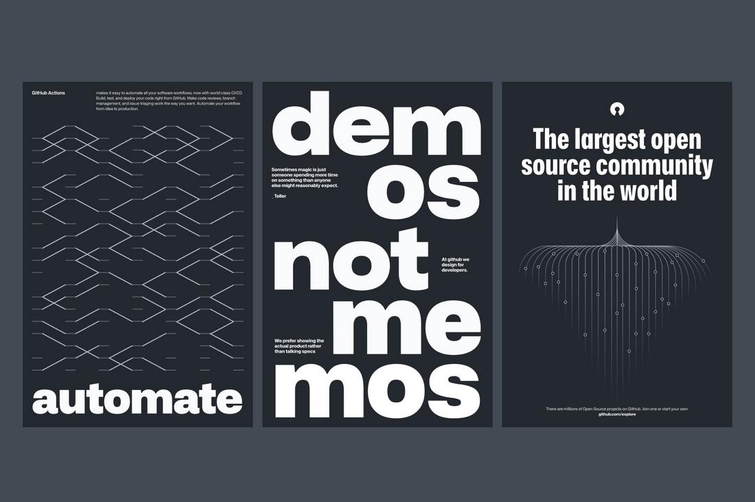
5. Make Headlines Span Columns
To create contrast and guide the reader’s eye, allow headlines or key statements to break the grid and span across multiple columns.
This adds visual interest while still anchoring the rest of your content within the grid.
6. Adjust Line Length for Readability
Make sure your body text doesn’t stretch too far across the page. Aim for 50-75 characters per line for comfortable reading.
Use column grids to create natural breaks and keep lines at an ideal length for readability.
7. Don’t Rely on Just Center Alignment
Center-aligned text can be difficult to manage within a grid and often leads to inconsistent spacing.
Left-aligned text is easier to control and generally feels cleaner, especially for paragraphs and supporting content.
8. Use Vertical Rhythm
Space your text blocks with consistent vertical intervals to maintain flow from one section to the next.
This rhythm helps readers move naturally through the content and gives your layout a sense of structure.
9. Be Consistent with Indents and Alignment
Whether you use indented paragraphs or line breaks between them, pick one method and apply it uniformly.
Also, make sure all your text blocks align with your chosen columns or grid guides to prevent misalignment that can throw off the overall layout.
10. Adjust for Responsiveness
If you’re designing for digital platforms, think about how your type and grid will scale across different screen sizes.
Use flexible grids and scalable typography to maintain visual consistency on mobile, tablet, and desktop layouts.
In Conclusion
Grids and typography aren’t just technical tools, they’re foundations for visual clarity and creative expression. When used well, they allow you to build layouts that feel cohesive, readable, and strong.
And while a grid might seem limiting at first, it’s actually the opposite. It gives you the freedom to design with confidence and purpose.
If you’re looking to improve your typography, don’t just look at fonts or colors. Look at your structure. Look at your grid. That’s where the harmony begins.