Utilizing Grids in Print Design
The basic organization of a design project typically begins with a simple concept – the grid. Whether you decide to work within its constraints or intentionally move away from it, deciding how to use a grid tends to be one of the first steps in the design process.
Print designers have been working on grids since the first newspapers rolled off the presses hundreds of years ago. Most magazines also employ a grid; books are put together using the grid format. The grid can be part of a publication’s identity and helps create a sense of space and organization. Understanding the basics of grid design – from how it originated, to developing your own grid and using it in your workflow processes – will make working within vertical and horizontal constraints a snap.
History
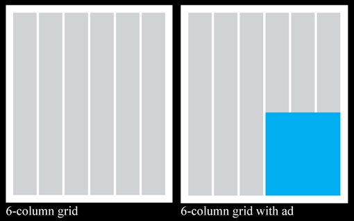
The grid-based design structure has been used in print for as long as presses have been running. Grids, which create structure and organization, are used in print publications and to develop advertisements. The grid is used as a guide for how to place text, photos and advertisements on the page.
Historically, news design was based on a distinct grid that was unchanged from day to day and page to page. Text flowed from the top to bottom of each column and then over to the next column. Photos sat inside the columns as well so each page contained a perfect set of vertical lines. As design evolved so did the grid. Designers began to cross items over the gutters of the grid so that a photo would occupy the space above four columns of type. The grid is maintained but used in a different way.
Advertisements, such as classifieds, still commonly run in the same old news design format. They use a set of distinct columns from top to bottom of each column, with all photos set within the columns.
Book publishers also use vertical grids to keep text easy to read. While multiple column grids are less common than one or two column structures, they are often used in books that contain images or text with lots of formatting (such as cookbooks). Paperback books often only have one column of text per page but wider formats, such as coffee table books, may have two columns (or more) columns per page.
Grid Terminology
Gutter
The gutter is the space between columns. In typical grid design, columns and gutters have consistent widths. Commonly, in print design, the space between each column is one to two picas. (A pica is a unit of measure that is equal to 0.1667 inches.)
Column Inch
When measuring news or advertising space in newspapers and magazines, editors will often refer to column inches. One column inch is one inch of vertical space by one column wide. The number of words that fit in a column inch varies by font and the grid a publication uses.
Jump
When items flow from one column to the next, it is called a jump. Text can jump from one column to the next on the same page, or can jump across multiple pages.
Rail
In some grid structures, a skinny column that is about half the width of columns in the standard grid, occupies the space from the top to bottom of the page on the far left- or right-hand side of the page. This column, which is off the page’s grid, is often called a rail. Rails were common newspaper design tools in the 1990s and early part of this century but have fallen out of fashion in recent years.
Modular Grid
A modular grid uses less of a vertical column format and allows designers to package text and images in rectangles. Column widths may vary from element to element on the page, but all elements will stack to form rectangular spaces. Publications that sell ad space to fit a modular grid offer increments of eighth, quarter, half and whole pages.
Vertical Grids

One of the most recognizable uses of the vertical grid in print design today is employed by The Wall Street Journal. This newspaper uses a distinct six-column grid in its daily design that has become part of its brand identity. Look across the page and you can clearly see each column.
The number of columns a publication uses is determined by the shape and size of the paper it is printed on. Newsletters, for example commonly use a three-column grid, explains Tim Harrower in “The Newspaper Designer’s Handbook.” A three column structure offers limited options for photo and text widths. Tabloid size publications most commonly use four- or five-column grids and most broadsheet newspaper pages use the six-column format.
The width of each column in a vertical grid can set the tone for the way a publication looks and be a factor in type font and size decisions. The font size that you use should be proportionate to the grid. Using a font that is too large will cause odd hyphenation and breaks, which can be difficult to read and using a typeface that is too small can cause strain on a reader trying to get from the start of a line to the end. As a general rule in print design, a column width (in picas) should be no more than double the point size of the body font.
Grids and Advertising
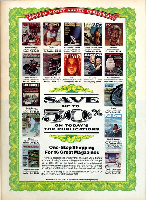
Grids are used in two ways in print advertising – as a unit to sell advertising space and as a unit of design measure.
Just as in news design, ad designers often develop a grid structure for text and graphics. Advertisements with many small images, fox example use a grid so that everything appears organized and easy to follow. A grid may also be used to keep text in proportion to images. Grids used in advertisements may not be as rigid as those in newspapers and magazine and can change from ad to ad, even within the same publication.
The vertical grid used by a newspaper or magazine to shape the way text and photos look on a page is also used to determine ad space. Customers buy ads in increments of column widths by a certain height. This method of ad placement in print publications makes it easier for advertising and news departments (which are separate entities at most organizations) to work simultaneously on pages because of the common grid system.
Develop a Grid Template
Developing a grid for your publication can be done in just a few minutes using built-in software tools. Programs such as Adobe InDesign will allow you to create a grid template that can be used for your projects. When you set your grid, remember to set a margin that corresponds to the space needed for printing.
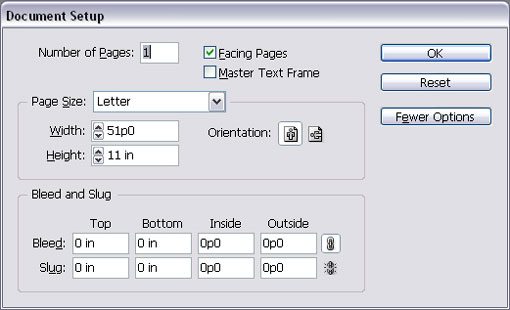
To set the document default, close all open files in InDesign and navigate to “Document Setup” in the File menu. Choose the number of pages you would like your document to include, the page size and orientation and bleed. Apply the changes by clicking “OK.”
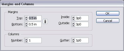
Set the page grid in the “Margins and Columns” option in the Layout menu. Set the page margins first. Click the lock icon, to ensure the margins are the same all the way around. Select the number of columns your document should have and the width of gutters. Apply the changes by clicking “OK.”
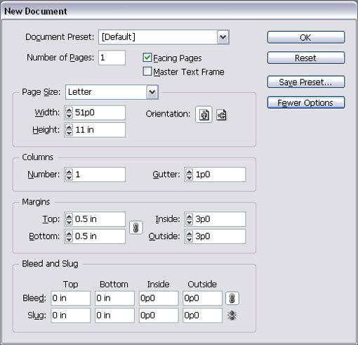
Another option is to create InDesign templates for each different grid you plan to use. Open a new document and follow the steps above. You should be able to see a blank document on the screen that is set to your specifications. Click “Save as” using the InDesign template option.
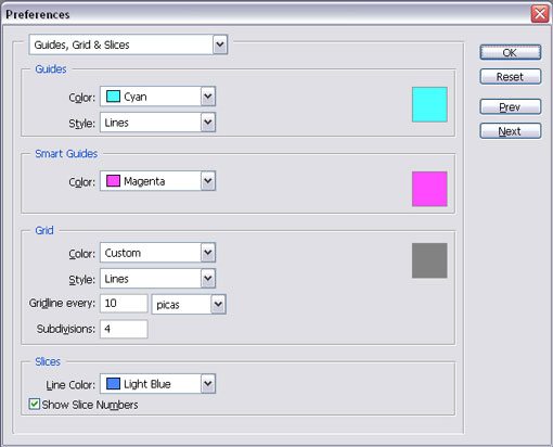
You can also use preset grid tools in Adobe Illustrator and Photoshop to show grid lines. Set grid preferences in the “Grids and Guides” option in the Preferences menu. Note that these programs use a square vertical and horizontal grid, not a columnar grid. Set the spacing of grid lines and how they appear in the document. Apply the changes by clicking “OK.”
If you would like objects and frames to snap to this grid, select the “Snap to Grid” option in the View menu. Objects will attach themselves to grid lines when they are moved near them; this will work even if grid lines are hidden.
Grids and Workflow
Using a grid in projects can save you time and provide a consistent look. Newspapers and magazines use the same grid day after day, establishing a visual identity. Publications have the same look regardless of which designer puts together the pages. You could almost pick out The Wall Street Journal from a stack of newspapers without seeing the nameplate on the top of the page.
This same methodology can be used no matter the size of the project. Set up several grid templates that use different grids for varying size and scale. Use a consistent grid template for a project that should have the same look each time it is published. Stick to the grid when your design should have an organized, consistent feel and break away from the grid to create chaos in design.
Further Reading: Grids On the Web
If you’re a fan of grids, check out these other great articles, which explore the use of grids in web design.
- Ditching the Grid: Alternative Layout Strategies and Tips
- Rolling Your Own Grid Layouts on the Fly Without a Framework
Conclusion
Grids are a method of creating organization in design and have been used by print publications for hundreds of years. A consistent grid can help a publication develop its visual identity, regardless of who puts together the actual design.
A vertical grid can help you determine type sizes and scale for your projects. Develop several grid templates to refer to as a starting point for new projects and use a consistent grid for ongoing design projects that need to have a visual identity.
Image Sources: micora, Tu Photo con El Presidente and Nesster.