Graphics / 16 Mar 2012
5 Gorgeous Note & Point Presentations You Have to See
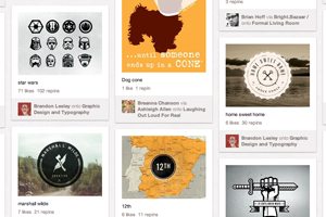
One of my favorite sites for design inspiration is Note & Point, which is a fantastic curator of great looking presentation decks (Keynote + PowerPoint = Note & Point). Not only is this site chock full of awesome design examples, most of their presentations are actually design and development related so you learn some great stuff along the way!
Today we’re going to look at five of my favorite Note & Point decks, which will teach us a ton of great stuff about presentation design.
