UX Design / 25 Aug 2025
How Card-Based Layouts Shape Modern UX
Card-based design has become one of the most popular UI patterns across the web and for good reason.
From mobile apps and dashboards to news websites and online stores, cards offer a flexible and clean way to organize content that’s easy to browse, understand, and interact with.
These modular blocks of content make it simple to display images, text, buttons, and links in a way that feels intuitive and responsive across all screen sizes.
But beyond just looking neat, card-based layouts play a big role in shaping how users experience and interact with digital products.
In this post, we’ll explore why card-based layouts work so well, how they influence user experience, and how to design cards that make content more usable and engaging.
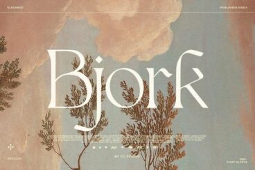
Typography / 25 Aug 2025
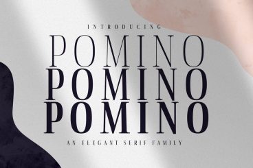
120+ Best Modern Serif Fonts 2025
It’s time to delve into a collection of the best beautiful, modern serif fonts. Serif fonts are ideal for printed literature, detailed typography, or for creating a more formal effect. And these popular serif fonts really stand out from the crowd.
We’ve gathered more than 100 of the best modern serif fonts that you can quickly start using in your work. You’ll be amazed at what a difference they can make to your design project, compared to the more generic system fonts that get all too commonly used.
There’s nothing like a distinct serif typeface to really set your layout apart, and create something beautiful.
Many serif fonts risk feeling a little old a dated. Not these. Our pick of modern serif fonts all look fresh, innovative, and ready for creating design work that sets a trend! And our tips for choosing a modern serif font will help you pick just the right one for your project.
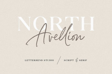
How to Design a Logo / 24 Aug 2025
120+ Best Fonts for Logo Design
Crafting the perfect logo often takes a lot of hard work and time. You have to come up with a design outline, pick the right colors, and find the perfect logo font to match the branding. Don’t worry. We’re here to make that process a bit easier for you.
No need to spend hours surfing the web to find a great font for your logo design, we’ve already picked the best ones for you. Have a look at this handpicked collection of the best logo fonts and choose the one that works best for your project!
Are you in the middle of a logo design project? Don’t forget to check out our in-depth guide on how to design a logo!
PowerPoint Templates / 24 Aug 2025
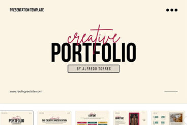
25+ Best Canva PowerPoint (PPT) Style Presentation Templates
Canva is like the Swiss army knife of online design tools. There’s virtually nothing you can’t do with this online graphic design tool.
In addition to using Canva to make social media graphics, logos, flyers, and documents you can also use Canva to create presentation slideshows.
We handpicked some of the best Canva presentation templates for making professional-looking slideshows for all kinds of projects. Believe it or not, these templates are just as good as PowerPoint templates.
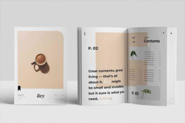
Microsoft Word Templates / 13 Aug 2025
70+ Best Microsoft Word Templates (Modern, Downloadable Word Documents)
Microsoft Word is a multipurpose tool you can use to create not just letters and documents but also resumes, brochures, flyers, and everything in between. This collection of Word templates will show you how versatile this software can be.
Whether you’re working on an important report for a client or making a simple flyer for an event, you can save a great amount of time by using a Word template. Templates come with pre-made designs so all you have to do is edit them to copy-paste your own content.
In this post, we share with you all kinds of Word templates you can use to quickly design professional documents without expert design experience.
Inspiration / 13 Aug 2025
40+ Best Moodle Themes of 2025
Moodle is a powerful learning management system that is widely used by academics and students to build online course management and e-learning websites for universities and institutions around the world.
Moodle templates and themes let you quickly establish a great-looking platform, without too much development time and resources. These templates are easy to implement and offer full customization. Some of these templates cover the corporate arena, while others focus more on education and learning. They’re a great starting point when developing your own platform!
PowerPoint Templates / 13 Aug 2025
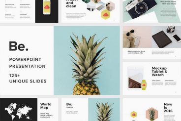
130+ Modern Professional PowerPoint Templates 2025
In today’s collection, we’re bringing you a set of fresh new modern, professional PowerPoint templates for creating presentations that stand out from the crowd. Give your presentation a modern edge, and convey your message in a professional way.
We handpicked a collection of unique and modern PowerPoint templates that you can use for crafting slideshows for all kinds of presentations, including startup pitch decks to business projections, photography, marketing, design, and more.
We’re also sharing our tips for creating a modern presentation, to help you get started fast.
Inspiration / 12 Aug 2025
120+ Best Social Media Kit Templates & Graphics 2025
Are you working on crafting a content plan to promote your brand and business on social media? Then these social media kits and templates will help you design amazing graphics for your social media campaigns like a pro.
Preparing content for your social media promotions is a time-consuming process that most social media managers and marketers have to deal with.
But don’t worry. You can use these social media kits and graphics templates designed by professionals to quickly edit and use with your own social media campaigns. The best part is you can easily edit and customize them all by yourself (and we’re sharing some helpful social media template tips to help get you started!)
PowerPoint Templates / 10 Aug 2025
160+ Beautiful, Premium PowerPoint Presentation (PPT) Templates 2025
PowerPoint presentations, love them or hate them, are an essential part of today’s corporate world. Whether for business use or design purposes, the look-and-feel of your PowerPoint presentation can make a tremendous difference in how impressively your pitch comes across.
To help out with making your next PowerPoint presentation particularly impressive, we have searched the internet for professional and elegant PowerPoint templates that you can easily apply to your work.
We’ve also collected a series of tips for finding a beautiful PowerPoint template if you need some extra help.
PowerPoint Templates / 7 Aug 2025
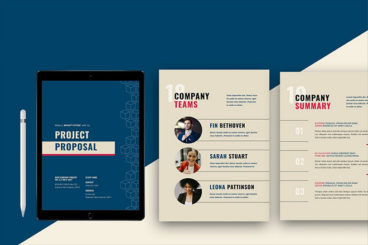
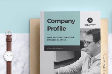
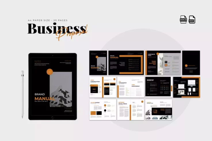
110+ Best Company Profile Templates (Word + PowerPoint) 2025
Creating a company profile brochure or slideshow is a big responsibility. You especially need to pay careful attention to the design, arranging content in a readable and attractive way. These company profile templates can be a huge time-saver!
Designed by professionals, these templates allow you to easily create a company profile brochure or a PowerPoint presentation without having to spend hours on perfecting the design.
We handpicked a collection of the best company profile templates for Word and PowerPoint, to help you create a modern company profile for your business. These templates are all easily customizable to boot.
PowerPoint Templates / 7 Aug 2025
100+ Best PowerPoint (PPT) Templates of 2025
The key to winning your audience is a perfectly designed PowerPoint presentation. Whether you’re speaking at a conference, pitching to an investor, or talking about sales projections at a business meeting, this collection of the best PowerPoint templates will help you speak to your audience.
The way you design your PowerPoint slides will play a key role in the success of your presentation. You need to use the right colors in your slides, structure the content for readability, and visualize data with charts and graphs to deliver a compelling presentation.
It usually takes hours to design a great PowerPoint presentation. But, you don’t have to go through all that trouble. We’ve found some of the best new PowerPoint templates you can use to quickly set up a professional presentation slideshow within a few minutes.
We’ve also collated some helpful tips for choosing a PowerPoint template, and key advice for giving a successful presentation, and Powerpoint Template FAQs to help get you started!
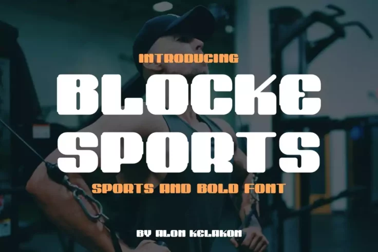
Font Collections / 7 Aug 2025
130+ Best Big, Poster Fonts of 2025
When it comes to designing posters and banners, there’s one thing that matters the most: the font. A poster without a great, attention-grabbing title is simply not an effective poster.
A great poster font has the power to turn even the most straightforward layout into a compelling design. As Irene Etzkorn once said, “There is no such thing as a boring project. There are only boring executions.”
If you’re still searching for that perfect poster font, you’re in luck. We found a set of fantastic poster fonts that’ll be perfect for any poster design. They’re big, bold, and creative enough to turn heads!
We’re also sharing a set of tips for choosing a poster font to help guide you in the right direction.
Font Collections / 7 Aug 2025
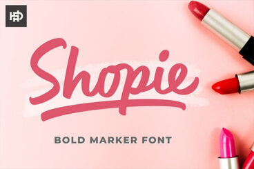
60+ Best Marker Fonts for Creative Typography 2025
When it comes to adding a creative touch to your typography designs, a marker font goes a long way to make your designs look more original and hand-crafted.
Marker fonts, however, are more than just about that handmade look. They also help show your personality as well as the fun and relaxed side of your brand.
We found a collection of awesome marker fonts that have all those qualities. You’ll find all kinds of marker fonts with different styles here that are suitable for everything from creative personal projects to business branding designs.
There are a few free marker fonts in there as well. Have a look.

UX Design / 27 Jul 2025
Designing for Touch: How Finger-Friendly UI Enhances UX
With mobile devices dominating the way we interact with apps and websites, touch-based design has become more important than ever.
Whether it’s tapping a button, swiping through a gallery, or dragging a slider, users expect smooth and intuitive interactions that feel natural on their fingertips.
That’s why designing for touch isn’t just about layout—it’s about usability, comfort, and a frictionless user experience.
In this article, we’ll look at what it means to create finger-friendly interfaces, why it matters, and how designers can build touch-first experiences that feel effortless for users across all devices.
Font Collections / 27 Jul 2025
20+ Stylish Swedish Fonts With Scandinavian Simplicity
Swedish design is world-renowned for its clean lines, minimalist approach, and functional beauty, and that same philosophy shines through in typography.
In this collection of Swedish fonts, you’ll find typefaces that reflect the essence of Swedish style: understated yet bold, refined yet warm.
From crisp sans-serifs that feel fresh and modern to subtly decorative fonts with just the right amount of personality, these fonts are ideal for projects that call for clarity, creativity, and sophistication.
Whether you’re designing for a sleek modern brand, a lifestyle blog, or a Nordic-inspired packaging project, these fonts will help you instantly capture that iconic Scandinavian aesthetic.
Features
Each Design Shack feature covers everything you need to know about a topic, with articles, inspiration, and how-to posts.


Resources
Thousands of free and premium fonts, presentation templates, graphics, video templates, and more.
Explore popular categories:

Watercolor Fruit Photoshop Patterns
These Watercolor Fruit Photoshop Patterns offer graphic design enthusiasts an exceptional collection of vibrant and elegant fruit illustrations. Exclu...
Blocke Sports Bold Font
Blocke Sports Bold Font is a distinctively robust typeface design, specially crafted for those who appreciate a blend of style and versatility in thei...

Doodle Patterns
Doodle Patterns are a set of creative assets you can use to add dimension and personality to your design work. Offered as eight AI swatches, these han...
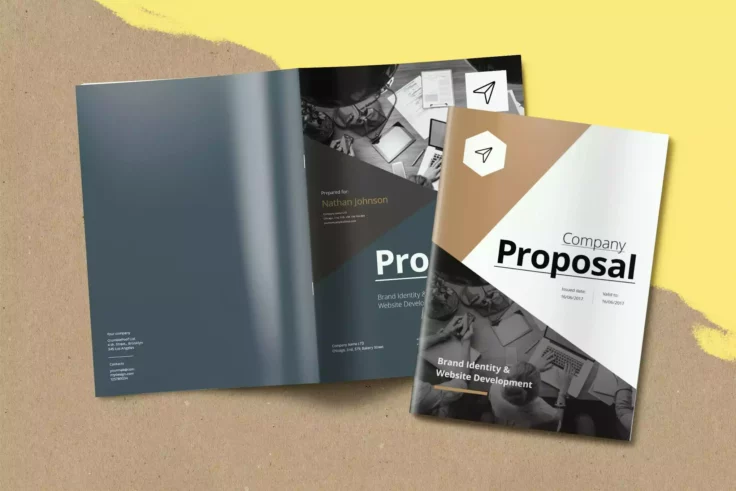
Business INDD Proposal Template
This proficiently designed Business INDD Proposal Template can make a striking difference in the way you present your brand to your clients, especiall...
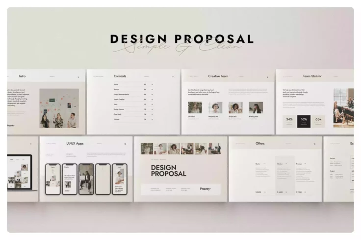
Stylish Business Proposal Template
Present your business proposal in a chic and professional way with our Clean Minimalist Beige Project Proposal Template Design. It ticks all boxes for...
Modern Proposal InDesign Template
Craft an impressive project proposal with this stylish Modern Proposal InDesign Template. The clean and contemporary design lends itself to any projec...