10 Ways to Simplify Your Design
It’s no secret that simple is often better when it comes to website design. An interface that’s simple to understand—and just as simple to use—is more likely to turn visitors into active users who will return to your site later.
But how do you simplify your website? Even if you aren’t building something new from scratch, the trick is to set goals and then look at the path to reaching them for users. Anything that gets in the way of that path should be eliminated. Anything that makes understanding what a user is supposed to do should be removed from the design.
That’s what we’re going to look at today – a few tricks that you can use to simplify your website design. And these ideas work for existing sites and new builds. (This article features examples of stellar simple designs, visit each site for even more inspiration.)
1. Focus on Calls to Action

Your website should have an end goal for every user to do something. That goal should be obvious to every person that lands on the design.
Calls to action need to be clear, large enough to see and in enough locations so that users never get too far away from making that key click.
2. Streamline the Number of Pages
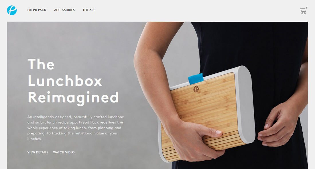
Is your design packed with pages and pages of information? Does it need to be?
Streamline content into manageable chunks, but don’t overwhelm users with too many pages to click through. Keep all related content together for ease of reading and flow.
Eliminate pages with old, out of date information or those that just contain a third-party widget or map. (Those elements can usually be incorporated elsewhere.)
3. Stick to a Color Palette

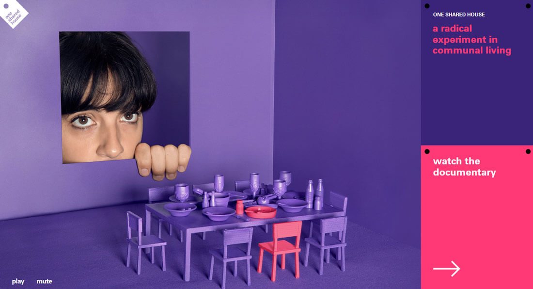
While a variety of color can be fun and engaging, it is also overwhelming. Stick to a color palette with just two or three options to help keep color under control.
If you want to go super-simple, consider a monotone color palette with just a few tints and tones of a single color. It amazing how beautiful something so simple can be, and it is easy for users as well. Fewer colors cause less mental overload and help create a more harmonious and organized appearance. (Something that almost anyone with a hectic life can appreciate.)
4. Opt for Standard Navigation
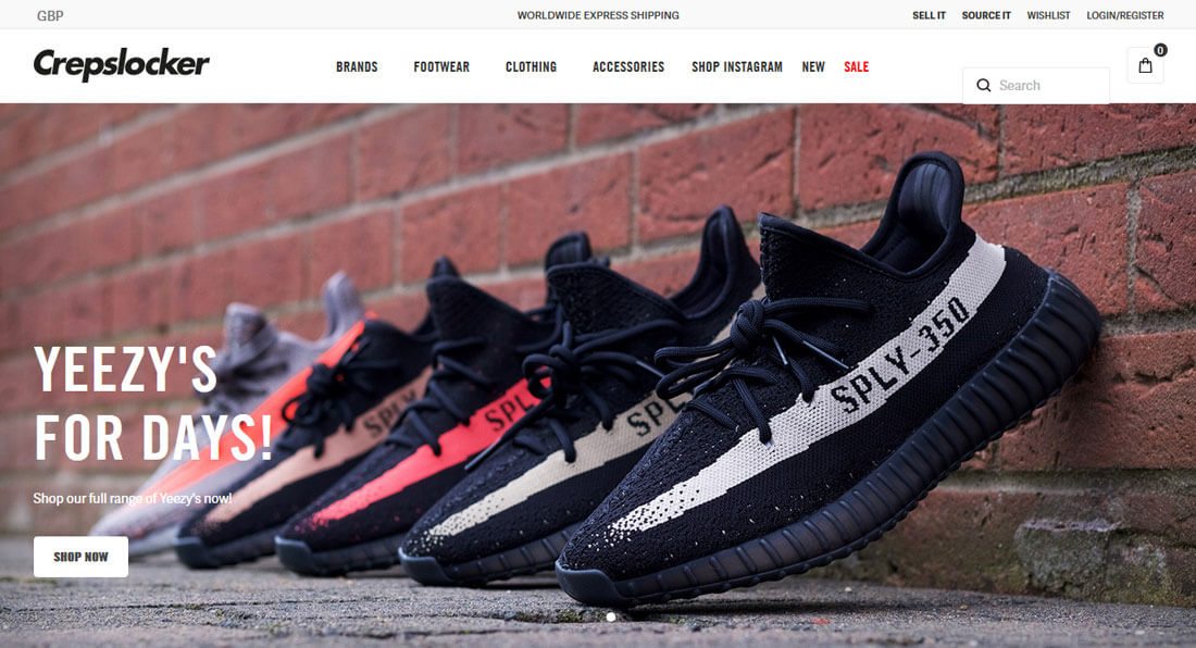
While hidden or alternative navigation styles might look cool, these trendy options are not as user-friendly as you might expect. Any deviation from “normal” user patterns can be somewhat jarring and make users think too hard about moving around the site. Opt for standard patterns so that your website is easy to use.
With that in mind, the standard is pretty lean. Top or pop-out navigation elements with three to eight menu options are the norm. And forget those mega-style navigation menus that were once popular. Unless you are a major e-commerce retailer, there’s no reason for every page in the design to have a place in navigation. (And many of those mega options don’t work at all on mobile devices.)
5. Consider the 80-20 Rule
The 80-20 rule is a good place to start when thinking about making changes to a design. There are two ways to think about and implement the rule.
- Keep in mind that 20 percent of the elements on your website will result in 80 percent of the desired user actions, meaning a handful of calls to action, buttons or other user interface elements will generate a significant portion of user interaction. This is perfectly normal.
- With that in mind, when making changes focus on the top 20 percent of content to make 80 percent of changes when you are updating or rethinking a design. The 20 percent elements that you might want to think about include the same elements that generate the most clicks – CTAs, traffic funnels, and images. White space is another important factor.
If the 80-20 rule seems familiar, it is also called the Pareto principle or law of the vital few. It was developed by economist Vilfredo Pareto but has applications across all disciplines.
6. Use UI Elements with Purpose

Icons, images and every other user interface element in the design should be there for a reason. (Just think of how annoying it is to click on a Facebook icon and not get linked to the brand’s page.)
Don’t overwhelm users with cool divots just because you have them. Plan and use elements only when they serve an actual use and purpose in the overall design.
7. Take Care with Typography
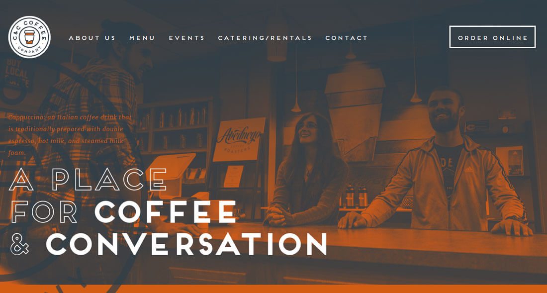
The model for using typography well is just like using color: less is more.
The typefaces that are easiest to read have standard shapes, uniform stroke widths and no abundance of embellishment. A solid type family comes with options so that you don’t have to look for additional typefaces if you need to add emphasis to specific lettering. The letters need to include enough heft to be readable and contrast with your background.
And start with just two typefaces. One for the main text on the website and one for display usage. That’s it. That’s all you need.
8. Bump Up the Text Size

And while you are thinking about typography, bump up the size of lettering. Screens keep getting bigger, make it easier for them to see your message rather than cram more text on the canvas.
While this might seem counter-intuitive when it comes to mobile devices, the same holds true. Larger lettering can be easier to read. Forget that old adage that everything has to be above the scroll. While keywords should entice users to scroll, not everything needs to be on that first screen. Users understand to keep going and are accustomed to scrolling, particularly when looking at websites on their phones.
9. Create Effortless Copy

While typography can make a huge difference in determining how simple or complex your design looks, the actual words are just as important. Every word should convey the same meaning as your visuals so there’s a distinct congruency.
Edit the copy. Then edit it again.
Websites are a medium that is meant as a readable form of communication. Ensure that the conversation you have with visitors is the one you expect with clean, concise, highly readable copy. Create a tone that flows through the design and uses words and language that appeal to users.
Then edit one more time and take out every bit of text that’s unnecessary.
10. Break One Rule, But Only One

Rules are meant to be broken. But only break one rule.
If you want to do something different, don’t muddy the design with a lot of different or unusual elements. By focusing on one more complex or unusual thing, you can create interest without overwhelming users.
It sounds pretty simple, right? (Just don’t get caught in one of the common traps of doing too much.)
Conclusion
A website design that’s too complicated or “too designed” can get in the way of what you want to communicate with users. Remember your conversion goals and what you want users to do with the design. Whether it is to fill out a form, download an app or buy a stuffed bunny, every design element should emphasize getting to this destination.
Strip out all the design elements that stand in the way of this path. Users like clean, simple and easy to use designs. This is particularly true on smaller devices, such as phones, where clutter can ruin the user experience in a matter of nanoseconds.