Minimal Design: How to Design More With Less
Minimalism and the use of whitespace are big design trends right now. Mastery of these techniques might look easy at first glance, but it is actually quite difficult to design with so much open space and so few objects. It can be hard for clients to come to terms with because they often want as much information as possible on a canvas.
But many designers like the look of minimal styles and maximizing whitespace can be a fun challenge. It’s a technique that translates well across mediums and can be used in print, web design and on packaging. Here, we’ll look at the trend and how to design more with less.
Minimalism and Whitespace Defined
When designers talk about minimalism, there’s often a “you’ll know it when you see it” attitude about the technique. There is no perfect formula that makes something minimal or not.
There are, though, some common attributes that most designers can agree on. Characteristics of a minimal design style include:
- Work that is stripped down to fundamental elements
- Simple functionality and user interaction
- Details that carry weight for the entire project
- Plenty of open space
- Simple or little color
- Use of only one or two typefaces with clean strokes
- Simplified content
This is more than just a graphic design theory. Minimalism is used across a number of disciplines including art, music, fashion, home decorating and literature. Often when people talk about minimalism, the phrase “less is more” gets repeated. While this may sound cliché, it is used because it is one of the best ways to describe the minimal style.
The use of whitespace is a key consideration when thinking about minimal design. It only makes sense that with fewer elements, more open spaces would show in the design. To create an effective minimally designed project, you have to think about this direction from the start.
Simplify Content
You should design for the content. Content is king.
If you want to create a minimal design, you can’t have an overly-complicated message. The type of content should match the style of design outline for any project.
So ask yourself a few key questions about the content you are designing for:
- Is it easy to understand?
- Can it be explained to users simply?
- Are the images and words clean and basic?
- Are the ideas easy to comprehend without a lot of explanation?
If the answers are “yes,” a minimal outline might be the way to go. Otherwise, hold off for another project to use this design technique.
Strip Away Design Tricks
In the past few years, designers talked a lot about flat design versus skeuomorphism. That’s where the re-emergence of minimalistic design started, because designers started stripping away all the design tricks.
When working with a minimal style, this is one of the most important considerations. The design should be absent of tricks, unless they are absolutely necessary. Be wary of drop shadows, extravagant textures, image frames or type treatments.
Get rid of everything and think about design elements in the most basic terms – color, type, space, grid and essential elements.
Focus on Details
Every detail should have a purpose. In a minimalist outline, objects and elements won’t fall into the background or hide in the design. Every detail matters, so take particular care.
In terms of details be aware of things such as grids and alignment. Organization will help the design feel harmonious and as intended. Consider the feel or emotion that users should have when interacting with the design. Now create each element to reflect that.
Color Needs Purpose
Sometimes the thought of minimal design evokes a visual of a black and white design. While that is a trendy example, a minimal style can use color.
Select a color palette that uses basic hues in with saturation and brightness that is similar across the palette. Stick to a more restricted palette than you might otherwise with only one or two color options. Limit tints as well.
Determine what color is supposed to mean. Is it the backdrop for the design? Is it an accent or way to draw attention to elements? Use it consistently.
Think About Type
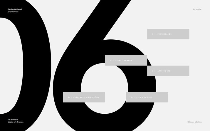
Typography is a lot like color in minimal design projects. It needs to be simple and direct.
Sans serif typefaces are a popular option in this style of projects, as is over- or under-sized typography. Type is often used as the primary graphic element and an exaggeration of size can bring focus to fonts that might get overlooked. The popularity of sans serifs is not a mandate for use. As long as the typeface is readable it can work effectively.
When it comes to thinking about type, the words on the canvas can be just as important as the typeface itself. If the design is simple, then the words should be equally simple. Don’t overwhelm the design with text. Stick to a formula of a logo or branding, simple elements for navigation or understanding and a headline with only a few words, followed by a small text block. (And if you can eliminate any of these, go for it!)
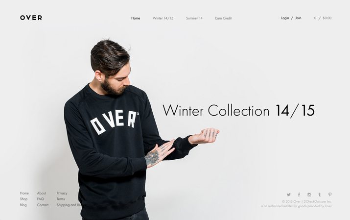
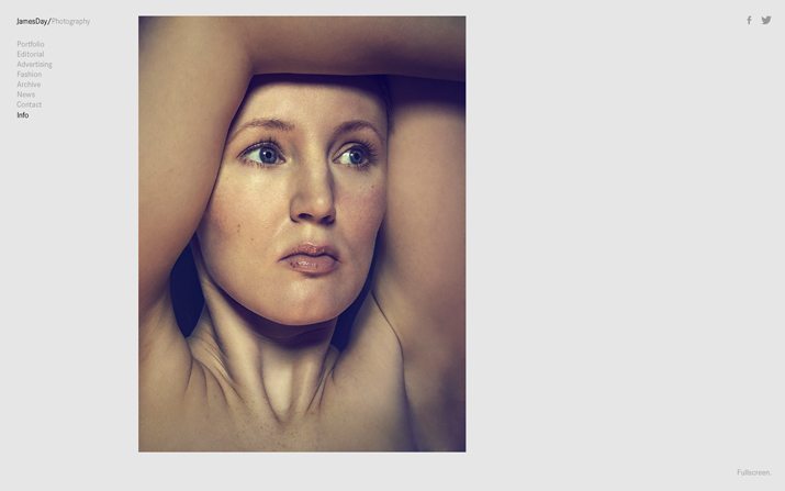
Incorporate Plenty of Whitespace
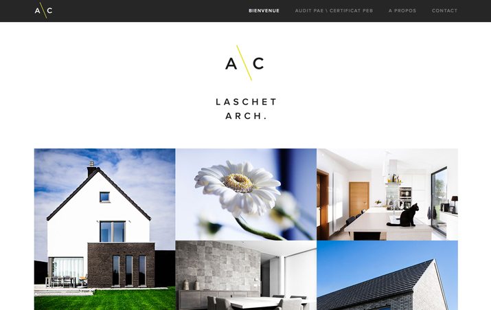
Whitespace is one of the key ideas that correlate to minimal design. If there are not many image or text elements, then there must be a lot of space, right?
When it comes to space, most of the design should be open. To start, make sure that at least have of the surface area of the design is space. (And as you work, try to open up even more of the canvas.)
Think about space in relation to every other element as well. Add extra padding around images, between lines of text and around clickable or tappable items in website design projects.
The space around each element should be used to bring emphasis to it. The space around elements should also have purpose and consistency. (If you just randomly add space, the design will end up feeling chaotic and messy. Use a grid system to organize and plan spatial relationships.)
Edit the Design
This is the part that hurts. After creating an initial design outline, edit it. Simplify the design even more. (Chances are you still have too many elements.)
Pick a focal point and get rid of everything around it. Create more space to further the attention to this part of the design. Analyze the focal point. Are there elements that can be removed from it?
Toss every element or bit of content that does not directly relate to the focal point. (This can be tough, but get rid of anything remotely extraneous.) Make the design almost too simple, keeping in mind that you can add elements back if necessary. Many times this step will help lend perspective on what really is and is not essential to the design.
The argument will be that no element can go eliminated. Try another style for common elements and break out of common design features. Do you really need …
- Icons for social media?
- Taglines or catchphrases?
- RSS feeds with recent posts or popular items on your website?
- Multi-level navigation?
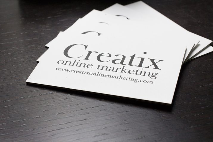
- Front and back printing on business cards?
I have what I refer to as the “rule of five.” In minimal projects, I allow myself a maximum of five design elements in the first presentation or design draft. Typically they include branding, image, headline, navigation and space.
If you are having trouble, step away from the design and come back to it later. Edit again. Look at the text. Remove a few more elements. Remove design elements until the final result feels uncomfortable, and then add one element back.
Conclusion
When it comes to a minimal design, only use elements that contribute to readability and usability. Everything else is just a decoration.
Thinking about this design technique really is just a lesson in going back to the basics. Sometimes it is easier to over-design than to just design. Tricks and decoration seem to almost creep in without us knowing it. Fight the urge to add extras and create with a typeface, a color, a grid and a common theme.
Image Sources: Adam Rasheed, Blast Brand, Daniel Catt and Andres Moncayo.