Minimalist Graphic Design
Most people think a minimal design is a style that just strips everything away. Or does it just require lots of white space? Or just a white canvas with black type? Any of these things can be true. Or none of them can be true.
Minimalist graphic design is a philosophy of creating something where every element serves a purpose. It is simple, clean and beautiful. It is highly usable. These designs are easy for users to understand and engage with. We’ll take a look at minimalist graphic design with ten tips for doing it well, plus examples of those principles in action.
Latest Minimalist Graphic Design Articles
2 Jun 2025
Design Minimalism in 2025: Evolved, Not Extinct
Minimalism has long been a go-to style in the world of design, where simple layouts, muted palettes, and clean typography thrived across various platforms.
But over the past few years, many predicted its decline. With bold type, rich visuals, and maximalist design making a comeback, some even assumed minimalism was on its way out.
But in 2025, it’s clear that minimalism isn’t extinct. It’s evolved.
Minimalism has matured into something more nuanced. It’s no longer just about stripping away, now it’s about clarity, focus, and intentionality.
Designers aren’t rejecting minimalism; they’re refining it. And the result is a new form of minimalism that still feels clean and modern, but with a bit more personality and purpose.
In this post, we’ll explore how minimalism has changed, why it still matters, and how to use it effectively in today’s design landscape.
3 Sep 2021
45+ Best Minimal Logo Design Templates
Minimalist logo design is an art. How can you convey your brand with a professional logo, but keep the simplicity of a minimal, clean, and simple design? Getting that balance right is the key to crafting an iconic logo.
One strategy is to try using a pre-designed minimal logo template to base your next logo mark or branding project on. Will it be as perfectly tailor-made as a high-end custom logo? Probably not. But it’s a great solution for getting your branding project started fast. To show you how amazing these logo templates can be, we picked some of the best minimalist logo designs from Envato Elements.
You can download any (or all) of these minimal logo templates to tweak, build upon, and use to design your own creative logo all by yourself. It’s a great, flexible way to experiment with your next logo project! If you think your company could use a beautiful minimal logo, this is a great place to start.
Are you in the middle of a logo design project? Don’t forget to check out our in-depth guide on how to design a logo! Or you can jump down this post to our specific minimal logo design tips for creating a simple, uncluttered logo.
6 May 2021
The New Rules of Minimal Design: Best Practices, Examples, and Tips
While there is nothing new about minimalism as a design trend, the application and techniques are ever-evolving.
Some of the most notable changes with modern minimal designs are the use of space, color, and typography treatments. These design elements can make the overall aesthetic seem new and fresh or show a more dated style.
Here, we’ve put together a guide on how to do minimal design right with some best practices, examples, and tips for creating a modern feel.
Let’s dive in!
24 Oct 2018
Minimalist Graphic Design: 10 Examples & Tips
Minimalist design is simple. But it is not boring. Just because a minimal style design often lacks some of the embellishments or color palettes or crazy typefaces in other projects, doesn’t mean it isn’t great to look at. In fact, designs featuring minimalism can be some of the most beautiful and usable websites around.
And even though minimalism is a design style of itself, what types of elements show up in these projects and how they are used tend to change over time. You might call them minimalism trends. Here’s a look at 10 tips for creating a modern minimalist graphic design with examples.
What is Minimalist Design?
Minimalist design can be identified by a framework that is simple in nature. Only necessary elements for functionality are included in the design.
Elements such as color and typography are also used with an emphasis on simplicity with extremely pared down palettes that may include only one hue or typeface. Details and space are design factors that really rule the aesthetic. Because there are not a lot of elements to work with, every design divot is on display.
1. Use Plenty of White Space

White space is an essential element when it comes to minimalism. Using plenty of space helps create a sense of peace and creates a visual focal point in the design.
But you can’t pack the remaining space with clutter. Opt for a distinct visual, little bit of messaging and single visual focus.
We Ain’t Plastic does just this with a super simple design that exemplifies the height of minimalism. There’s almost nothing to look at one the homepage design, which forces the user to see the elements that the designer wants to be front and center.
2. Keep Elements on a Grid
A grid can help a simple design look as simple as it should. Grids keep information and elements organized and help you create logical groupings of elements.
A grid makes design elements easy to follow thanks to logical patterns. So even in a design that initially feels less minimal, a grid can create the right spatial relationships to make it work in harmony.
Cory Etzkorn has nice grid work for his portfolio website. Note the keen alignment on the left and right sides of the screen and if you click the example and scroll, there’s distinct alignment of elements on a grid throughout the design. This distinct organization creates a sense of harmony, a key factor in minimal design.
3. Go Flat (Almost)
Flat or almost flat design schemes are a perfect starter for minimal projects. Both design concepts emphasize a lack of additional ornamentation and when you think flat, you’ll almost come to a minimal concept naturally.
Look for elements that are simple in nature – icons and color. Avoid too much layering when it comes to elements and effects. Strip away any unnecessary hover actions for website designs and keep animation direct and simple.
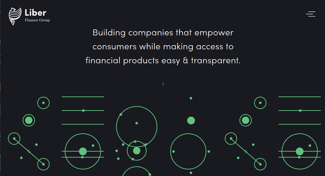
Liber Finance Group has a design with a simple minimal, and flat outline that’s easy on the eyes. The moving elements at the bottom are a single color (although they do change somewhat), but the motion is natural and simple. Users see it, but don’t get over-encumbered by it.
4. Plan for Consistency

When planning a minimal graphic design, make sure the elements of that minimalism carry through the project. A minimal homepage with cluttered interior pages can be visually confusing.
While some pages must have more content than others, make sure the minimal theme is obvious. Whether it is space (most common) or another element, a consistent design is innately easy and feels simple to users.
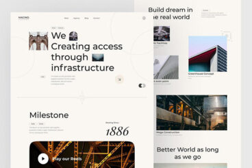
Motus uses its homepage to show a bike. This same white background with a headline and product image is used throughout the website design. Even with more colorful images in the alternating parallax scroll, the design keeps coming back to this minimal – and consistent – element.
5. Create Balance Without Symmetry

Not every minimal design needs to be perfectly symmetrical. It can actually be more engaging if the design isn’t split down the middle.
Use space to create the balance between contrasting elements.
In the pop-up ad on the Visme website, a distinct visual on the left leads the eye to text on the right. There’s plenty of white (yellow) space and a clear directional pull. The full-screen image is simple and effective.
6. Simplify Color Choices
While a design with high-color images can fit a minimal style, more often streamlined color palettes are the norm. Black and white is popular, although that isn’t the only option.
When thinking about color and minimalism stick to the most ridged of palettes. Pick a color (maybe two) and use them exclusively throughout the design.
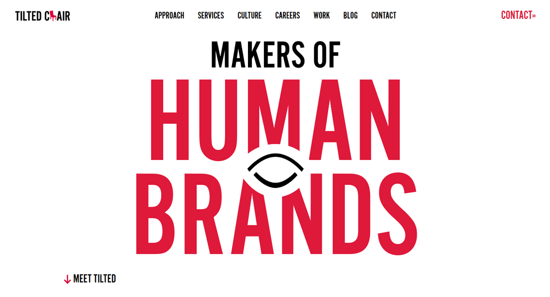
Titled Chair uses a classic black and white outline for its minimal design with a bright red accent. Thought the entire design, red is the only color used. This single color adds emphasis where it is used and contributes to the overall feeling of simplicity in the design.
7. Pick Highly Readable Typefaces

Minimal graphic design is easy on the user. That extends to readability as well.
Pick a typeface that’s easy to read and scan quickly. Serif or sans serif options are often best with letters that have a normal x-height, regular weight and plenty of line spacing. Use text that’s big enough to read at a normal viewing range but not so large that it overwhelms the user.
Even with the animation, the lettering on the Airnauts homepage is incredibly easy to read. The simple sans serif is direct with letterforms that are understandable at a glance.
8. Make Everything Intentional
When you aren’t working with a lot of design elements, everything must serve a purpose. Place, design and create interaction with intent in minimal designs.
If an element doesn’t contribute to the overall goals of the project, then why is it there?
The Sister Agency does a great job with this. The design is simple (although some of the visual elements are a little more complicated). There are only a handful of things to do or look at on the screen – click the menu, or view one of the two portfolio options. It’s clear what to do and why users should want to engage with the design.
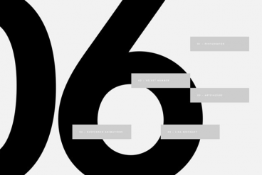
9. Break a Rule

When planning a minimal design, consider breaking one design rule. With a design pattern that is super simple and streamlined, rule-breaking can actually help add visual interest and make the overall impact greater.
But choose wisely. Break a rule that doesn’t get in the way of users actually understanding and interacting with the design. Break a rule that will help create more engagement and generate user interest. And make sure your rule breaking fits the rest of the design. (Something too elaborate in a minimal scheme can have the opposite of the intended effect.)
Westbourne Grammar School has a beautiful minimal style with one funky element that breaks a big rule: The text at the bottom of the screen is animated and users have to wait to read it all. But it works great. The minimal design gives a trick like this room to work because it doesn’t compete with anything else.
10. Keep It Simple
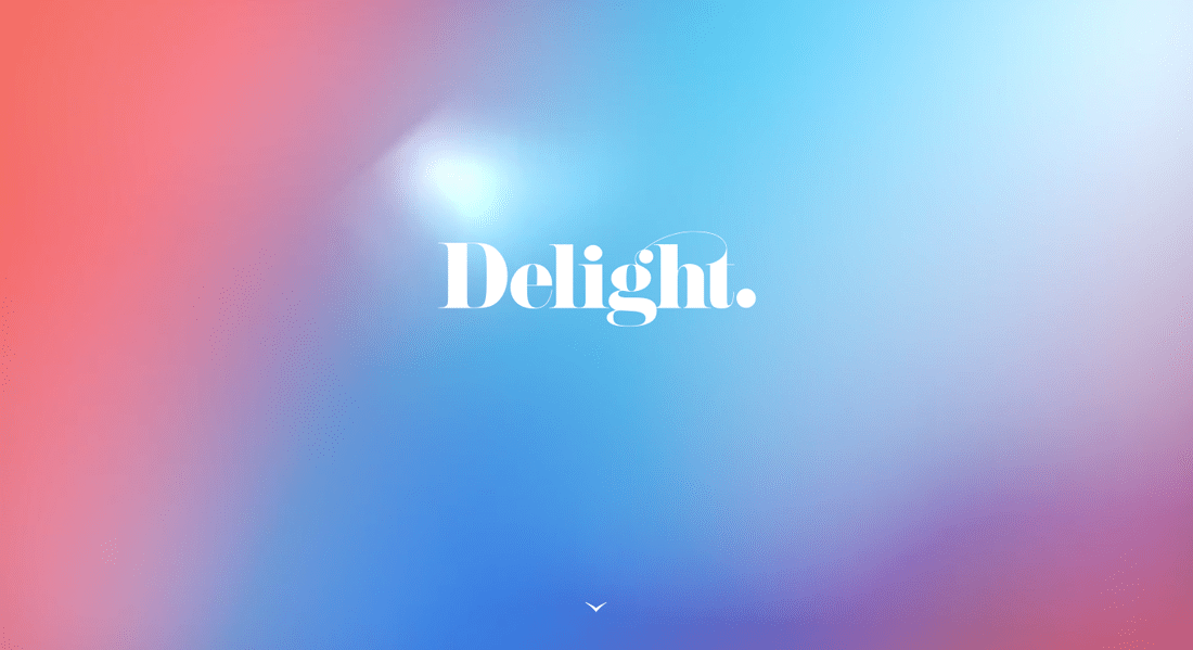
Less is more when it comes to minimal graphic design projects. Strip as much away from the design as you can to achieve this. When going simple, remember to include just enough to get the message across at a glance or so little that users want more, like the example above.
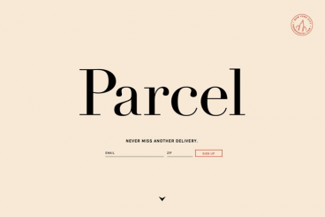
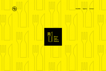
Delight should make you curious. Bright color and fun typography are inviting, but there’s not enough to know what the website is about. The bouncing arrow will get you there. The simplicity of this minimal (although highly visual) design, is interesting because it makes the user want to know what comes next. What’s equally delightful is that the rest of the design uses plenty of space and a grid for a classically minimal feel.
Minimalist Graphic Design Is A Win for Everyone
One of the great things about minimalist graphic design concepts is that they can be the foundation for a project or just a key element in the design. The great thing about minimalism in general is it makes the designer think about what is important in the design, and causes them to really focus on it.
This way of thinking about projects, from website design to poster to packaging – can help create designs that are easy to understand and use. And that’s a win for everyone.