Minimalist Graphic Design: 10 Examples & Tips
Minimalist design is simple. But it is not boring. Just because a minimal style design often lacks some of the embellishments or color palettes or crazy typefaces in other projects, doesn’t mean it isn’t great to look at. In fact, designs featuring minimalism can be some of the most beautiful and usable websites around.
And even though minimalism is a design style of itself, what types of elements show up in these projects and how they are used tend to change over time. You might call them minimalism trends. Here’s a look at 10 tips for creating a modern minimalist graphic design with examples.
1. Keep It Simple
The key to a minimalist graphic design is simplicity.
But that doesn’t always mean it is easy to design. Sometimes the simplest visual and functional designs are actually quite complicated to develop. (It can take a lot of work to look so easy.)
To help streamline elements and keep the design simple, start with a font and color palette that’s rather limited. Consider a key element that will serve as the visual in the minimalist graphic design and focus on how to get users to look at that.
Create messaging that matches the visual theme, and you’ve got a solid start to create a simple design.
2. Be Selective with Typography
Fonts will make or break a minimal design. Since there’s not a lot of other visual material competing for attention, a minimal style needs to feature clean and readable typography to be most effective.
Develop a font palette with one or two type families and create a hierarchy for how to use type elements. Stick to this hierarchy like you would a grid. It should be the foundation of the type design for a minimal project.
Add a few subtle elements to highlight keywords, phrases or messaging, such as color.
If you question the type, rethink it. Typography is a key element in a minimalist graphic design and should be treated with utmost care.
3. Streamline the Color Palette
The color palette should be as simple as the typography palette. Aside from black and white (or your base neutral), pick one color to drive the design.
This color can be bright or light and can serve as anything from a background texture to accent. To maximize the impact of color in a minimal graphic design, use your preferred hue consistently. But don’t be afraid to use it.
The example above shows a minimal design with a bold color option for the background. It’s the only color but sets a mood to the project and helps drive its visibility.
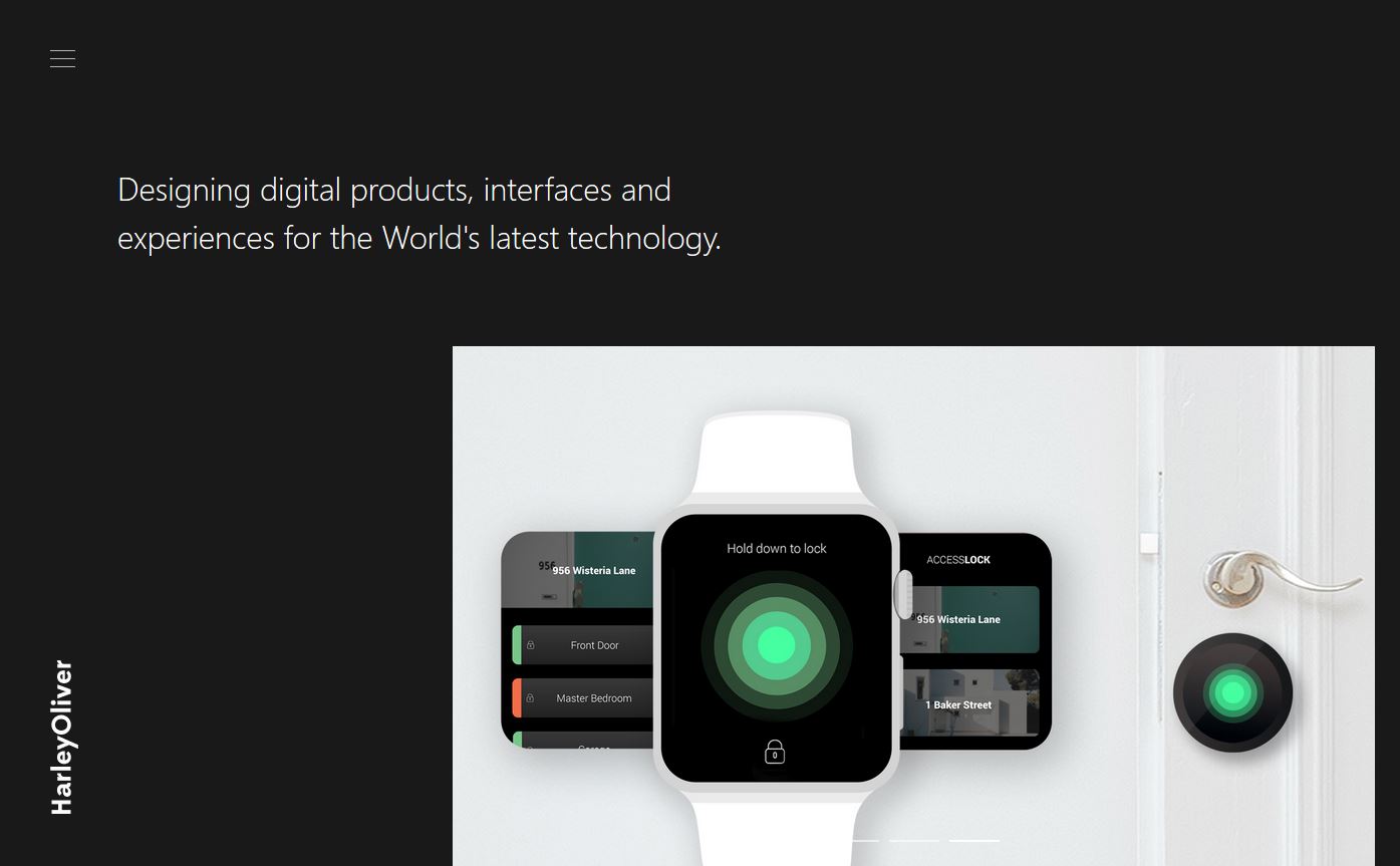
4. Design a Consistent UX
Not only should the visual design be rather simple and intuitive in a minimal graphic design, but for websites the interface should be just as easy to understand.
From user interface elements and buttons to scroll actions and engagements, create a consistent user experience that isn’t complicated and that doesn’t require an instructional manual to use. Each visitor should understand, without even thinking about it, the interface and how to interact with it.
Keep the engagements simple and direct so that the feel is consistent with the visual design. If the overall aesthetic is minimal and every hover action explodes animated confetti, there will be a disconnect and it will impact usability.
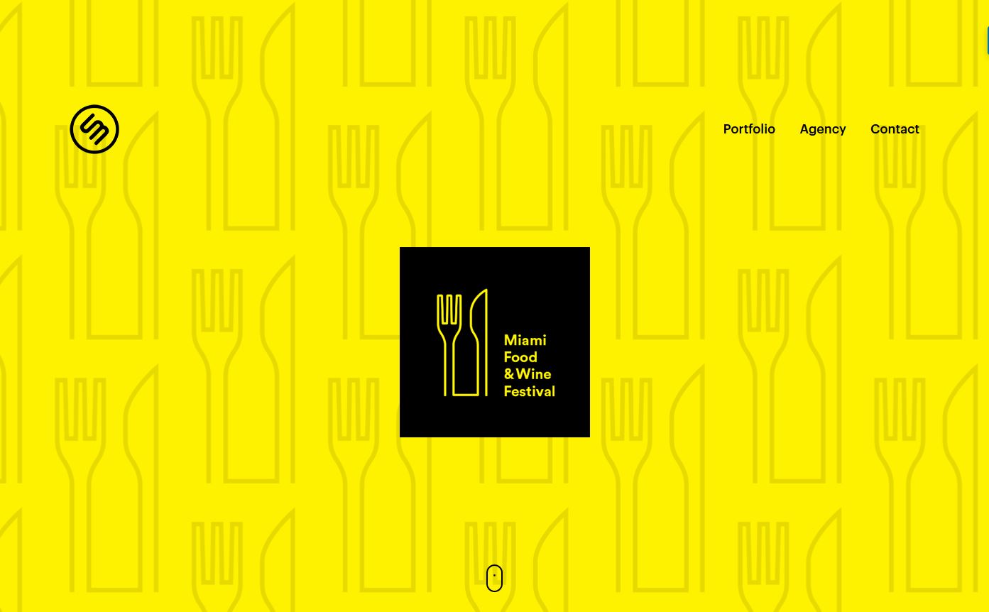
5. Use Color

While you probably want a more streamlined palette for a minimal graphic design, you don’t have to have colorless design. There’s a misconception that minimal means black and white. That’s just not true.
A minimal design can be black and white, but it can also feature a full color palette. The trick here is to create a simple palette in terms of number of colors and usage.
The Curious Agency, above, does a great job with a bright background that’s bursting with color in an otherwise minimal design scheme.
6. Strip Out All the Extras

Getting rid of clutter in a minimal graphic design is important. (It is the essence of minimal.)
Once you get the design in pretty good shape, think about each element individually: Does it serve a purpose that will create a better journey for the user? Does it help meet a good? Or is it pure decoration?
If the answer is the latter, you might want to rethink whether that element should be part of the design or not.
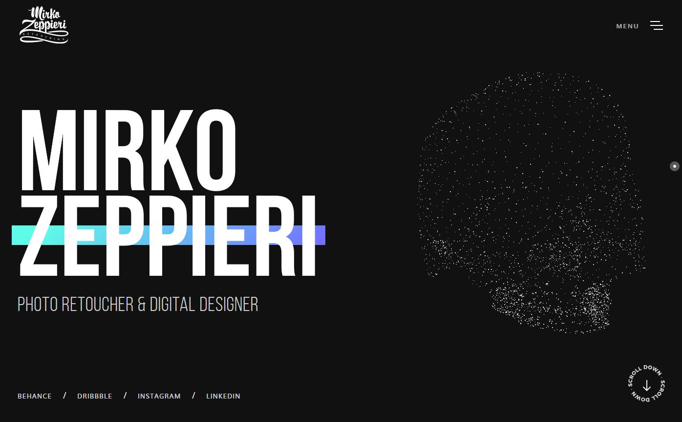
7. Be Bold with White Space
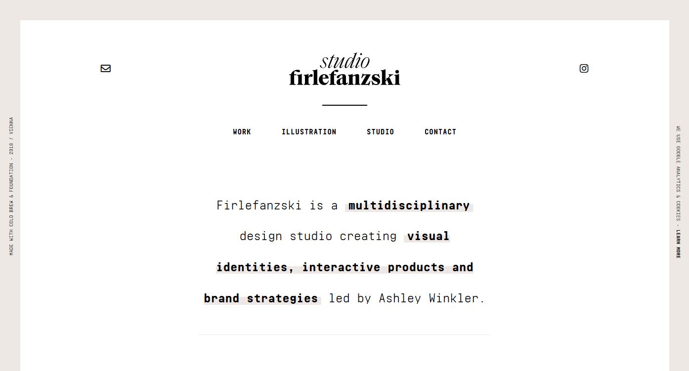
White space is one of the elements that most minimal graphic designs have in common. You won’t have any mushed, smushed or crowded elements here.
Every piece of a minimal graphic design should have meaning. And it should have plenty of space around it so that that concept is clearly discernable.
Studio Firlefanzski, above, does this with plenty of space around the edges of the canvas, but where the design really excels is in the spacing between lines on the main block of text. This extra space makes every line stand out so that you read each word, fully taking in the meaning.
8. Create Open Spaces
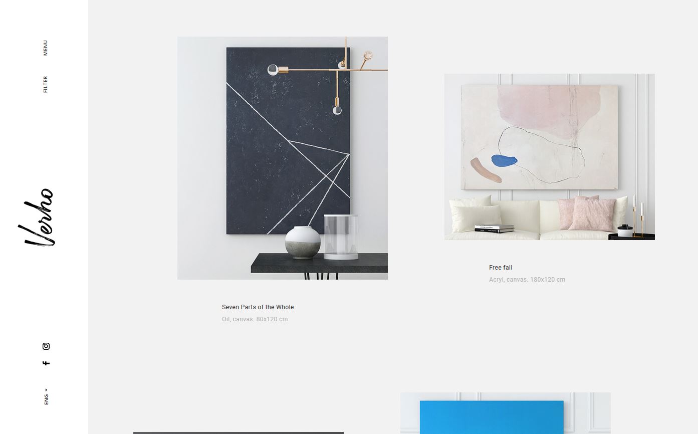
This might seem like incorporating white space, part 2 … it is that important.
Create open spaces to draw the eye and balance heavier parts of the design. The key difference here is not to get stuck in a symmetrical flow or pattern of linespacing and padding.
Make space part of the design.
Verho, above, does this in so many different ways:
- There’s interesting space for the vertical navigation.
- Image elements line up a little off-center to create spaces that move the eye from element to element.
- Text elements are light and just a little more tracked out than average.
- Elements are also placed “off-center” vertically, changing the way space feels from scroll to scroll.
9. Seek Balance and Harmony
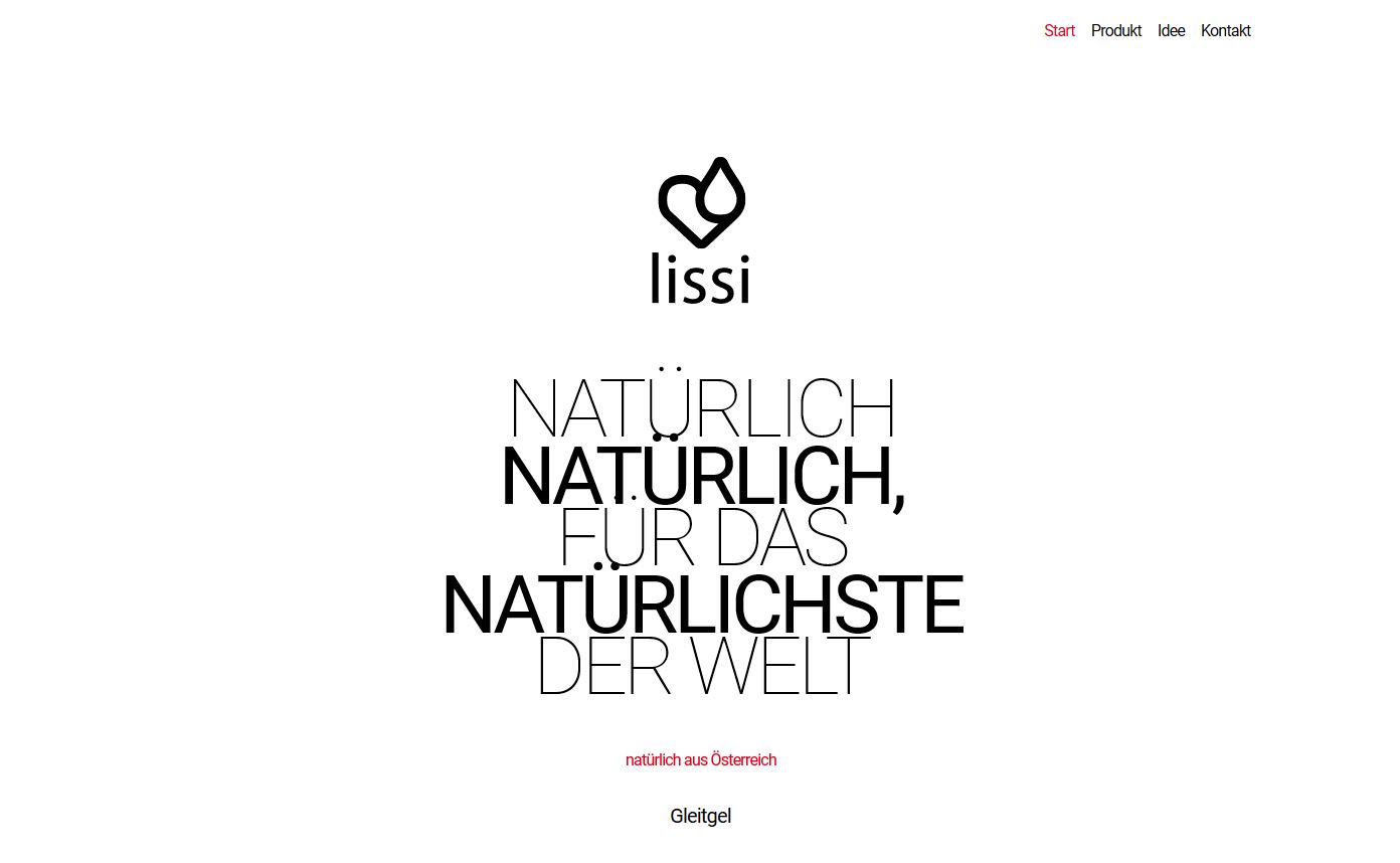
For every heavy element in the design, look for a way to balance it with space or lighter elements to establish harmony in the overall design.
Many minimal graphic design projects can be text-heavy, leading to some really dominating elements and spaces. Establishing a counter balance to that weight is important to keep the design from feeling lopsided or overwhelming.
Lissi, above, does this with plenty of white space and alternating regular and bold typefaces to create more balance.
10. Incorporate Imagery
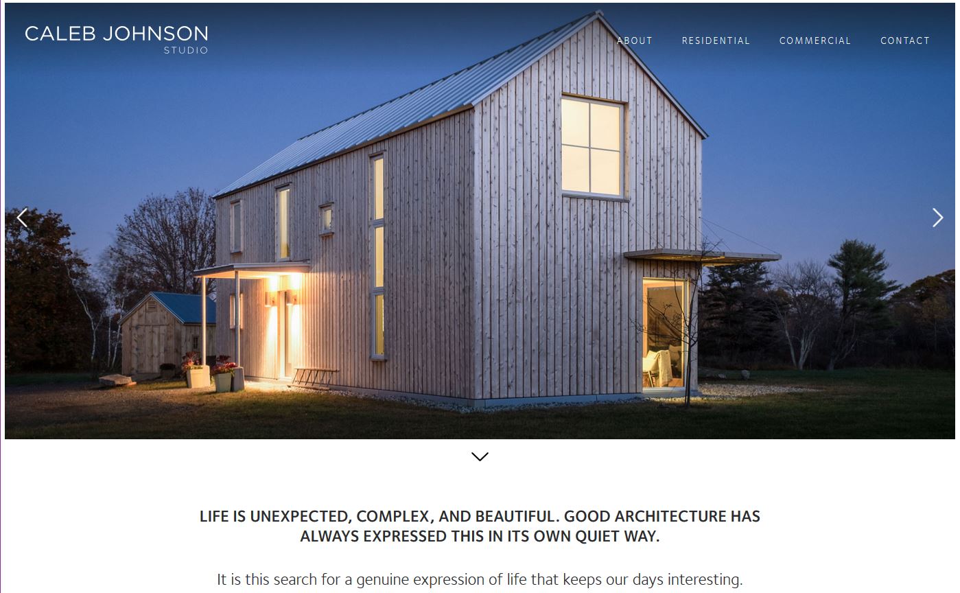
One of the things that many designers forget about or ditch when working with a minimal project is images. It’s ok to incorporate images into a minimal design project. (In many cases you probably should use images.)
When picking out photos, look for photos that also feel simple and easy-going. Avoid cluttered scenes or crops that feel exceptionally tight.
Caleb Johnson Studio, above, uses a handful of serene photos in the hero slider with bright, light colors and simple visual ideas. The photos match the overall tone and feel of other design elements for a colorful, visually impressive minimal design.
Conclusion
Although you can strip away elements as you create a minimalism graphic design, remember there is more to it. Some of the trends we are seeing in minimalism, have a minimal feel with some maximal elements, such as photography or color.
Mix and match styles to get a simple graphic design that you love and meets the goals of your project.