5 Traits of Successful Minimalism
At first glance, minimalist websites might look like they’ve just been slapped together as quickly as possible. After all, they’re plain and simple, and most people tend to associate lots of detail with good craftsmanship. But the same rules just don’t apply to the online world.
It only takes a small amount of user interaction to quickly reveal the quality of a minimalist site. This is because the original idea that fueled the rise of minimalism was that functionality is inherently beautiful. A design that clarifies and reveals the structure of a website can be just as appealing as one that obscures its purposes behind fancy decorative additions. Furthermore, it often yields a much better user experience, because those unnecessary distractions are eliminated.
Minimalism is all about reducing the number of elements in a site down to what’s really essential and useful; making elements multifunctional while still clear and purposeful.
A good minimalist designer understands that simplicity in the aesthetic tends to be a byproduct of simplicity in the structure. And while not all types of websites lend themselves to this treatment (such as very complex ecommerce sites), the ones that work well with minimalism are just as much of a pleasure to use as to look at.
1. Depth Within Simplicity
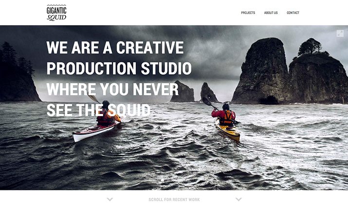
Within every good minimalist site, there is an underlying emphasis on functionality and user experience. While layouts, color palettes and effects are limited, there’s a focused attention towards communicating specific elements clearly to the viewer. For example, Gigantic Squid does an excellent job of focusing the user’s attention on the their photos by eliminating additional distractions.
But while the site may be simple, it provides the tools that viewers need to dive deeper: Full screen viewing options, before / after options to showcase their post-production capabilities, and clear navigational elements.
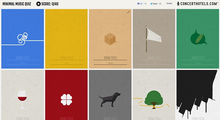
The minimal music quiz is another site that shows how simplicity can convey great conceptual depth. It’s a wonderful example, because not only is the site itself minimalist in design, so are the illustrations that it showcases. This site demonstrates that identifying the meaning behind these images is fun enough to merit making a game out of the activity. It just goes to show how people tend to respond to the resonance of filtered, retrained imagery.
2. Balance
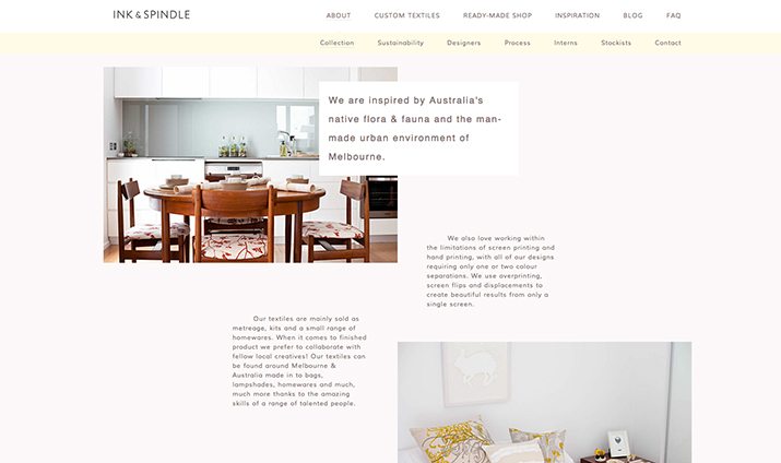
Because there are so few elements on a minimalist webpage, it’s much more obvious when the balance between these elements is off. This is in part why many of these designs are so rigorously defined and organized by a grid layout. When the rules of the grid are strictly applied to a design, all the components tend to get distributed in a way that feels visually harmonious. However, a grid layout doesn’t always have to look the same way. Ink and Spindle show how aligning to a grid doesn’t mean sizing everything the same. Instead, they use a grid system as a framework for creatively balancing their content.
3. Contrast
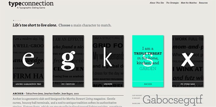
Contrast is another thing that makes a big difference in the effectiveness of a minimalist website. TypeConnection provides a great example of how eye-catching and energizing a dose of extreme contrast can be; its rollovers are a shock of neon in a field of neutral beige and black. This wouldn’t be nearly as effective in a site with plenty of color.
4. Unusual Accents
Something that could look completely zany in a busier design can be edgy and interesting within the simplicity of a minimal design. For example, we’ve already discussed the importance of grid-based designs in the minimalist world. So when a design breaks the grid, even in the smallest way, it makes for an intriguing and attention-grabbing alteration.
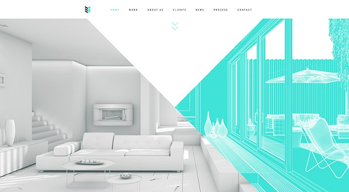
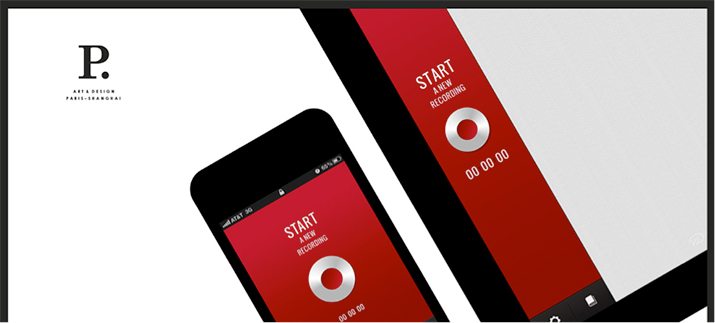
Case 3D and Pierrick Calvez are different examples of the same application. In the first, the diagonal line bisects the entire homepage offering visual interest to an otherwise standard layout without being obtrusive. The second example has a less irregular treatment, but yields the same intriguing result: the background image is arranged at that same grid-breaking angle.
5. Focused Interactivity
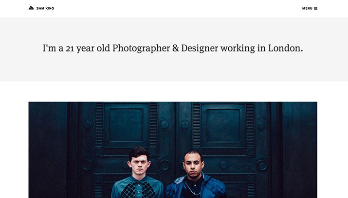
What minimalist sites lack in complexity, they must make up for in focused interactivity. With the advancement in web technologies over the past couple of years, it’s become easier than ever to leverage simple CSS animations within designs. And when it comes to embracing minimal trends, these simple animations can have a huge effect.
For example, while Sam King’s site has a relatively basic layout, he does an excellent job of drawing the viewer’s attention through simple hover effects. They’re still clean and simple, but they go a long way in adding depth to the design. Without these kinds of interactive touches, static minimal sites can often lose the user’s interest.
Minimalist web design should feel simple, and utilitarian, but never boring or generic. It should focus on a balance between an appealing first impression and a lastingly functional user experience.
Like any other popular design trend, there will be second-rate knockoffs that don’t hold up the principles of successful minimalism, but when these traits are implemented thoroughly and thoughtfully, minimalist sites can leave a powerful lasting impression that goes beyond mere visuals to an all-encompassing experience.