How to Design a Minimal Logo That Works
It doesn’t get much more minimal than that classic Nike Swoosh. The design is simple, iconic and you’d be hard-pressed to find someone that doesn’t know what it stands for. The logo is the company.
And it’s so minimalistic. That same concept is trending again in logo design. Minimal logos are the “in” thing from brand marks to badges on website home pages. Whether you have a logo or not, there are plenty of great ways to incorporate this minimal logo style into your design work.
Note: All of the featured logos are from the Design Shack gallery.
Make it Black and White
The key to a minimal logo is black and white. A good minimal logo starts with only these colors, reads in black and white, and then you can move forward with colored elements. But if the logo doesn’t work without color, it probably won’t work minimally.
(This is actually good to think about for most all designs.)
Start with this framework and think about what additional elements you will add. Color, a gradient or other texture should come after the basic concept of the logo is complete.
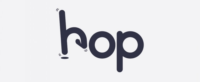
Try a Squiggle
Whimsical design elements are pretty trendy right now, so move forward with that in mind by creating a simple squiggle as part of your logo.
A crooked line, or cluster of lines, can become an iconic part of your identity, serve as emphasis for specific letters or words in your logo and work as a secondary mark when a full logo is too much for the space. Think about different ways to develop a squiggle; it could be a line or spiral or a completely free-flowing shape.
What’s nice about this concept is that you can really own the style you choose with a hand drawn element or something you create digitally. Sketched styles are a popular option that can work with a design containing other illustrated elements or in a more traditional setting with photos or textured backgrounds.
Create a Logotype
When in doubt, look no further than your brand name (or your own name if you are working on a portfolio project). Put your spin on lettering to create a logotype with flair.
Opt for a trendy type style – such as vintage – or twist and bend letters to develop something more customized. What’s nice about a good logotype is that it can last a long time and provide great value for your brand.
Unlike other trends that can come and go, logotypes are pretty consistently used and developed for various applications.
Go Retro
The idea of creating elements for a minimal design aren’t new. This classic concept tends to ebb in popularity. Circle around to the last time minimalism was in and combine the mood of that era for a funky, retro logo.
Retro minimal styles tend to focus on simple typefaces with clean lines, such as a circle around the type. Thin strokes and sketched styles are also indicative of this period.
Combine that with color schemes that feature sepia tones or bold, neon color choices for a distinct 1980s vibe. The thing that’s neat about retro concepts is that you can go back and pull from a variety of eras; with minimalism that could even mean going back 100 years!
Stick to Geometric Shapes

There’s nothing more recognizable than a geometric shape. Start a logo design with a circle, square or triangle and build using one or more shapes together.
A geometric shape is more than just a way to draw users into the logo as well. The shape (or combination thereof) that you choose can communicate a great deal as well.
- Circles: Because circles do not have a distinct beginning or end, they imply movement (such as a wheel). The shape is thought to have a feminine association and is connected to love, energy and power. Circles also suggest infiniteness and harmony.
- Squares: The common shape creates a sense of equality and conformity. It is stable and trusting. Conversely, because this shape is so common it can sometimes be seen as boring or plain.
- Triangles: The shape can imply stability, power and energy when the shape rests on a solid base. But it results in feelings of conflict, tension and nervousness when the base is upside down or appears unstable.
- Crosses: Crosses symbolize religion as well as health, hope and balance.
Don’t Embellish It
Now here’s the most important advice of all when it comes to thinking about minimal logo styles – don’t embellish it.
There are plenty of ways to create something simple and creative and beautiful, but the minute you adorn the design “just because,” the minimal concept will be ruined. In the design process you’ll likely want to take the opposite approach and continually look at your sketches and mockups and try to determine ways to strip more elements out of the design.
Think in terms of flatness and try to create something that works, is readable at a glance and feels appropriate for your message without any extras. A mentor once gave me this bit of advice: “For a truly minimal design, try to sketch the logo without ever taking your pen off the notebook. If you can do that, the design is truly minimal.”
While that advice won’t always work, it is a good place to start. The exercise alone will help you better think about all of the elements in the design and how to better streamline the concept. Try it out with a new idea or put your current logo to the test.
Conclusion
Minimalism is a timeless style. Regardless of what trends come and go, a simple logo will almost certainly work in the design. (That’s why Nike has maintained the same Swoosh mark for decades.)
A simple logo is easy to remember, identify at a glance and a great tool to help you connect with users. The tricky thing is a logo design can come to you in a flash and withstand time or take years to perfect. So take your time, create with purpose and find that perfect mark. (Just make sure to have fun experimenting along the way.)