Minimalist Design Is Taking Over: Here’s Why
Everywhere you turn, another designer is releasing a project featuring a minimalist design style. This focus on space, simplicity and beautiful typography is refreshing. And it’s a great option for a number of design projects. That might be one of the reasons minimalist design is so popular.
But the trend is not brand new. Minimalism has been around almost as long as design itself. It’s a technique that ebbs and flows, but always remains as one of the classic styles, making it a design choice that almost always works.
What is Minimalist Design?
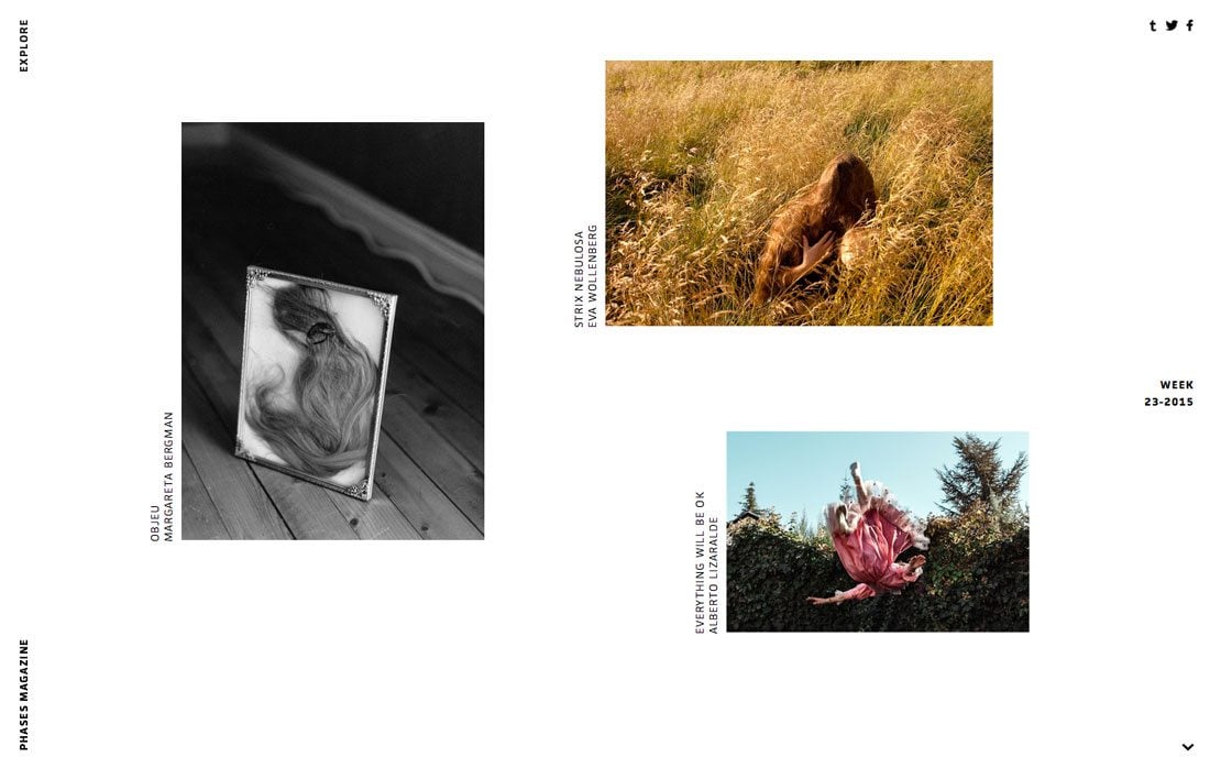
Minimalist design can be identified by a framework that is simple in nature. Only necessary elements for functionality are included in the design.
Elements such as color and typography are also used with an emphasis on simplicity with extremely pared down palettes that may include only one hue or typeface. Details and space are design factors that really rule the aesthetic. Because there are not a lot of elements to work with, every design divot is on display.
Short History
You can find elements of minimalism in design, art and architecture in almost any time period. The style has an almost timelessness to it that makes designers keep coming back.
The roots of minimalism as we know it today can be traced to a three key periods, according to a history of minimalist design by Oleg Mokhov for SpyreStudios:
- De stijl art movement: Between 1917 and the 1930s, “de stijl” – Dutch for “the style” – pushed simple and more abstract ideas with a focus on color and form using lines, rectangles, white and black, and primary colors.
- Architects such as Van Der Rohe: The post World War I architect used materials with clean lines, simple structural frameworks and plenty of open space.
- Traditional Japanese design: When you think of traditional Japanese culture, simplicity and Zen may come to mind, these elements are part of the culture from clothing to pottery to other designs.
You can learn more about the history of minimalism and some of the other influencers of the trend from SpyreStudios.
Today’s Minimalism
The minimalist designs of the current period aren’t that much different than in many other eras. The identifier is often how minimalism is used with other trends. So right now you are likely to see a minimalist framework with elements of flat design or with a video or with a full-screen header or with card-style elements.
Actual minimalist concepts don’t really change all that much. Many designers, regardless of time period, often create projects using a predominantly white and black color schemes, lots of space – especially for the borders and around the central image, and sans serif typography. That’s not to say these are requirements of minimalist design, but they are quite common identifiers, regardless of time period.
What we are really seeing with minimalism right now is a distinct focus on one bit of content, without competition from other elements. This could be a photo, logo or simple block of text. Elements such as navigation or contact information or footers are almost hidden in the design (even though they are often there in the form of hamburger menus or in a sticky position right “below” the scroll).
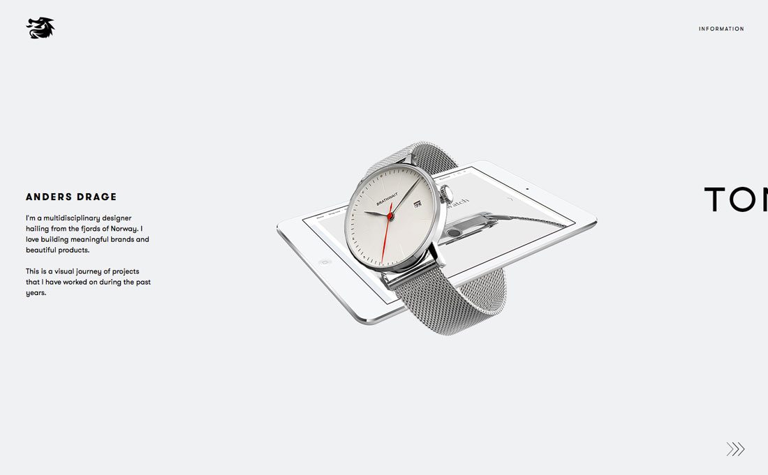
Designers are also beginning to incorporate animations into website designs using minimalism. While this can be tricky – the animations must be subtle – it can draw a beautiful connection between classical and modern design. This concept also extends to animated scrolling effects such as that used in the site for Anders Drage (above)., which has a subtle arrow animation and scrolls horizontally.
The other major minimalism trend is text size. Designers are opting for dramatic sizing – super small or gigantic – lettering with stack backgrounds and simple images. The high contrast is great for creating focus in a simple framework and emphasis on the “right” content within the design.
Practical Application
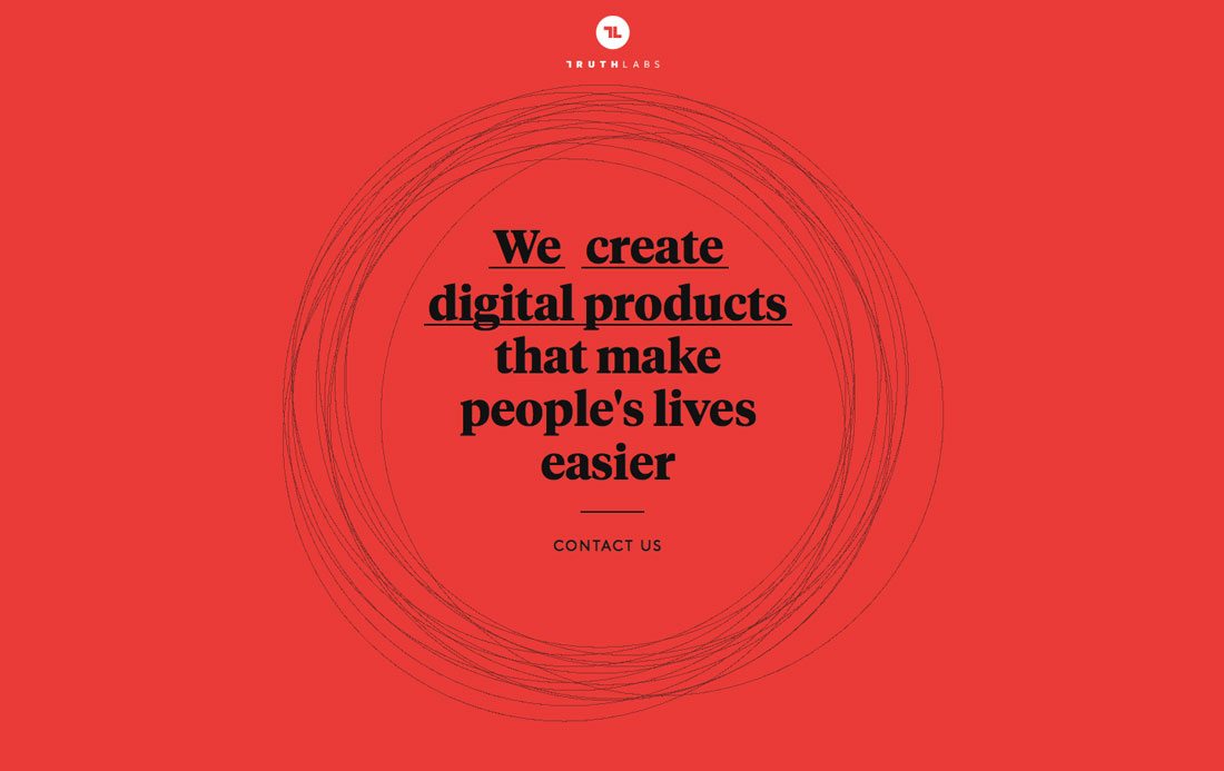
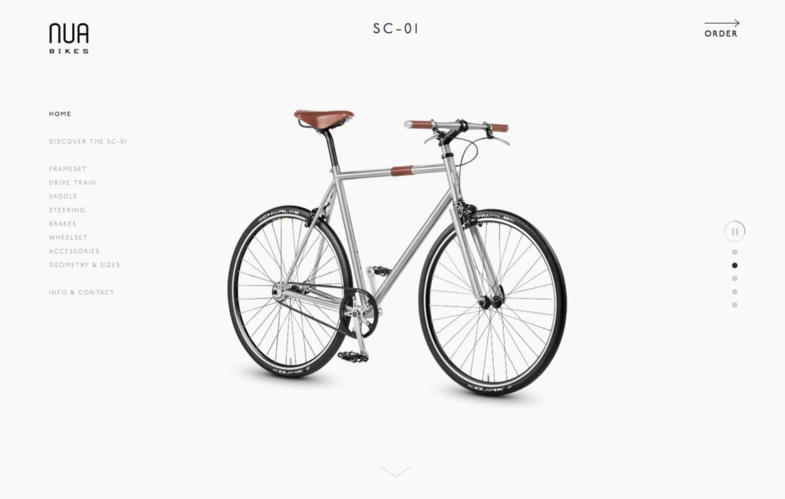
Minimalist design is taking over because it just works. The style is so simple that users don’t have to think about it. (Even though it requires quite a bit of thought and planning from designers to create something that looks so easy.)
Benefits of Minimalism in Websites and Apps
- It is designed around the content. Focus and purpose is key when it comes to making minimalism work.
- It works well in responsive environments. There are fewer elements to shrink and stretch and consider in the code.
- It’s fast. Less information equals less loading time.
Benefits of Minimalism in Print Design
- It’s timeless; you don’t have to worry about a printed job looking dated as soon as it leaves the printer.
- Simplicity can help you achieve better quality print, with less worry about colors or bleeds or improper cuts.
- It can stand out against all the other design clutter because it’s different. Think of those community bulletin boards and how many things are crammed into every poster. Go minimal and yours will grab the eye of passersby first.
How to Design Minimally
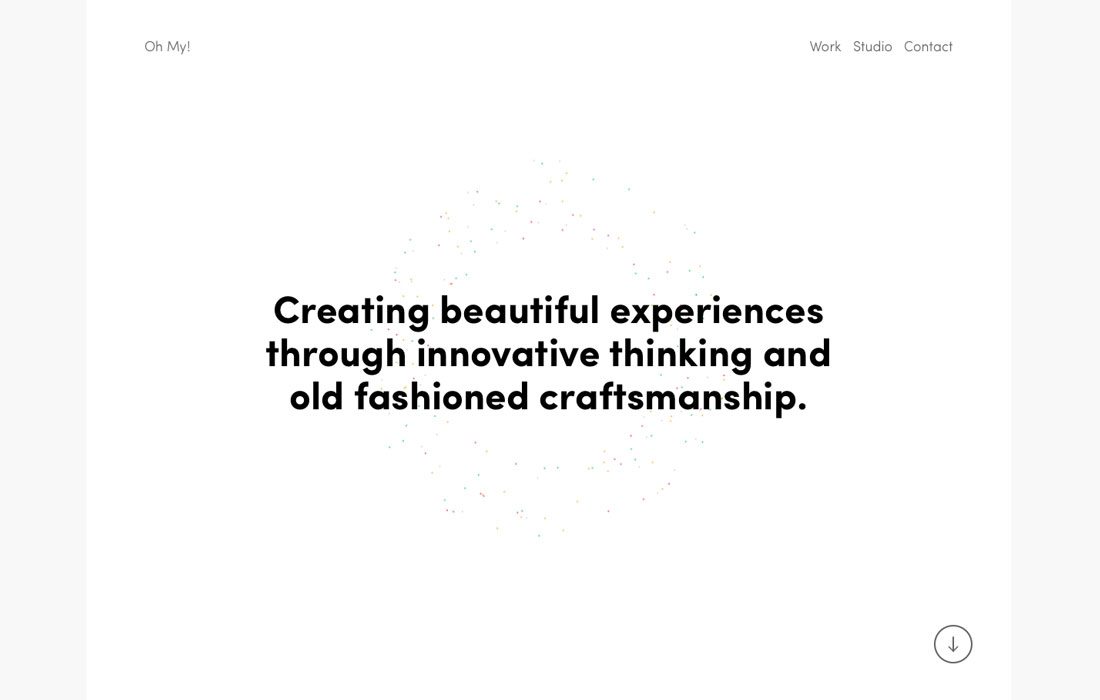
Plan with purpose. It sounds simple, but that’s all you really need to do. Every element, color and font in a minimalist design project needs to have a reason to be included.
Start your project with a goal. What are people who interact with the design supposed to do with it? How do you get them there? While this sounds simple, it can be a little more complicated than you think. And it might require you to throw away common design elements.
Minimalism is about a return to the basics of contrast, space, organization, color, dominant visual and typography.
- Contrast: Black and white schemes are popular because they innately contain a lot of contrast between elements. But any high-level contrast works. Use yin and yang concepts to pair elements with opposing forces – large and small text or images, open space and a single element, other colors with plenty of contrast, stark design with an elaborate typeface.
- Space: Minimalism is built on space, and while you don’t have to include massive amounts of white space, element breathability is a must. Each piece in the design puzzle must have room to stand on its own in the design. Minimal outlines seldom feel cramped and work.
- Organization: Please use a grid. Go back to some of the roots of minimalism and the use of lines and rectangles. Even those lines we can see impact how users feel about the design. A grid will keep you organized and your design feeling harmonious.
- Color: Contrast and color are often lumped together in discussions about minimalist design, but are separate visuals. Color can create contrast, and it is an important part of the planning process. Too many designers trying to go minimal overuse color or think that minimal has to be black and white. The palette should be streamlined; rather than the two- to four- colors from a traditional color scheme, try to stick to a single hue in a light and/or dark framework.
- Dominant visual: Don’t get caught in the too many visuals trap. Pick one thing and make it dominant (note dominant, not necessarily large). Dominance links directly to contrast to uses the techniques in concert. Suggestions for dominant visuals include an image, block of text or element with surprising color.
- Typography: The common usage in most minimalist frameworks is sans serif typography and that’s a great option. Go with a typeface that has clean lines and simple strokes. Bold or thin typefaces are usable, depending on the message you want to convey. If you are using type as the dominant element, consider a typeface with more flourish or personality for contrast.
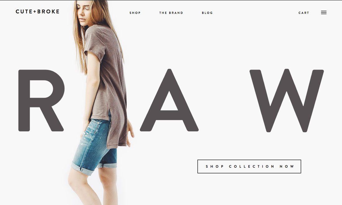
Cute + Broke is an interesting take on minimalist design for a retail site. Unlike many retailers that focus on selling items from the start by bombarding customers with options, the homepage features one model in one outfit with the word “raw” and a call to action button.
You can’t help but look at the homepage; you see every detail in the model’s clothing and then you are ready to shop. The minimal style focuses on one aspect and connects emotionally with the user. (The theme continues on interior pages as well with simple product photography on a uniform light background with a line of text and pricing.)
Conclusion
Minimalism is one of the design trends that just never gets old. The simplicity of it makes minimalism easy to incorporate into a number of other styles and trends. It is classic and classy. It works with – and emphasizes – many different types of content.
Minimalist design will continue to take over website, app and print design. It will evolve and change as design preferences always do, but the roots of the technique will remain.