80s Fonts: A Retro Typographic Trend (+ Examples)
Everything about my childhood seems to be cool again. The Netflix hit Stranger Things seriously evokes feelings of the 1980s, people are buying classic Nintendo game consoles again, and everything 80s is totally rad, even when it comes to design projects.
And what makes that 80s connection quickly? It’s typography. This decade definitely had a pretty distinct feel. We’re taking a look at the 80s retro font trend with plenty of great typographic options for your projects.
Iconic 80s Fonts & Typography
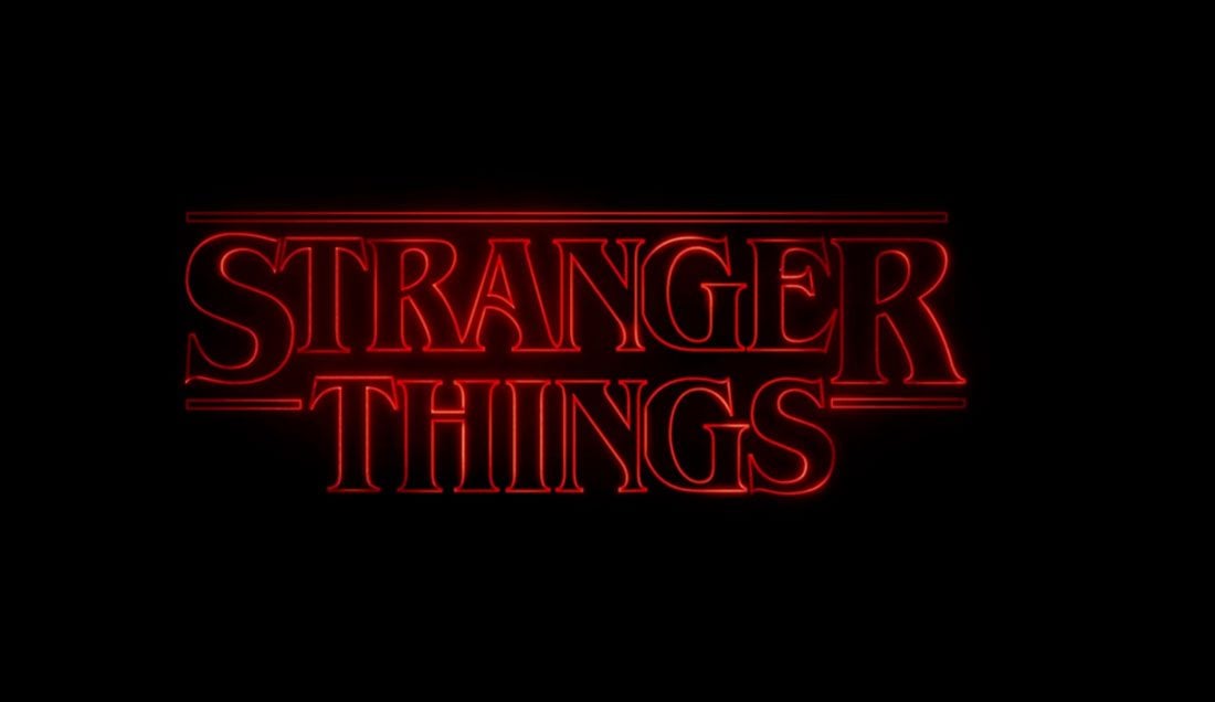
There are some typefaces that just scream the 1980s. The type treatment for Stranger Things is reminiscent of popular Stephen King book covers from the era.
But that’s not the only style that feels very 80s. Block style-lettering with elaborate details is also a common visual type treatment of the era.
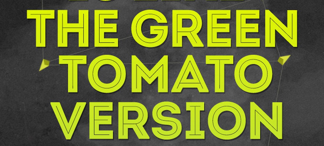
Stranger Things
Ruben
Thinking Miami (Vice)
Many of the popular styles of the 1980s are derived from pop culture and television in particular. Some of the reason these styles are coming back around again are due to reboots of popular television shows or movie versions of past hits.
Everything 80s tended to have an almost overdone style, with plenty of distinct layering – even when it came to typography.
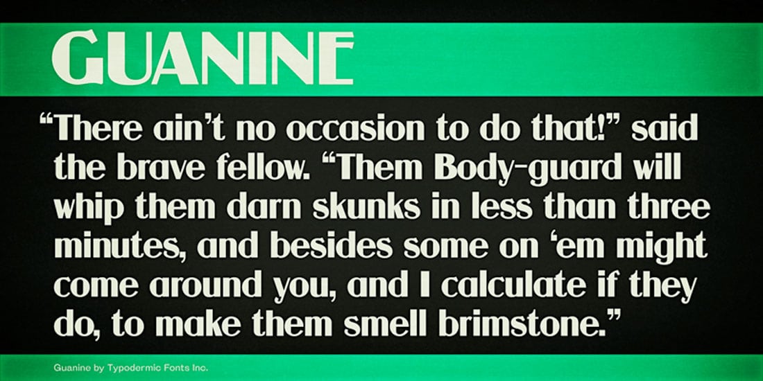
Guanine
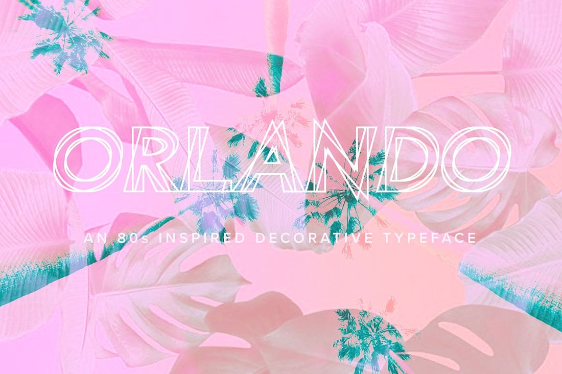
Orlando
Pixel Perfection
The digital era was just beginning in the 1980s and many type styles used this concept to create what was then a futuristic style. Blocky, pixel-based typefaces were popular and are a key indicator of 80s style today.
These typefaces were used for everything from posters to movie titles to video games. They are probably most notably associated with arcades (where 80s children spent countless hours so there’s a nostalgia here that creates distinct emotional ties).
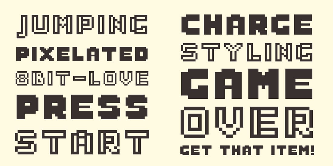
Arcade Classic
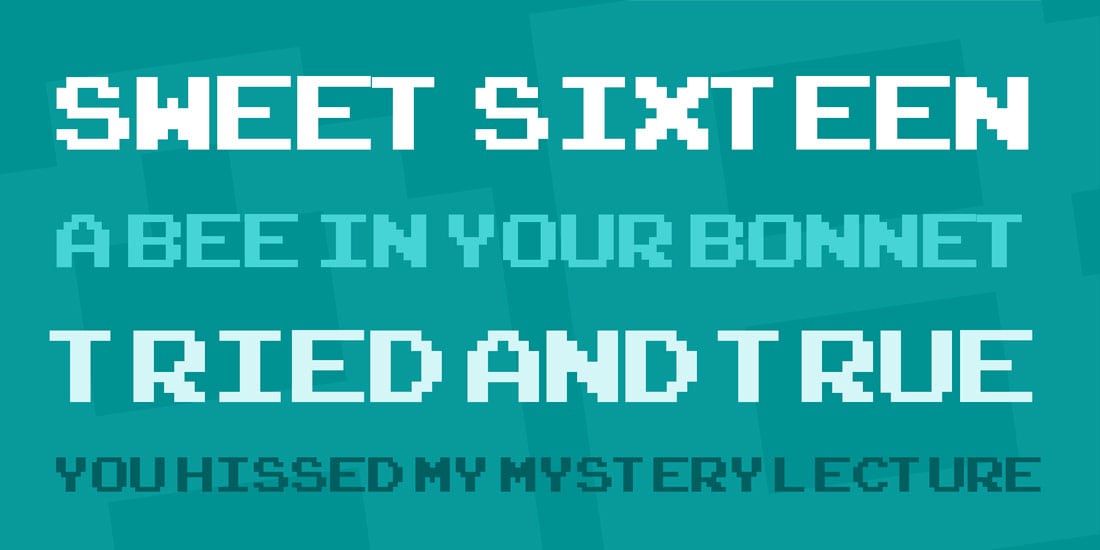
Sabo
Video Game Mania
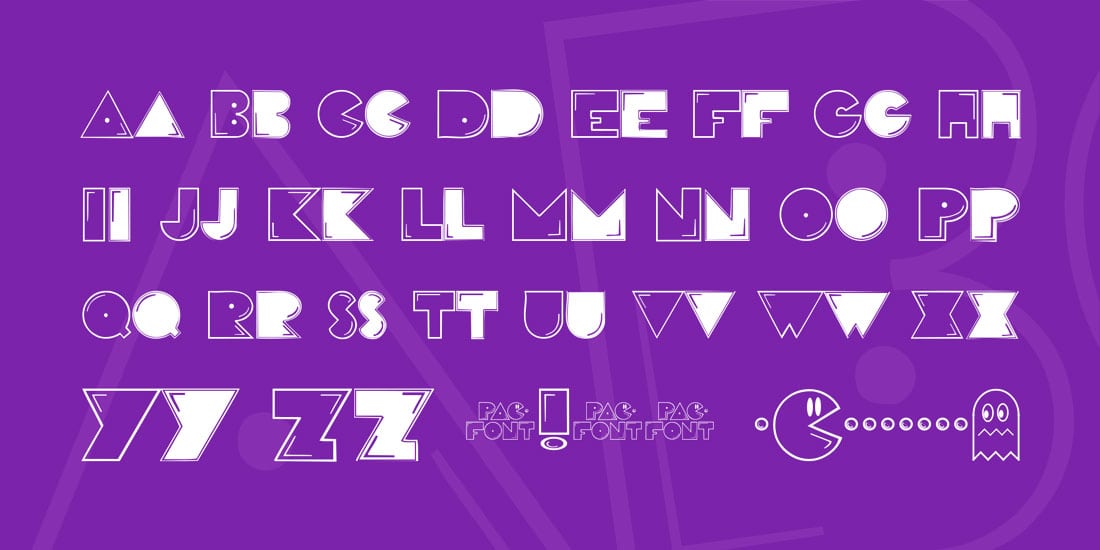
In addition to the arcade, pixel style typefaces that were popular in the 1980s, there was another style of video game typography as well. These typefaces were much more of a novelty style in nature and had thick lines and elements.
There are hundreds of video game copycats fonts out there. All you have to do to find them is Google your favorite game and add “font” to the end.
PacFont
Stiff Staff
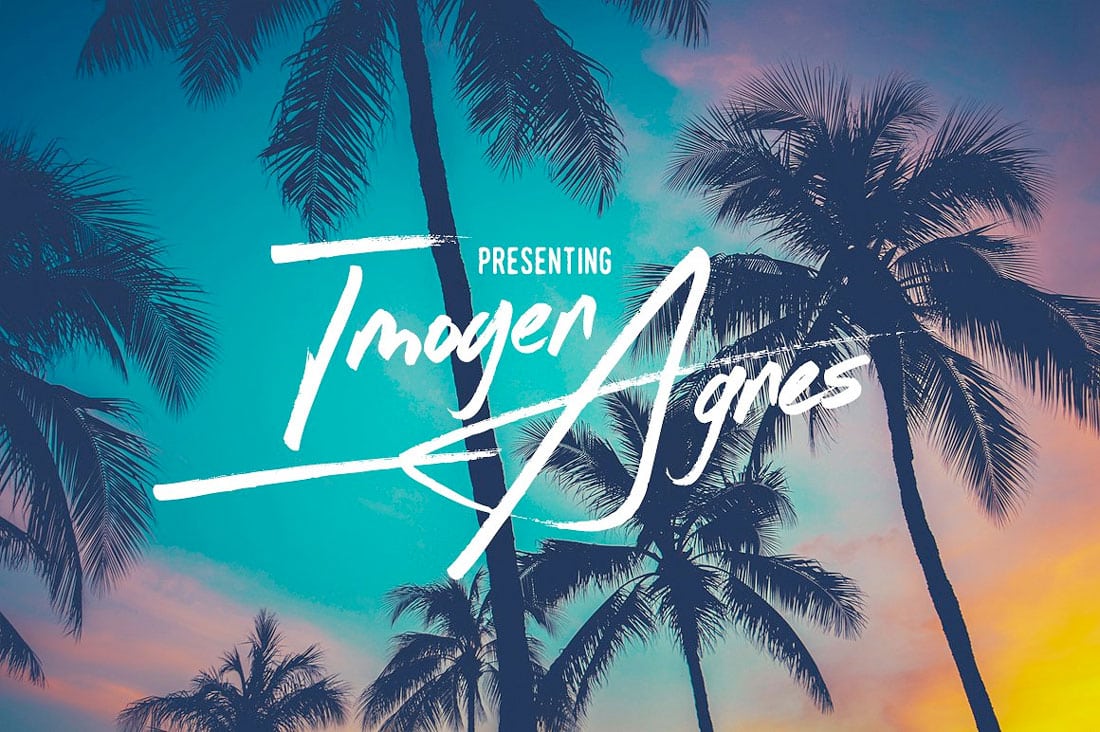
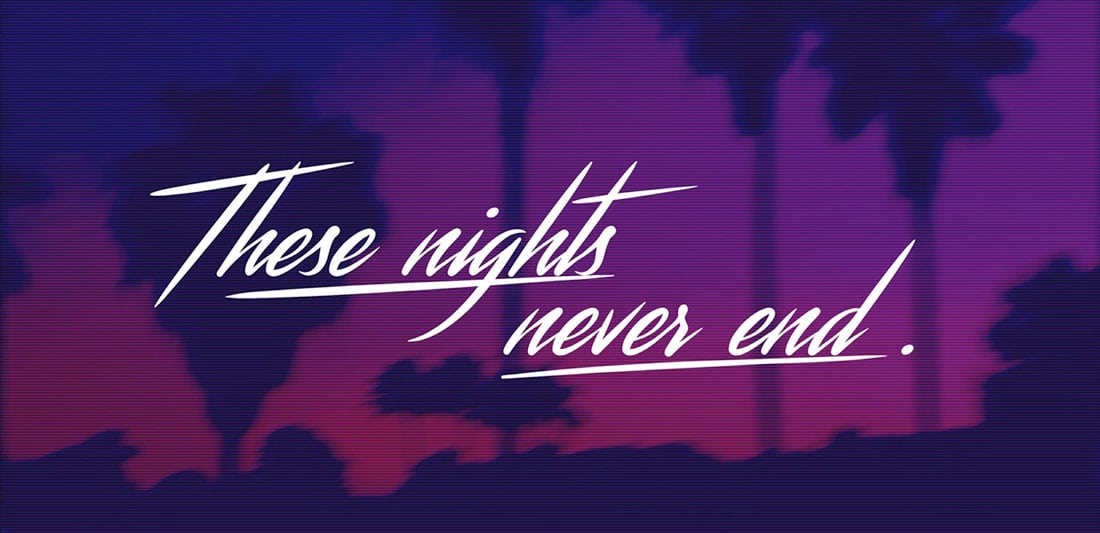
80s Brush Script
Even the softer typography styles of the 80s had somewhat of a hard edge to them. Brush script styles were popular but often came with distinct (and bold styling).
While these fonts have characteristically smoother lines and strokes, they aren’t near as flowing as today’s popular styles.
Imogen Agnes
Streamster
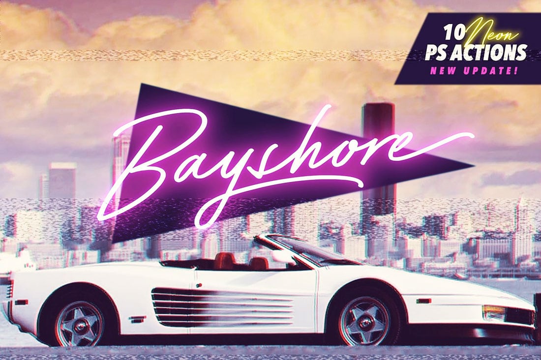
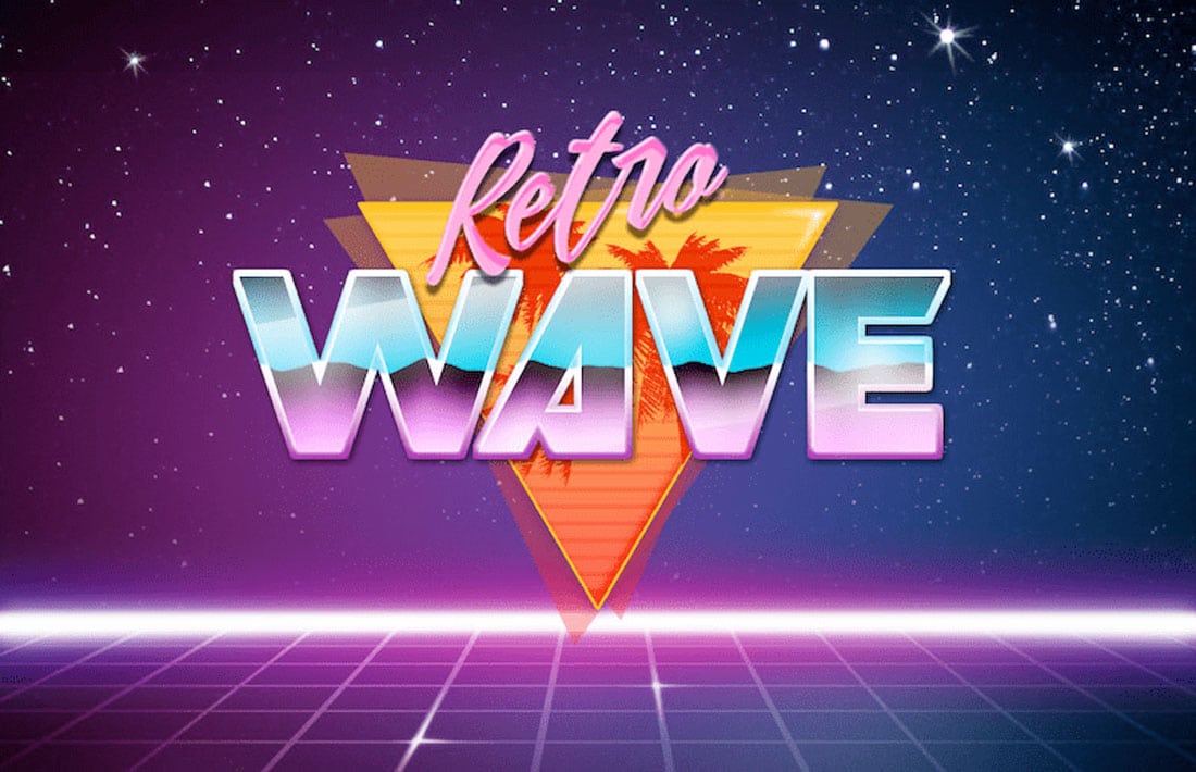
Neon Shapes and Color
Typefaces that work with a neon glow are a very 80s design. Any type of over the top text effect – neon, crazy color, multiple colors, glow spots – that has an almost gaudy look can fall into the 80s typography classification.
The attitude was that adding more effects to lettering was always an option.
Bayshore
Retro Wave
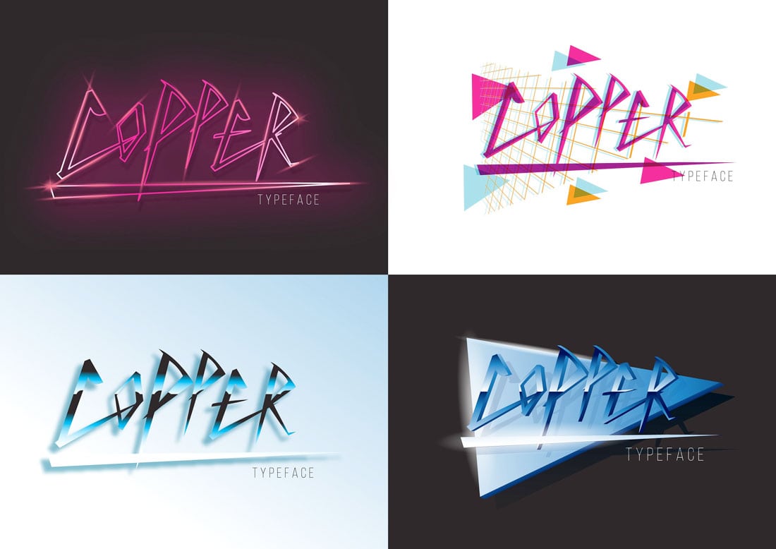
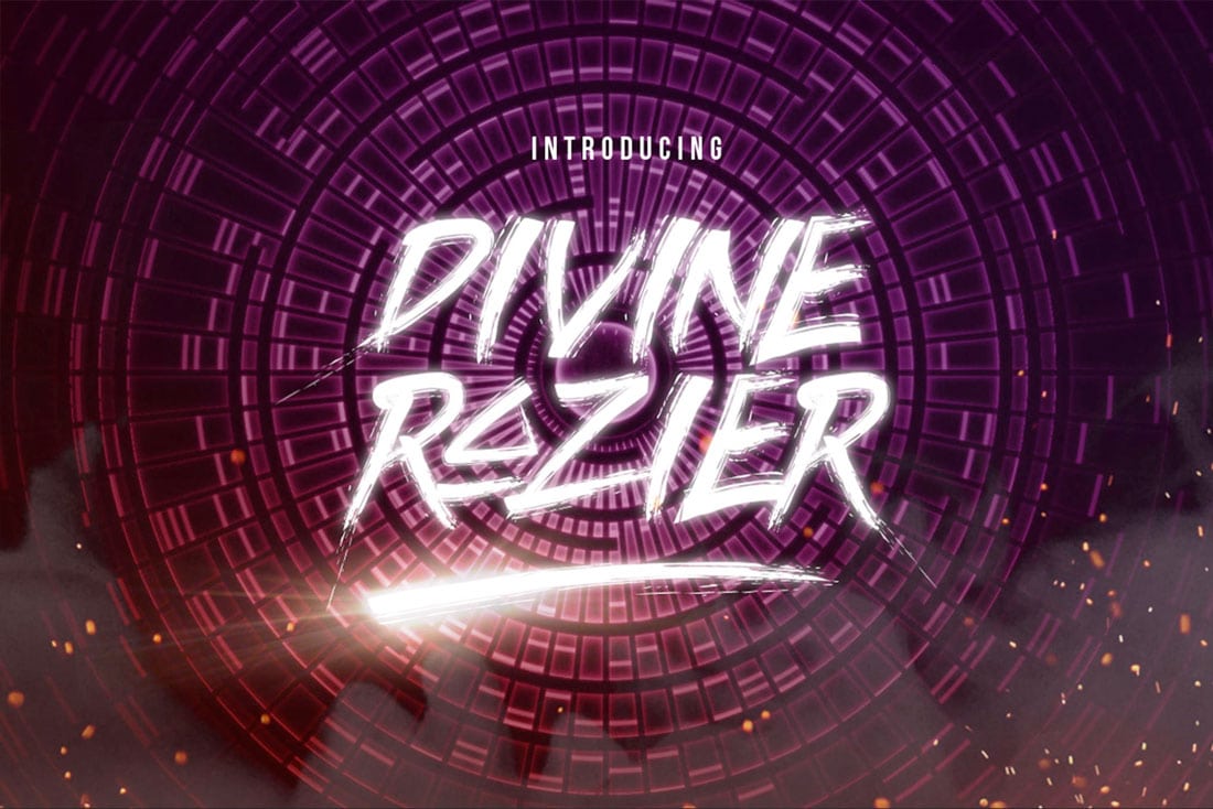
Edgy, Metal Fonts
Thanks to an emerging heavy metal music scene in the 1980s, many type styles took on this hard edge as well. These type styles were popular with metal bands and even thriller movies.
(Can you see the continuing influence pop culture made on this generation of design elements?)
Copper
Divine Razier
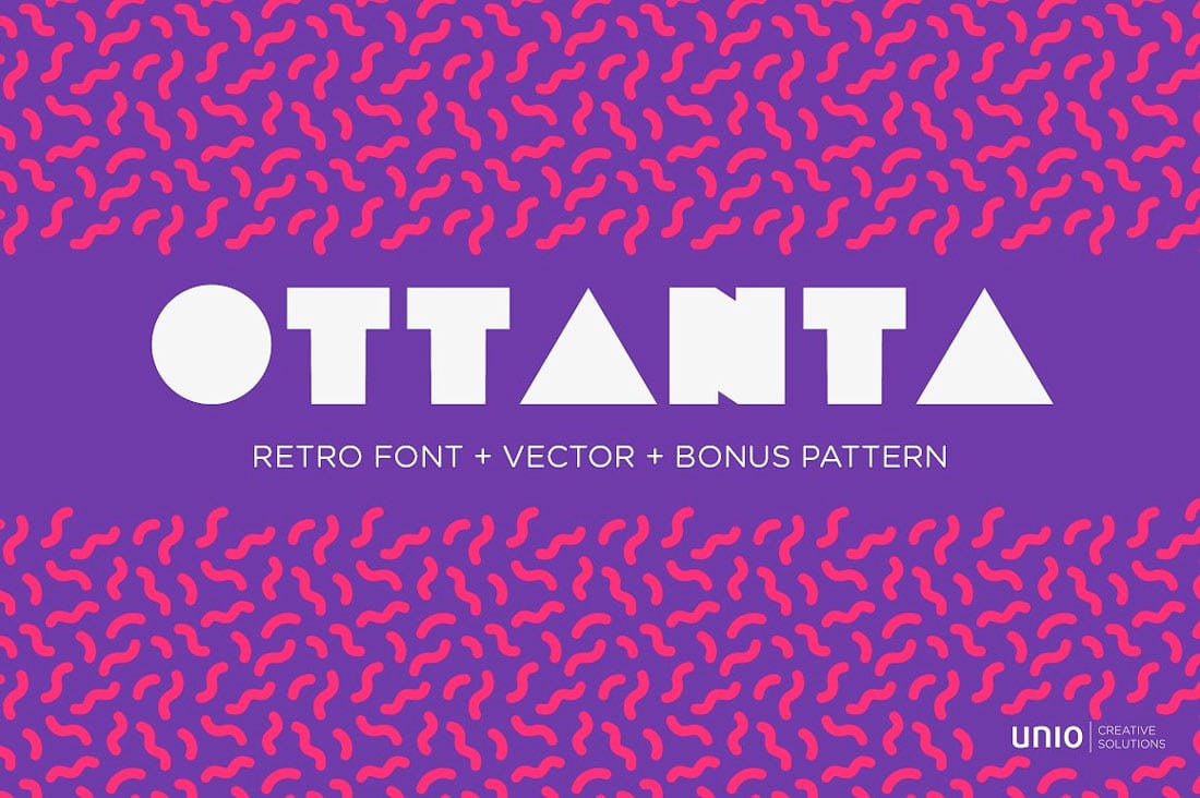
Cool Geometry
Not every font was created to be super readable. Knockouts, swashes, and interesting geometric features add visual interest to lettering, even if it isn’t quick to understand.
This retro style was a differentiator for projects so that they wouldn’t be so much like all the other styles above. It was almost a retro style then, as it is now.
Ottanta
Wonderbar Regular
80s Inline
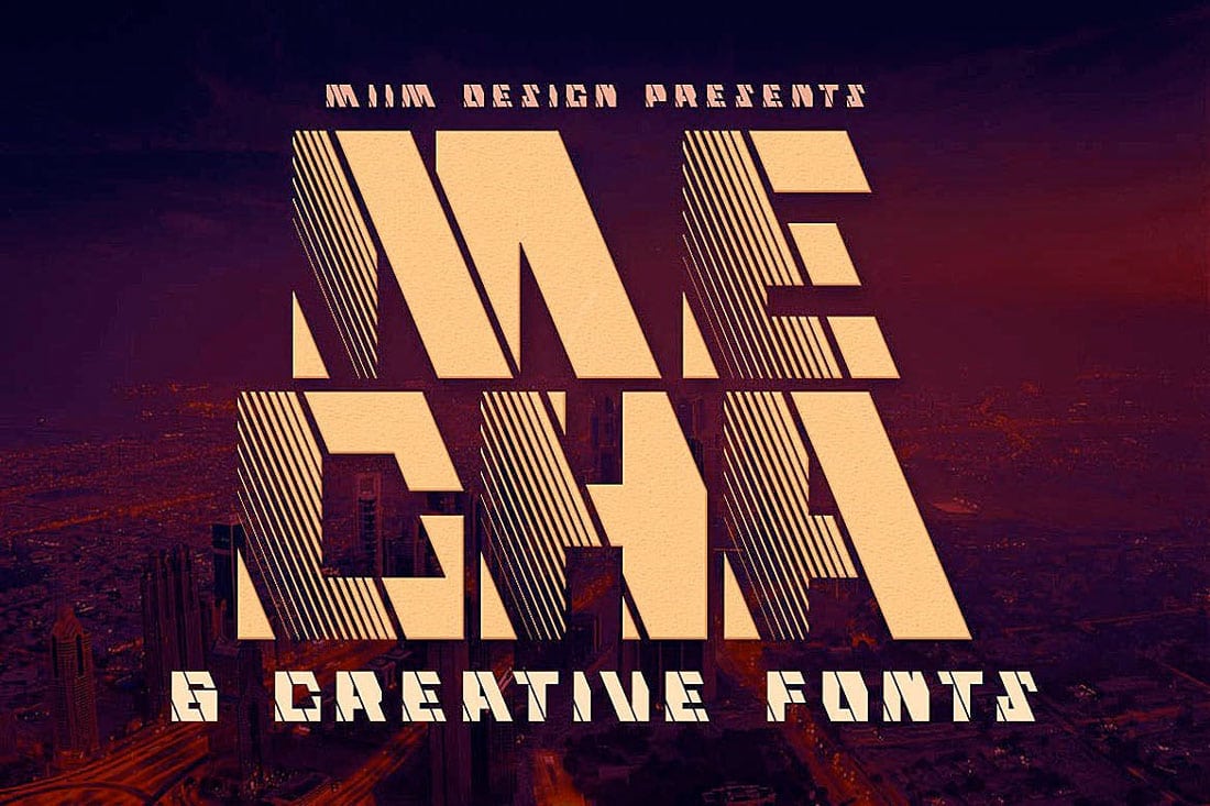
Inline typography styles are one of the few 1980s trends that have lived on and still pop up in plenty of design projects that don’t necessarily have a retro feel. Inline styles make for interesting display options.
Below is a more mainstream inline option with a totally 80s concept for comparison.
Intro
Mecha
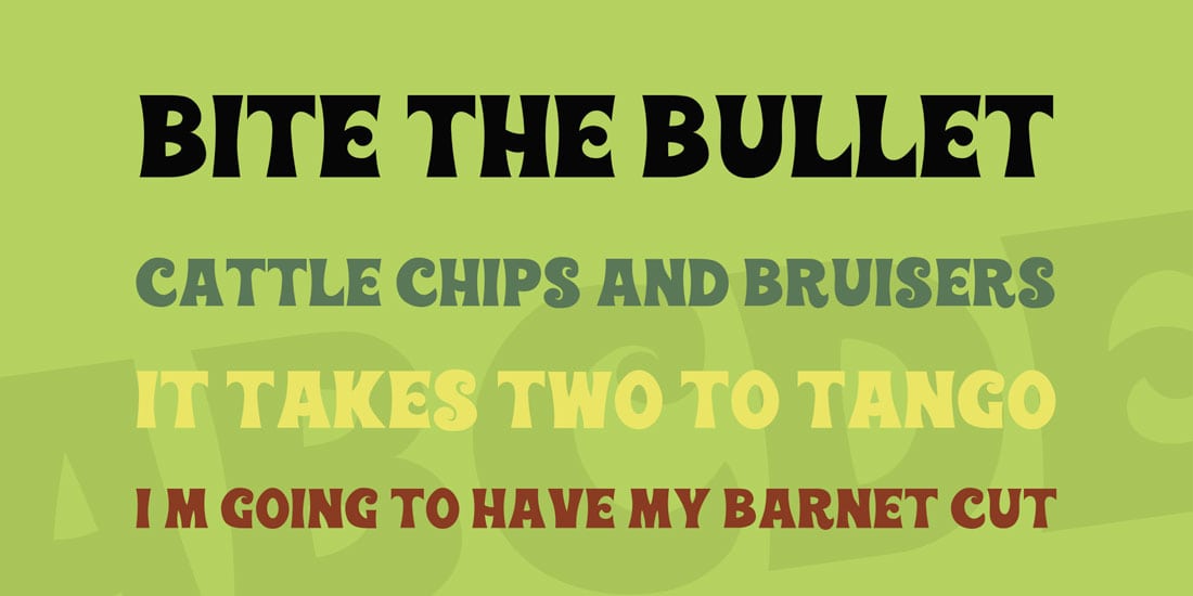
Comedic Movie Posters
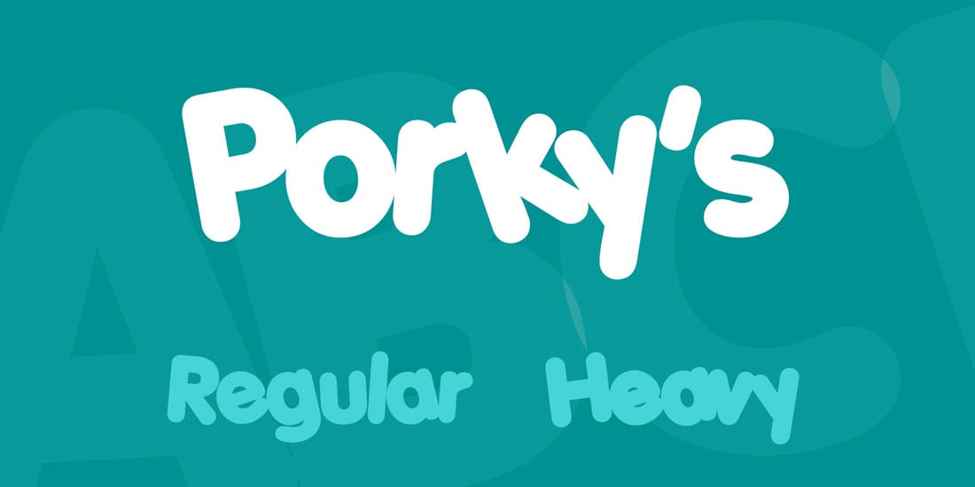
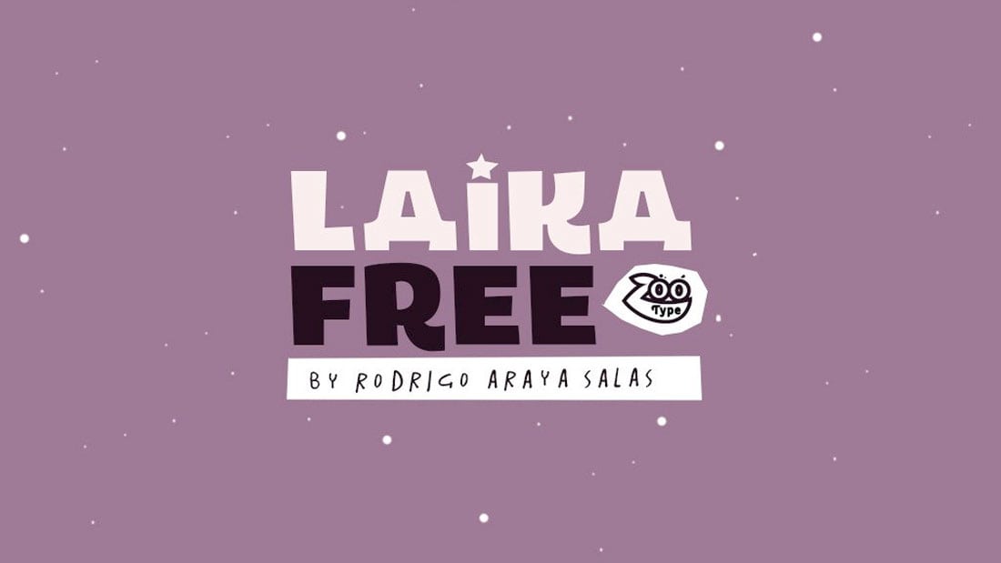
Everyone likes to laugh, right? You might smile at these fonts from the 80s with a more cartoonish look. Bubbly, elaborate typography options were popular, particularly for comedy movie posters.
Use this typography style to add a hint over over-the-top nostalgia and make users giggle at the same time.
Porky’s
Laika
80’s Fonts Are Back, Baby!
Print and digital projects can all benefit from the fun 80s retro style when it comes to choosing funky fonts. While many of these typographic options are best for display use only, there are ways to incorporate them into plenty of projects – posters, homepages, flyers and more.
When picking an 80s retro style typeface, look for something that matches the feel of your project to create something that’s most bodacious.