Serif vs. Sans Serif Fonts: Is One Really Better Than the Other?
There is an ongoing debate among designers – both print and digital – about what makes an ideal typeface for a project. The debate almost always breaks down to a single question: serif or sans serif?
Before you answer that question, think about all of the things you know about serif and sans serif typefaces and all the myths associated with them.
Today, we’ll take a look at both categories of type and try to determine if one is really better than the other, and in what circumstance.
Anatomy of a Serif
Serif typefaces are among some of the oldest modern typefaces. They are used in everything from book publishing to newspapers and magazines to billboards and websites. So what is a serif anyway?
It’s the little decorative stroke that extends from letters. It can be in the form of a tail, sharp or blunt, decorative or plain. Each serif typeface will have a distinctive style for this mark that makes the family identifiable. Serifs appear on both upper- and lower-case letters within a font family, as well as on glyphs, numerals and other characters.
The mood and feelings most associated with serif typefaces are classic, elegant, formal, confident and established. Some of the most well-known serif typefaces include Times Roman (and Times New Roman), Rockwell, Georgia, and Baskerville.
Going Sans Serif
Sans serif typefaces are considered more modern and include a variety of widths and shapes. This style of typeface lacks strokes at the ends of letters (hence “sans” serif). The type category is thought to embody simplicity because of this lack of added detail. Sans serif typefaces have a look that is direct and precise, although character edges may be either sharp or rounded.
The mood and feelings most associated with sans serif typefaces are modern, friendly, direct, clean and minimal. Some of the most well-known sans serif typefaces include Helvetica, Arial, Futura and Franklin Gothic.
Myths and Rumors
The problem with selecting a typeface – either serif or sans serif – is magnified by all of the myths we read daily about the different letterforms.
While in the past some of these myths and rumors may have held some credence, modern publishing techniques (printed and online) have narrowed the gap between serif and sans serif typefaces and readability. In many instances, readability concerns are not based on the type category but rather the actual typeface and its application.
Only Use Serifs in Print

This is one of those myths that is repeated without merit. Why would you only use serifs in print? Look at websites like Church of The Atom. It uses serif typefaces in a beautiful way. It’s perfectly readable and adds a lot of emphasis to the overall design concept.
So where did this myth come from? The top argument in support of his flawed theory is that screen quality is not as good as the quality of printed materials, therefore making serifs hard to read on a screen. While some printed materials do have higher publication resolutions, this is still a flawed argument.
Think about how you learned to type. It was likely on a screen using Times New Roman (a serif). Did you have trouble seeing it?
Think about changes in screens as well. In the last few years, high definition and retina-display have become almost the norm. These higher-quality screens also debunk the argument that you can only read serifs in print. The days of poor-quality screen resolution affecting readability are coming to an end.
Sans Serifs Are for Digital Publications

Just like saying serifs are only from print, some try to claim sans serifs are only for digital publications. Again this is just plain false. Designers have been using sans serif typefaces in print for many years successfully. To relate sans serifs only to digital publication is ridiculous. Look at the number of books and magazines that use sans serif typefaces for their covers and in text throughout the publication.
Serifs Are Hard to Read
Readability studies have actually found that serif typefaces are easier to read because the added strokes make each character more distinctive. More distinctive letters are easier for the eye to recognize quickly.
Further, this style helps guide the flow of letters, words, sentences, and paragraphs because serifs can help “push” you from one letter to the next.
Sans Serifs Are Informal
The use of a sans serif typeface alone does not convey a message of informality. It can be informal when used with other imagery or in conjunction with a novelty typeface.
But one of the nice features of a sans serif typeface – and one of the things that makes it a flexible choice – is that it tends to take on the characteristics of surrounding typefaces. So a sans serif paired with an old style font will have an aged and classic feel; a pairing with an ornate script may feel more formal or feminine.
Serifs Can Be Used to Increase Spacing Between Letters
Yes, this is a real argument. But serifs do not affect letter spacing. Letters that are improperly kerned can actually have the opposite effect and serifs can actually end up making letters look closer than they may be. Using a serif typeface is not a solution to resolve kerning or tracking issues.
Sans Serifs Are More Attention-Grabbing
The amount of attention your design garners is not based on a typeface alone. It is a matter of color, contrast, imagery, and typography. It takes all of these things to grab someone’s attention.
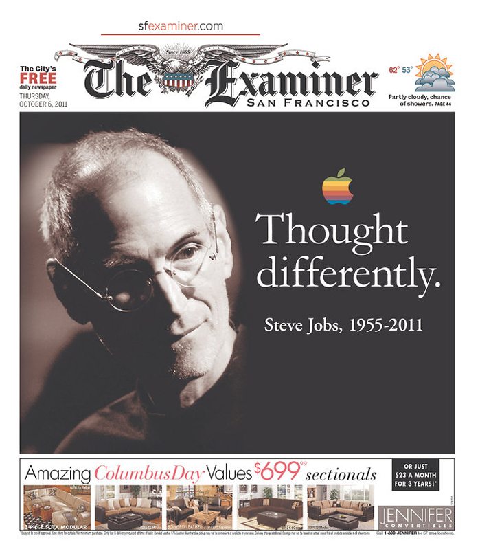
Take a couple of classic examples. Newspaper headlines, such as The Examiner San Francisco above, often use serif typefaces for headlines. “Thought differently” is very attention-grabbing. It is as much about the content as the typeface used.
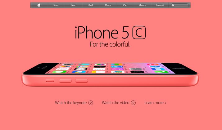
Then look at the site for the Apple Store. The sans serif typography is bold, dramatic and attention-getting. Both serif and sans serif styles can be equally impactful.
Conclusion
So which is better: serif or sans-serif? It all depends on the use, mood and individual project. The best answer is typically the least clear – many great design projects incorporate both styles. This applies to print and digital projects.
Serifs and sans serifs can work in any number of applications. The key, like for any other design technique or tool, is to use the typefaces well, with purpose and in concert with the content.